
Hey everyone, the Sea Beast is out today on Netflix and I am super thrilled to share some of the innovative aspects of the color finishing. I hope you all enjoy reading about the techniques used and the “why” behind some of the choices. It’s a gorgeous film and I’m very grateful to have had the opportunity to contribute my small part.
If it’s not on the page it’s not on the stage
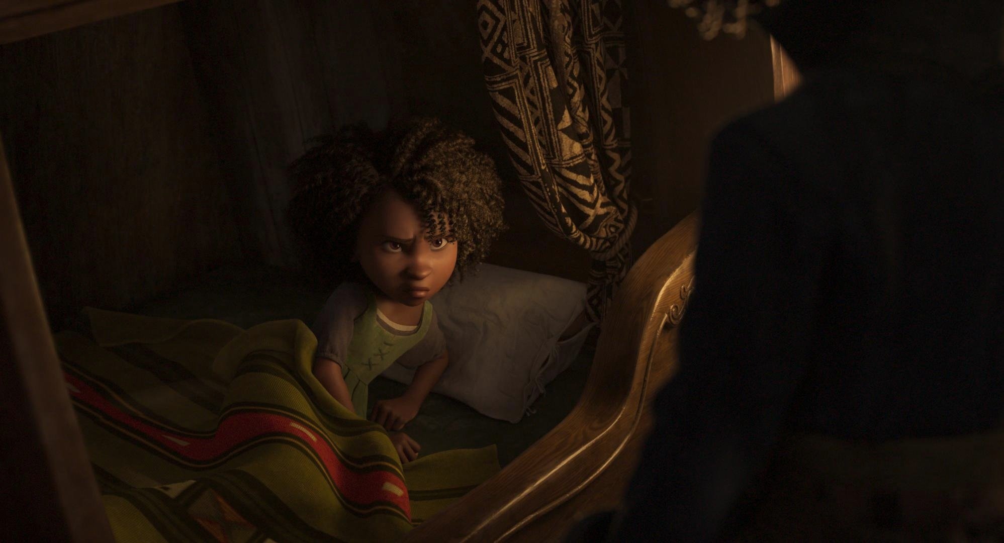
It all starts with a script. In Sea Beast’s case, that script was co-penned by the story’s visionary Director Chris Williams. I’m a big fan of Chris’s past work, so getting the chance to collaborate with him on his latest was exciting, to say the least. He’s sort of animation royalty in my book.
The world was conceived from the minds of two fantastic artists. Matthias Lechner wore the mantle of art director while Woon Jung took up the production designer role. Sony ImageWorks was tasked with bringing the characters to life supervised by Stirling Duguid. Steven Schweickart kept us on time and honest, while Tim Archer supervised the post. Joyce Arrastia was the editor who put it all together. Netflix put together the dream team of animation heavyweights on this one and it shows on the screen.
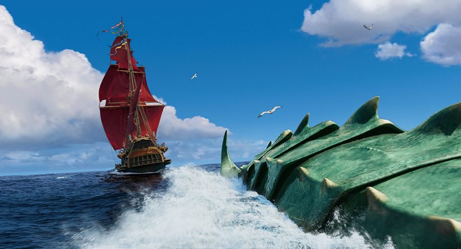
The World
The look of the world in one word would be painterly. We used Filmlight’s Baselight to “paint” the frame with a lot of soft, atmospheric touches.
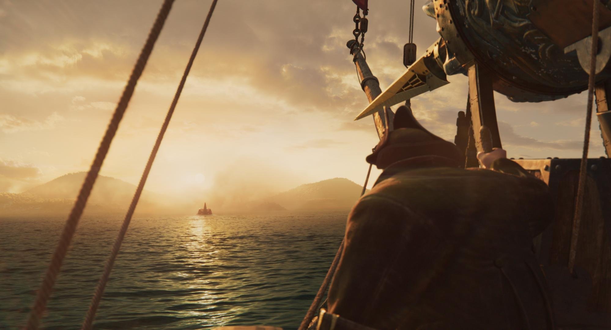


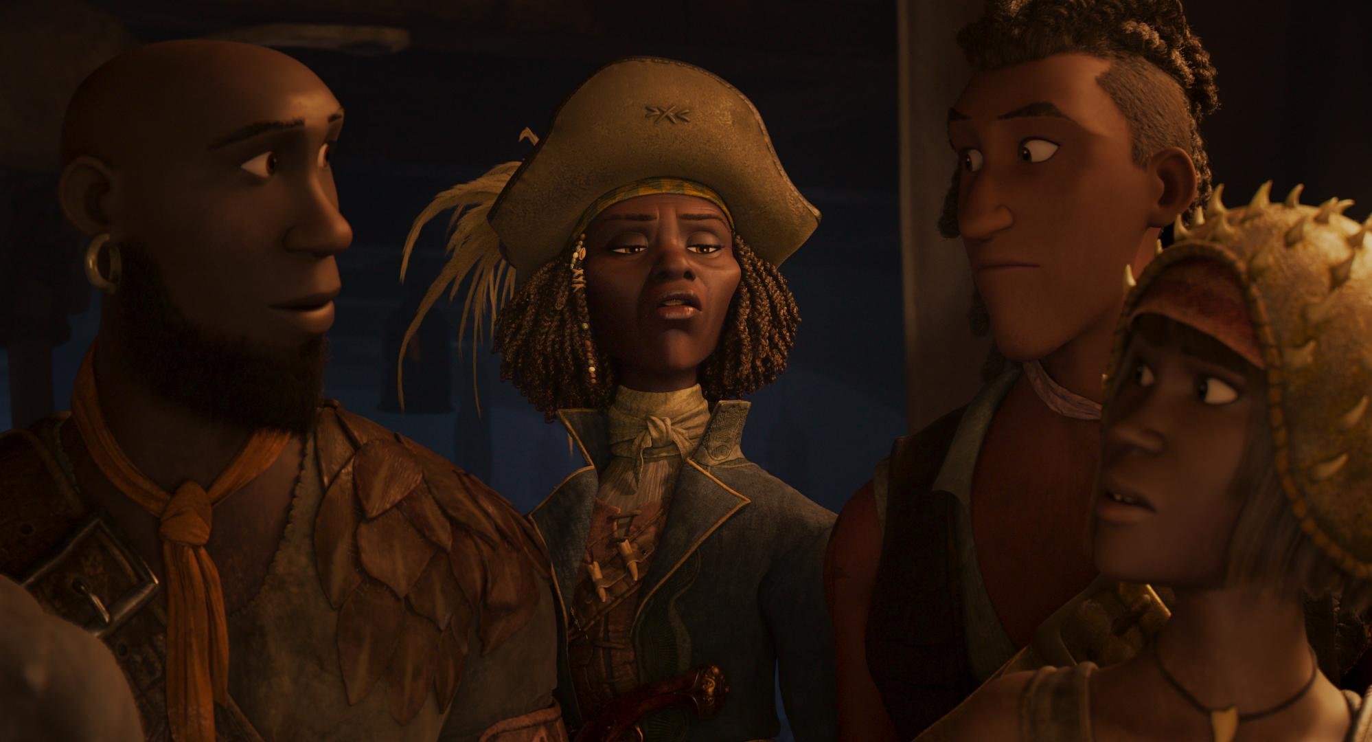
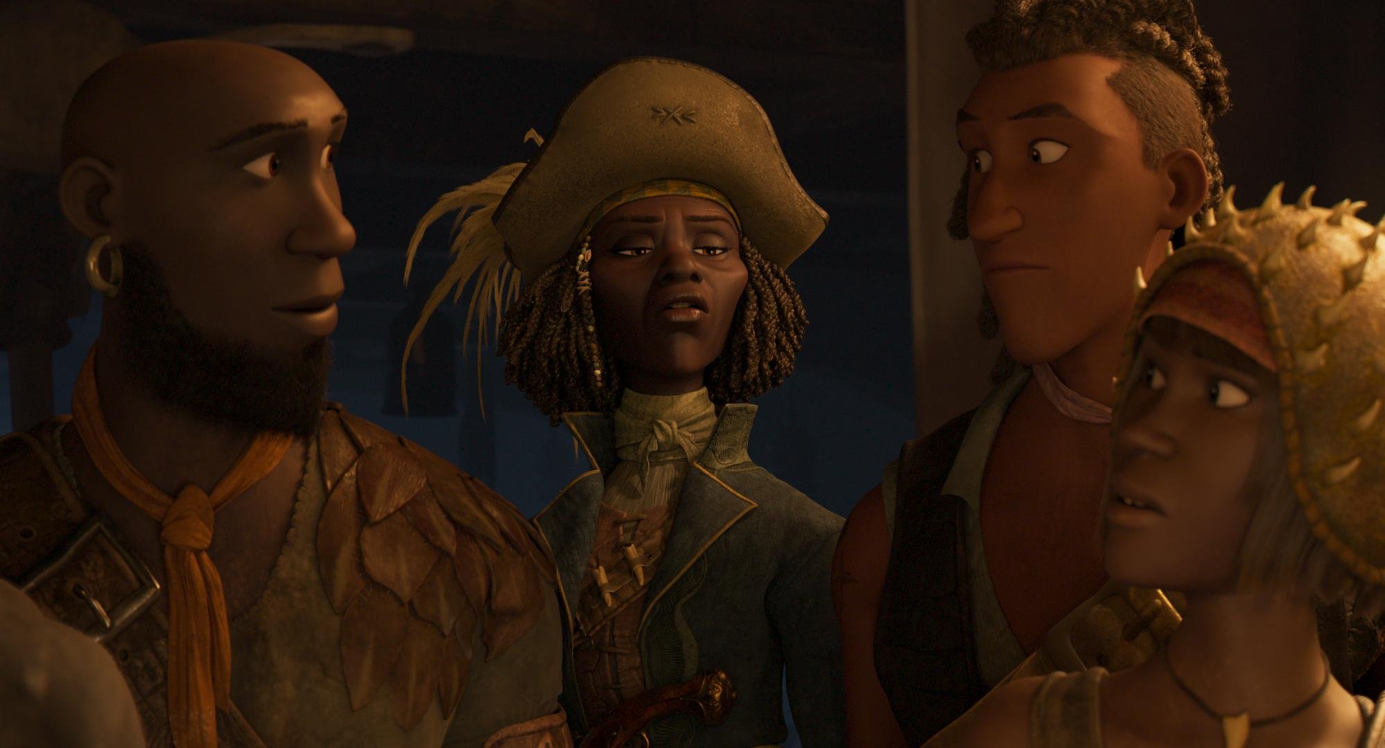
Much of the film takes place in humid locations with a lot of volumetric haze. This does two things for the picture. One, it softens what could be a sometimes overly contrasty CG aesthetic. Two, it really plays up the scale of the world by imparting a sense of depth.
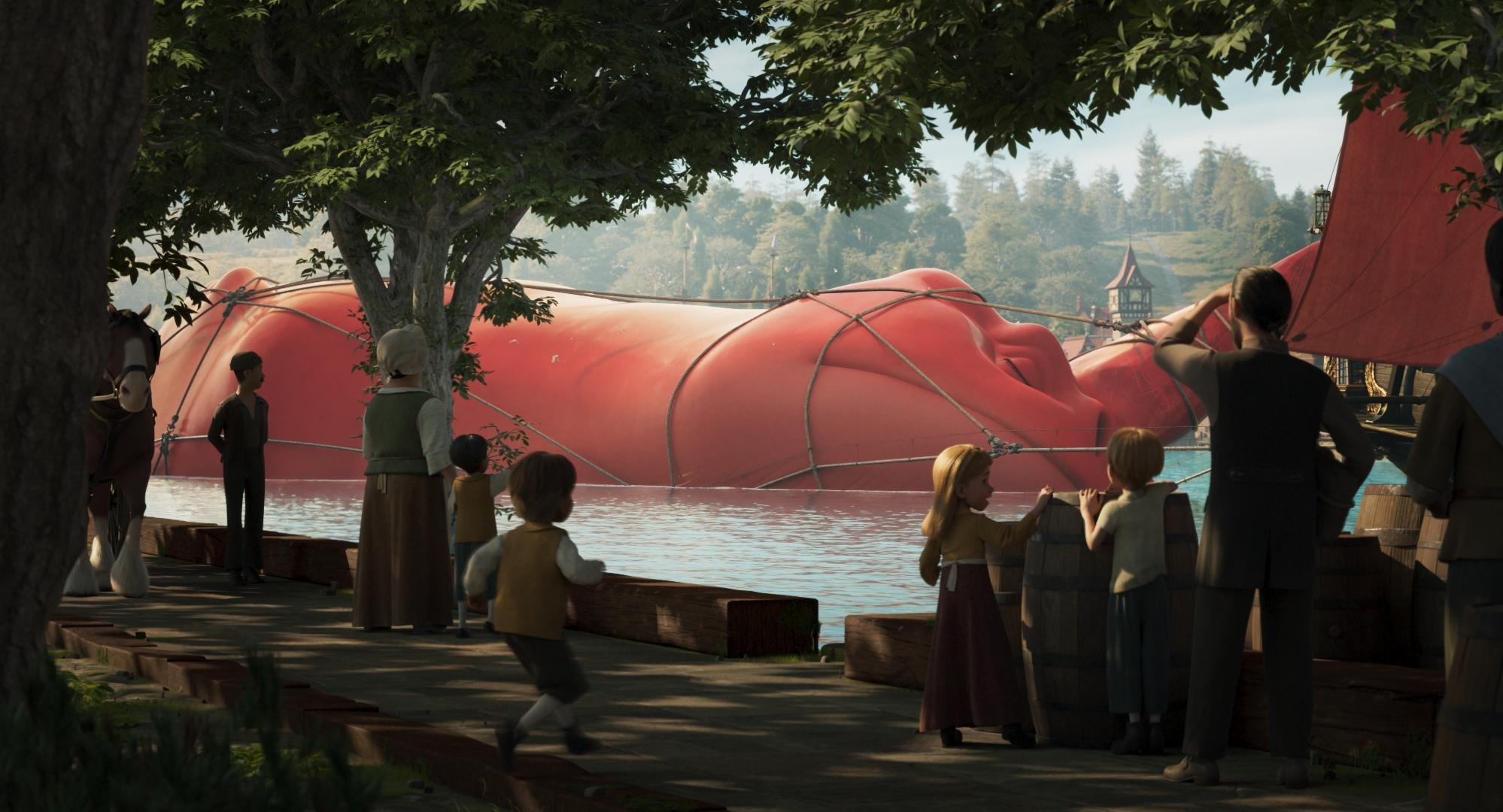
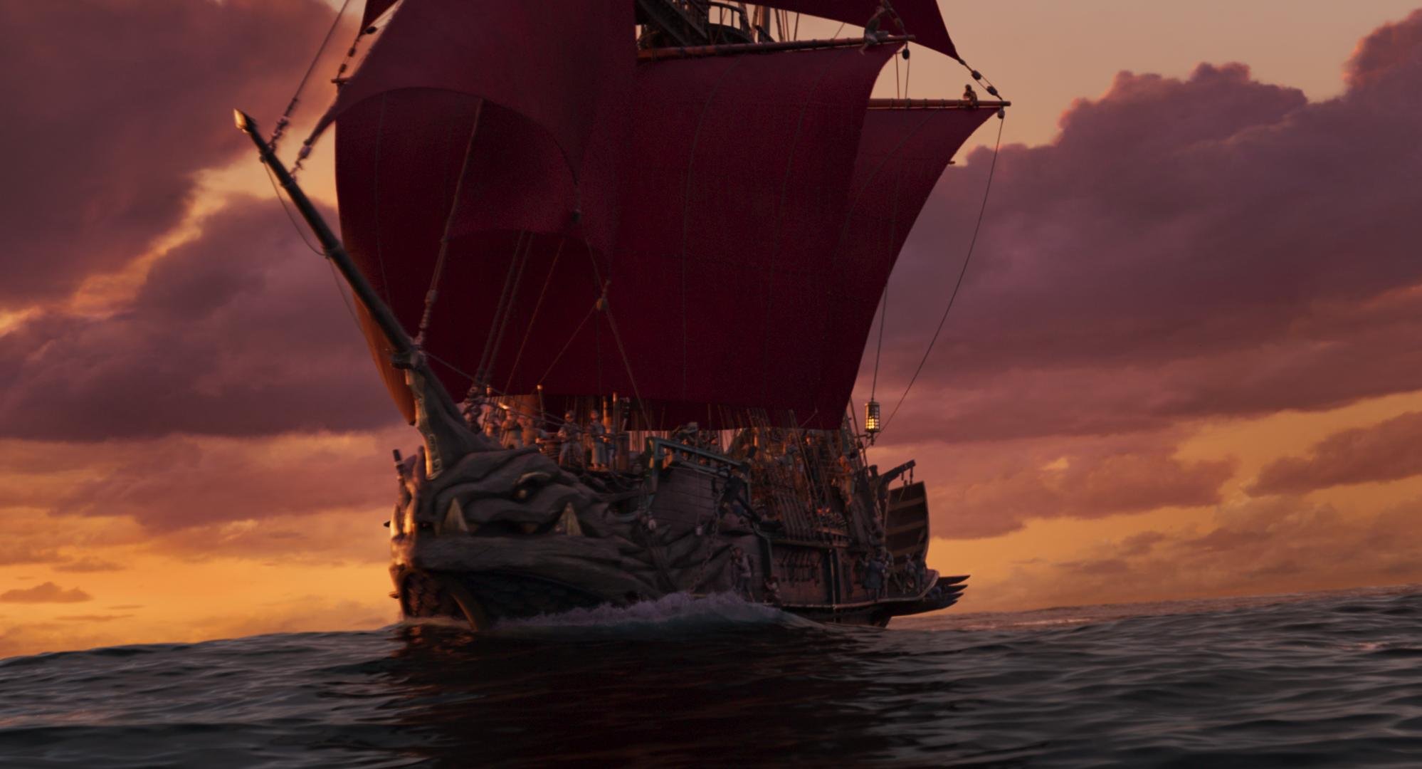
We always made sure to play the background a little desaturated and low con. This was inherent in the design and execution of the files coming out of ImageWorks, but was further enhanced in DI with the use of mattes and depth channels.
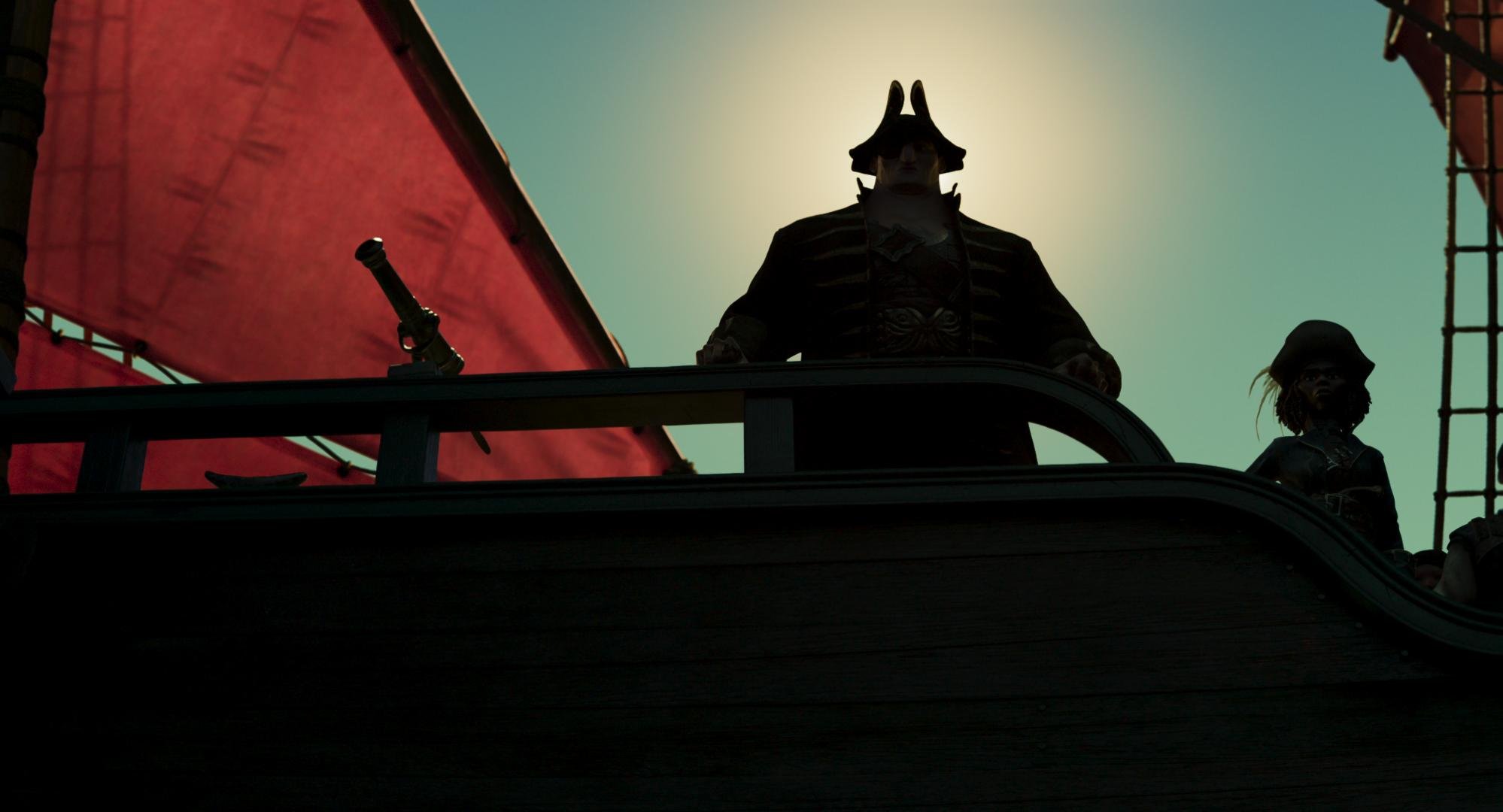
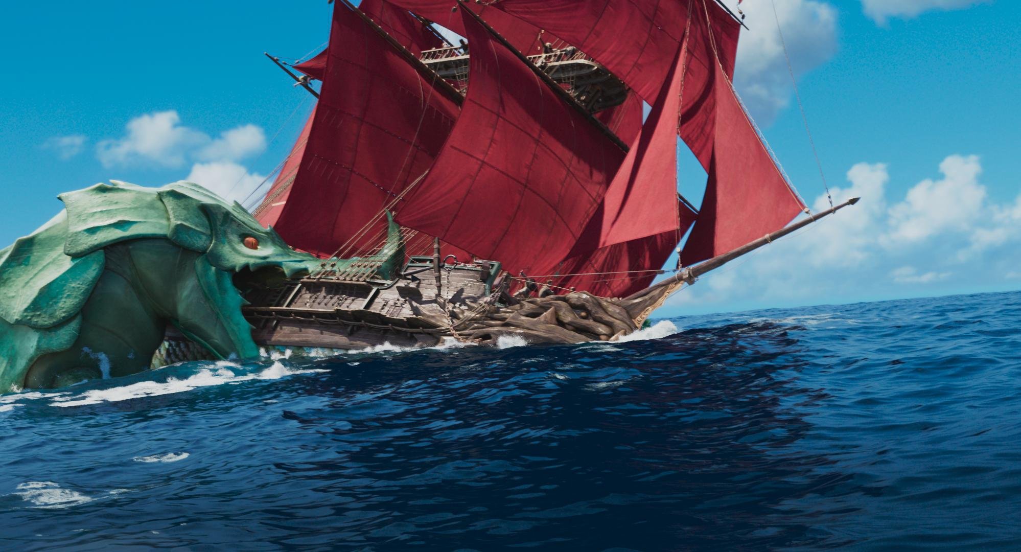
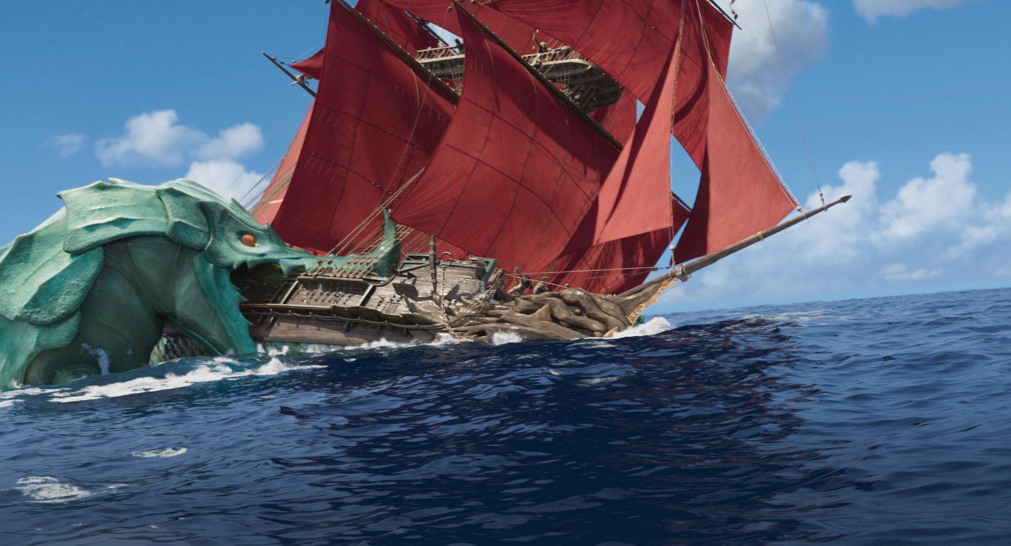
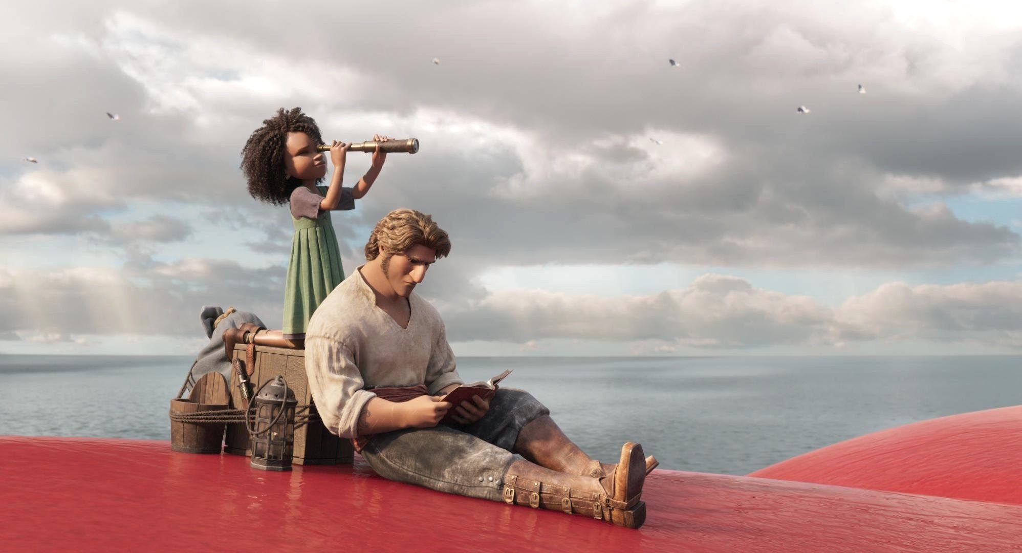
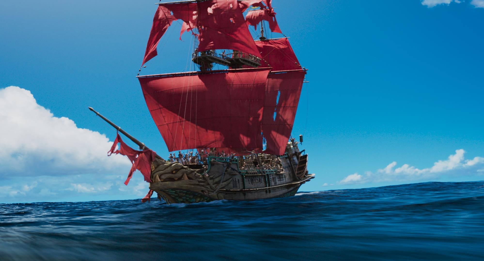
Cyan blues were also very important, as you can imagine for a movie set out on the sea.
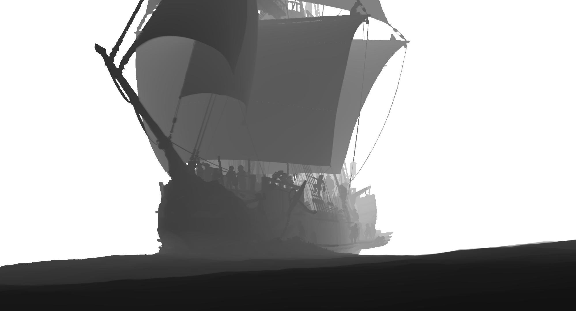
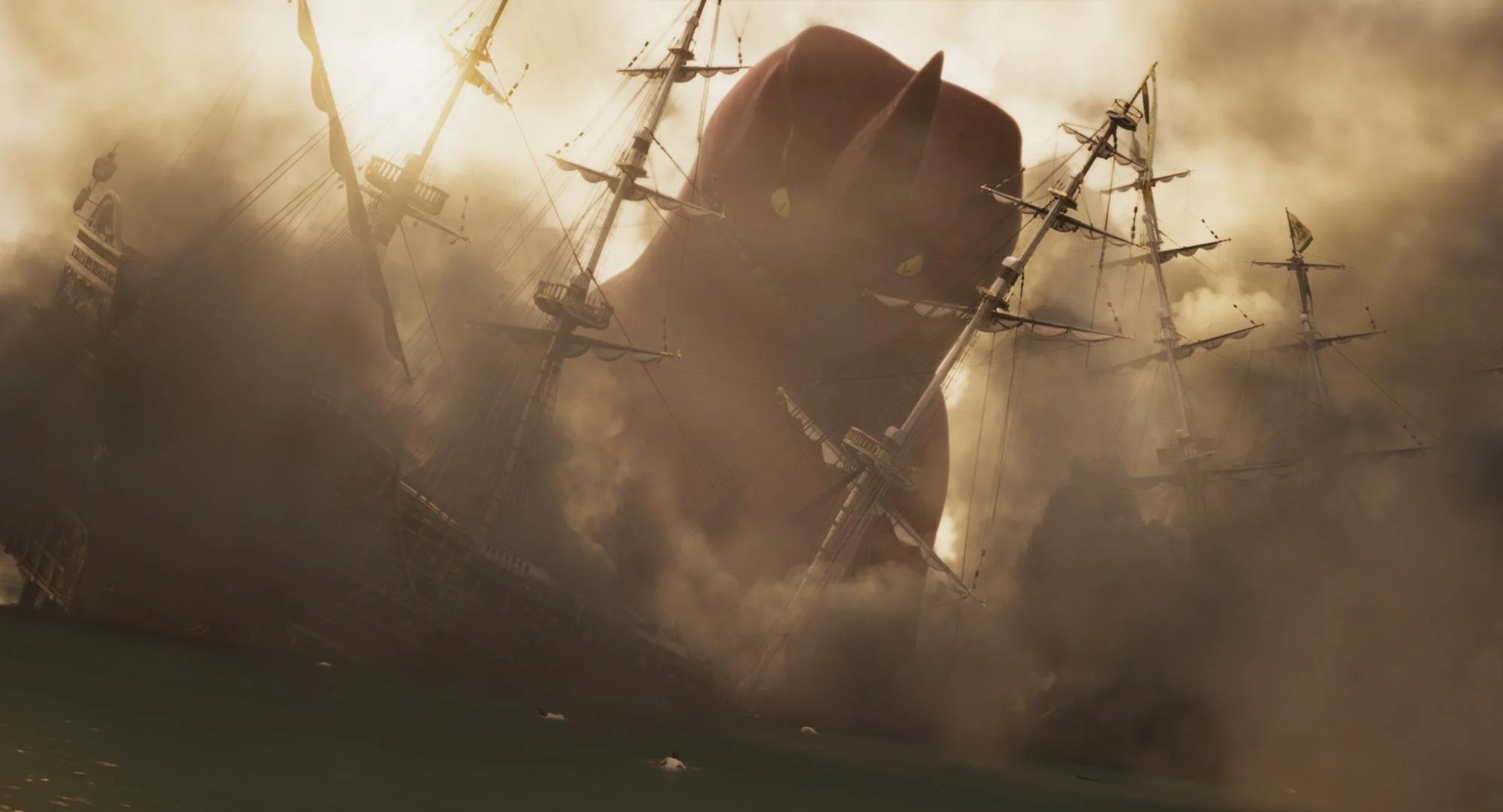
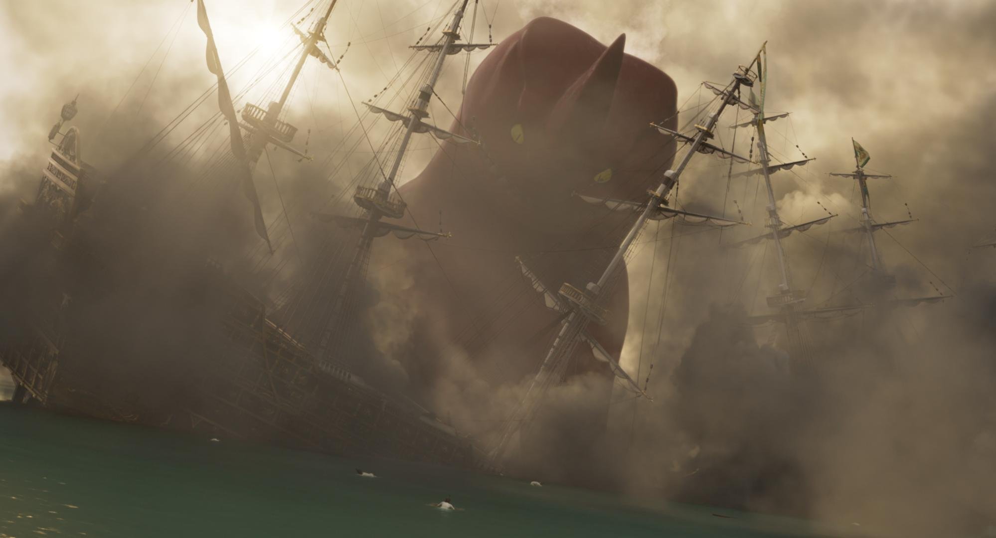
The sky and the weather were closely linked to the dramatic plot points of the story. We made sure that the sky felt like a reflection of the mood that was at play in the scene. One such example was when we darkened the storm clouds in the second act. This gave a threatening feeling as the characters trudged forward in the story.
Shapes used to create an ominous feeling in the clouds.
Enhancement of the Blood moon to create a foreboding presence.
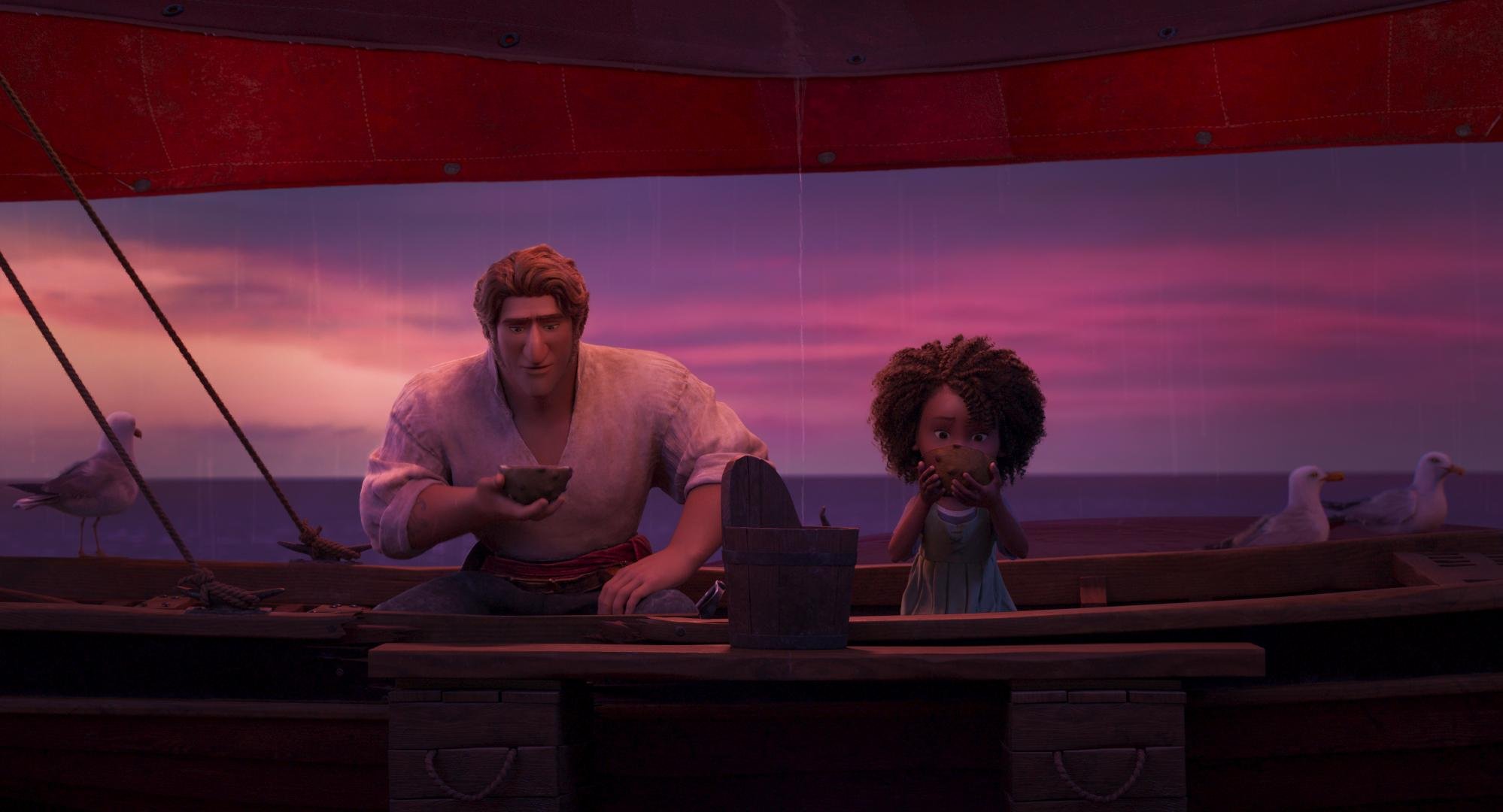
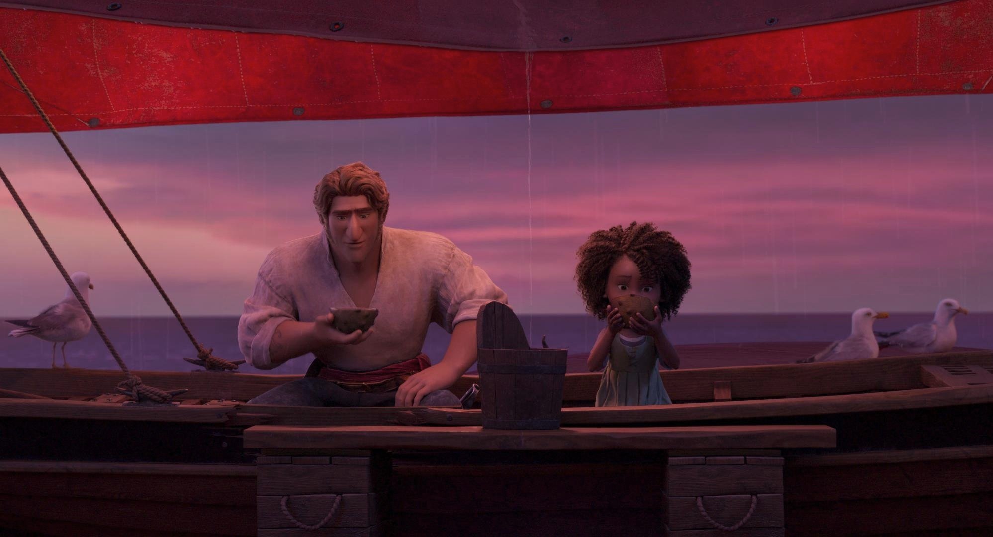
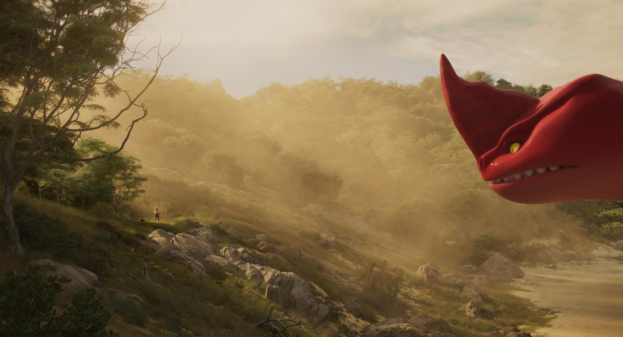
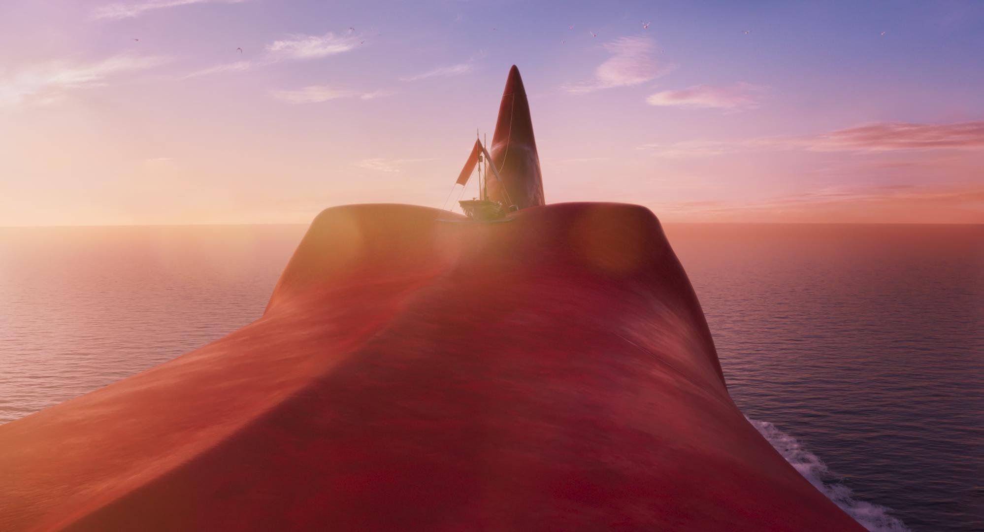
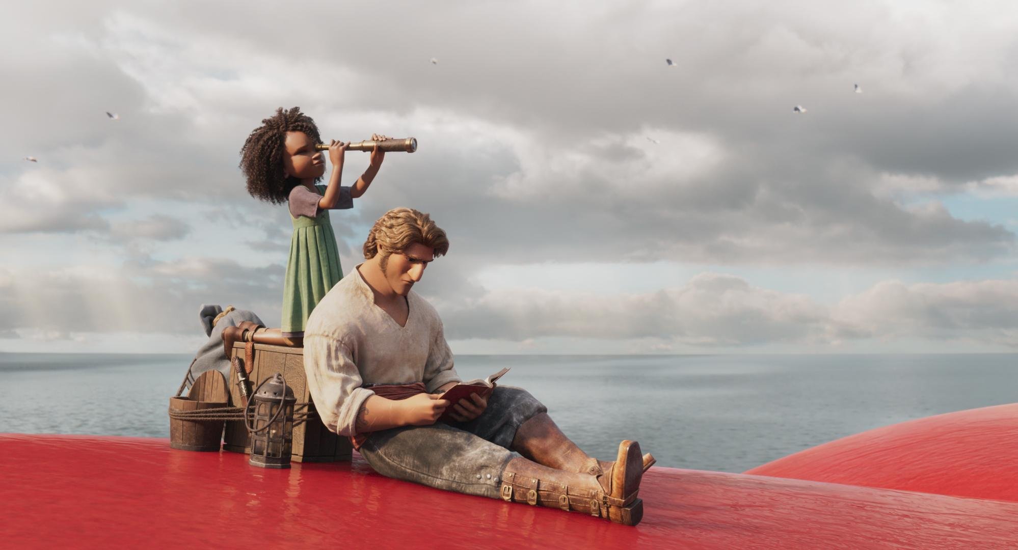
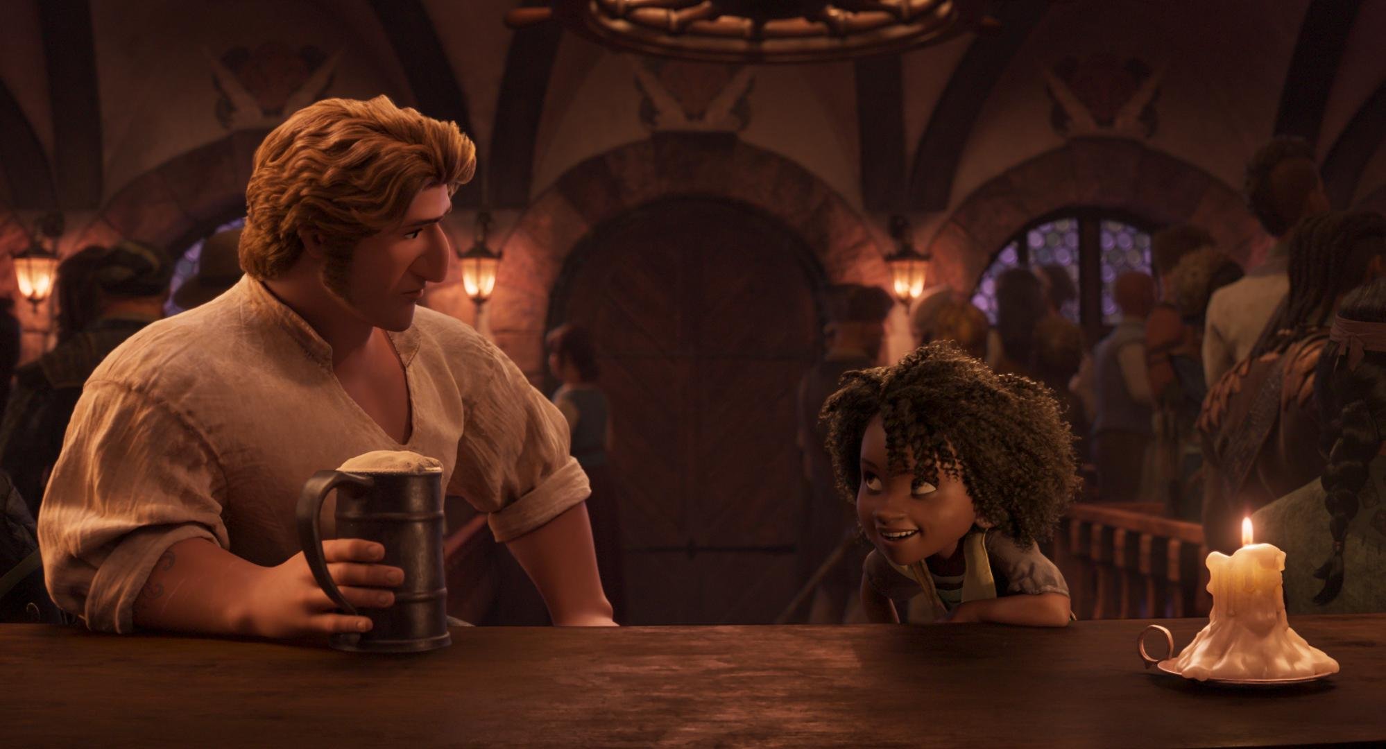
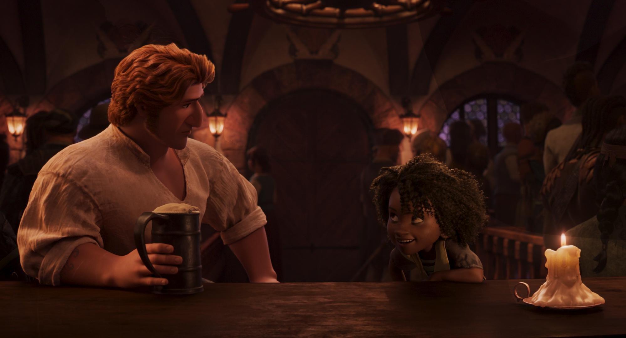
Another important color consideration was the look of one of the main characters named Red. As her name implies, the character is a very saturated red hue. We made sure to play up the complementary nature of the relationship to the opposing cyan sky and ocean using secondary hue swings.

Special attention was made to ensure Red had the right hue for the environment. This meant slightly leaning Red’s skin color to align with the scene. Warmer in sunlight and more towards the cooler side of magenta at night.

A different type of script
The Sky was not the only color consideration when it came to plot. Matthias and Woon came up with a color script that we diligently adhered to. Here is a graphic of the most important hues vs. time.

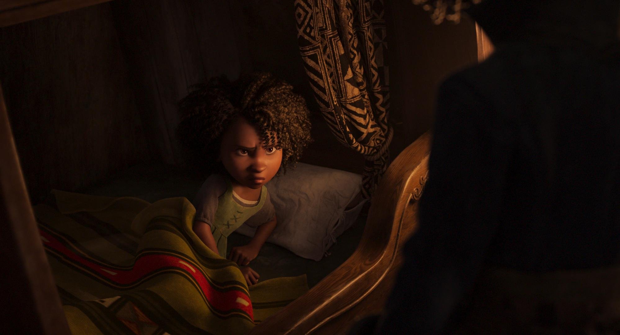
You can see that as the film is building tension we leave the “pretty colors“ for a more earthen palate. One reference Matthias gave me was “Delicatessen” shot by the great Darius Khondji. I love that film and immediately knew what he was going for. We used the uneasy, green side of yellow to symbolize corruption.


As the character's adventure unfolds we see that certain arcs are “corrupted” by revenge, greed, or just plain ignorance. We linked the intensity of this descent to the intensity of our yellow look that we developed. I achieved this by mixing back the full look with differing levels of opacity to get peaks and valleys over time. I feel that the use of this device goes a long way in helping set the tone of certain moments. The idea is to be felt but barely perceived.
HDR modulation
Early in testing, I received a note from the team that the skies were too busy vs what they designed and were used to seeing. I started to explore what was causing this reaction because I liked the look that I had first presented very much. Once I dug in a bit more, I found that due to COVID restrictions most of the approvals were done in SDR. This was the first time the creatives were seeing what was hiding in their data.
I built an LMT to solve this concern. Up to this point, the show’s pipeline was vanilla ACES. The LMT mimicked what the sRGB output looked like but tone mapped to 1000nit PQ. I started with an exact match. Then I used a simple curve to “stretch” the picture so that the middle grey was mapping correctly. I then rolled off the top end, mapping the specular highs around 600nits. This gave us the feel of the SDR but still took advantage of the extra range.


Simplifying the sky by blending the LMT layer
This was a fantastic way to simplify the sky and get the picture closer to the original artwork. The LMT approach proved to be much more efficient and safer than a key would have been. We also found that in some cases the opposite was true. There are a handful of pivotal moments where maximizing the range was to our benefit. Certain shots hit harder from being more complicated in their HDR rendering. The images shown here in SDR don’t really showcase what is happening +100 nits, but hopefully, you get the idea.
We ended up riding the opacity of the LMT to taste. This gave us one more device that we could use to link the look with the narrative arc. Here is a graph of the “amount” of dynamic range over time.

You can see that the trend line shows we used more range as the film progressed. You might think that the curve would correlate to the action scenes, but I noticed while gathering the data for this graph that it was actually coupled to the scenes with the most emotional weight. This was a first for me but I plan on using this technique on other shows going forward. I have always said just cause you have the range doesn’t mean you need to use it. HDR is like salt, a little goes a long way, and too much ruins the dish. I now feel it’s better to approach the extra range like punctuation that enhances key moments. If everything has an exclamation point it sort of loses its meaning.


Mastering
We spent two weeks on the HDR grade. I’m a big proponent of HDR first. It is your highest quality master and the one that will live on past the others. Once we had the HDR P3D65 1000nit master perfect, we moved on to the Dolby SDR trim. This was pretty straightforward except for a couple of scenes. There is a scene early on with a very flared vibe. The Dolby tools were not allowing us to get to where Chris wanted to play it. I was unable to achieve the toe compression in the shadows that I wanted no matter how I trimmed the lift up and gamma down (I call this the gamma shuffle.) Changing the analysis and the L3 mid data didn’t get us there either. We needed to use the higher precision tools found in the color corrector.
We opened back up the HDR pass I made a curve tweak to the toe, keeping an eye on the SDR output simultaneously. I found something that worked for both and was by no means a sacrifice in the HDR world. Other than those scenes it was business as usual.


We also created a theatrical version for a DCP. We did that pass in a day and a half making slight contrast and saturation tweaks. I did this in the same timeline giving a “Theatrical” category to the stacks that I used specifically for the 2.6 48nit XYZ version. Then in the exports of the other versions, I set this category to “bypass.” There is a deeper dive into this type of workflow in my post on Space Jam a New Legacy under the “multiple deliveries, one timeline” heading.
Archival
We also created an ACES AP0 deliverable in addition to the standard display referred masters. This GAM (Graded Archival Master) had all of the grades plus the LMT baked into a linear gamma EXR with ACES primaries. Standard ACES transforms applied to the GAM will get you back to the display targets where we were in DI. We also created a NAM (Non-Graded Assembly Master) that was only the conform without the grades. Both of these masters can be sourced for remastering in the future. Since I’m a card-carrying member of the organization, People for the Ethical Treatment of Pixels, I can safely say, no pixels were harmed in the making of this motion picture.
Thanks
A big thank you to Leo Ferrini, Paul Lavoie, Chris Coleman, Patrick Brennan, and the entire Warner PPCS staff. This was a super fun swashbuckling project with an amazing team. I’m looking forward to this rich world’s following chapter and to “sea” what’s next for Red, Blue… and green 😉 Thanks for reading, and as usual, reach out with any questions or post in the comments below.
Now go watch The Sea Beast on Netflix today!
Happy Grading,
JD