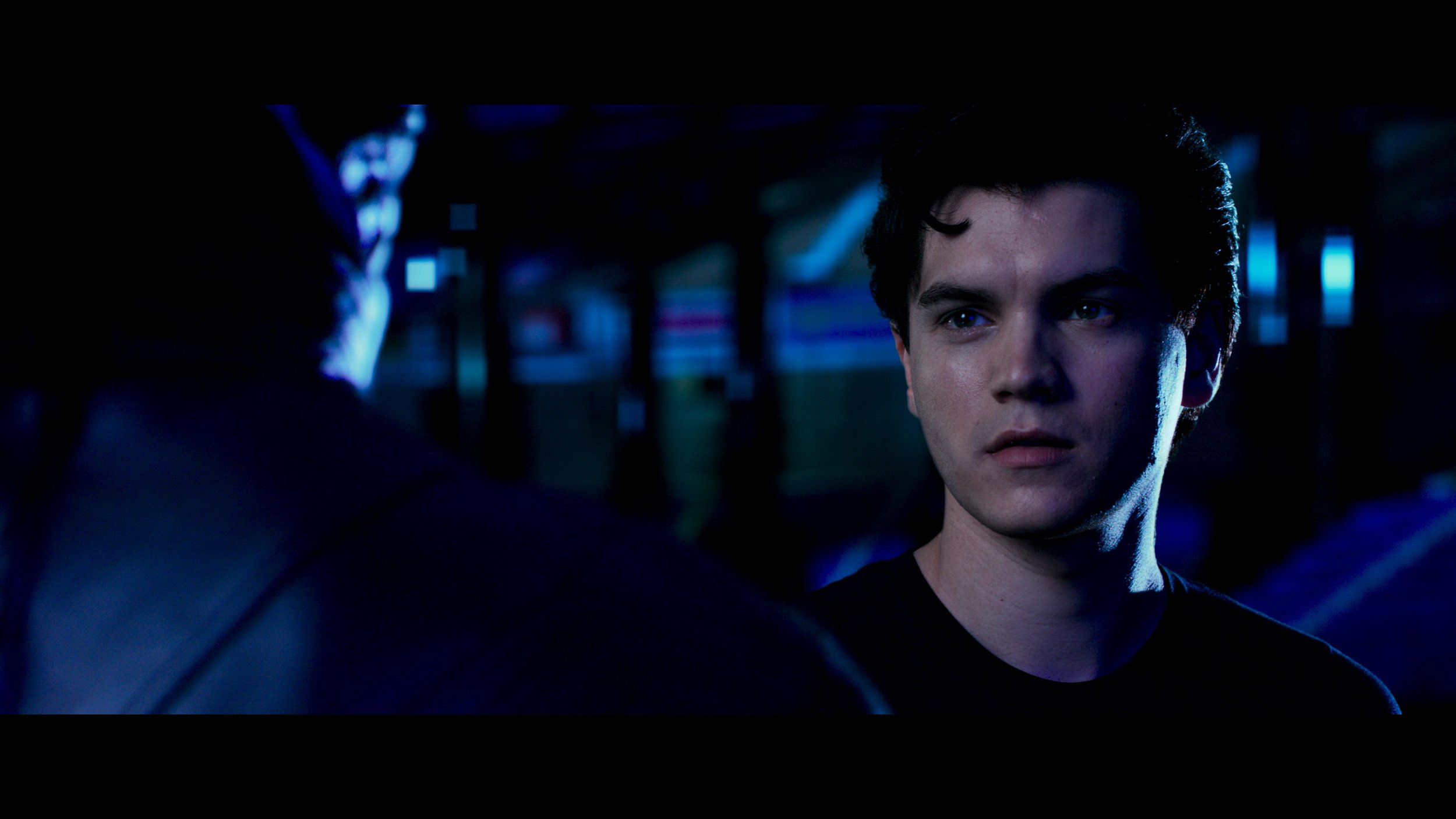
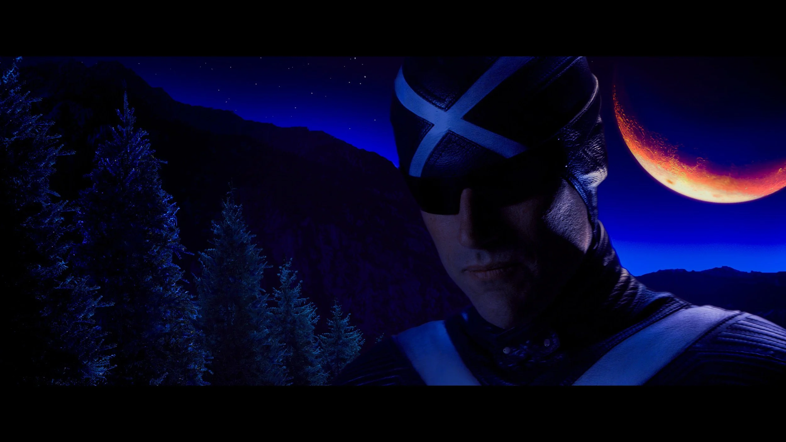
A big thanks to Filmlight and Restar for getting us all together.
https://www.instagram.com/p/DbX10CFiV69/?hl=en
A big thanks to Filmlight and Restar for getting us all together.
https://www.instagram.com/p/DbX10CFiV69/?hl=en
I had a need for this the other day while prepping a timeline and couldn't find anything quickly. I needed a straightforward way to rip CDL data—Slope, Offset, Power, and Saturation—out of an Avid Log Exchange (.ale) file and pack it into a standard Color Correction Collection (.ccc) XML for the pipeline.
Usually, extracting this metadata means firing up a heavy piece of software or navigating a massive proprietary pipeline tool, but I just wanted a lightweight, standalone utility. Since Python is the only language I code in, I threw together a script to parse the formatting and wrapped it in a basic GUI so others wouldn’t need to hit a terminal.
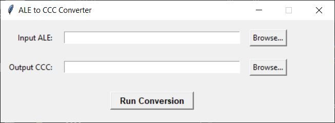
The tool is incredibly simple but handles the core pipeline hazards:
Reads the ALE: It locates the Column and Data sections and parses out the ASC_SOP and ASC_SAT values.
Formats the Math: It converts the raw ALE tuple strings into properly structured XML nodes.
Namespace Protection: If a source clip is cut multiple times in your timeline, it auto-increments the ID strings so your downstream conform tools don't overwrite duplicate CDL tags.
It runs locally, requires no external dependencies (the GUI uses standard tkinter), and outputs a perfectly formatted XML tree ready for OpenColorIO or your finishing system of choice.
Here is the download if anyone needs it:
happy to help,
JD
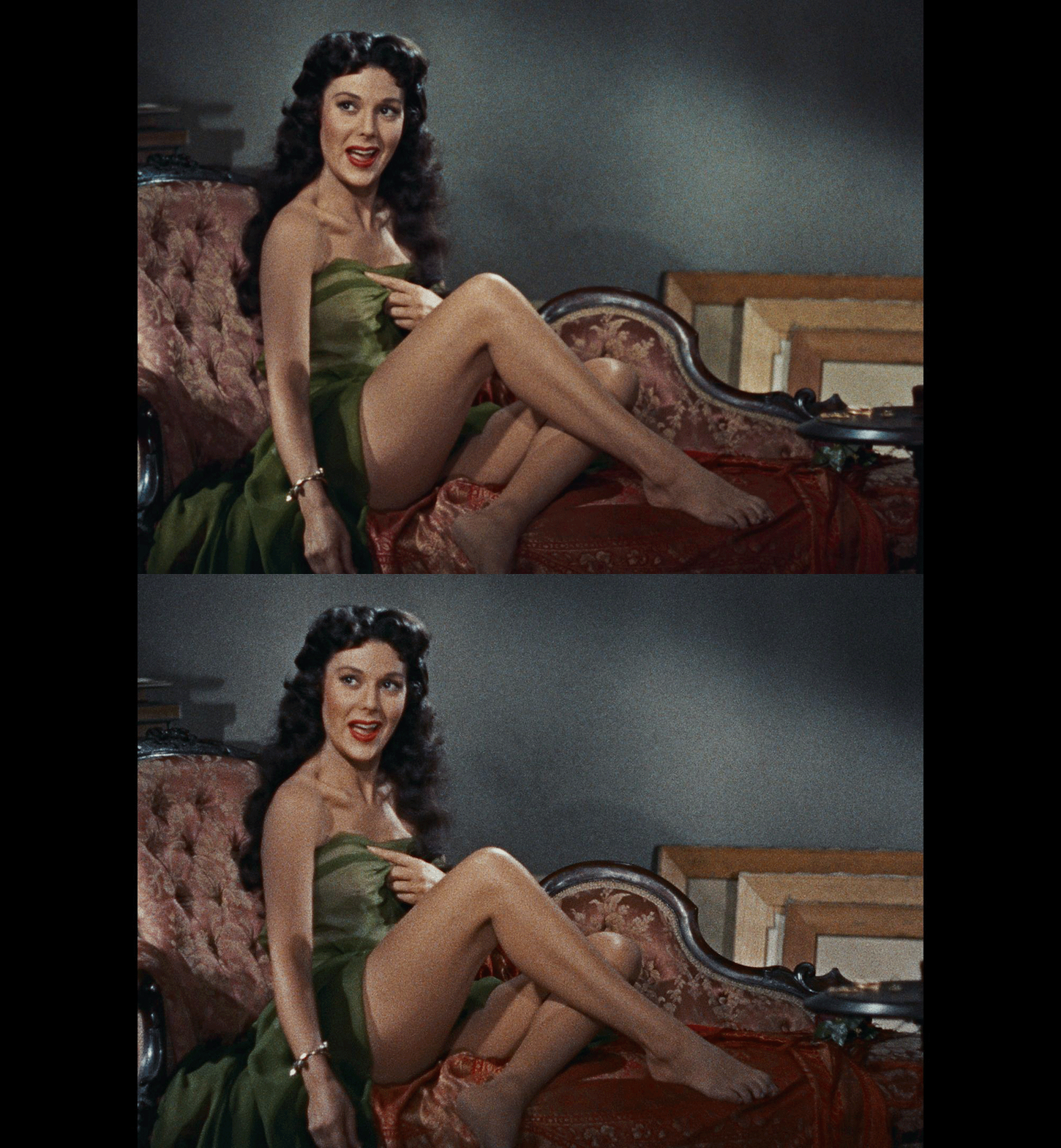
Over the course of my 25 years in the industry, finishing everything from theatrical releases to high-end streaming projects, I've tackled plenty of tricky restorations. But there is a special kind of magic and a unique set of headaches that comes with restoring classic 3D films. Here at Water Tower Color, we recently had the opportunity to resurrect a slate of 1950s stereoscopic titles in collaboration with The Film Foundation.

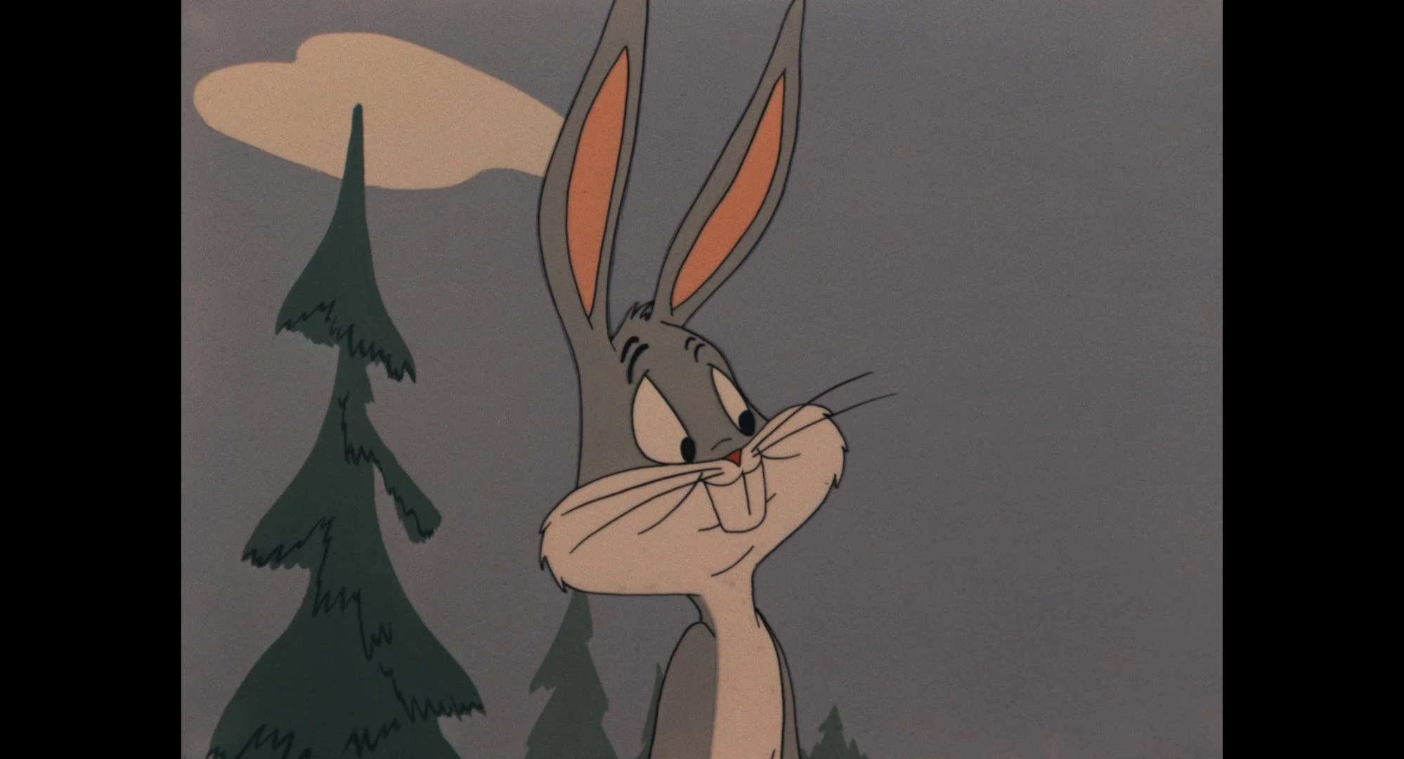
Before we get into the weeds of the pipeline, let's talk about the mechanics of the format. Stereopsis is the term that describes how we collect depth information from our surroundings using our sight. When you look at something, your left and right eyes see it from slightly different angles. As you focus on objects closer to you, your eyes converge, turning inward toward your nose.
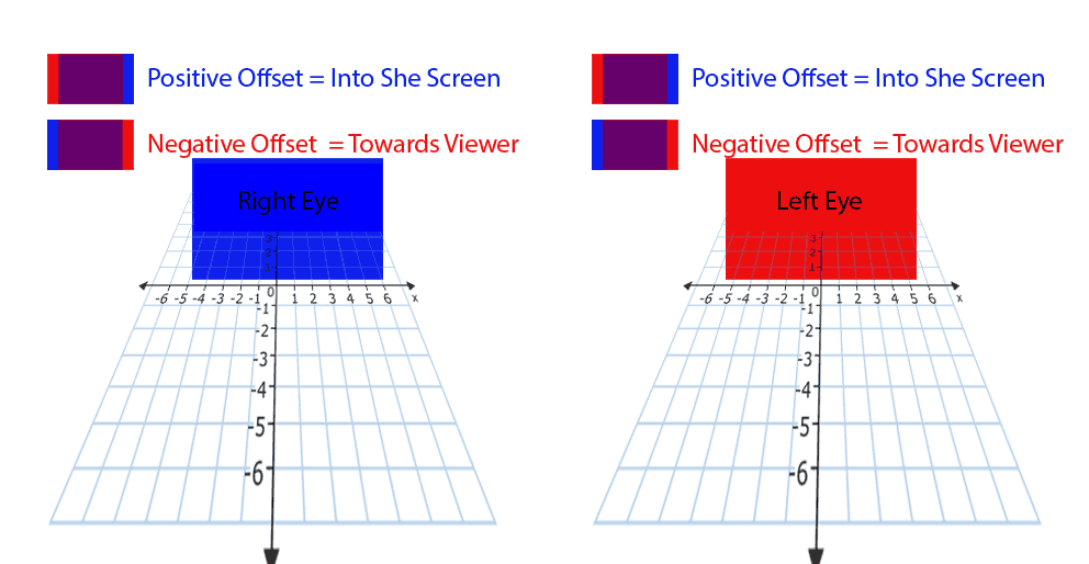
0 on the cartesian plane is the projection screen.
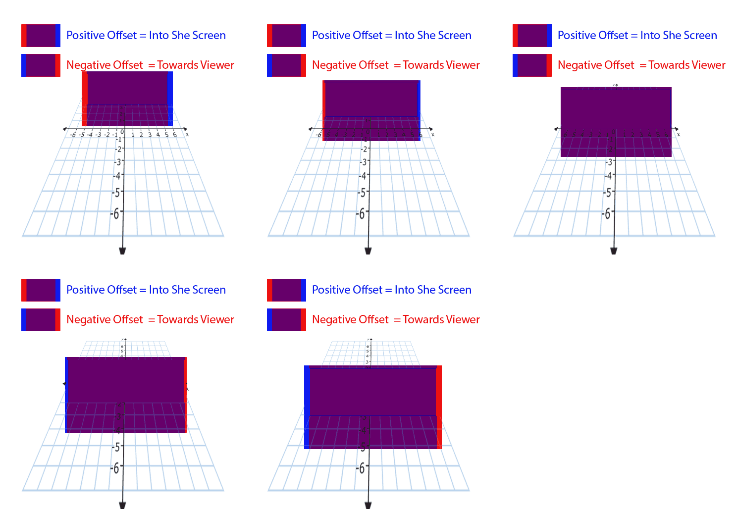
When the rectangles converge we are at screen plane.
Artificial 3D relies on tricking this natural reflex by displaying slightly different images to each eye, forcing them to converge in front of or behind the screen. Our ultimate goal in 3D convergence is always to make the experience comfortable and headache free for the audience.
Let's look at how we tackled some very different stereoscopic challenges across classic animation and live action.
Animation: The Retinal Conflict of Bugs and Popeye
We restored two landmark 3D cartoons from 1953: Lumber Jack-Rabbit and Popeye, the Ace of Space. Both of these restorations were overseen by Warner Bros. Post Production Creative Services, with color grading and 3D convergence completed at Water Tower Color.
Lumber Jack-Rabbit was shot on Eastman Panchromatic BW 5231 using a Technicolor Successive Exposure animation camera, which shoots all three colors (YCM) in succession on a single strip of film. The most significant challenge on this title stemmed from the original Burton 3D dual strip techniques. Unlike modern virtual camera offsets, the animators manually drew the left and right eyes with slightly different perspectives. This resulted in mismatched shapes between the eyes, causing intense retinal conflict and making objects appear at incorrect depths.
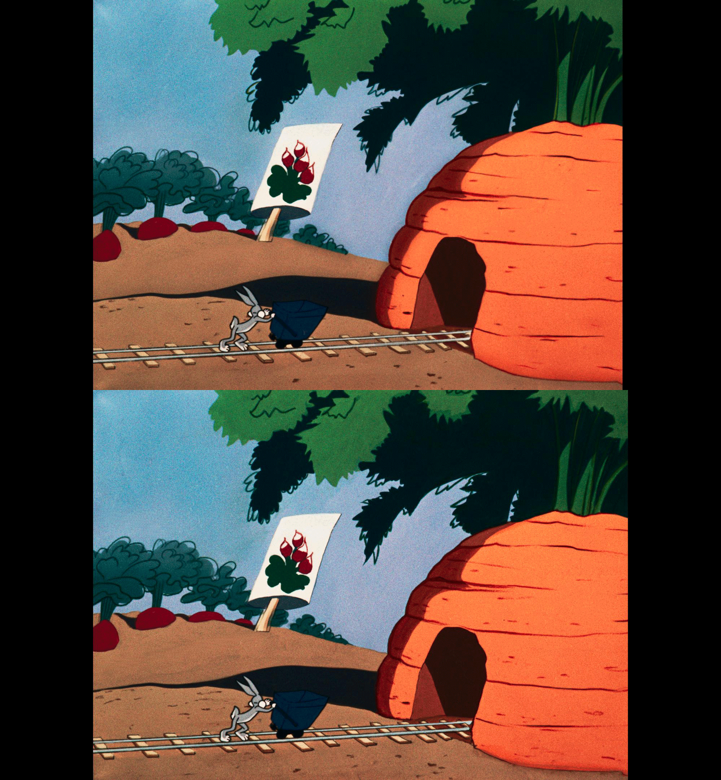
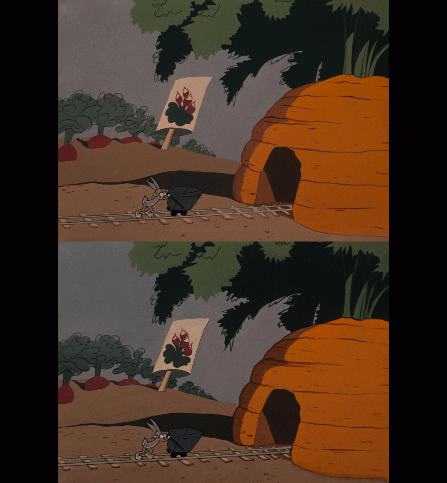
To fix this in Mistika, we threw the kitchen sink at it:
Initially, we applied standard optical flow warping to constrain disparity strictly to the X-axis.
When that failed and shapes remained on the same plane, we composited information from one eye over the other to ensure shapes matched with the correct offset.
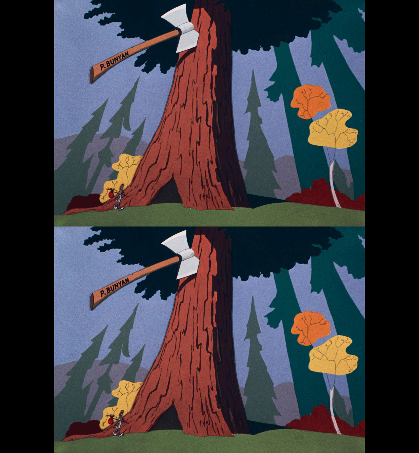
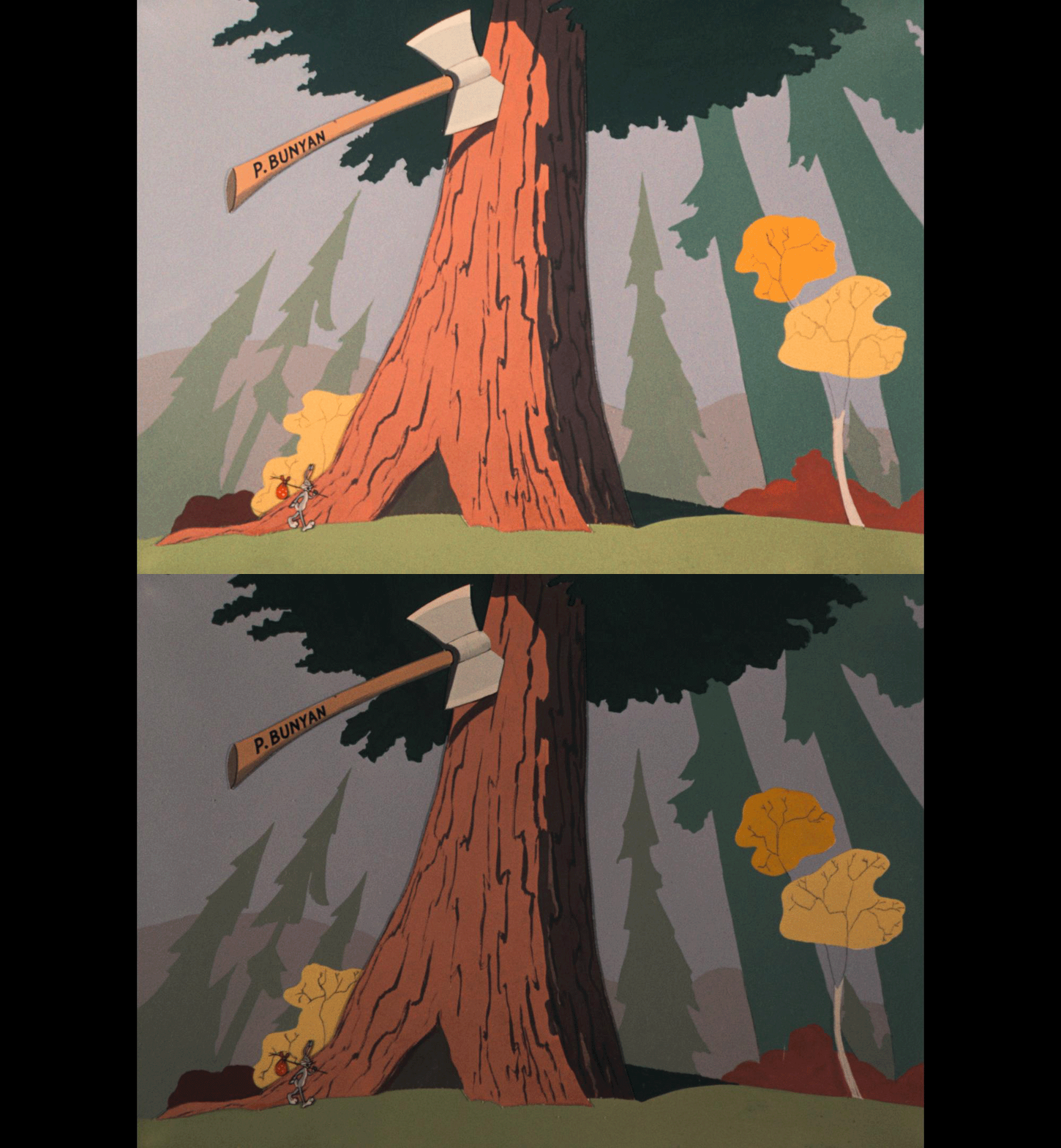
If those methods failed, we discarded the problematic eye and utilized a depth map to recreate the view, essentially doing a stereo conversion.
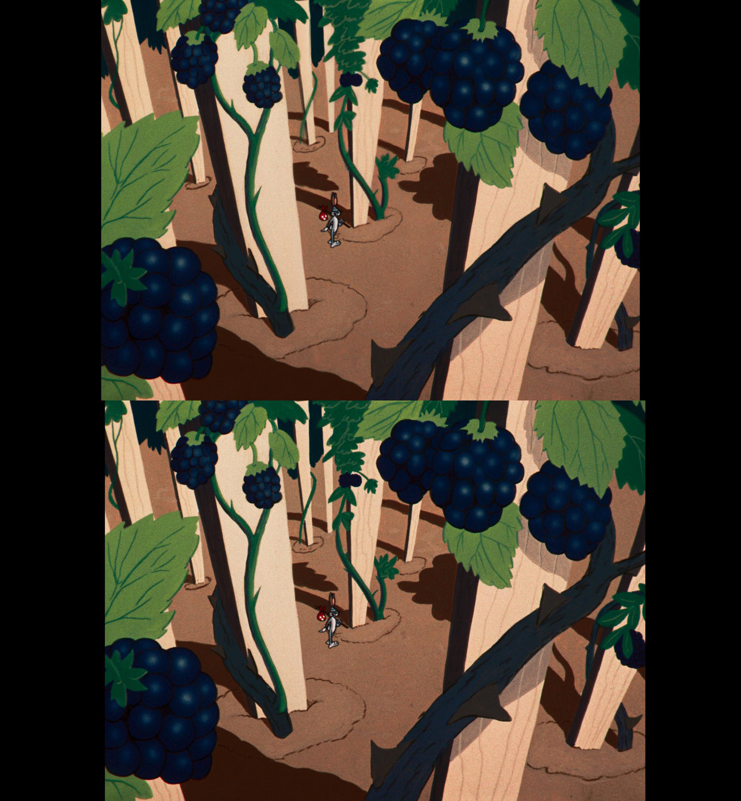
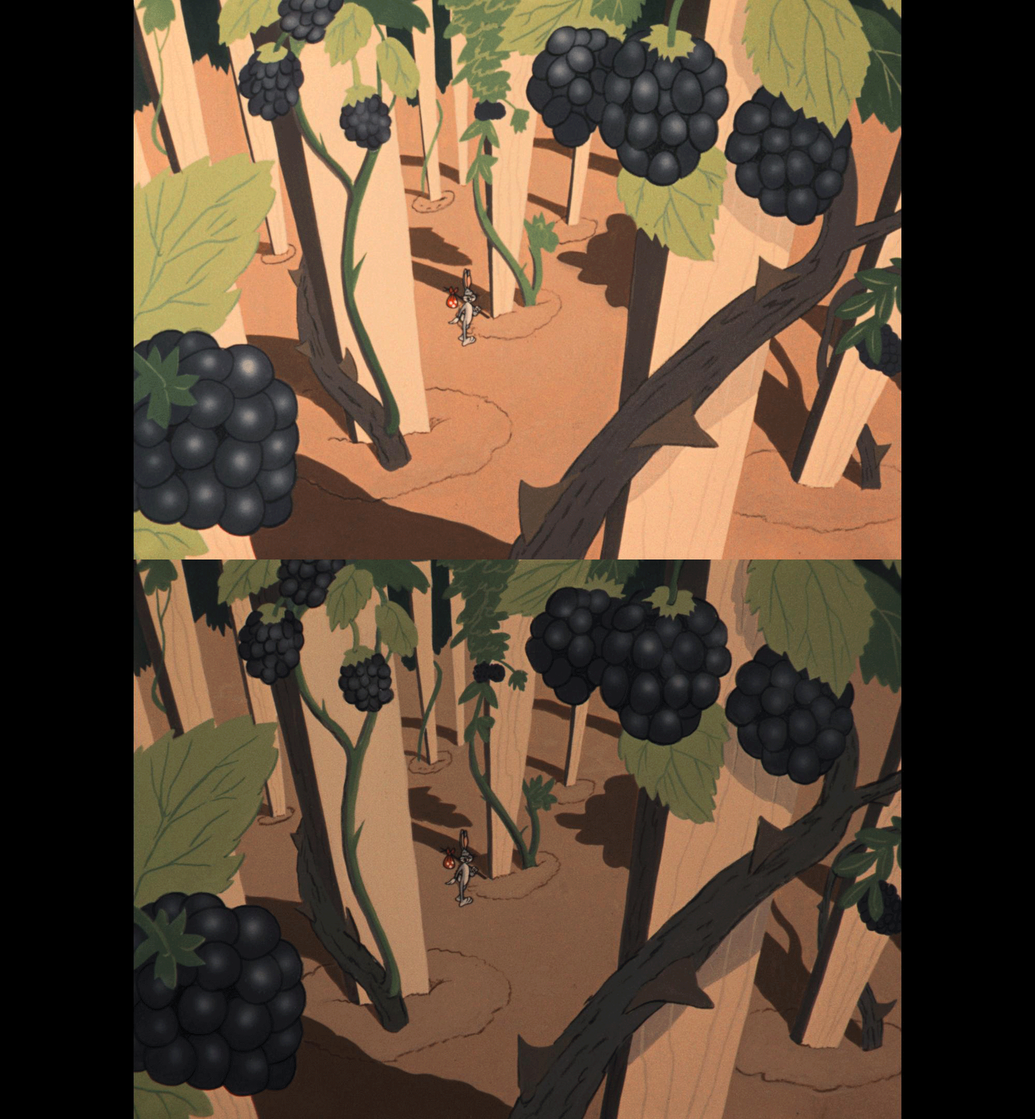
For one specific shot of the dog coming over the hill, none of these techniques were successful, so we relied on a 2.5D approach, dropping to 2D and offsetting the convergence for viewing comfort.
Popeye, the Ace of Space was a slightly smoother ride. Produced by Paramount's Famous Studios, it used the Stereotoon process. Instead of drawing two separate perspectives, they drew a single eye, duplicated the frame, and shifted it to achieve the look. Because the process isolates different visual elements to separate characters from the background, there were significantly fewer issues with retinal conflict.
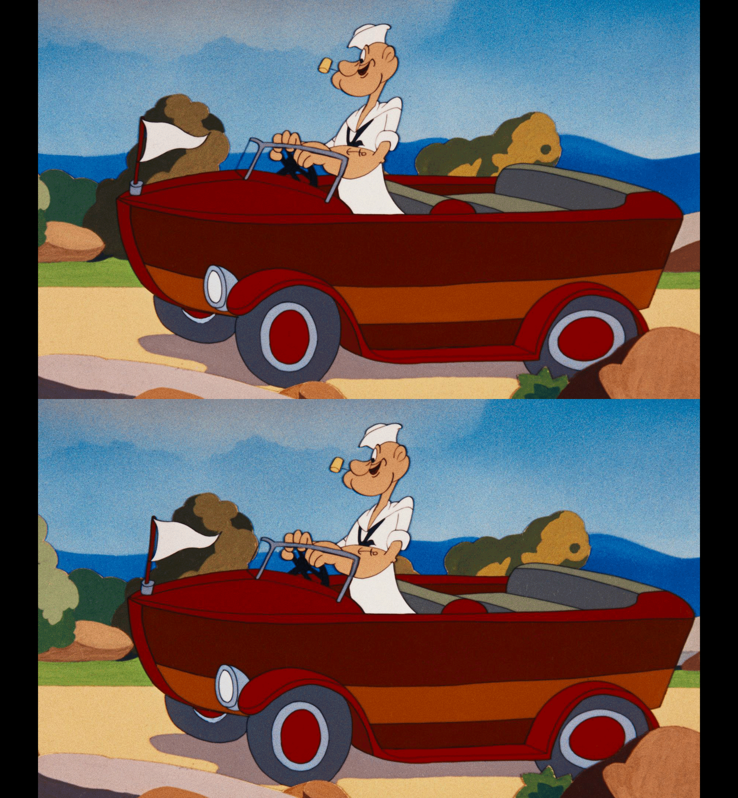
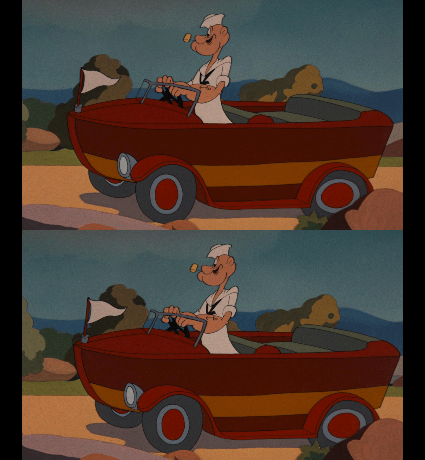
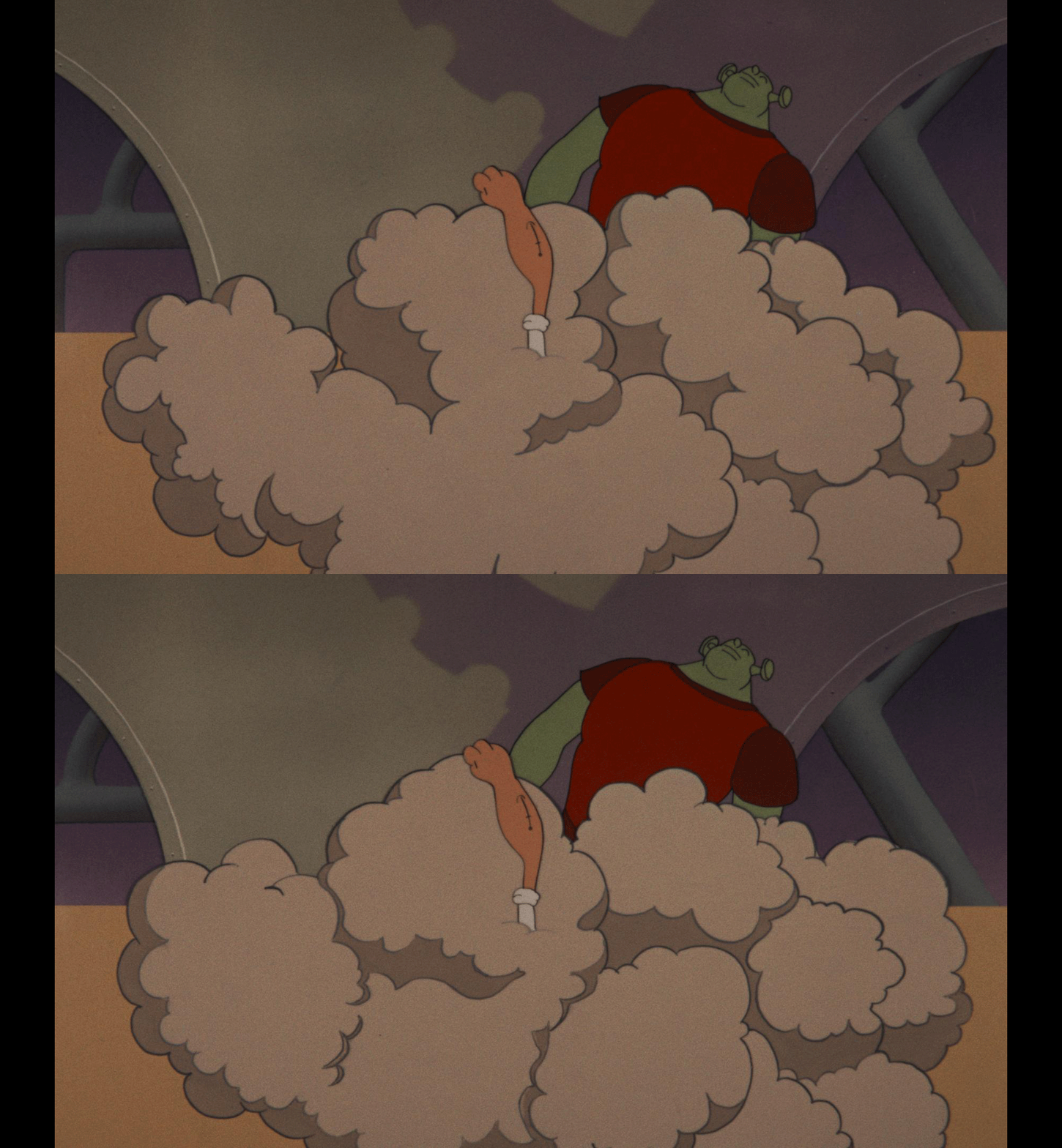
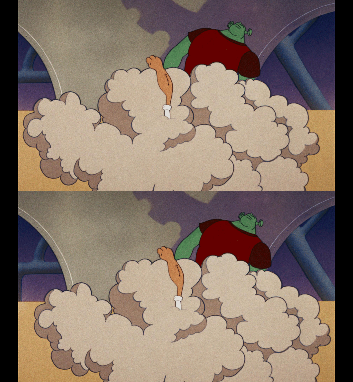
The primary challenges here were missing frames and ghosting. I used optical flow to interpolate the gaps. In a tricky shot where Popeye is fighting aliens in a dust cloud, the dust cycle was out of phase between the eyes. Because we couldn't simply slip the timing and lose sync, I painted the cloud to match the existing frames and used fades to transition in and out of the damaged sections. The 3D work was primarily done in Mistika, with a few final composites finished in Baselight.
Live Action: WarnerVision and the Deep Backgrounds
Moving over to live action, we dug into two 1954 features shot on WarnerColor negative 5248 using the dual strip WarnerVision camera system: Phantom of the Rue Morgue and The Bounty Hunter.
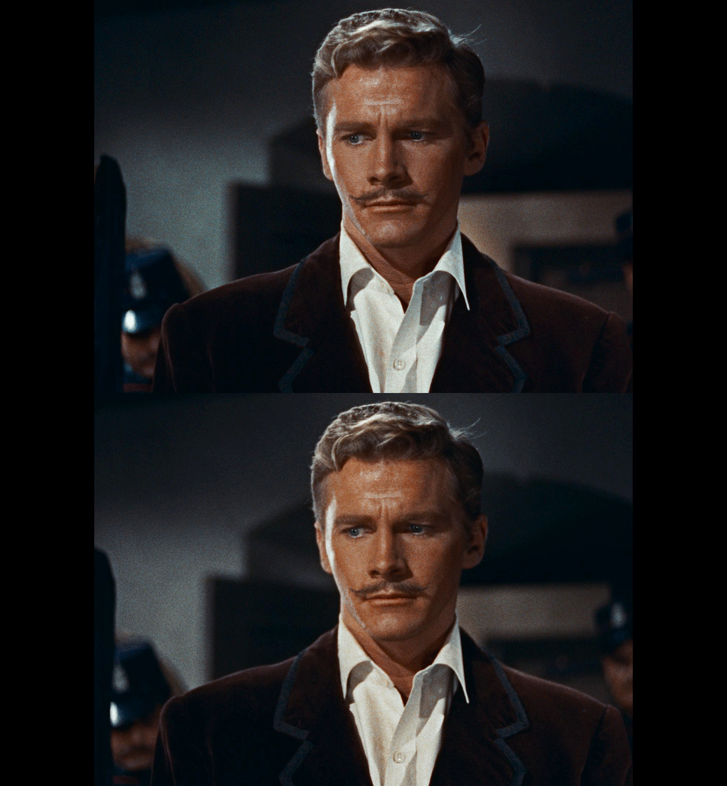
Working on Phantom of the Rue Morgue was genuinely amazing. The quality of the stereo blocking, camera positioning, and movement surpasses much of what we do today. The original negative itself was the reference for where to land the shots, and the moves I did afterward were purely to prevent eye strain.
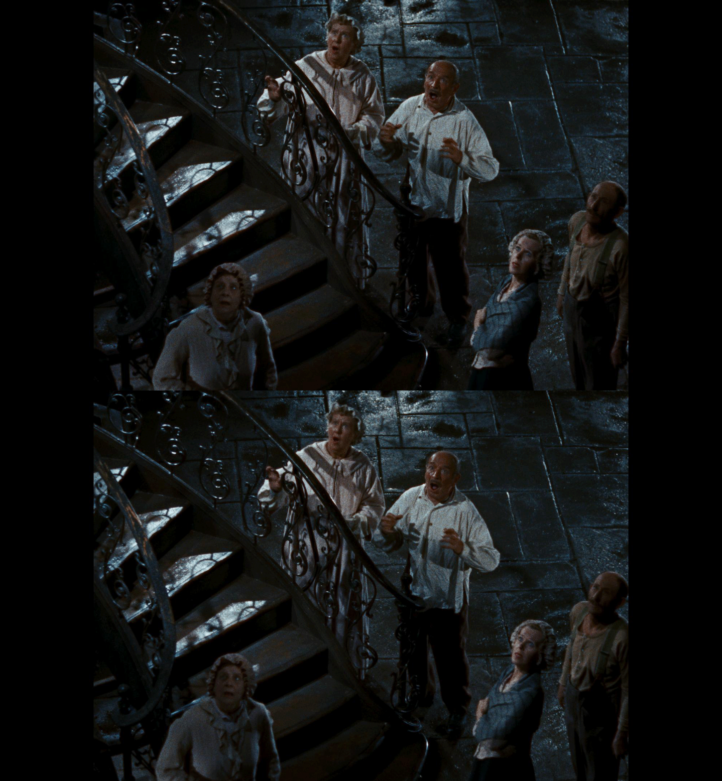
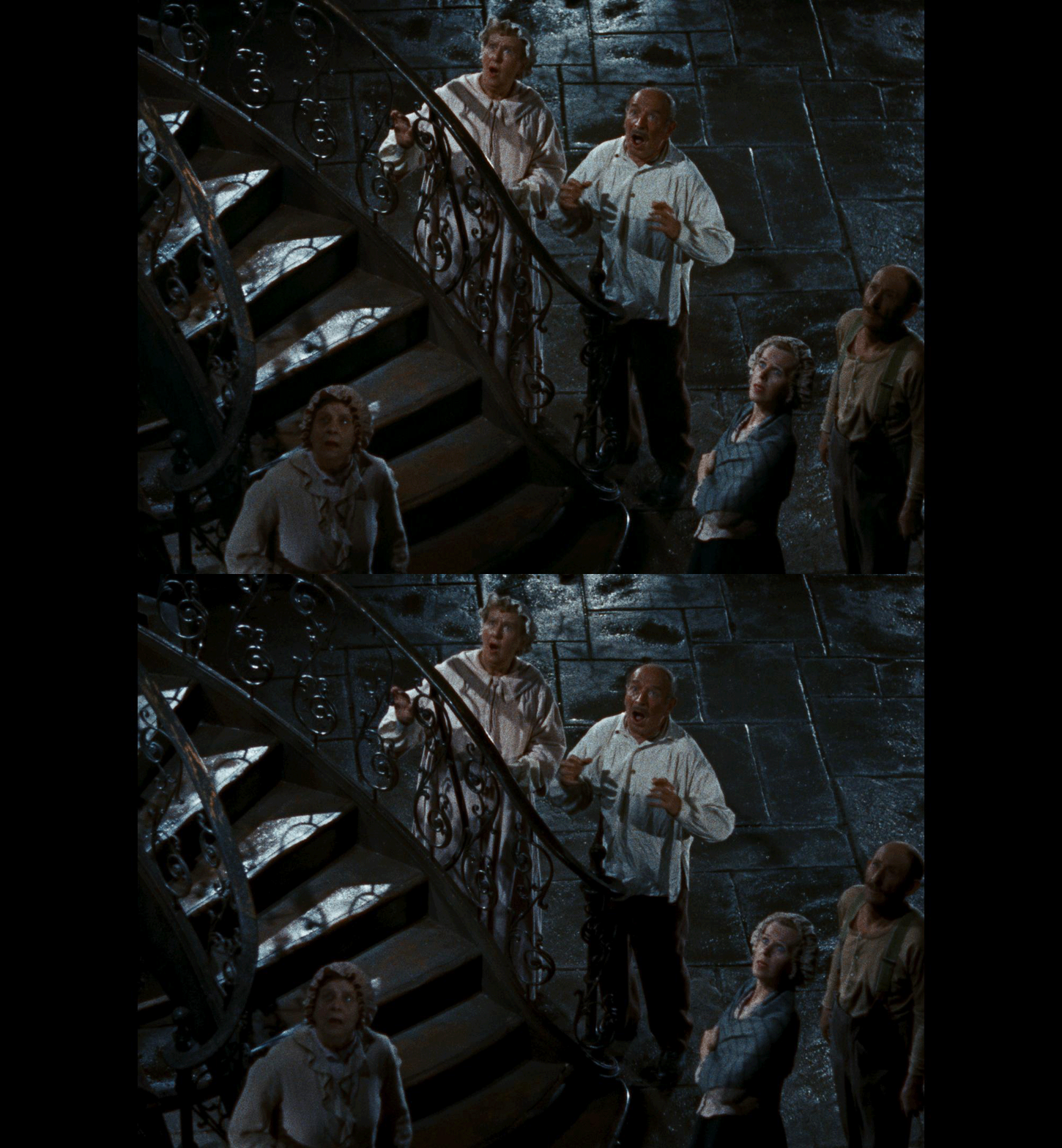
There were a few specific fixes required:
In a shot featuring a gorilla, there was a black slug in one eye. I successfully converted it to 3D using a depth map from a previous cutback of the same shot.
For an out of phase leg, I duplicated the first frame to bring the two eyes back into sync.
We left a wide shot of a city street alone, as the intentional wide interaxial separation was too great, and attempting to reduce it introduced too many optical flow artifacts.
We also had to manage a halo effect, which presented as ringing, an artifact from the optical printing process.
Aside from those specific instances, the 3D plays smoothly like butter. I'm very proud of the work done here.
Finally, we tackled The Bounty Hunter. This film was released in September 1954, but because the 3D fad had died out by the time it was finished, it only ever got a 2D release. This 2026 restoration marks its 3D World Premiere. The biggest issue for this title was the thin negative in some of the darker scenes, which resulted in the image not being visible in one eye. The fix was to use optical flow to grab the data from the "good" eye and push it to the crushed one. The blocking and staging were also a bit tricky; very deep shots with wide interaxial separation caused background occlusions. These disparities cause discomfort, and you get ghosting when a bright light is visible in one eye but not the other.
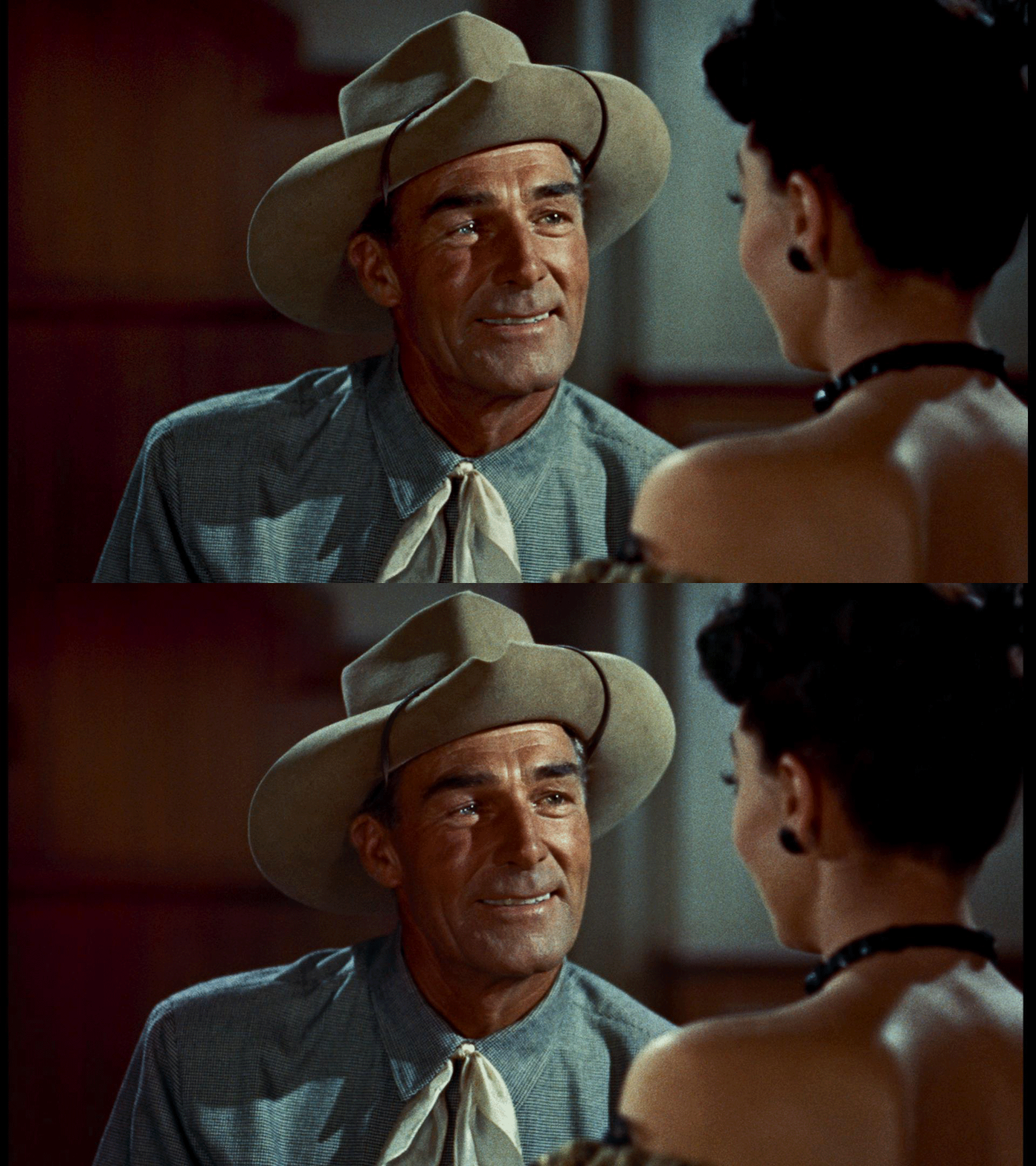
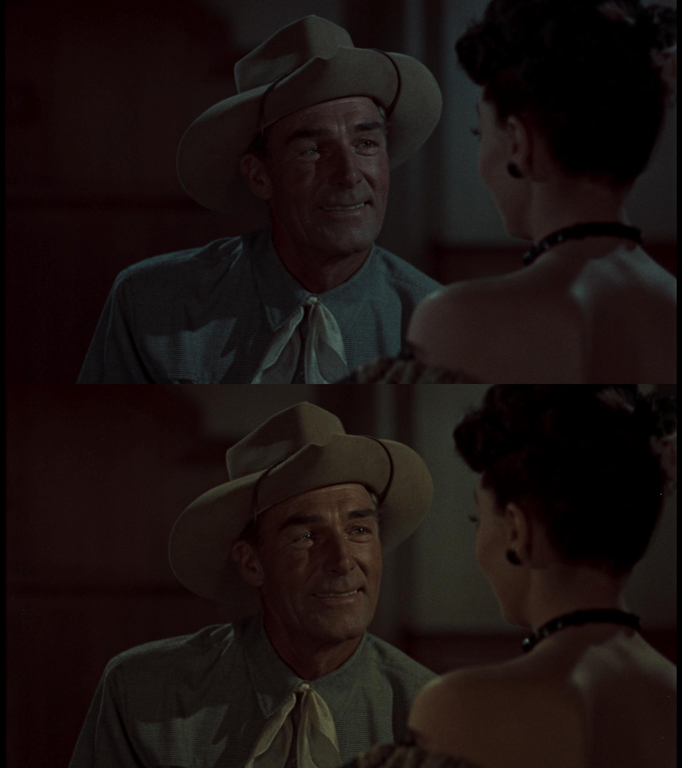
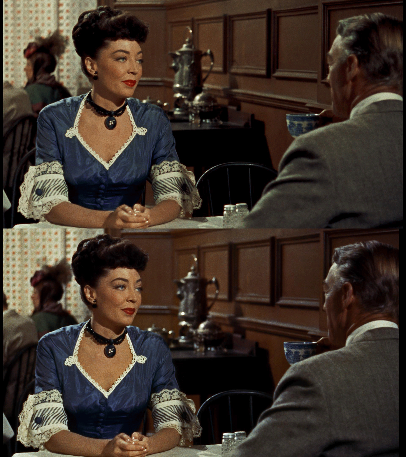
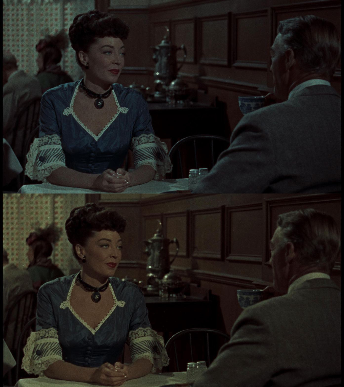
For all of these titles, every eye was scanned separately, graded first to get the eyes to match, and then rendered out to do 3D convergence.
It's an incredible feeling to leverage modern post tools to preserve the technical legacy of these artists.
A massive shout out is due to the incredible team that makes all of this possible. It truly takes a village... and a Water Tower! Huge thanks to Andrea Leigh Chlebak, Leo Ferrini, Laila Tehrani, and Patrick Brennan for their tireless dedication to the craft and for always keeping the quality bar so incredibly high. I also have to give a special nod to Paul Lavoie for flawlessly managing our operations and keeping the schedules running smoothly through every single complex project. To the rest of the Water Tower Color team, your hard work and expertise do not go unnoticed. We could not pull off these intricate 3D restorations without every single one of you.
Thanks for reading and happy grading.
JD
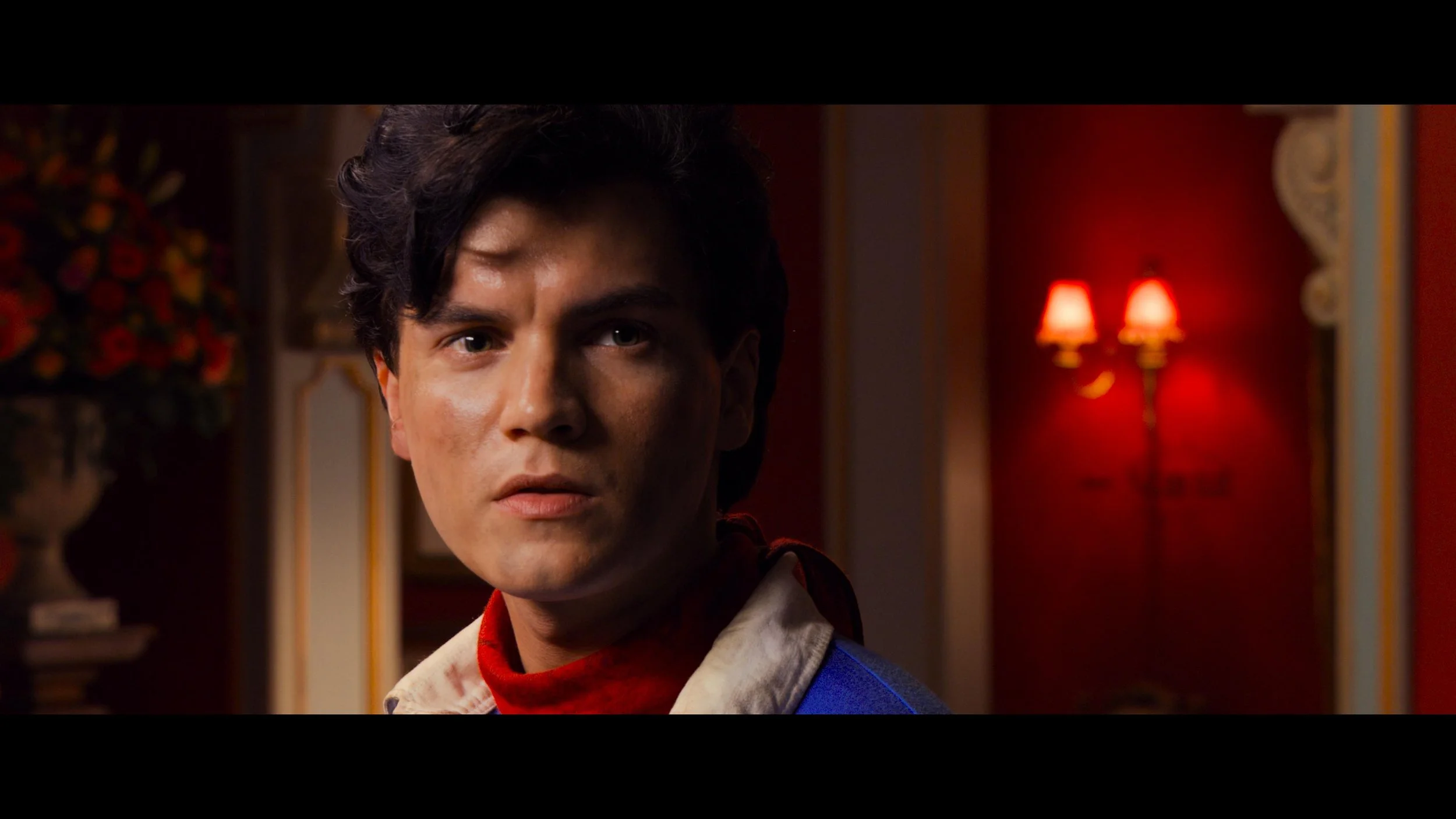
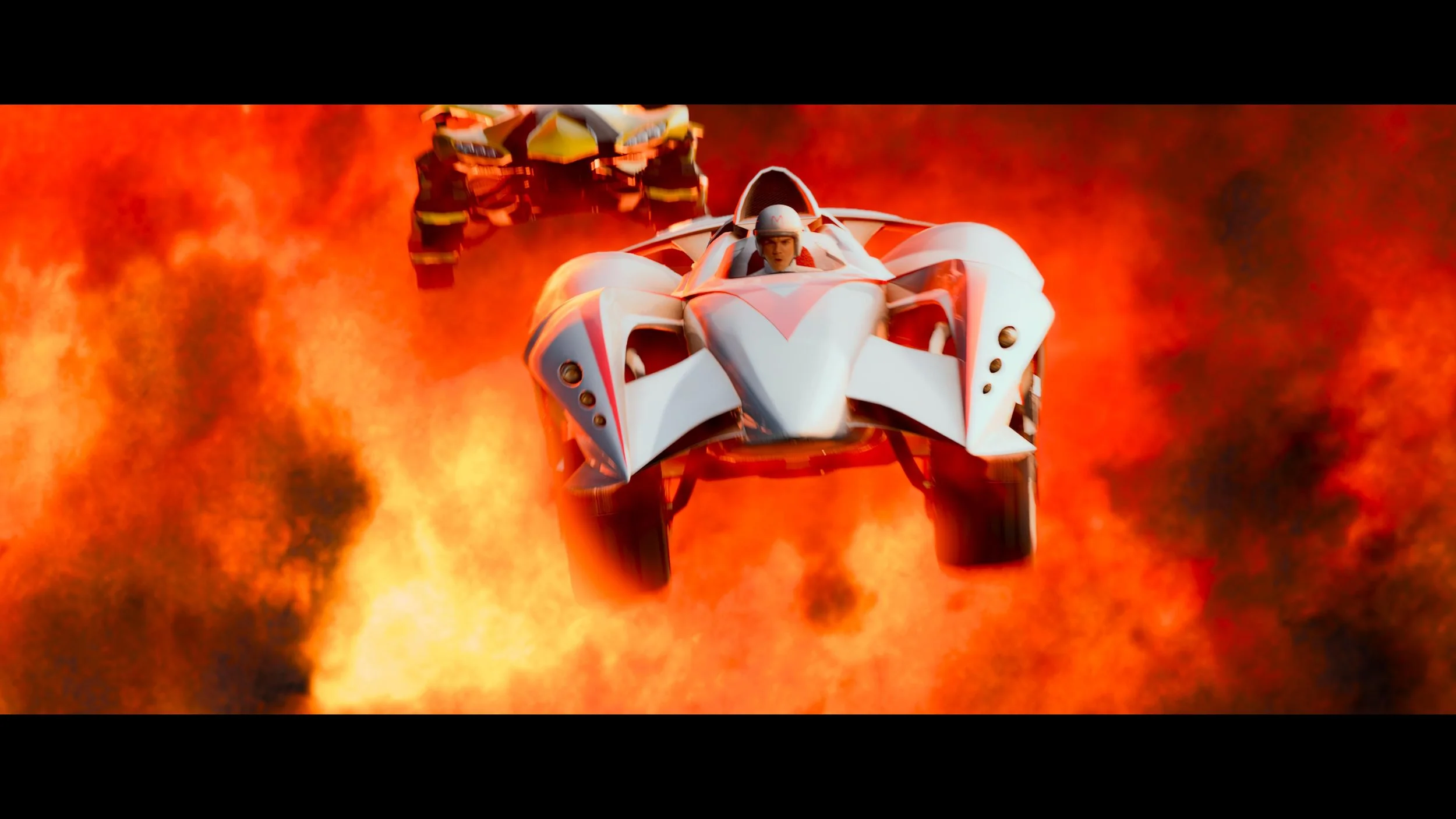
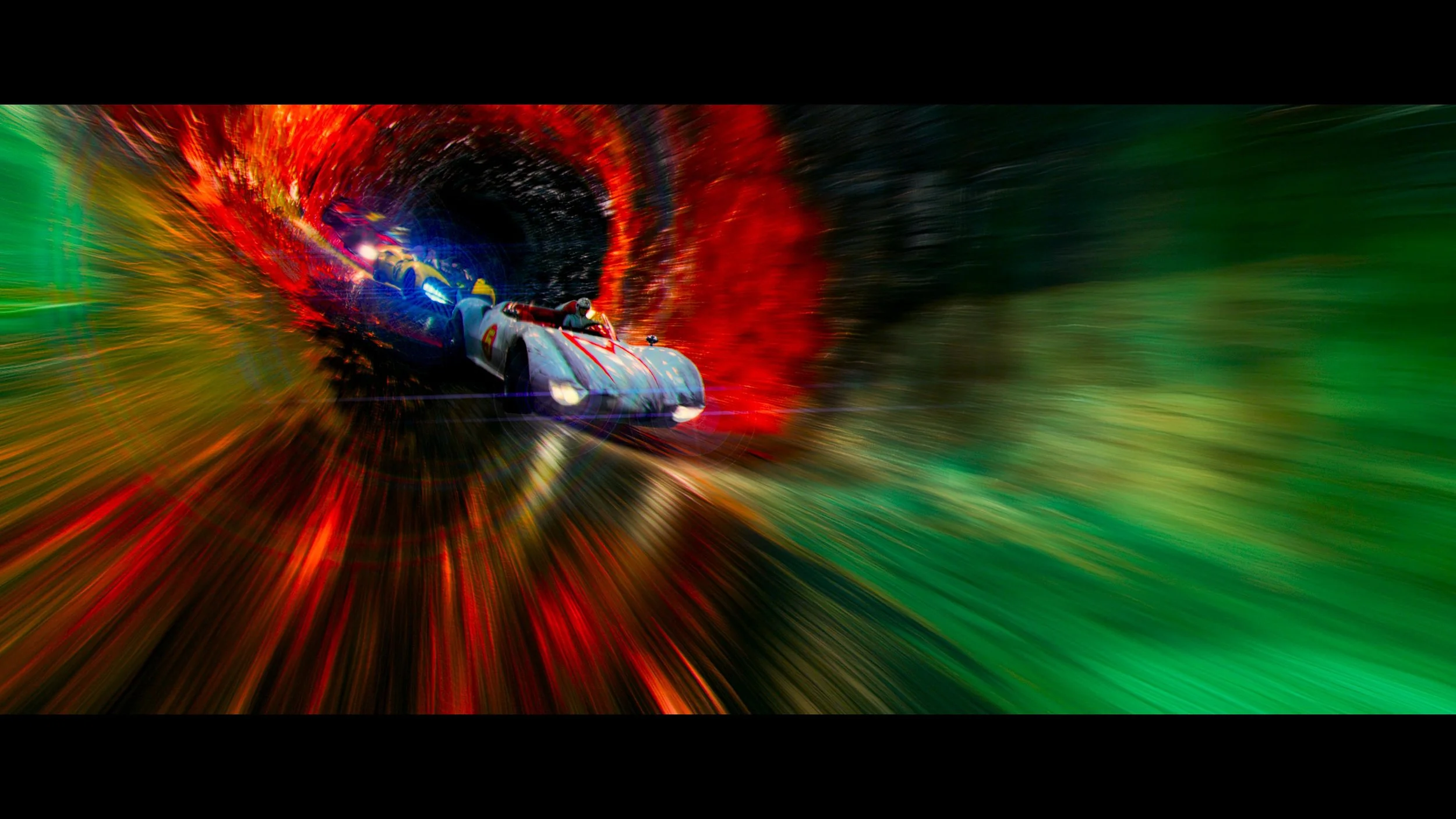
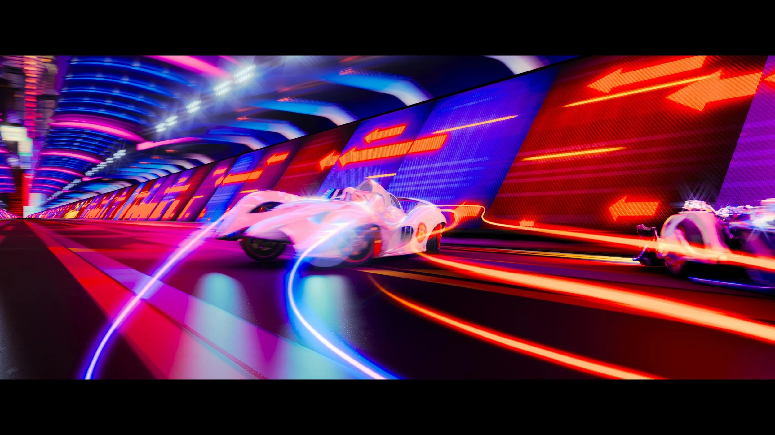
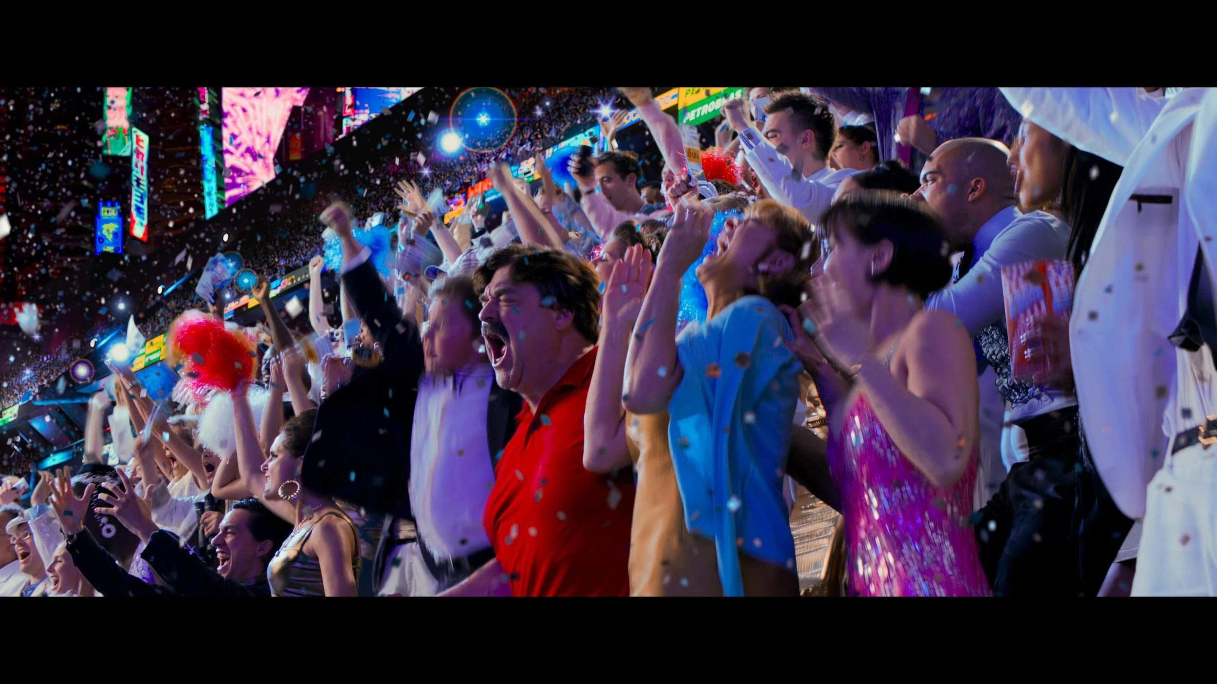
When the Wachowskis unleashed Speed Racer upon the world, it was a visual assault in the best possible way. A hyper-kinetic, candy-colored dreamscape that was years ahead of its time. Over here at the Water Tower, getting the chance to revisit and remaster this title for a modern home release was an absolute thrill. I regularly dive into the technical weeds of color grading, and this project pushed the boundaries of what we can do with archival files and modern display tech.
Our starting point for the remaster was the original 2K Academy aperture Filmout Camera files. Because the original source was 2K, the first major hurdle was getting the resolution up to a pristine UHD standard without introducing artificial artifacts or losing the original texture of the image.
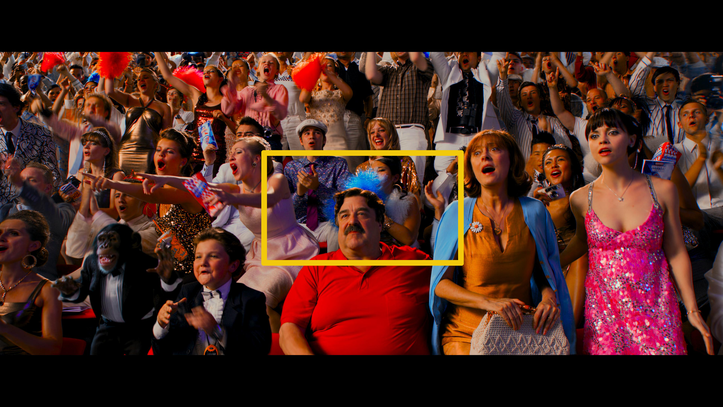
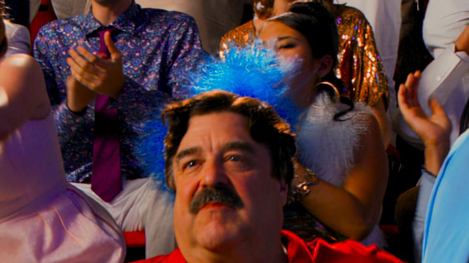
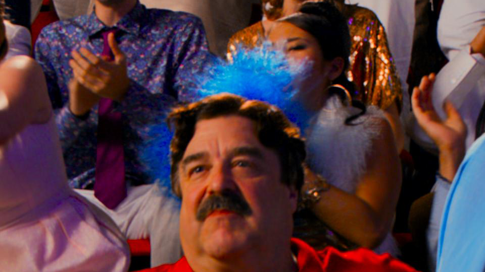
4x Zoom
To achieve this, we ran the files through our proprietary in-house up-rezzing tool called Samurai. Samurai is incredible for this specific use case because it intelligently targets and sharpens high-frequency detail to give you that crisp 4K bite, while leaving the rest of the picture unaltered and organic.
Once we had our UHD foundation, it was time to build the color pipeline. Using our custom in-house tool, JIB, I built a brand-new show LUT specifically tailored for this HDR pass.
We took the original filmout log source material and placed it into P3 color space. From there, I slightly lifted mid-grey. The original grade is famously dense, and this subtle lift gave the blacks a little more room to breathe, opening up the contrast ratio just enough to take advantage of HDR dynamics without washing out the shadows.
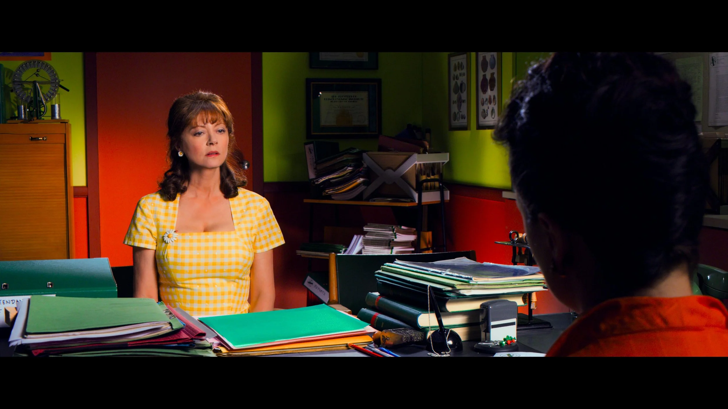

Here is where things get really exciting for the color nerds out there. In some rare, highly specific instances, we actually pushed the grade outside the P3 gamut and into extreme 2020 colors.
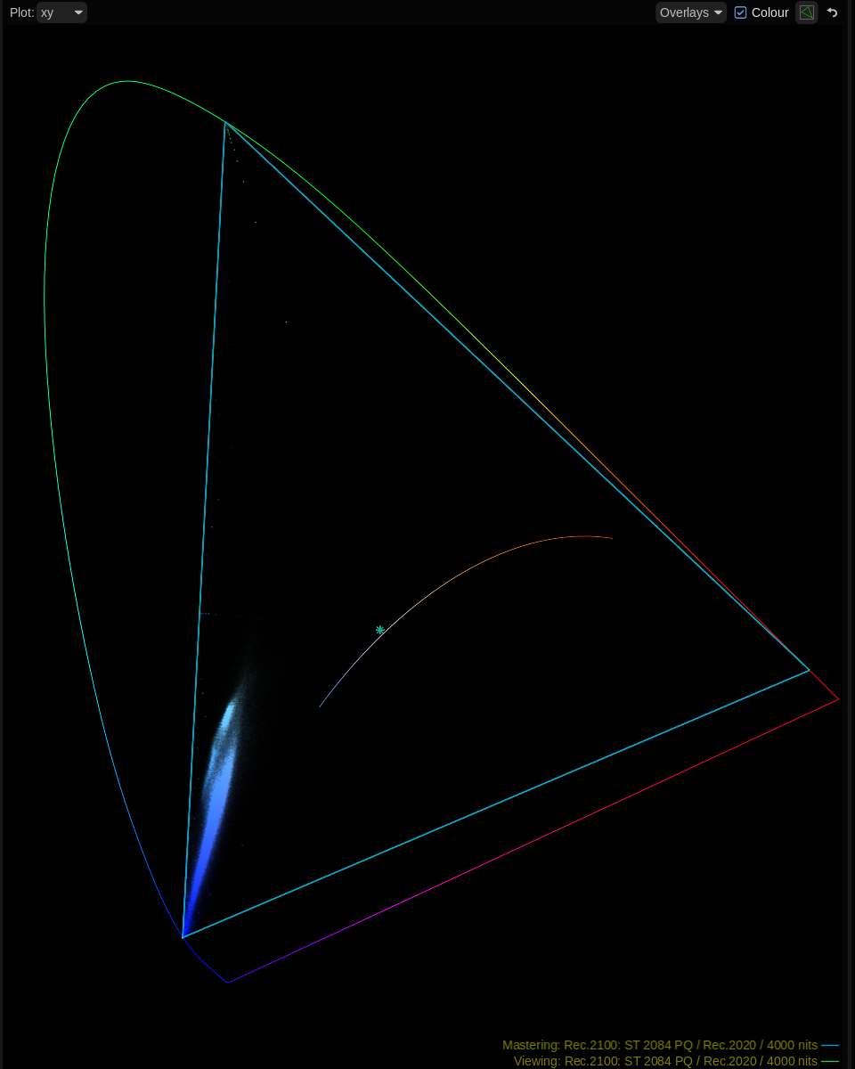
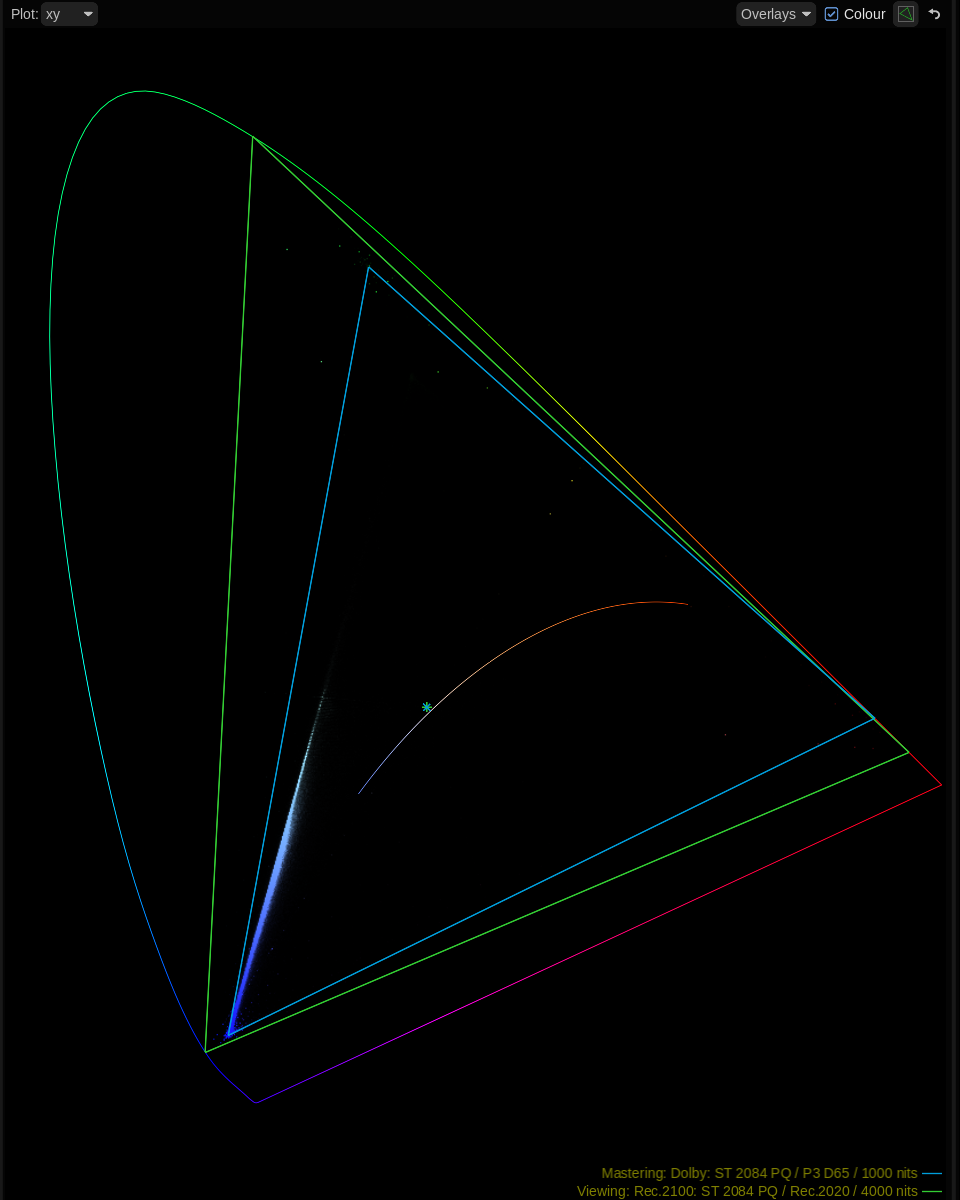
To my knowledge, this is a first for a Remastered Warner Bros. disc. I felt the timing was finally right; with modern display manufacturers like LG and Samsung producing consumer panels capable of rendering these extreme wide-gamut colors, it was time to let Speed Racer completely off the leash.
"When I watch you do some of the things you do, you just take my breath away.”
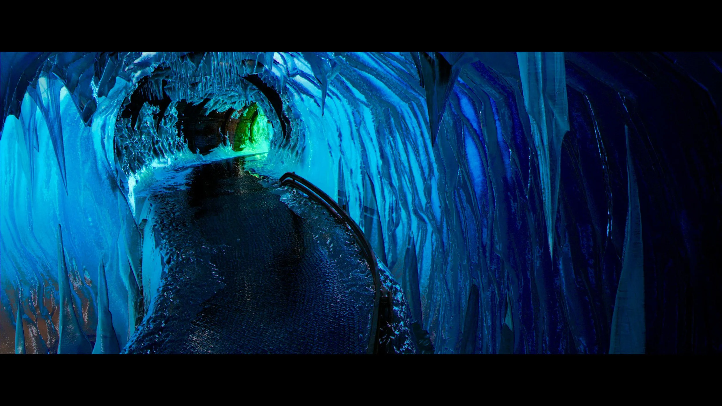
If you want to see what Rec. 2020 looks like in action, look out for the vibrant, toxic green of Snake Oiler’s car and gear, or the hyper-saturated, piercing cyan blue of the Ice Cave sequence. These colors simply could not be reproduced on older standard dynamic range displays, and seeing them light up a modern OLED panel is breathtaking.
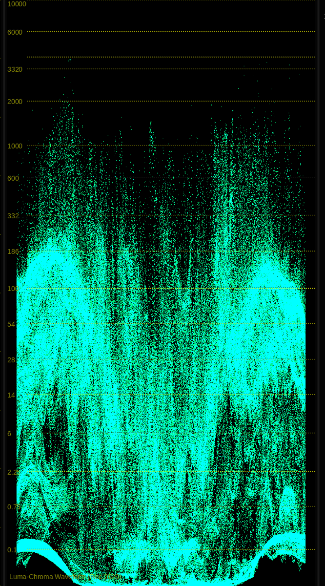
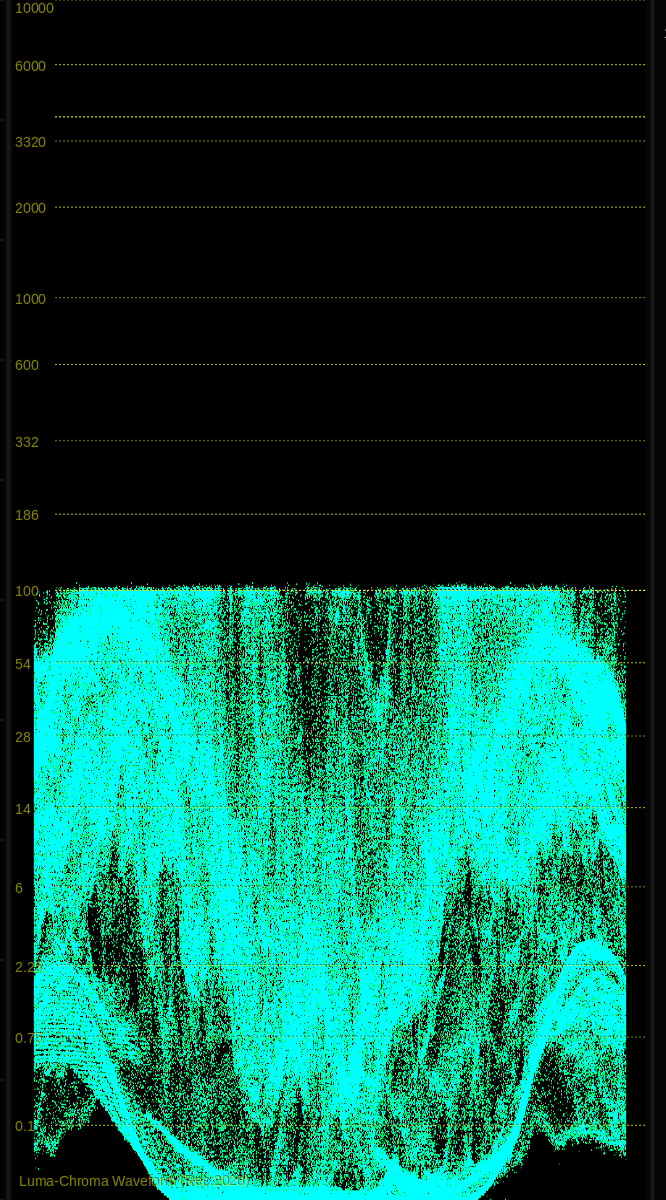
Speed Racer is a film built on extremes, and I wanted the luminance to match the saturation. There are select moments in this film where I applied the most aggressive HDR grade I have ever done.
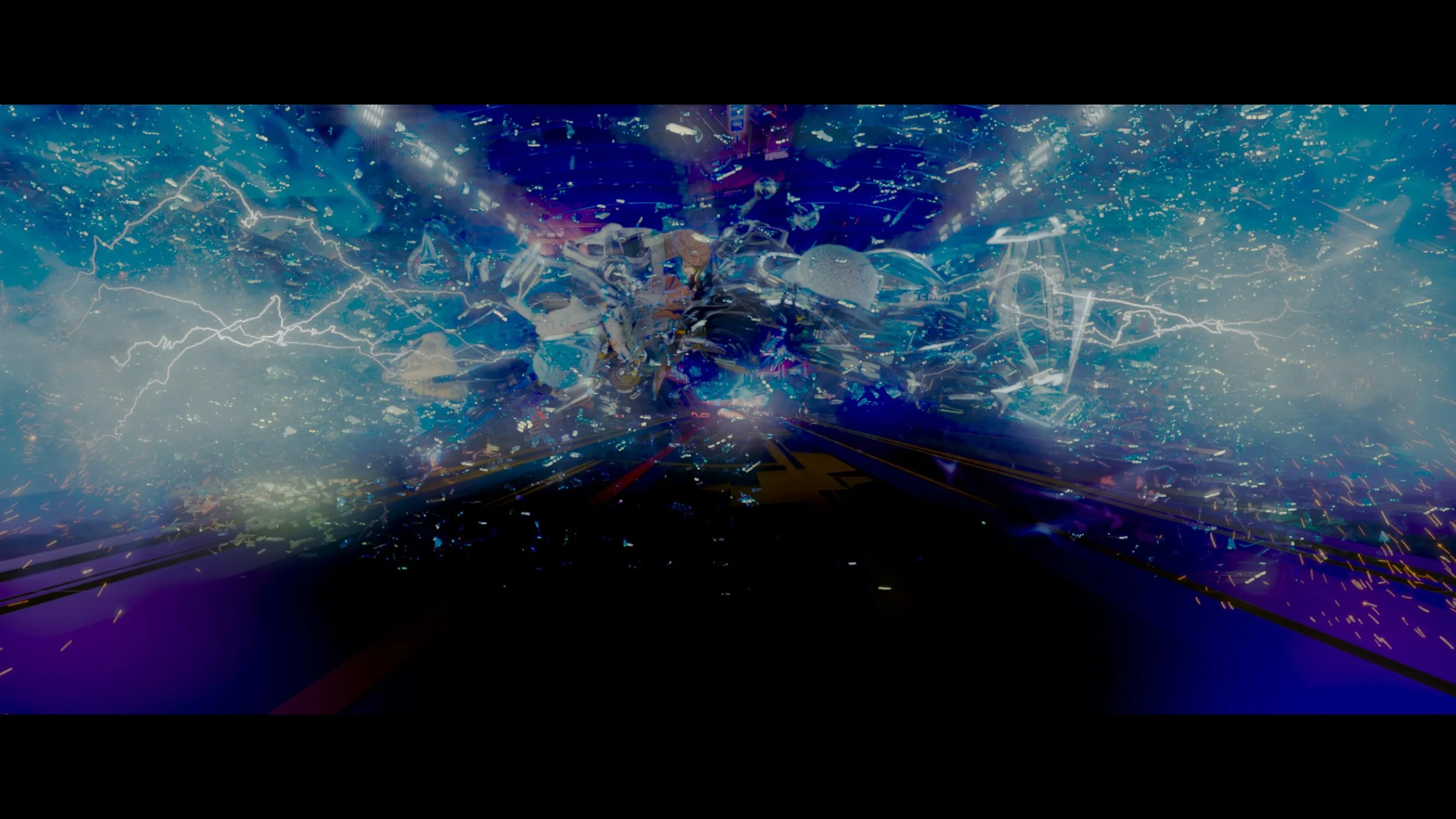
The standout example is the sequence featuring the intense, Tesla-coil-style lightning strikes. If there was ever an element in cinematic history motivated to kiss 4000 nits, it’s those electrical kicks from the Bernoulli Convergenator. The sheer blinding energy of the lightning popping off the screen at 4000 nits creates a visceral, immersive viewing experience. "Transponder schmonder. You want real kick, you go Bernoulli!"

If you missed the recent IMAX re-release, don't fret. You can bring the race home and experience the absolute limits of your television today in glorious, mind-melting 4000-nit Rec. 2020. Start calibrating those panels now.
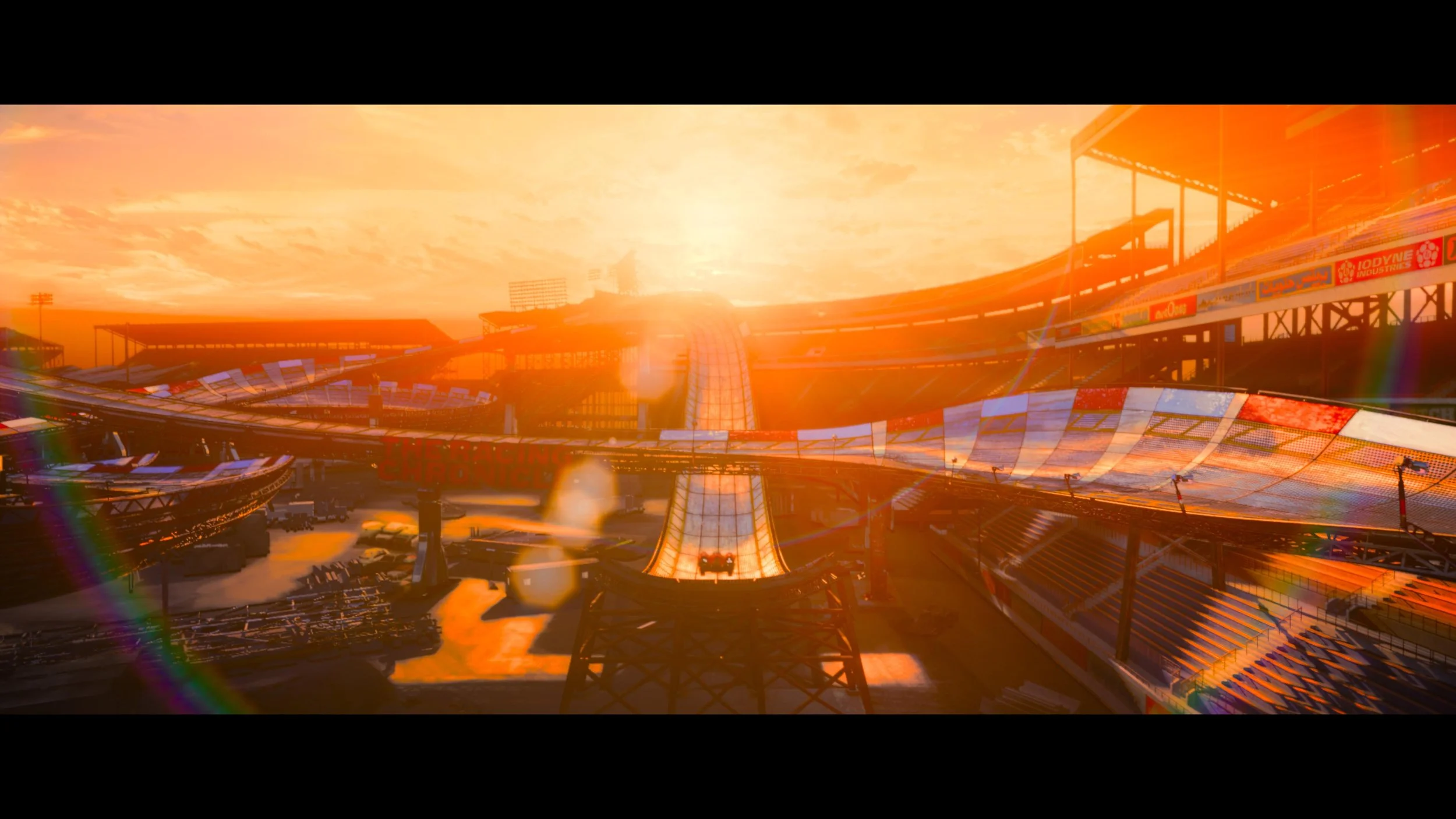

Thanks for reading and happy grading. Go Speed Go!
JD
If there’s one question that constantly comes up in the grading suite, it’s this: How spicy is too spicy?
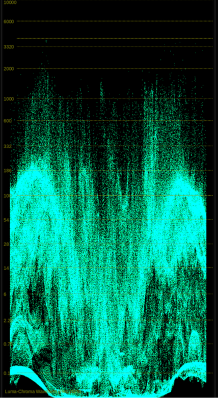
We are living in an era of rapidly evolving display technology, where managing HDR standards and pushing the limits of contrast are just part of the daily workflow. But as we navigate these massive dynamic ranges, maintaining a perceptually equal creative intent across every platform—from a premium theatrical projection to a smartphone screen—has never been more challenging.
I’m excited to be part of an upcoming event co-hosted by the Colorist Society Hollywood and SMPTE to dive deep into this exact topic. We’ll be exploring both the subjective and quantifiable nature of brightness across a wide range of viewing environments.
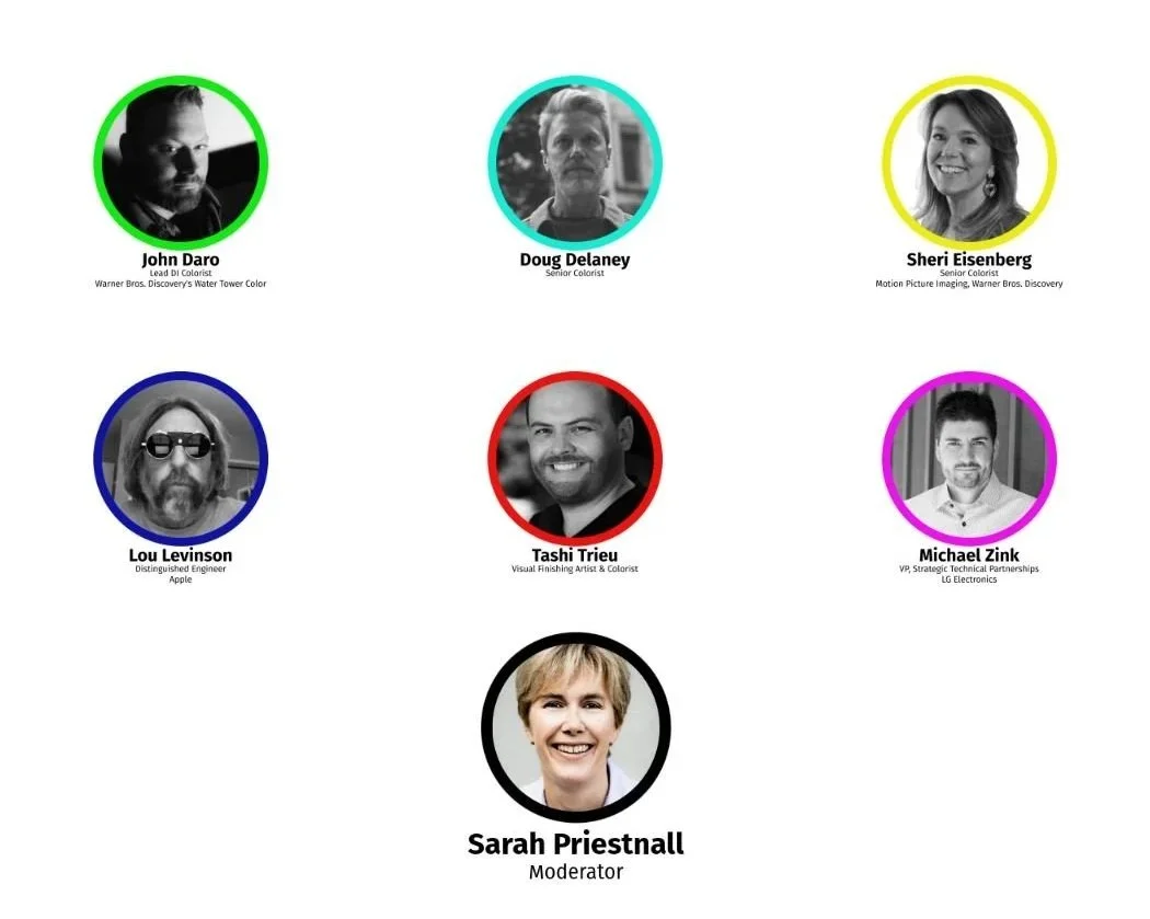
Whether you're finishing large-format theatrical features or mastering for the web, this is a conversation you won't want to miss. Come grab a drink, catch up with peers, and join the debate.
Event Details:
Date: Wednesday, May 27th, 2026
Time: 6:00 PM – 9:00 PM
6:00 PM - 7:00 PM: Reception and Check-in
7:00 PM - 9:00 PM: Presentations & Panel Discussion
Venue: The Culver Theater | 9500 Culver Boulevard, Culver City, CA 90232
Important Logistics for Attendees:
Mandatory Registration: Advance registration is required for everyone attending. Please ensure the name you use to register exactly matches a valid government-issued ID for security check-in.
Food & Drink: The Culver Theater lobby features a full no-host bar. You can grab a bite in the lobby or at any of the great spots in Downtown Culver City—and yes, food and beverages are allowed inside the theater.
Parking: Click here for parking instructions.
Looking forward to seeing you there and diving into the physics and philosophy of modern color grading!
I had a very cool project this spring that I wanted to share. Let’s talk about high fashion, high resolution, and the high-difficulty world of 360-degree video.
Recently, I had the pleasure of jumping into the trenches for Balenciaga’s Fashion Week presentation. The setup was as ambitious as the clothes: a massive 360-degree rig, fully loaded with RED cameras, all feeding into a Disguise system to power a mind-bending visual experience.
My official job title for this gig? Just the colorist.
But anyone who has ever touched a multi-camera array knows that "just the colorist" is a trap. If you grade each camera feed in a vacuum, you are going to hand back a beautiful, completely disjointed mess. To ensure the color handed off seamlessly from one camera's field of view to the next, I had to step slightly out of my lane and build a temp stitch.
Here is a deep dive into how I tackled it, along with a few tips for anyone staring down the barrel of a multi-cam 360 project.
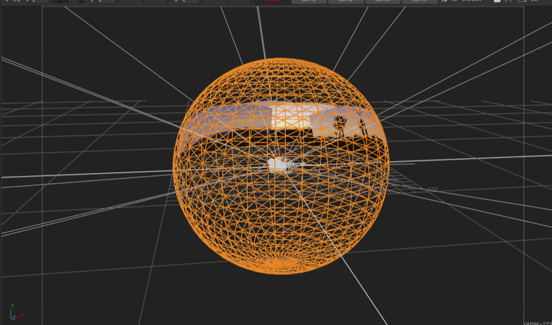
When you have a ring of RED sensors pointing in every direction, they are never going to see the world the exact same way. One camera is staring straight into a harsh sun; the next is catching the shadowy falloff. Even with perfectly matched settings, lenses have different characteristics, and sensors have micro variances.
When those images are graded, stitched together and pumped through a Disguise media server onto massive screens, any discrepancy in contrast or color balance at the seams creates a harsh, visible line. It shatters the illusion.
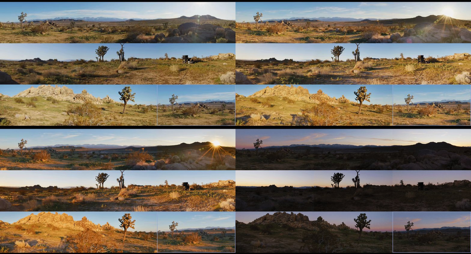
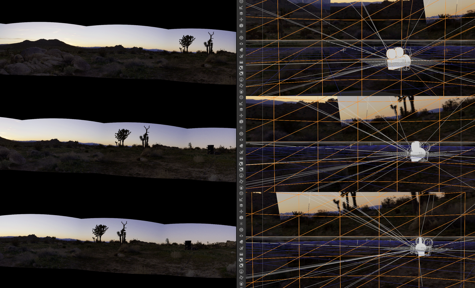
To fix the seams, you have to see the seams. I couldn't wait for the final VFX stitch to come back before doing my grades, so I built a quick-and-dirty temp stitch right in the color bay using Baselight’s 3x3 view mode.
Here are my top tips for managing the madness and making sure your handoffs are buttery smooth:
Before you even look at a seam, your color management pipeline needs to be bulletproof. Working in a scene-referred space (like ACES) is an absolute lifesaver here. By transforming all those RED raw files into a massive, unified working space, you ensure the math behind your exposure and contrast adjustments behaves predictably across the entire array. The next step is to build camera specific LUT’s that correct any sensor and lens discrepancies.
This is the silent killer of 360 stitching: lens vignetting. The center of a lens is always brighter than the edges. When you place two edges side-by-side in a stitch, you get a dark band down the middle of your overlap.
The Fix: Before you do any creative grading, you have to build a spatial correction to flatten the luminance across the sensor. Lift those edges so the base exposure is uniform corner-to-corner.
It’s tempting to group all the cameras together, slap a primary grade on, and call it a day. Do apply your base look at the group level, but the real work happens on the individual clip trims. The stack consisted of a grouped operator followed by and individual trim layer. I also added a key framed dynamic layer to control shadow detail as the sun set. You have to ride the offset and pivot on the adjacent cameras to feather the differences in lighting environments.
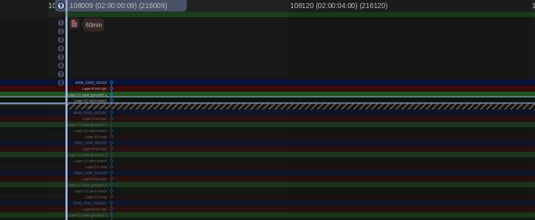
My temp stitch wasn't about perfect geometry; it was about perfect color geometry. I set up a workspace where I could view the overlapping edge of Camera A directly against the overlapping edge of Camera B in a split-screen. I just worked my way around the circle: A to B, B to C, C to D... all the way back to A. If A matches B, and B matches C, but the final camera doesn't match A, you have to go back and figure out where your exposure, contrast or color drifted.
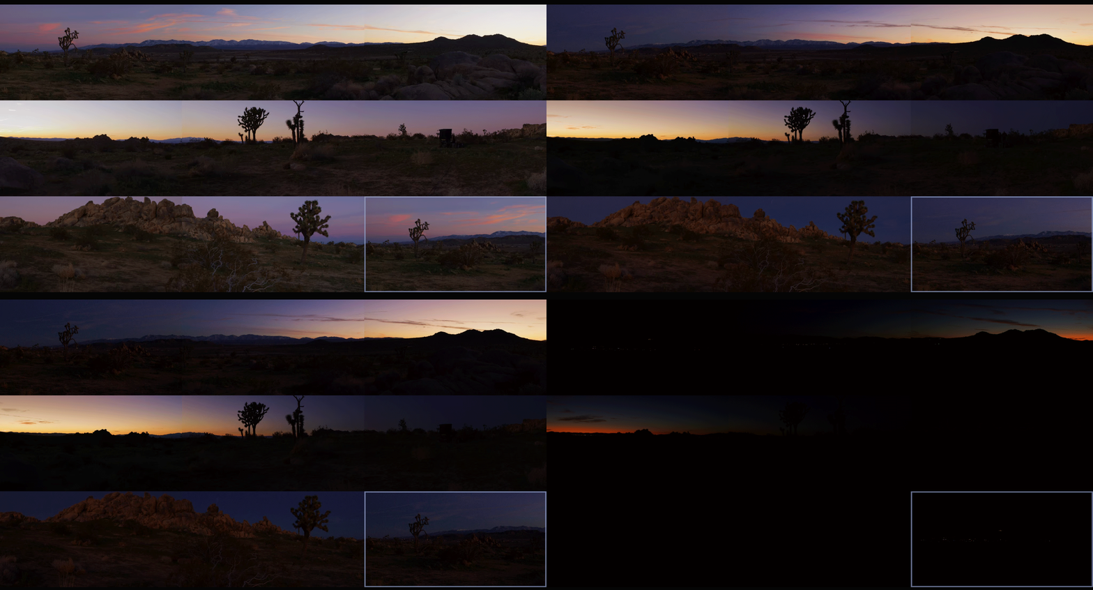
The Disguise system is incredibly powerful for mapping content to complex surfaces, but it demands technical precision. By doing the temp stitch and mocking up the final layout, I could render out test patches that matched the exact specs the Disguise operators needed.
Once the temp stitch did its job and the final grades were locked, it was time for the heavy lifting. The sheer volume of pixels in a 360 array is staggering, and for this project, we were delivering eight final outputs, each demanding pristine 4K resolution.
To get there, the pipeline was a two-step process. First, the grade was rendered out of the color bay as 10-bit DPX sequences. I love DPX for this stage because it is bulletproof—giving you uncompressed, perfect frames. Plus, if a render machine hiccups on frame 40,000, you don't lose a massive video file, you just re-render that single frame and move on.
However, if you try to make a media server play back eight simultaneous streams of 4K uncompressed DPX frames, it will simply say “computer says no.” To solve this, we took those massive image sequences straight into Adobe Media Encoder to crunch them down into the Notch LC codec. Today it’s built into Baselight, Mistika, etc, but at the time Adobe is what we needed to use. Notch is a 10-bit, GPU-accelerated video codec built specifically for media servers. It retains the immense visual fidelity and color depth of our DPX masters but plays back like absolute butter.
Working with 360 rigs is a unique puzzle. It forces you to think spatially about your color pipeline. Building that temp stitch added a little extra time upfront, but it saved us from a mountain of headaches (and notes) on the backend. The REDs delivered gorgeous data, the fashion was couture and wonderful, and the seams? Completely invisible.
Thanks for reading and happy grading!
JD
If you are in Tokyo 6/23, come say hi!
I recently received a great question and it made me realize that something very fundamental in color is shrouded in mystery to many, so I figured I’d open up the conversation here. As we’ve transitioned into HDR-native pipelines, the requirements for bit depth and color precision have increased significantly. The "good enough" standards of the SDR era simply break down when you start pushing dynamic range.
For any professional HDR deliverable, 12-bit is the absolute minimum. In a high-latitude HDR container (like PQ/ST.2084), 10-bit often lacks the code-value density to prevent "banding" or contouring in fine gradients, particularly at the edges of a color space.
Think of it like the difference between a high-end recording versus a generic MP3. The 44k or 48k sample rate describes the amount of time slices that approximate a sound wave. Bit depth does the same thing for pictures, but for amplitude or brightness. It's essentially how many specific "steps" you have to define a gradient from absolute black to absolute white.
Here is the math on the available steps per channel:
8-bit: 2^8 = 256 steps (Standard Web/SDR)
10-bit: 2^10 = 1,024 steps (Broadcast HDR)
12-bit: 2^12 = 4,096 steps (Cinema/Dolby Vision)
16-bit: 2^16 = 65,536 steps (High-end Finishing/VFX)
We currently utilize a 16-bit ACES (Academy Color Encoding System) pipeline for modern finishing. The reason for this is twofold, and it comes down to the difference between Integer and Floating Point math.
1. Precision vs. Quantization
While 12-bit Integer is often the delivery spec, we work in 16-bit Float to maintain mathematical precision during the color grade. Every transform we apply—LMTs, look dev, or secondary corrections—benefits from that extra headroom. If you work in 10-bit or 12-bit, you risk "rounding errors" where values get snapped to the nearest integer, creating artifacts.
It’s also worth noting that GPUs favor standard data alignments (8, 16, 32-bit). A 12-bit word often gets padded to a 16-bit word in VRAM anyway, so attempting to "save space" with 12-bit processing is often a fallacy; it is just as heavy on the machine but with less precision.
2. Linear Light Workflow
High-end animation and VFX are rendered in "Linear Light." In a 16-bit Half-Float (OpenEXR) format, we can represent values far above "white" 1.0. This allows us to store specular highlights (the sun, reflections, explosions) that might be 5.0, 10.0, or even 100.0 times brighter than "white."
If we used an Integer format (like 10-bit or 12-bit), those values would be clipped at the ceiling (1.0). By using 16-bit Float, we have a future-proof master that can be re-mapped to any current or future display standard (SDR, HDR10, Dolby Vision, or even LED walls) without clipped highlights.
Essentially, 10-bit and 12-bit are "bucket" formats usually reserved for the final "container" (the file you watch). 16-bit is the professional standard for the "canvas" we work on to ensure no data is lost during the finishing process.
I always say, "No pixels were harmed in the making of this major motion picture." ;)
Cheers and happy grading,
JD

Of all the projects I’ve been a part of, The Wizard of Oz at Sphere is in a category of its own. It’s one thing to grade a film; it’s another to grade an experience that wraps around a 16,000-seat audience on a 16K, 180-degree screen.
This project was a massive undertaking by the entire Water Tower Color team, in collaboration with Sphere Studios, Warner Bros., and Google. But our primary mission wasn't to reinvent the wheel—or in this case, the Yellow Brick Road.
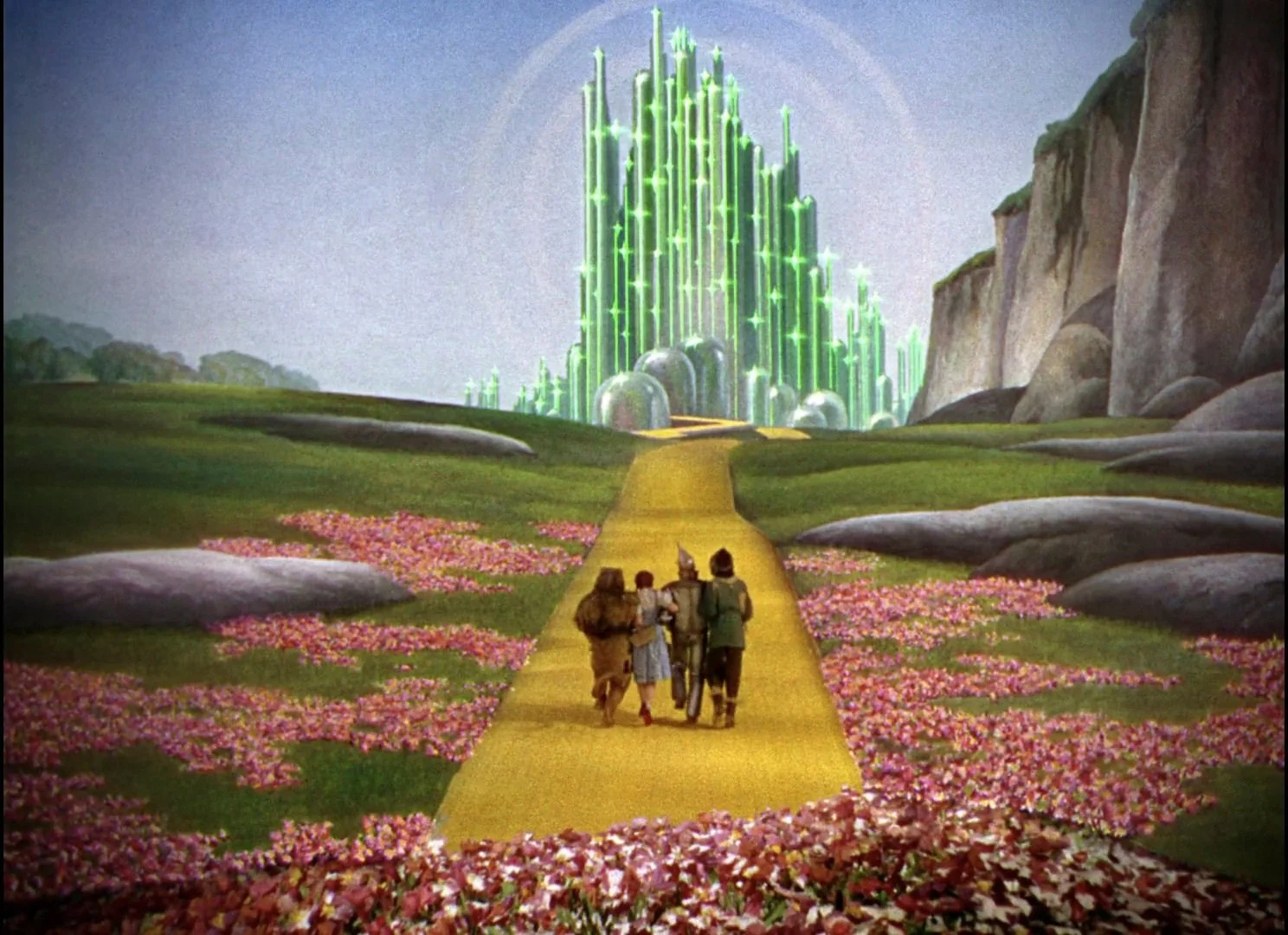
The Mission: Protect the Master
Our main task was to stay 100% true to the definitive 4K remaster completed a few years ago. That master was a beautiful P3 D65, PQ 4000-nit grade. Our challenge was a technical translation: how do you take that reference-quality image and faithfully port it to the Sphere's unique display—a new color space (MSG Primaries) with a 2.6 gamma and a 500-nit peak?
It required building a custom transform, rigorously testing, and ensuring that the artistic integrity of that 4K master was preserved, just on a scale no one had ever worked with before.
The "How": Grading a Sphere
So, how do you color-grade a sphere? The short answer: you flatten it.
You could just put a spherical image in a timeline and start working, but instead we worked closely with FilmLight, who built custom tools specifically for this project. These new tools allowed us to work with the massive lat-long (equirectangular) images "flat" in the Baselight, removing the spherical distortion so we could see the picture clearly. This was a critical innovation, building on the smart panorama tools already in the software, and it made the entire process possible.

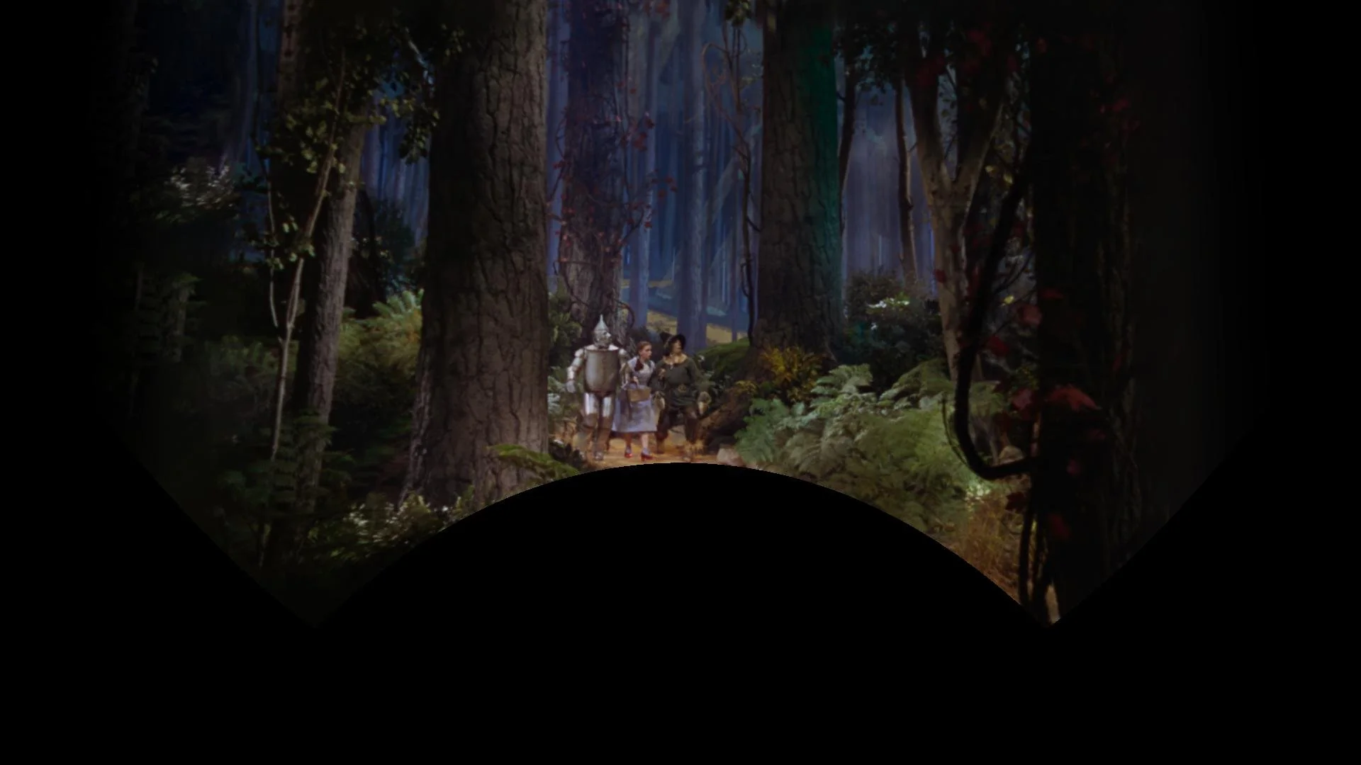
The Origin: A VR Sizzle Reel
This project didn't start in a 16,000-seat arena. It started over two and a half years ago as a proof of concept for a VR headset.
The initial goal was simple: create a sizzle reel to get executives on board and, more importantly, to test a core technical question: would the original film scans even hold up once they were stretched and placed into a 180-degree equirectangular format?
It was a long journey from that first VR test to the final show in Las Vegas, but seeing it all come together has been one of inexpressible highlights of my career. A huge congratulations to the entire team for pulling off this massive technical and artistic achievement.
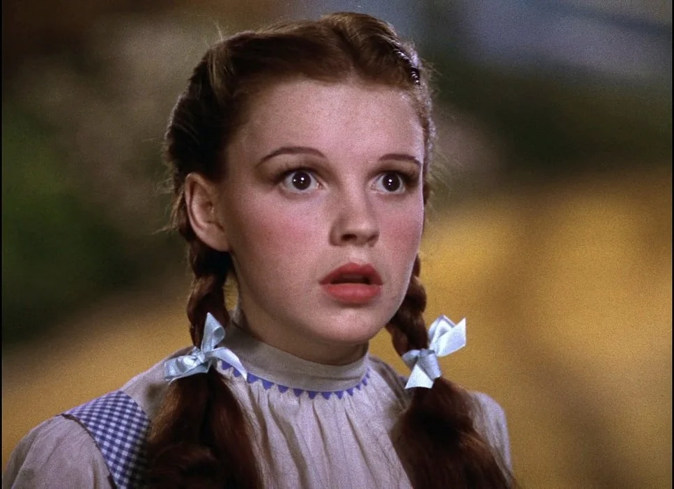
It’s finally here.
After years of advocacy, IMDb and IMDbPro have officially launched a dedicated "Color Department" category. This is a monumental and long-overdue step forward for our craft.
For decades, the work of professional colorists, the artists who help shape the final look, mood, and emotional impact of a film has often been bundled under generic categories like "Additional Crew" or "Editorial Department." While we are proud collaborators with every department, this old system obscured the unique artistic and technical contributions that are core to our profession. It made it harder for audiences to find us, for producers to credit us properly, and for new talent to see a clear path.
When a change like this happens, it makes you reflect on your own body of work. I find myself thinking back to Contagion. This was back when the 'Intermediate' in Digital Intermediate really meant something. It was an intermediate step to a final film print.

We had all this text over picture that needed a very specific, saturated "warning / danger" red. It looked fantastic on the digital projector, but that red was completely out of gamut for celluloid; you just couldn't hit it on film. I'll always remember the challenge of working with my mentor and film timer, Dan Muscarella, tweaking the look-up tables to land on a red Steven was content with for the final prints. I say content, not happy or elated… content. Ahh, the good ole' days of the film lab.
That kind of problem-solving, that invisible craft, is at the heart of what we do. To know that this film, and all the unseen work that went into it, will now be correctly and clearly categorized under my primary profession with the rest of my team... that's what this is all about.


This is more than just a database update; it's about visibility and acknowledgement
To all my fellow colorists: log in to your IMDbPro account, update your page, and officially set your profession to "Color Department." Let’s make our new home visible.

What a lively and insightful afternoon we had at the SMPTE Media Technology Summit! A huge thank you to everyone who joined us at the Solutions Hub Stage to participate in the "Colorist Society Presents: Ask the Colorist" panel. It was a true pleasure to engage in such a thoughtful and forward-looking discussion with my fellow colorists and our enthusiastic audience. We had a lot of great questions asked.
A special shout-out to my esteemed co-panelists: Picture Shop's Natasha Leonnet, The Foundation's Gareth Cook, the Colorist Society's own Sarah Priestnall, and FotoKem's Rory Gordon. Your contributions were invaluable!

For those who couldn't make it, here are some of the deeper takeaways from our conversation.
Delving into machine vision's role
We went beyond a surface-level look at automation and explored the specific, powerful applications of machine vision in the color suite.
The conversation around shot matching was particularly rich. We touched on tools from Filmlight’s presentation, which leverage machine vision and perceptual models to quickly analyze a key shot and automatically match its "look" across an entire scene. This technology streamlines the technical heavy lifting, freeing the colorist to focus on artistic direction.
It's not just about matching. I've previously blogged about using machine vision to create a depth channel from existing footage. This allows for advanced atmospheric effects, like subtly desaturating the background to draw the viewer's eye to the foreground action.
We also addressed the technical hurdles. As machine vision relies on robust image data, we highlighted challenges related to lighting changes, calibration, and managing large datasets. This reinforced the need for a precise and consistent technical foundation. Perhaps even a standard for checkpoints from SMPTE in the future.
The backbone of consistency: The ACES workflow
Another key discussion centered on the Academy Color Encoding System (ACES), which was front and center in conversations about modern post-production.
We discussed how this device-independent color management system is no longer a niche tool but a foundational element, especially when dealing with multiple VFX houses and camera formats. ACES simplifies matching footage from different cameras by normalizing everything into a single common space.
In the age of HDR, we focused on how ACES provides a predictable and consistent image display across a wide range of devices. This is essential for preserving the creative intent throughout the entire pipeline, from on-set monitoring in virtual production to final delivery.
Balancing art and technology
Ultimately, the technology is only as good as the creative eye behind it. Taste was echo’ed many times by all panelists. Machine vision is a powerful assistant, but it doesn't replace the colorist. The consensus was that our role is shifting:
Instead of being overwhelmed by repetitive tasks, soon use machine vision to handle the initial technical correction.
This allows us to dedicate more creative energy to refining the mood, shaping the story, and making those nuanced, human-driven decisions that define a project's final look. More time grading and less time “correcting.”
The ongoing evolution of remote workflows. The discussion touched upon the lasting changes from the pandemic and how cloud-based grading is becoming more and more common. We talked about how to strike the right balance, manage latency issues, and ensure secure, high-quality collaboration when a client is not in the same room.
The importance of consistency over flashiness. A great reminder that long-term success in this field isn't about chasing one viral, incredible grade. It's about consistency, repeatability, and being a reliable, trusted partner within the post-production pipeline. We touched on the importance of checking your ego at the door and focusing on the client's needs.
Thank you again to SMPTE for organizing such an excellent event and to everyone who attended. It was a privilege to share insights and discuss the incredible future of our craft. I look forward to seeing you all again soon!
I'm thrilled to announce that I will be speaking on a panel at the upcoming SMPTE 2025 Media Technology Summit this month in Pasadena.
It's an honor to be part of the "Ask the Colorist" panel, presented by the Colorist Society. This will be one of the highlights of the summit, offering a chance to connect with peers and discuss the craft we're all so passionate about. I'm looking forward to a lively discussion and answering any and all of your questions.
I'll be joined on stage by an incredible group of esteemed professionals, including Natasha Leonnet (Picture Shop), Gareth Cook (The Foundation), Sarah Priestnall (Colorist Society), and Rory Gordon (FotoKem).
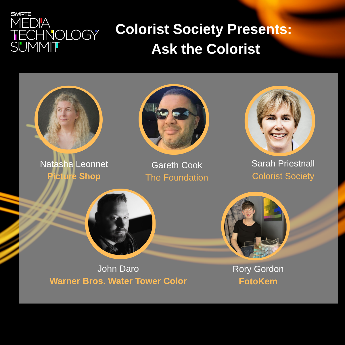
What: "Ask the Colorist" Panel
Where: The Solutions Hub Stage at the SMPTE 2025 Media Technology Summit, Pasadena Convention Center (300 E Green St, Pasadena, CA)
When: Tuesday, October 14th, 2025, at 2:00 PM
The full summit runs from October 13-16 and is a must-attend event for anyone in media technology.
If you're attending SMPTE, please mark your calendar and come by the Solutions Hub Stage. I hope to see you there!

Here’s the new trailer for “In Your Dreams” Finished at Water Tower Color. Very excited for this one to be released in November!
In Your Dreams | Official Trailer | Netflix

Absolutely honored to have contributed with the Water Tower Color team on "The Wizard of Oz" for the MSG Sphere. This project represents a paradigm shift in immersive entertainment.
A massive congratulations to the entire post-production team, the forward-thinking visionaries at MSG Sphere, and the brilliant minds at Google DeepMind who powered this spectacle. This was a monumental collaboration, and the result speaks for itself. We didn't just raise the bar; we created a new one.


Congratulations again to all involved. The future of immersive entertainment is bright, and I can't wait to see what we all create next.
Click through to YouTube to use your phones accelerometer to move the view around.
Here is the original proof of concept I made over two and half years ago. It was truly amazing to see how far it had come at the premier last night. Make sure to check it out next time you are in Vegas!

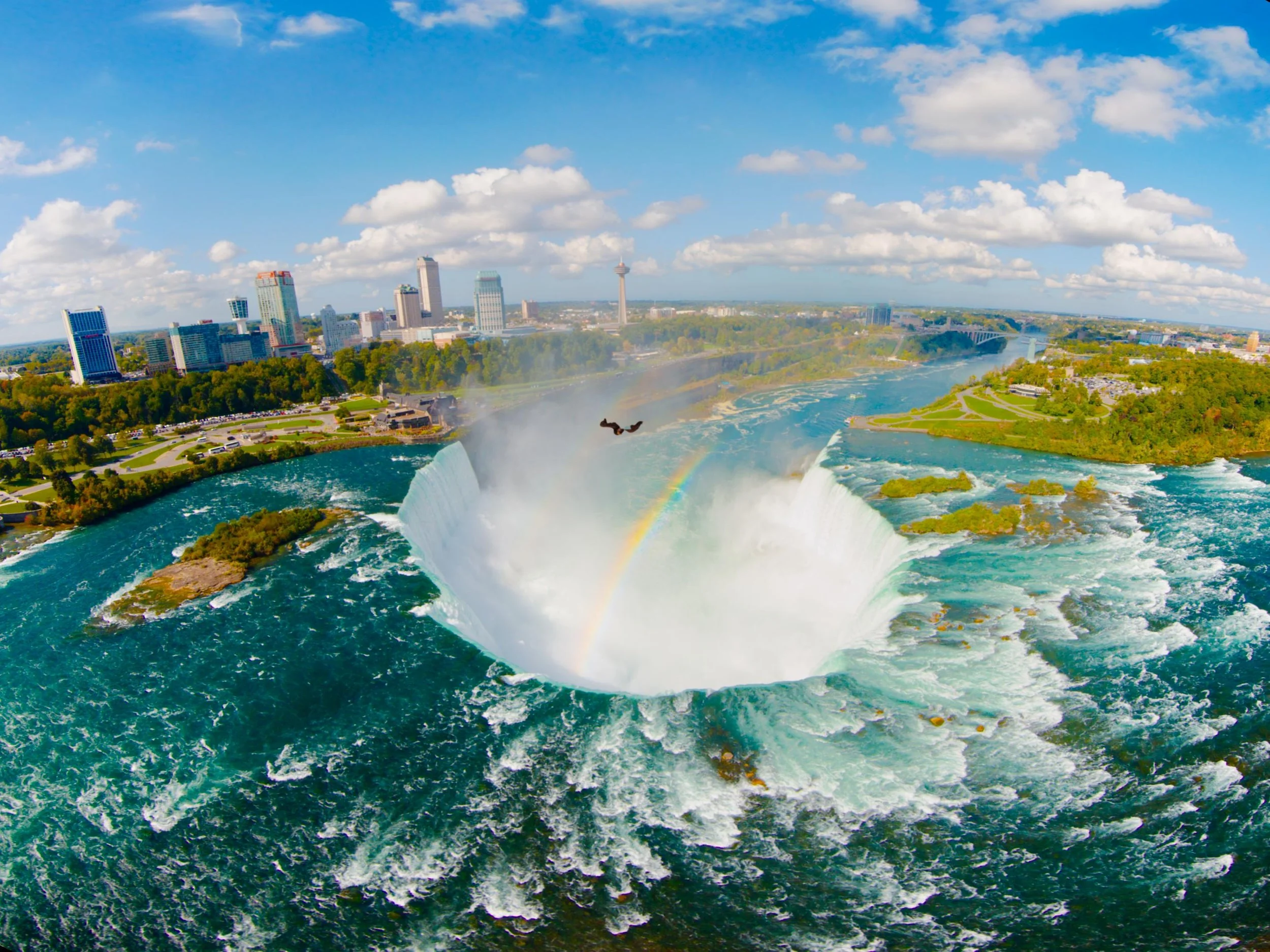
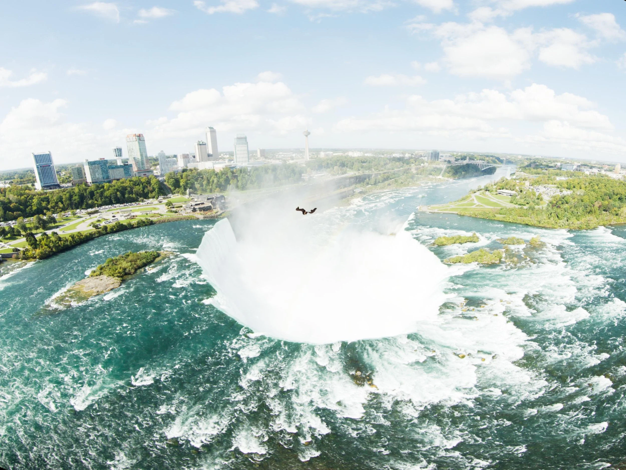
Niagara Takes Flight opens today! Its a beautifully Immersive 4d adventure over Niagara Parks. I’m very greatfull that my long time collaborator Rick Rothschild tapped me again to make the images sing like the locations do in real life. Rick and I go all the way back to Soarin’ Over California when we first met. It’s honor to work with such a consummate professional and true leader and innovator in the space.

I've spent a lot of time in the controlled environment of the theater at Warner Bros. Water Tower Color, but sometimes a project comes along that requires you to get out in the field. This was one of those times. "Niagara Takes Flight" is an immersive ride experience that uses four laser projectors and a Seventh Sense system to warp and project the content onto a massive, curved dome.
There's just no substitute for being in the venue. The interaction between those four projectors presents a unique set of grading challenges that you simply can't solve in a standard grading suite. My goal was to create a seamless, powerful, and truly immersive experience for the audience. To do that I had to take Water Tower Color to Niagara.
My portable setup was built around a MacBook Pro M3 Ultra and a 12TB IOdyne Pro Data drive, configured in RAID 0 for pure performance. The disk's speed and small footprint made all the difference; honestly, there's nothing else on the market that would have let me travel so light, and set up so fast.

Control Surface: Tangent Elements. My first choice would have been a Slate, but the Elements' modularity made it perfect for packing.
I/O: A Blackmagic UltraStudio Mini 4K connected via Thunderbolt.
Storage: An IOdyne Pro Data 12TB array. Be sure to enable multipathing and connect the disk on two different busses, for example 1&3 not 1&2.
Misc: An Elgato Stream Deck for macros and a 4th gen iPad Pro used as a secondary display for scopes and stills via Sidecar.

The footage was 60fps, 5760x4320 PIZ-compressed 16-bit half-float EXR files. I kept my Baselight project on the Mac's local database, but all the source media, caches, proxies, and renders lived on the Pro Data drive. The timeline was complex. We worked in a scene-referred grading space, which meant I wasn't doing any harm to the pixels, keeping the master as fluid as water until the final delivery targets were struck for the theater and frozen into ice, ACES archival elements, and other client versions were also rendered which insures longevity for any systems that may come along in the future.
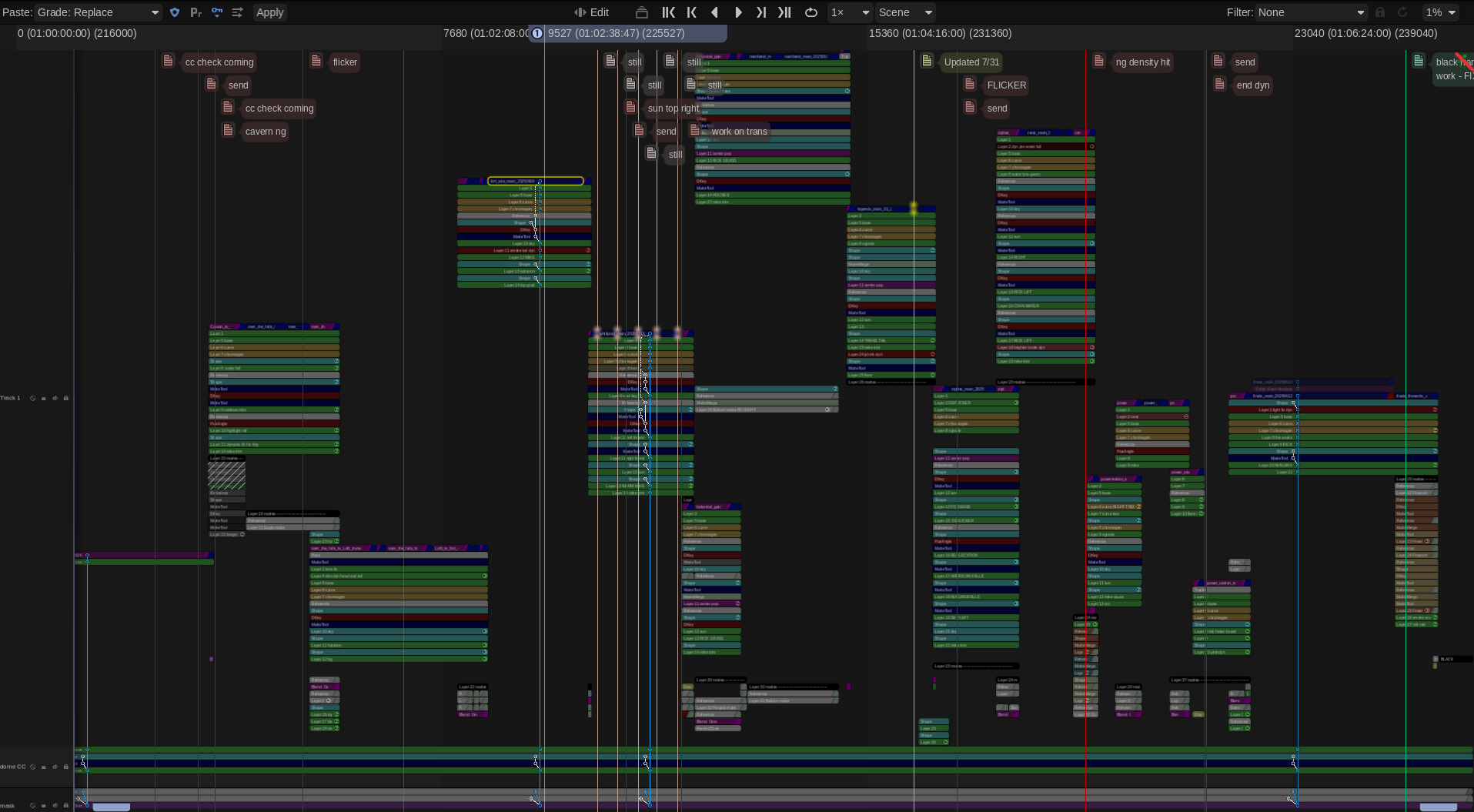
Playback was a dream—60fps with no problem. I did have one render hiccup: the Mac went to sleep during a long render when it ran out of power even though it was connected to the Pro Data. The solution was simple— disconnect the panels and breakout box, since they're not needed for rendering and just plug in the power adapter in.
Peter Postma and the Filmlight crew came through in a big way with early versions of Baselight M. It’s such a pleasure to have that kind of power in my backpack. Another huge thank you to Mike Gitig and the entire IOdyne team for thier support. I also want to thank NPC, Brogent, Rick Rothschild and Mike Quigley for allowing me to contribute my small part to this spectacular attraction. I have a feeling it will be there for many years to come so go check it out next time you are planning your family vacation! The falls are truly one of those bucket list places you must visit. Nothing else like it on the planet.
Here is a promo video I was recently a part of, showcasing a technology I'm incredibly passionate about: ambient light compensation at the LG Roadshow. If you've ever wondered how we ensure the picture you see at home matches what we see in the color grading suite, this is a big part of the answer. In a way, a little bit of my eye is in every display that has this technology.
A huge thank you to Mike Zink, Annie Chang, Mike Smith and the UHDA for their tireless efforts in bringing this functionality to living rooms everywhere.
And a friendly reminder: please use Filmmaker Mode. It should be the default, in my opinion. If you care about seeing a film as the artists intended, make sure to turn it on!
Check out the video below!
Join me on the ACES panel "Color Management That Can Up Your Game!" at Cine Gear Expo! Saturday, June 7th, 1:15 PM - 2:05 PM, Theater 1. Looking forward to a great discussion with Lynette Duensing, Patrick Renner, and Mark Weingartner, ASC. See you there!

Check out this spot Water Tower Color graded for WB Tours.
It’s scarier in a theater! Go check it out