Post Perspective - Color Pipeline: Virtual Roundtable

Here is a Q&A I was recently included in. Check out the full article here at postperspective.com

Warner Bros. Post Creative Services Colorist John Daro

My mission control station at HQ

Warner Bros. Post Production Creative Services is a post house on the Warner Bros. lot in Burbank. “We specialize in feature films and high-end episodic projects, with picture and sound finishing under one roof. We also have editorial space and visual effects offices just one building over, so we truly are a one-stop shop for post.” 

What does your setup look like tools-wise?


I have been a devotee of FilmLight’s Baselight for the past five years. It is the beating heart of my DI theater, where I project images onto a 4K Christie projector and monitor them on two Sony X300s. For that “at-home” consumer experience, I also have a Sony A95K.

Although I spend 90% of my time on Baselight, there are a few other post-software necessities for my craft. I call my machine the “Swiss army box,” a Supermicro chassis with four Nvidia A6000s. I use this machine to run Resolve, Mistika, Photoshop, and Nuke. It also makes a fine dev box for my custom Python tools.

I always say, “It’s not the sword; it’s the samurai.” Use the right tool for the right job, but if you don’t have the right tool, then use what you’ve got.

Do you work in the cloud? If so, can you describe that workflow and the benefits?


Not really. For security reasons, our workstations are air-gapped and disconnected from the outside world. All media flows through our IO department. However, one cloud tool I do use is Frame.io, especially for the exchange of notes back and forth. I really like how everything is integrated into the timeline. It’s a super-efficient way to collaborate. In addition to those media uploads, the IO team also archives finished projects and raw scans to the cloud.

I do think cloud workflows are gaining steam, and I definitely have my eye on the space. I can envision a future where we send a calibrated Sony X3110 to a client and then use Baselight in the cloud to send JPEG XS straight to the display for remote approvals. It’s a pretty slick workflow, and it also gets us away from needing the big iron to live on-prem.

Working this way takes geography out of the equation too. I would love to work from anywhere on the planet. Bring on the Tiki drinks with the little umbrellas somewhere in the tropics with a laptop and a Mini Panel. All joking aside, it does open the talent pool to the entire world. You will be able to get the best artists regardless of their location. That’s an exciting prospect, and I can’t wait to see what the future holds for this new way of looking at post.

Do you often create LUTs for a project? How does that help?


I mostly work with curves and functions to do my transforms, but when on-set or editorial needs a preview of what the look will be in the room, I do bake LUTs out. They are especially critical for visual effects reviews and dailies creation.

There’s a film project that I’m working on right now. We’re doing a scan-once workflow on that show to avoid overly handling the negative. Once scanned, there is light CDL grading, and a show LUT is applied to the raw scans to make editorial media. The best looks are the ones that have been developed early and help to maintain consistency throughout the entire workflow. That way, you don’t get any surprises when you get into the final grade. Temp love is a thing… LUTs help you avoid loving the wrong thing.

Do you use AI as part of your daily job? In what way?

Superman II Restoration


I do use a bit of AI in my daily tasks, but it’s the AI that I’ve written myself. Originally, I started trying to make an automated dust-buster for film restoration. I failed miserably at that, but I did learn how to train a neural net, and that led to my first helpful tool.

I used an open-source image library to train an AI up-rezer. Although this is commonplace now, back then, it was scratching an itch that hadn’t been scratched yet. To this day, I do think my up-rezer is truer to the image and less “AI”-feeling than what’s available off the shelf.

After the up-rezer, I wrote Match Grader in 2020, which essentially takes the look and vibe from one shot and applies it to another. I don’t use it for final grading, but it can be very useful in the look-dev process.

Building on what I had learned coding Match Grader, I subsequently developed a process to use machine vision to create a depth channel. This turns your Power Windows from circles and squares into spheres and cubes. It is a very powerful tool for adding atmosphere to images. When these channels are available to me, one of my favorite moves is to desaturate the background while increasing the contrast in the foreground. This adds dimension to your image and helps to draw your eye to the characters where it was intended.

These channels can also aid in stereo compositing, but it’s been a minute since I have had a 3D job cross my desk that wasn’t for VR.

Machine vision segmentation with YOLO. 16fps @4k

Lately, I have been tinkering with an open-source library called YOLO (You Only Look Once.) This software was originally developed for autonomous driving, but I found it useful for what we do in color. Basically, it’s a very fast image segmenter. It returns a track and a matte for what it identifies in the frame. It doesn’t get everything right all the time, but it is very good with people, thankfully. You wouldn’t use these mattes for compositing, but they are great for color, especially when used as a garbage matte to key into.

I have also recently refreshed my AI uprezer. I built in some logic that is somewhat “intelligent” about the source coming in. This way the process is not a one size fits-all operation.

SamurAI Image Restoration

It can auto-detect interlace and cadence now and can perform a general analysis of the quality of the picture. This allowed me to throttle the strength and end up with the perfect amount of enhancement on a case-by-case basis. The new tool is named SamurAI.

If given an example from another show or work of art, what is the best way to emulate that?


It’s good to be inspired, but you never want to be derivative. Often, we take many examples that all have a common theme or feeling and amalgamate them into something new.

That said, sometimes there are projects that do need a literal match. Think film emulation for a period effect. People can approach it in two ways. First — the easiest way, while also being more complicated — is to get a hold of some of the stock you are emulating. Next, you expose it with color and density patches and then develop and measure the strip. If you read enough points, then you can start to interpolate curves from the data.

FilmLight can help with this, and back in my lab days, that is exactly whose software we used. Truelight was essential back in the early days of DI, when the “I” was truly the intermediate digital step between two analog worlds.

The second way I approach this task would be to use my Match Grader software. I can push the look of our references to some of the production footage. Match Grader is a bit of a black box in that it returns a completed graded image but not the recipe for getting there. This means the next step would be to bring it into the color corrector and match it using curves, keys, and scopes. The advantage of doing it this way instead of just matching it to the references is that you are working with the same picture, which makes it easier to align all the values perfectly.

Oh, or you can just use your eyeballs. 😉

Do your workflows include remote monitoring?


Not only do they include it, but there was a time in the not-too-distant past when that was the only option. We use all the top solutions for remote sessions, including Streambox, Sohonet ClearView, Colorfront and T-VIPS. The choice really comes down to what the facility on the catching side has and the location of the client. At the moment, my preference is Streambox. It checks all the boxes, from 4K to HDR. For quick approvals, ClearView is great because all we need on the client side is a calibrated iPad Pro.

What film or show or spot resonates with you from a color perspective?


Going back to my formative years, I have always been drawn to the austere beauty of Gattaca. The film’s use of color is simply flawless. Cinematographer Sławomir Idziak is one of my favorites, and he has profoundly influenced my work. I love Gattaca’s early flashbacks, in particular. I have been gravitating in that direction ever since I saw the picture.

Gattaca

Magic Mike

The Sea Beast

You can see a bit of Gattaca‘s influence in my own work on Steven Soderbergh’s Magic Mike and even a little bit on the animated film The Sea Beast, directed by Chris Williams.

Gattaca

The Sea Beast

I am always looking for new ways to push the boundaries of visual storytelling, and there are a ton of other films that have inspired me, but perhaps that’s a conversation for another time. I am grateful for the opportunity to have worked on projects that I have, and I hope that my work will continue to evolve, inspire and be inspired in the years to come.

Dear Mama

7/12 - Update: “Dear Mama” Emmy nomination for Best Documentary or Nonfiction Series

Well, if you are my age and grew up in the ’90s, you listened to Tupac. Even all of us white boys from Camarillo knew every word to every song. His music really was the soundtrack to the last decade of the millennium and my youth.

Tonight is the final installment of “Dear Mama.” FX’s most-watched unscripted show.

Perfect for a Mother’s Day weekend! Please go check it out on FX tonight or streaming on Hulu.


Allen Hughes directed this insightful docuseries. Fitting because Allen and his brother directed Tupac’s early music videos. Sure, there was a bit of drama, but that adds to the flavor of the story. That connection to the material made Hughes the quintessential choice for captaining this ship. Tupac wasn’t any one thing; more like an eclectic stew of many influences and identities. One thing is for sure. Dude was thug life for real.

Cognac hues or Hughes as it were

Allen was clear on the look and vibe he wanted for the series. Cognac was the word. We spent a couple of weeks developing a look that feels like you have filtered the light through a fine liquor. We also used Live Grain to achieve that end-of-the-film-era perfect Kodak grain structure of the 90s.


Documentary grading is an entirely different beast. Here are a few tips for you to tackle your next interview-based production.

  1. Color management - I preach this a lot, but even more critical with many different sources.

  2. Sounds basic, but group your interviews.

  3. Normalize the frame rate upfront.

  4. AI up-rez is like salt; a little is good, but too much ruins the dish. Don’t be afraid to let some pictures just look old.

  5. Build a KEM reel of all interview setups. Having the A and B cam shots together in the timeline will help you reference grades quickly.

The first step was look development. Allen had already shot some of the interviews we used to refine the look. I built an LMT that had the cognac golden vibe. I used that look and the ACES standard outputs to create a 709 LUT for Avid media creation. Eric DeAzevedo was the operator responsible for many terabytes of dailies. We also normalized all the archival footage to 23.98 during the dailies step. Cortex was used to make the mxf files and bins. We had to double-hop to render in LiveGrain since it wasn’t supported in Cortex at the time.

Early on, we were still in the late stages of the COVID lockdown. I built a reel of every interview setup and had a ClearView session with Hughes and Josh Garcia (Producer). This scene was super critical to our success going forward. It set the bible for the show's look and ensured that Allen’s vision was consistent through the many days of shooting. At the start of each episode, I applied our base settings using a “Fuzzy” match. (yes, that is a real Baselight thing.) Basically, “Fuzzy” is a setting that allows the machine to match grades presumed to be from the same camera roll rather than a timecode approach. This put all the interviews 90% of the way there from the get-go. The next step was to sort the timeline by clip name and time of day. I would then work through a pass where I would track the shapes and balance out any inconsistencies in lighting as the sun hung lower throughout the day. The archival footage didn’t have as graceful of a strategy applied. Each shot was its own battle as the quality differed from source to source. My main goal was to ensure that it was cohesive and told the story Allen was crafting.

The first deliverable out of the gate was a theatrical version for the Toronto International Film Festival. I graded in ACES cc going out to PQ 1000nits. Then that was run through the DoVi analysis, and a P3D65 48nit version was trimmed. Finally, we applied a P3D65 to XYZ lut on the output render to create the DCDM.

The biggest challenge of this show was keeping up with editorial. As you can imagine, documentary storytelling is honed in the edit bay. The edit was constantly being updated as shots were cleared or discovered. Back at my shop, Leo Ferrini would constantly update my project to chase editorial. Multi-Paste (Remote Grades for our Resolve friends) was clutch in this situation. We took the old grades and copied them across. Leo would categorize the new material so I could sort the scene for the changes. The timelines constantly evolved and took shape until we got Allen in for the final grade. Allen has a great eye and religiously kept us in the world he had envisioned. We paid particular attention to eye-trace and ensured the information from each visual told a straightforward story without distraction. Next was a pass of Dolby trimming to take the approved PQ to 709. We would send that 709 file to Allen and get notes before creating the final IMF for delivery.

A super big thanks to Paul Lavoie for managing this one. There were many moving parts on this production but thanks to him, I rarely felt it. It’s a blessing to have a partner that doesn’t mind getting his hands dirty even though he’s one of the suits😜.


Be sure to check out this killer doc about one of our generation’s most prolific artists, told through Hughes's equally unparalleled artistic voice. Allen is a true master of many formats but has solidified his place as one of the best documentarians. Thanks for taking the time to peek behind the curtain, and let me know what you think.

Here are some more before and afters. Mellow yella’ Dan Muscarella would have been proud.


Cheers to "The Sea Beast" Best Animated Feature Film Nomination!

Sending a big cheers and congratulations to Netflix and The Sea Beast crew for their nomination today. The film is a beautiful culmination of an elite group of artists' fantastic work. I am super grateful and proud to have been a part of the team.

Cheers to "The Sea Beast" Best Animated Feature Film Oscar Nomination!

Flippers crossed for a win on the day!

Best Animated Feature Film Nominations

  • “Guillermo del Toro’s Pinocchio,” Guillermo del Toro, Mark Gustafson, Gary Ungar and Alex Bulkley

  • “Marcel the Shell With Shoes On,” Dean Fleischer Camp, Elisabeth Holm, Andrew Goldman, Caroline Kaplan and Paul Mezey

  • “Puss in Boots: The Last Wish,” Joel Crawford and Mark Swift

  • “The Sea Beast,” Chris Williams and Jed Schlanger

  • “Turning Red,” Domee Shi and Lindsey Collins

Questioning Color

I was recently interviewed for an article on the power of color. The questions were very thought-provoking, and some topics I hadn’t thought about in years. I think it’s always a good practice to periodically approach the profession with a kindergarten mindset, ask the important “why’s”, and question or reaffirm first principles.


You can check out the article here and see the complete list of questions and my responses below.

Hopefully, this helps my fellow hue benders out there. Let me know if you disagree with anything in the comments. I always appreciate new ways of looking at things.


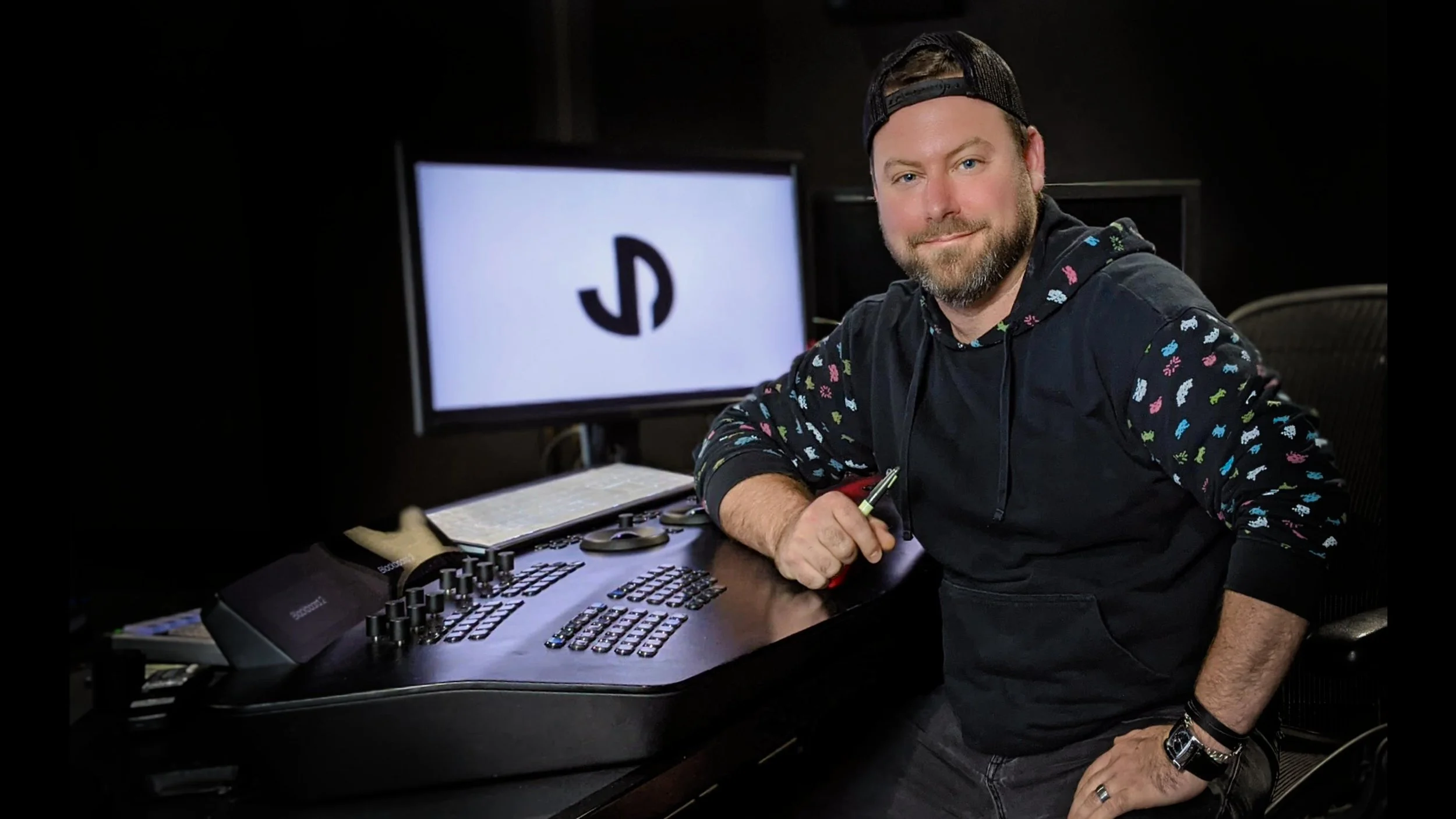
  • John Daro, Senior Colourist, Warner Bros

    John Daro is a Lead Digital Intermediate (DI) colourist at Warner Post Production Creative Services, a division of Warner Media. He has supervised the finishing and grading of many feature films, television pilots, commercials, and music videos for clients, including all the major studios, in addition to independent productions.

    Daro started his career at the film lab FotoKem. His first notable achievement was architecting a direct-to-disk dailies pipeline. From that role, he moved on to film scanning-recording and, with the DI process's creation, his current position as a finishing colourist. His past jobs gave him a mastery over colour transforms, and he started to couple those strengths with the art of cinematography. He continued to pioneer post-production techniques, including 3D conversion and the early days of HDR imaging. As a founding team member of their digital film services department, he helped FotoKem achieve its status as one of the premier post houses in the film and television post-production industry.

    In this interview, Daro talks to us about how colour can be used to shape an audience’s interpretation of a film and provides examples of how he’s used colour to help communicate a narrative in the past. 

  • How do you think colour shapes the way audiences perceive film?

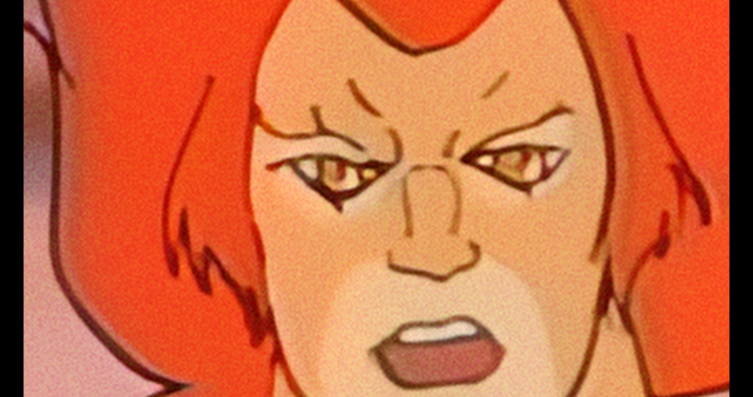
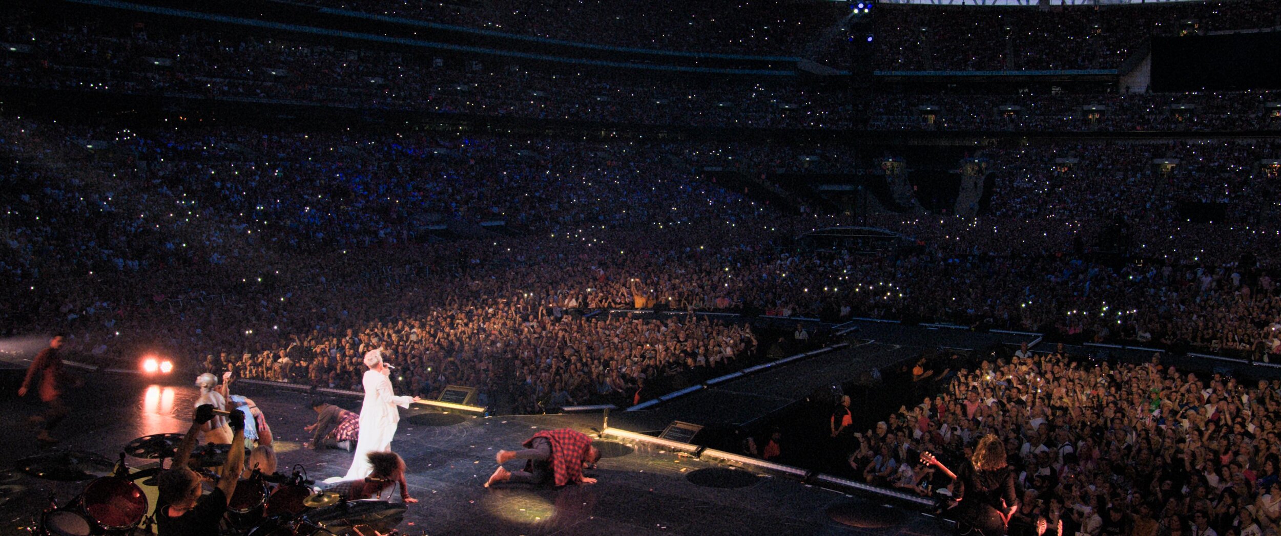
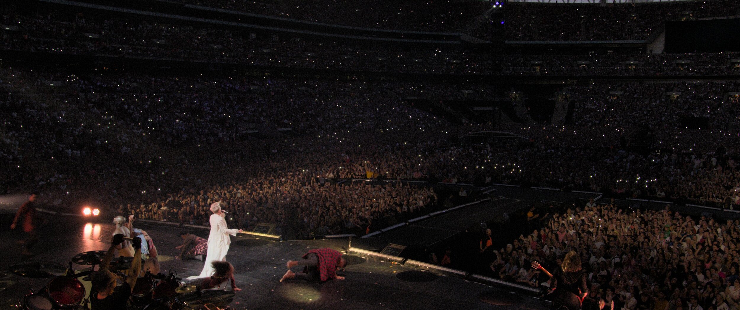
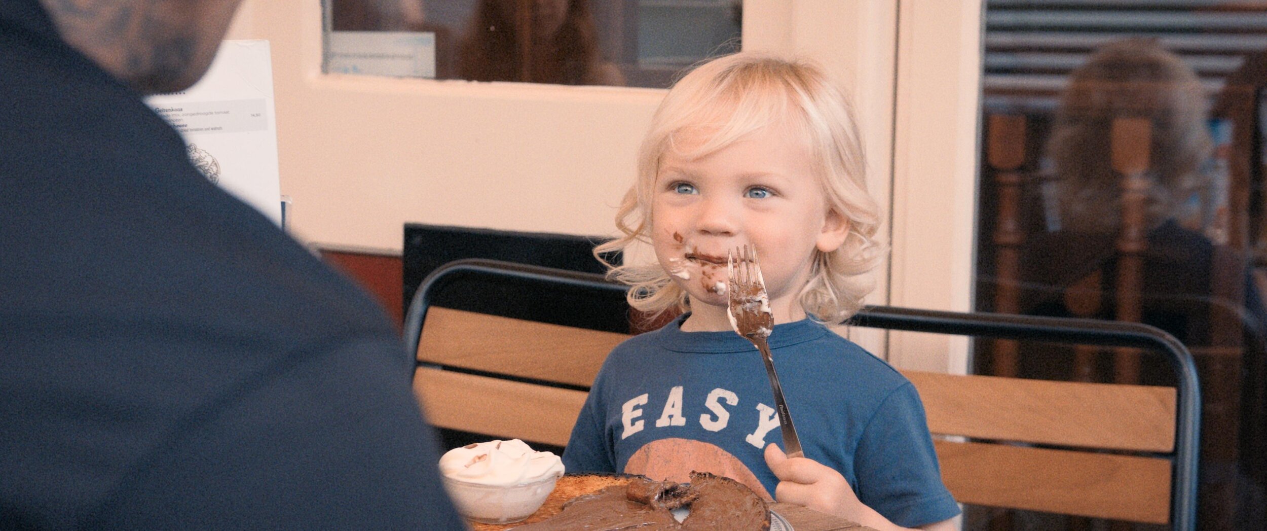
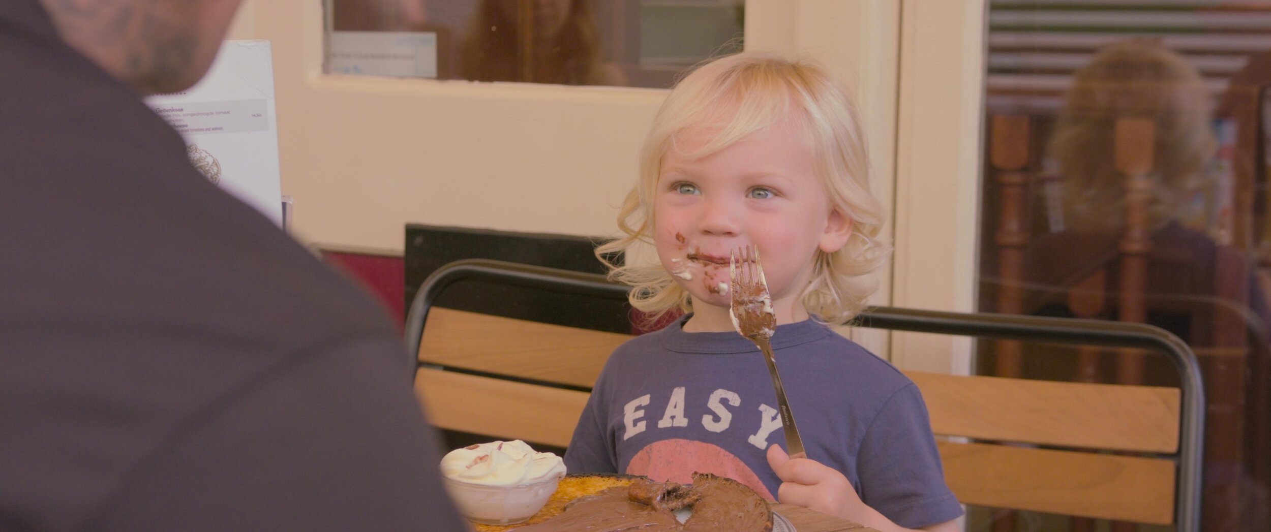
    It's funny that you asked how colour shapes the audience's perception because, in a way, the colour process is literally “shaping” what we want you to see and what we don't. At its most basic, colour finishing is the process of highlighting and subduing certain key areas which directs the viewer’s attention to where the filmmakers intended. Before digital colour grading, cinematographers highlighted these key areas through shadow, light, depth of field and lens effects. Photochemical timing changes were limited to colour and density.  Nowadays, the sky's the limit with shapes, articulate roto masks and matte channels. Ultimately, the end goal of all these tools is to make it feel natural and true to the story and highlight key moments necessary for the viewer to absorb the supporting narrative. It's an old cliche, but a picture tells a thousand words. 

  • How have you used colour to communicate with an audience?

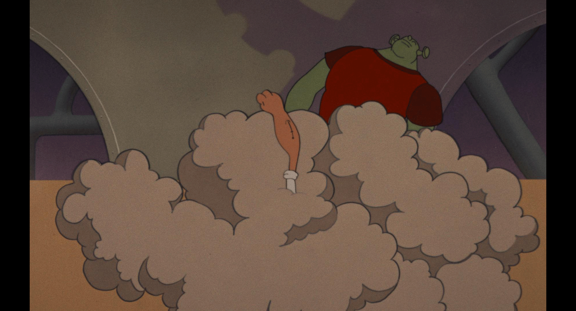
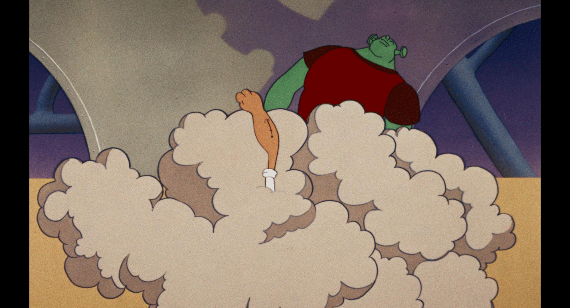
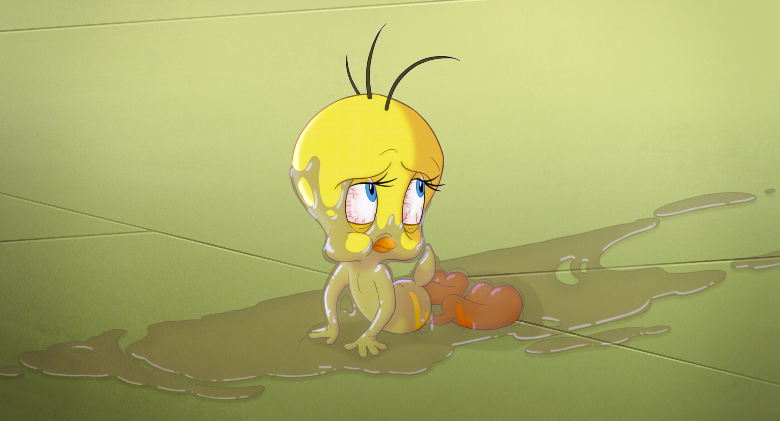
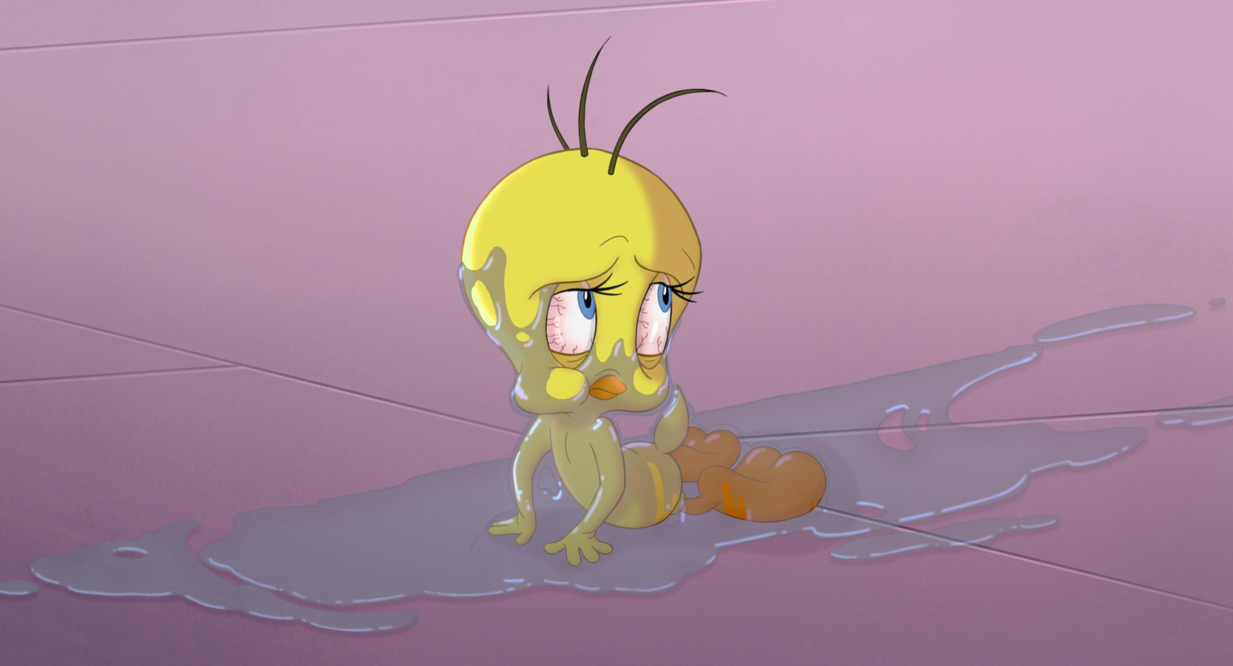
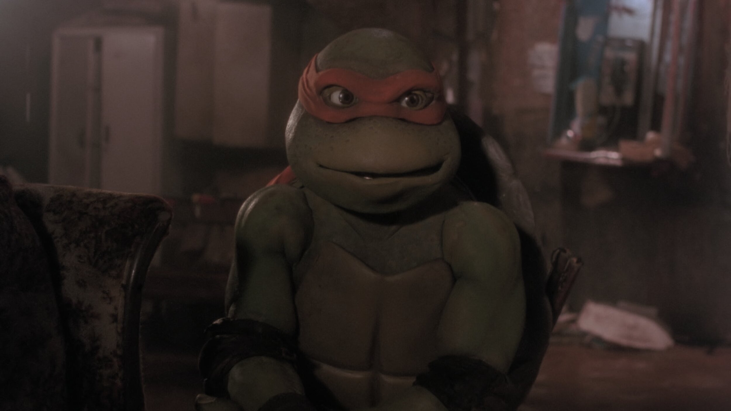
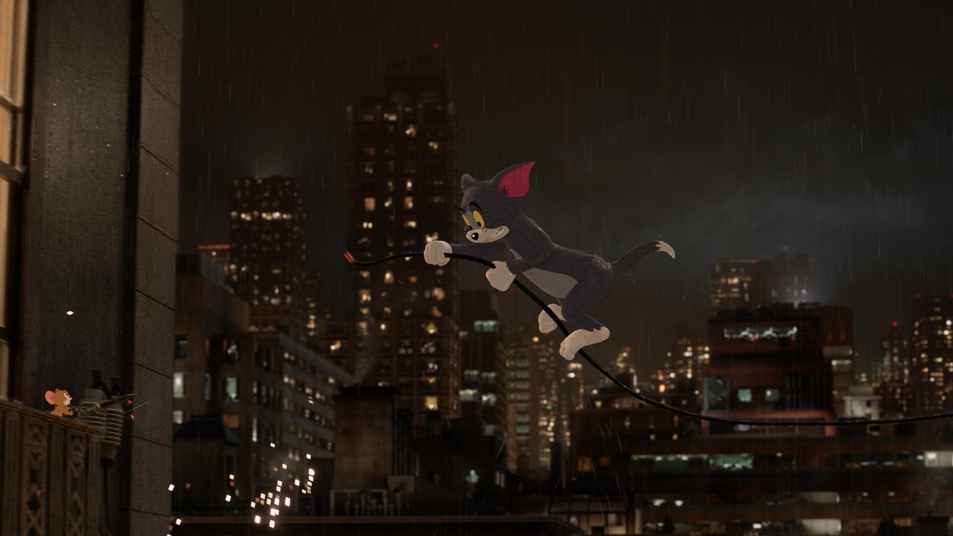
    A couple of examples that popped into my mind involve using dynamics to simulate coming out of a bright area. I think I used this technique most effectively in Laika’s The Boxtrolls. When Eggs, the film’s protagonist, came out of the sewer for the first time, we applied a dynamic luminance adjustment to simulate what your eyes would do when adjusting to a bright light coming from the darkness. 

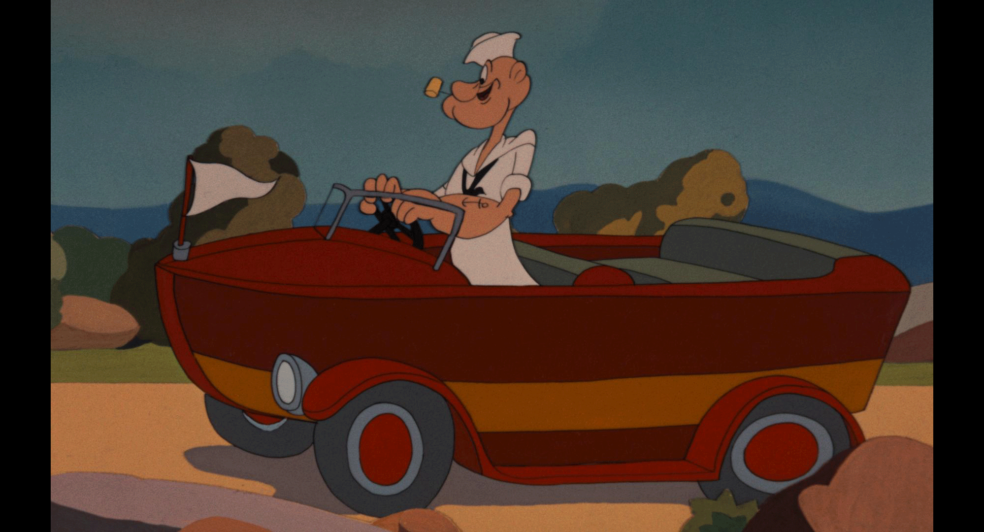
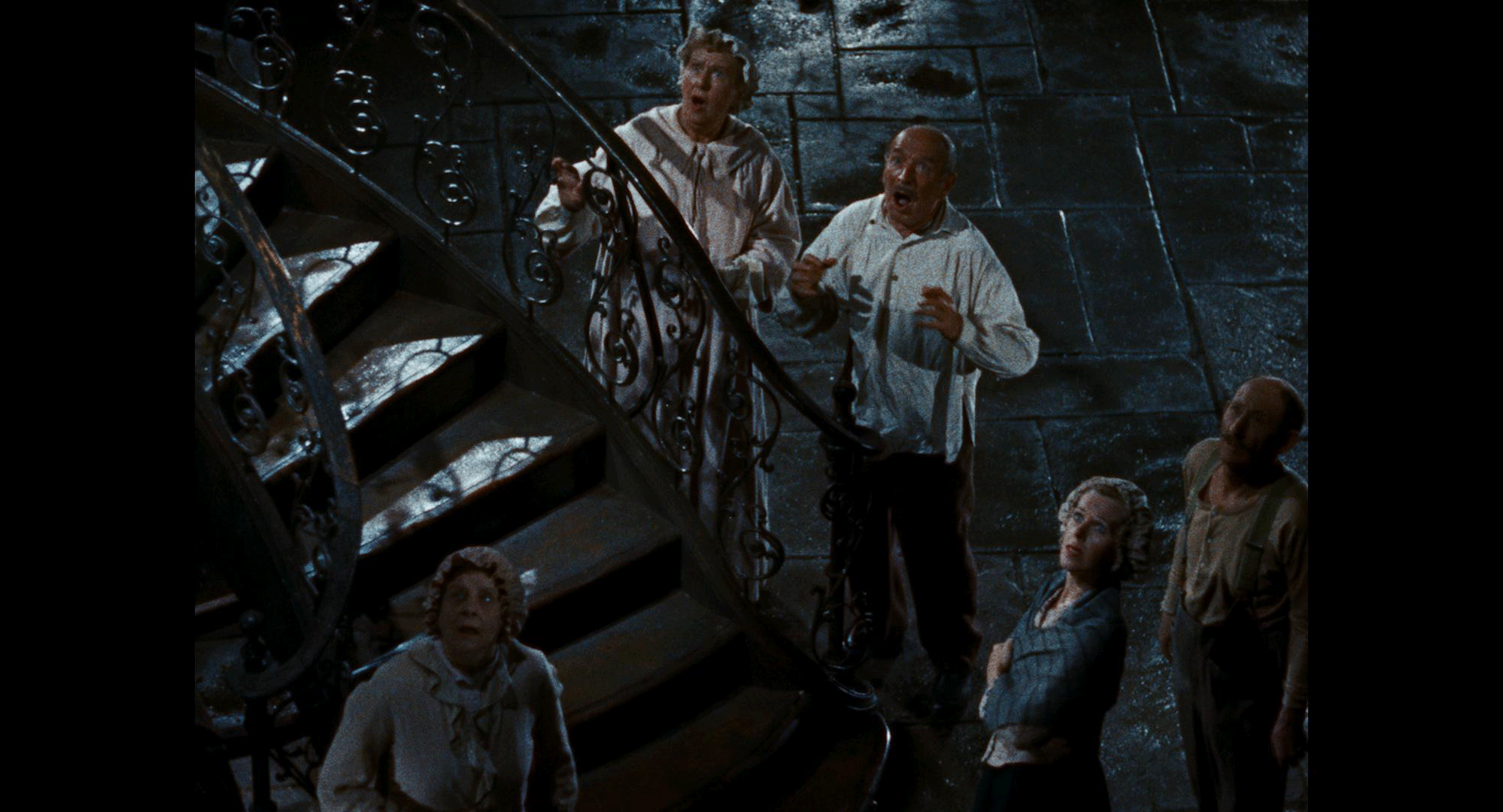
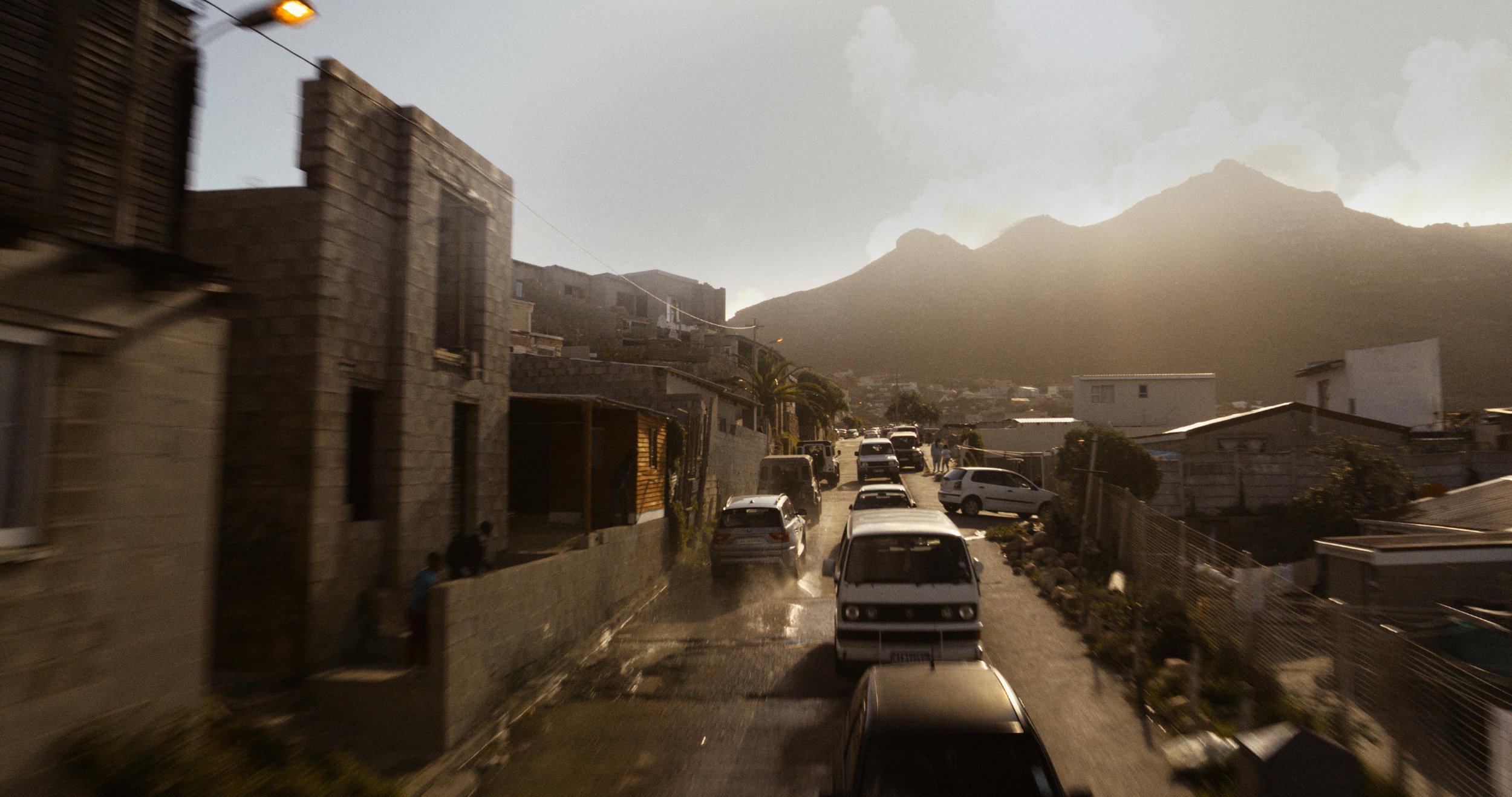
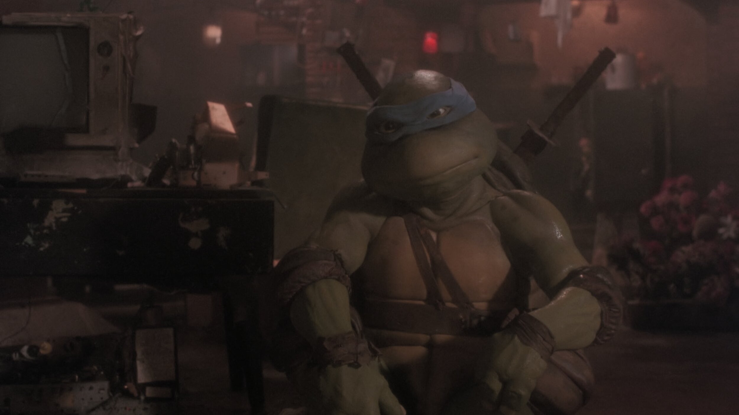
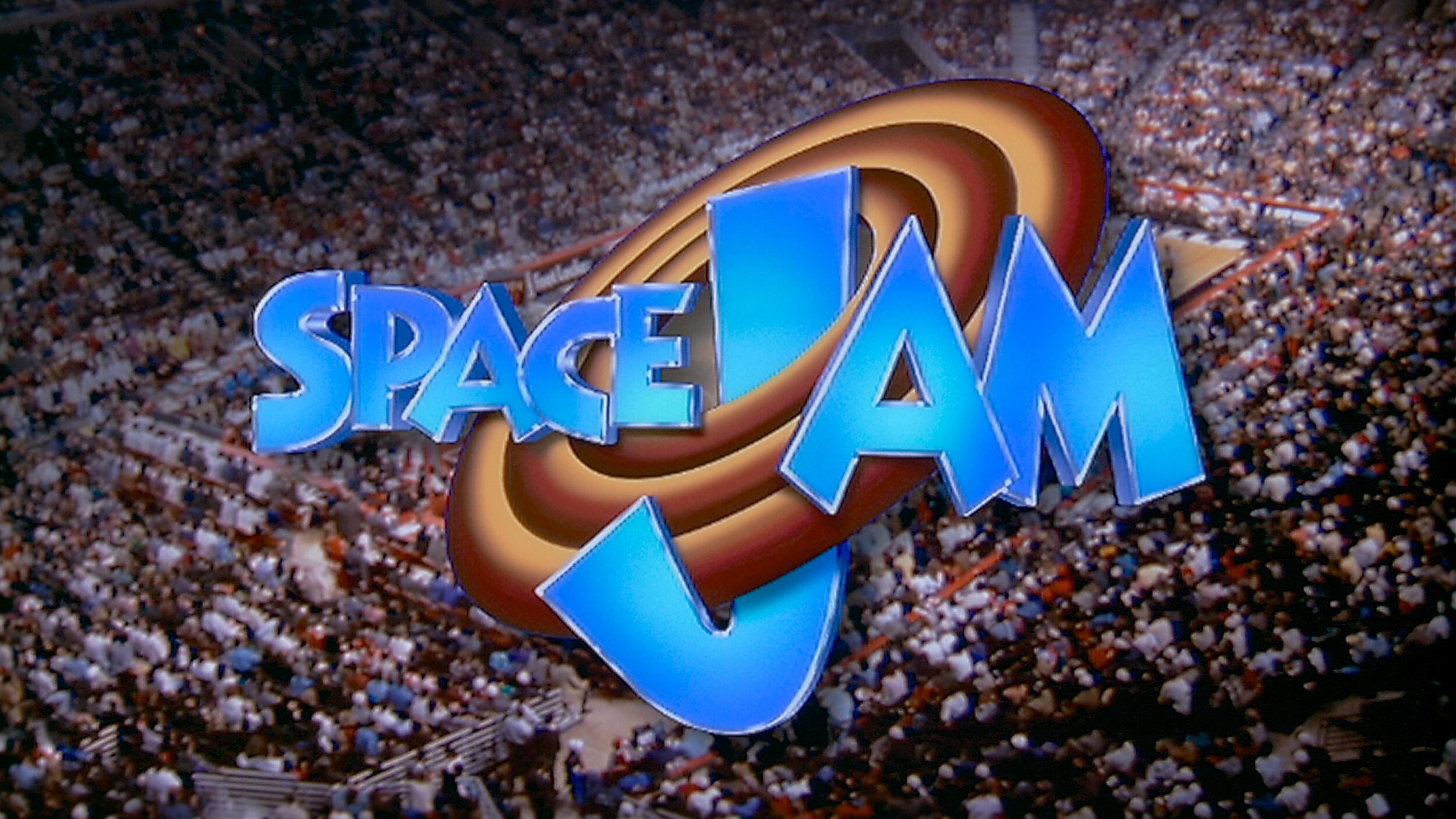
    Another example is Steven Soderbergh's Contagion, where colour choices define geographical location to help the viewer know where they were without needing additional information.  I also used this technique in Natalie Portman’s adaptation of Amos Oz’s A Tale of Love and Darkness. For this film, we were dipping through memories and a fantasy world.  Colour choices defined the real world versus the world inside the character’s head.

  • Can you talk us through your involvement in choosing and implementing a colour palette for a specific scene/film?

    So many of these decisions are decided upfront through lighting, production design and wardrobe. It's always a pleasure to be brought in on a project early enough to have been part of those conversations and understand the motivation behind the choices. I feel there's great value for everybody to be on the same page and know how specific colours on the set will render in the final output.

    Look development can have many muses. A style guide, concept art and a reference deck are great tools. I like to start by picking two or three key colours that are important to the story, symbolize a character, or represent a message. Then the objective is to find the best way to shift and enhance to make a split complementary palette. Contrast and simplicity are at the heart of the finest design in my opinion.

  • Do you think colour is the backbone of emotion in film?

    I don't think so, no. I think sound is. Smell would be even more evocative, but luckily for the Jackass movies, smell-o-vision didn't catch on!

    I prefer to grade with the latest mix. It's the sum of all the parts that make a great cinematic symphony. Colour and sound must be playing in concert, similar in tone or in contrast but always together.

    I think that kind of sensory feeling might be ingrained in our DNA. Whenever I hear the opening to Peter and the Wolf, I visualize spring greens. It doesn't work the other way, however. I don't hear Peter and the Wolf every time I see green. Colour must be taken in context. Green can make you feel safe and calm like a lush field of grass blowing in the wind does. At the same time, it can evoke feelings of jealousy or sickness. It all depends on context and the motivation behind the story being told.

  • How do you know when a specific colour scheme does or doesn’t work?

    There are a few academic reasons I could give you. For example, certain colours clash with other colours. Certain colour harmonies are not particularly pretty, but that doesn't mean that you can't use those mismatches. Especially if what you're going for is to make the viewer uncomfortable or uneasy. Colour is subjective; balance is not. 

    Ultimately, the real answer is feeling it in your gut. You know when it’s right. I have an internal rule when taking my passes. The reel is done when I can watch it down and have less than three tweaks to make. You are never really finished. Most often, you just run out of time.

  • How do you work with the director and cinematographer to achieve a specific look in a film?

    I first watch a rough cut or read the script and get an idea of the story. Next, I take camera tests and start to build a basic look. The goal with this V1 transform is to find something that works for the cinematographer and gets them repeated results in different lighting conditions. Obviously, it should also have an aesthetically pleasing visual component. It's important when building a look to ensure that the camera still behaves as expected regarding sensitivity and dynamic range. You don’t want to bake anything that could hamper the original photography. Essentially, make sure mid-grey still maps to mid-grey. 

    Once we have dailies, the process begins again, where I might have a V2, V3, or V4 version of the look that we're going for. I put those in a still gallery on a server for remote viewing, and we constantly update the conversation forum page with feedback from the creatives. I maintain before and afters of all versions to ensure we improve and never go backwards creatively. The last step is to ensure that the look works for the story once the film is assembled. Tweaks are made to the show look and certain scenes get special treatments for effect. 

    CDLs are a vital part of this process as well. Grading your dailies is very important for ensuring that there are no surprises when everyone gets to the DI theatre. I've had past experiences where producers see something that has the final grade, but it's too far of a departure from what the look was in editorial. To combat this reaction, we always want to ensure that the look is consistently maintained from the first shot out of the camera through to the final finish.

  • How can colour set the tone for a scene? 

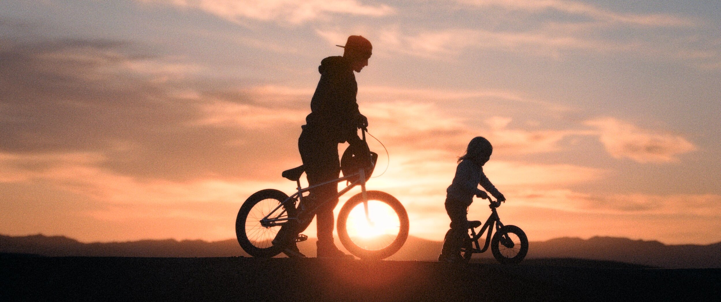
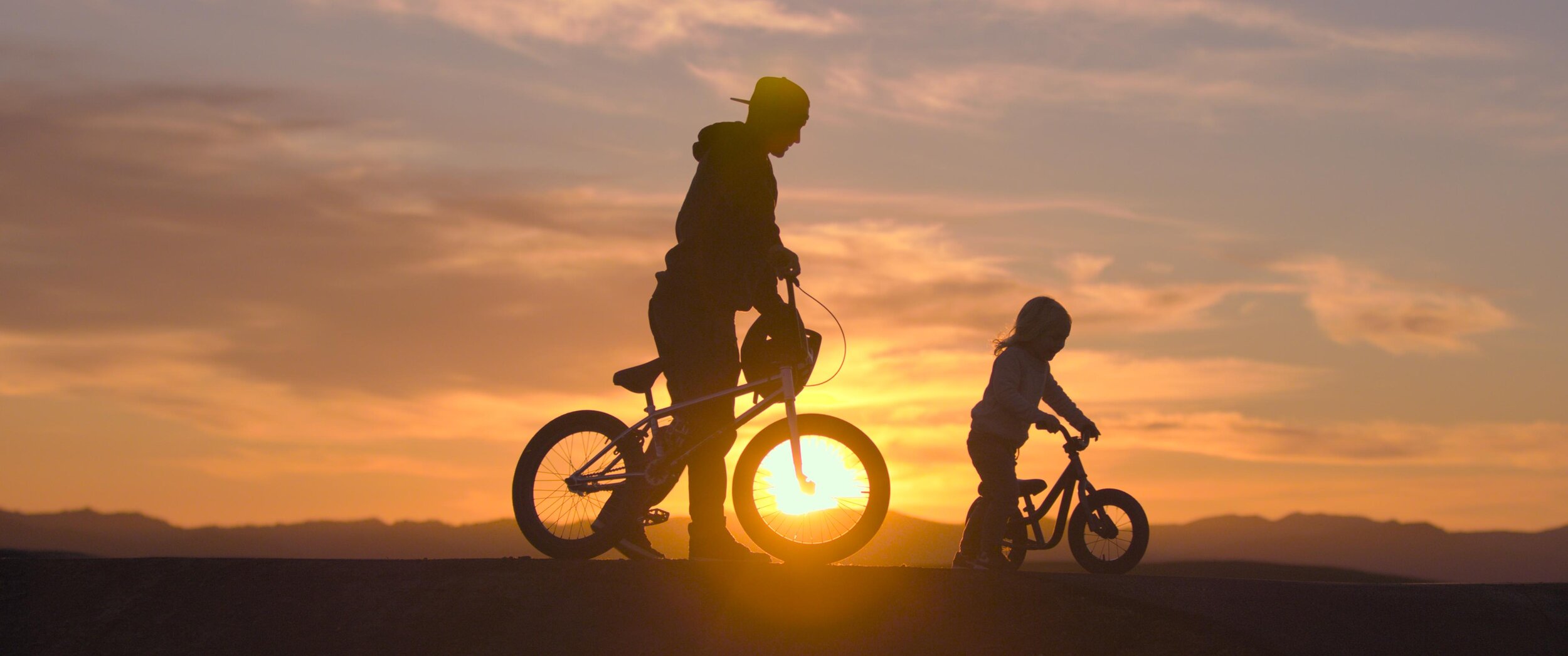
    To set the tone, it's all about warmer, colder, brighter, or darker. As I've already touched on, it's really important to pick a few colours that you want to enhance and then let the background support that enhancement, whether through a complimentary value or making it recede. They're also the obvious washes that you can do. For example, if you make a scene very red, the warmth invokes a sense of romance or love. It can also yield a literal hot vibe. Something very cold, very desaturated invokes a sense of bleakness or a dystopian feeling. Magenta's a weird one because it can be warm and cold at the same time. Depends on the context and how it's used. Green-yellow also functions similarly. It can seem sickly and off, but it can also be romantic and warm, depending on what side of the hue you're on. I don't know where these generalities came from, but they're almost universal at this point. My gut is that human evolution has something to do with it. I think the responses to these colours helped us survive at some point. When I say it’s in our DNA, I do mean just that.

  • What technical difficulties do you come across with undertaking this critical part of film production?

    You can avoid many technical difficulties by ensuring you’re doing no harm to your pixels. The most important thing is that you have a colour-managed pipeline, in that you’re never working on what the film looks like, but rather what the film was captured as. Make sure you’re always working in a photon real-world scene-referred way. At that point, the displays don’t matter as much. They simply target what you’re trying to hit. They can always be adjusted after the fact if there are technical concerns. I always work with soft display-referred transforms that gradually roll off your highs and also have a nice toe in the black. This generally helps cut down on the number of technical issues. 

    Past that, it's all about keeping your eye on the scopes and ensuring there are no technical glitches in the actual capture or renders like quantization, dead pixels, hits or bad frames. All it takes is an eye for detail and a great QC department.

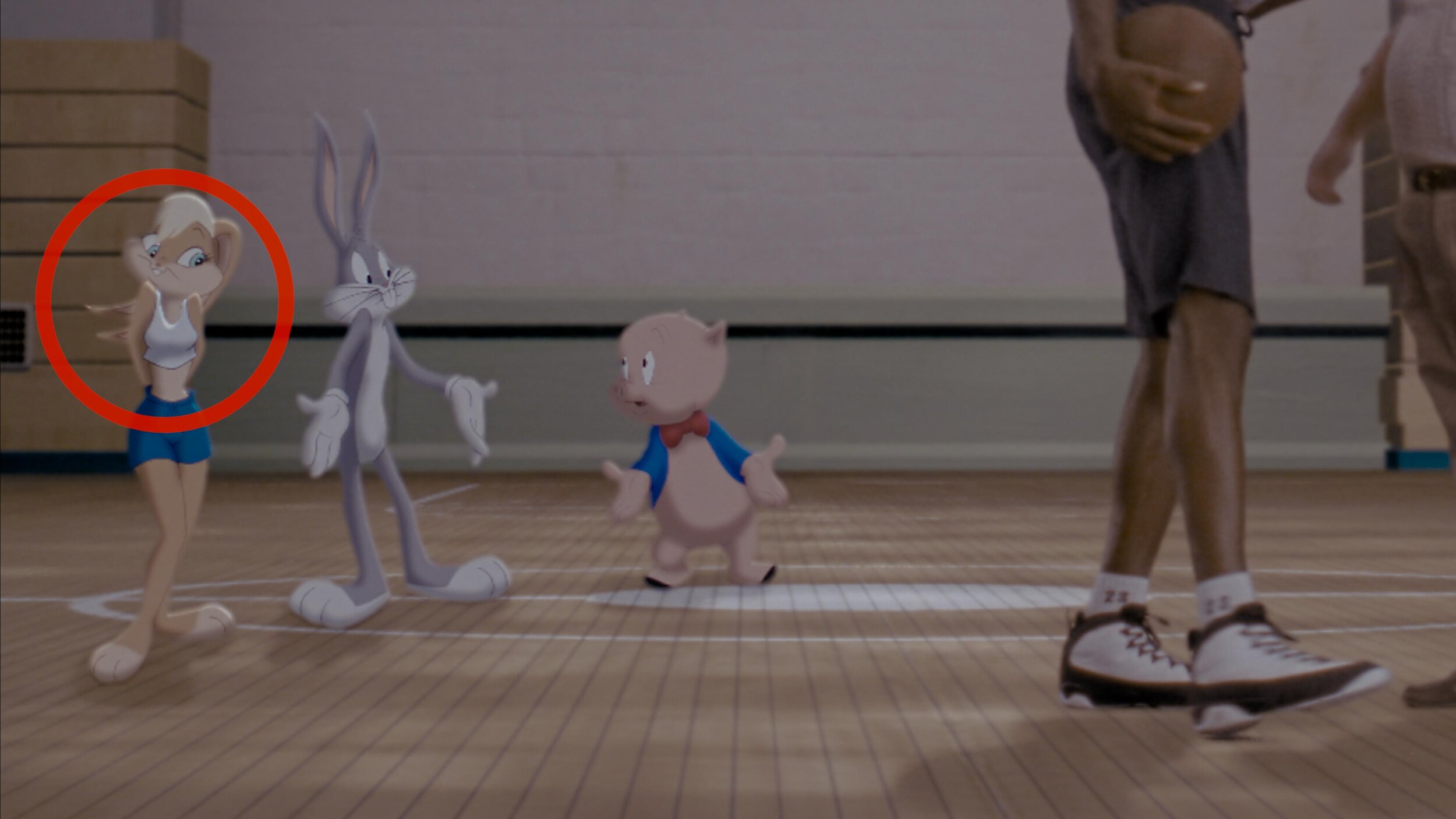
  • How does your role as colourist differ when working on animation compared with live action films? 

    At the core, the two are very similar. The same principles that make a strong image still hold true regardless of how the image was created. Modern render engines are very good at doing what light does. So much so that a lot of DoP buddies of mine are pre-vising lighting setups virtually.

    Nowadays, that line is being blurred even further, where some films can be comprised of mostly VFX shots. Many of these setups, especially with the advent of digi doubles, are not very different from a fully animated picture.

    Now, if we’re defining a “live-action” shot as being something captured with a camera, and no further manipulation, then the biggest difference comes from the workflow. For example, if you take a live-action setup that has been shot with clouds and maybe some inconsistent lighting situations, your first step is technical colour correction just to balance the shots together. You don't have this problem with animation, but you do have a similar situation where you might have many artists working on the same scene. This can sometimes lead to slight inconsistencies that must be smoothed out.

    A huge advantage of CG-originated shots is that they tend to have advanced matte channels. These could be as simple as a matte for the main character or as complicated as depth or normals. These additional tools allow for more complex grades but also increase the time that you spend on each shot.

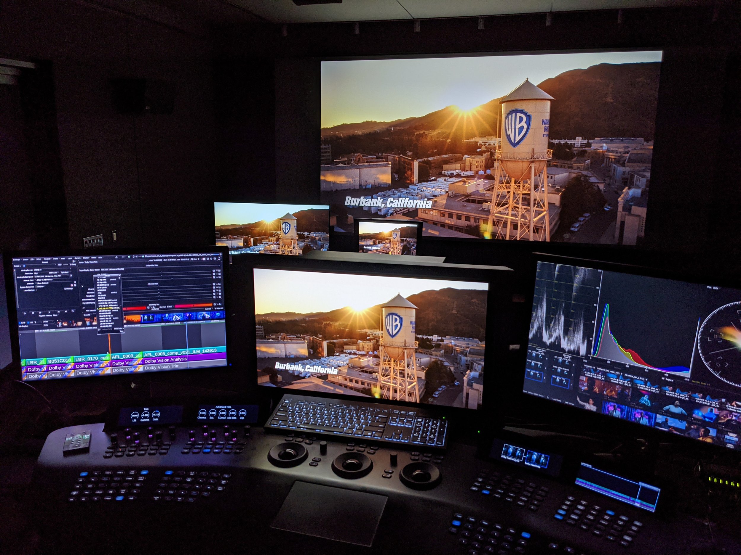
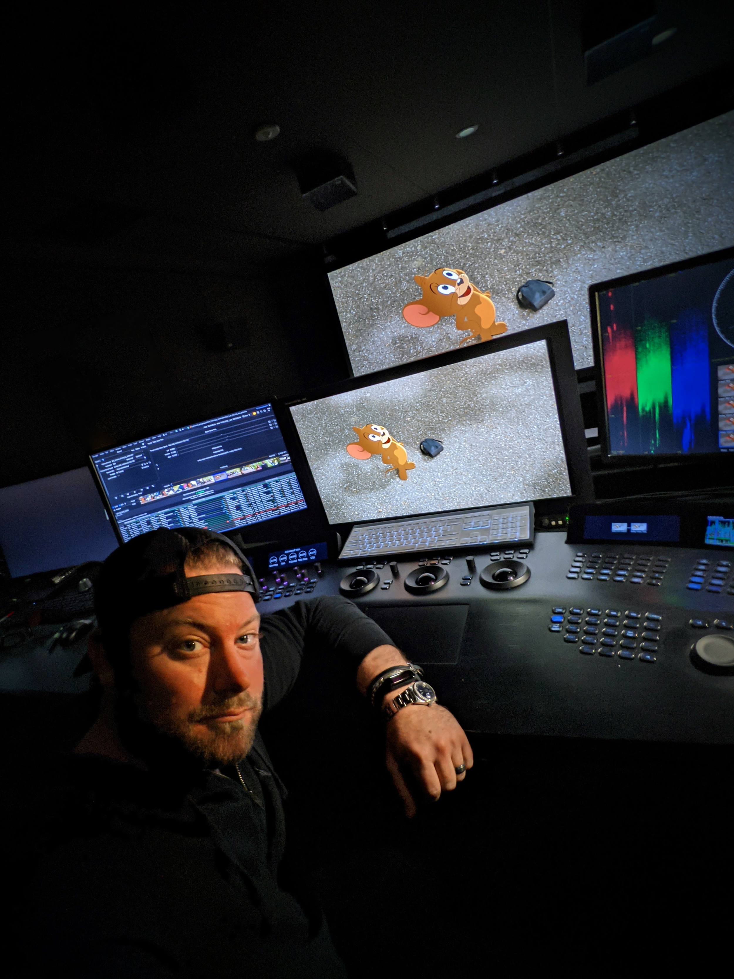
  • Can you tell us about your grading suite? What could you not be without while at work?

    My grading suite looks like a hot mess. Imagine the Great Wall of monitors. I have two x300s, and two GUI monitors for Baselight, one extra wide LG for what I call my Swiss Army box and an admin computer. The most important display is my Christie 4k projector. I also have an LG C2 to simulate a consumer experience.

    The most important machine in my tool set is the Swiss Army box. Essentially, it's a super micro chassis with four a6000s that has every single piece of post-production software that has ever been useful. I also use this box for coding and the development of my own in-house tools. I would consider this machine mission-critical. Second to that, the next most important piece of gear would be an external scope. Your eyes can lie to you, but scopes never do. Software scopes have made huge advancements in recent years. I can't say I use the external one every day, but when you need one, there really isn't a substitute.

  • How does Baselight aid your role as a colourist?

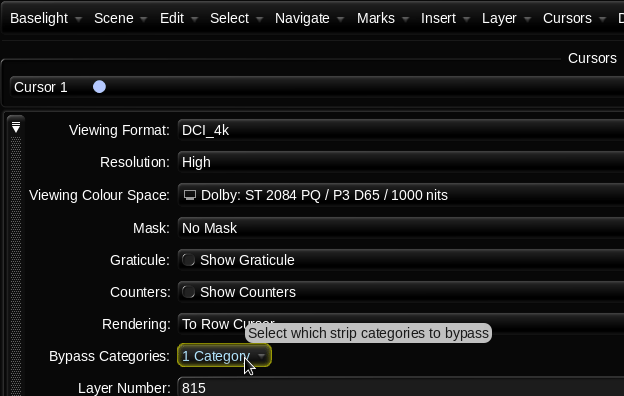
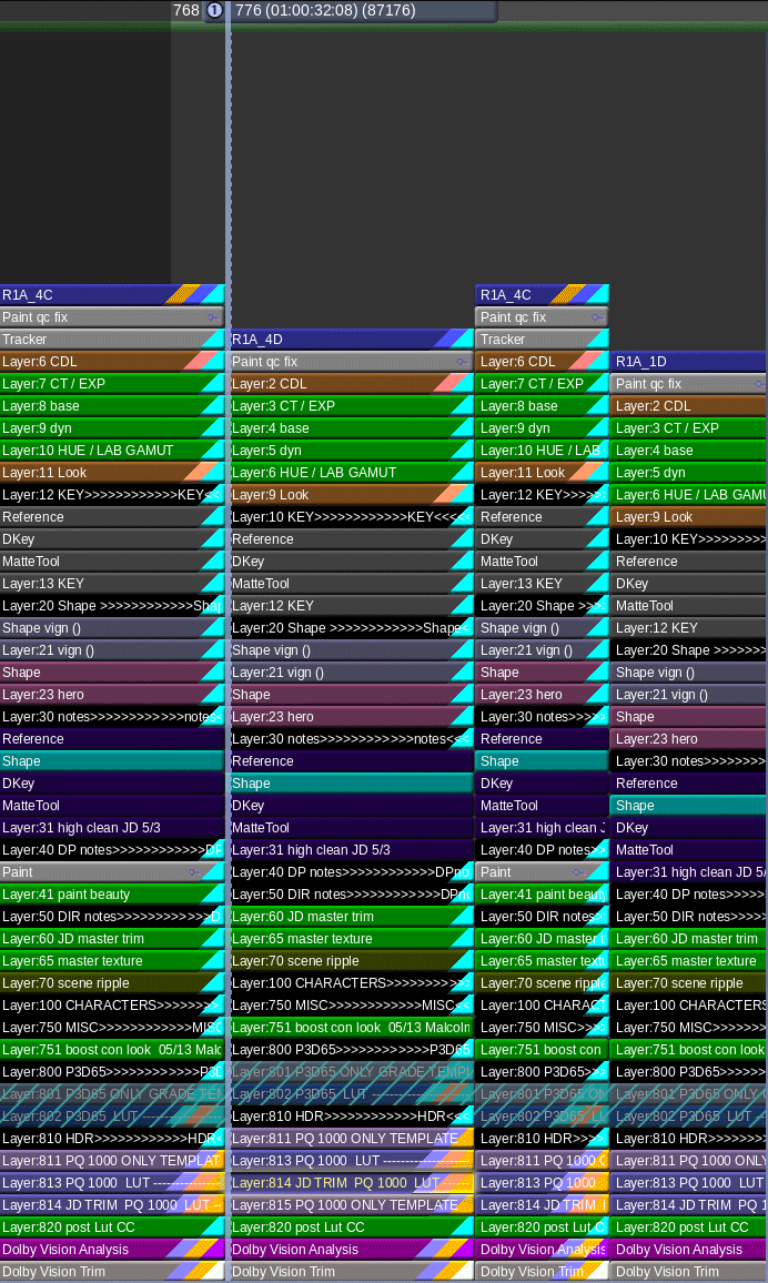
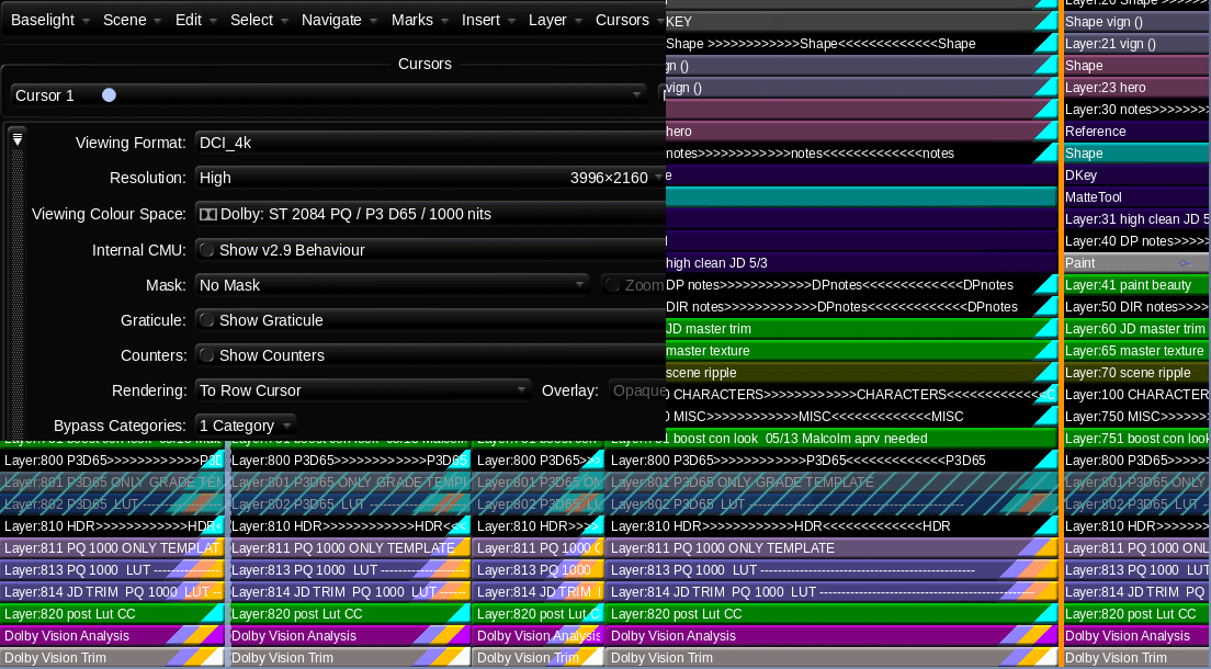
    There's a lot of great software out there and I always say use the right tool for the right job. For most of my jobs, that ends up being Baselight. The reasons are straightforward. Firstly, the colour science in the machine is second to none. Next, I appreciate the simplicity of the interface. When colouring long form, most of what you're doing is manipulating groups of many shots. Baselight makes this very easy to do. The other thing I can't live without is how Baselight organises and categorises. When you get towards the end of the project, things get hectic, and it's very nice to be able to sort and view in any way that a project demands. Often this has to do with missing visual effects or work I need to get to after the session. I use categories and marks so that I always know what the status of a scene is at any given time. This organisation also aids in communication. I can always keep post supervisors up to date with reports. Additionally, my in-house team always knows what needs to be done and what is already completed based on the organisation that we have put in place. I've always felt that Baselight was built by people who do the job of colour – not by committees or nonpracticing theoreticians. 

  • What are you working on now/next?

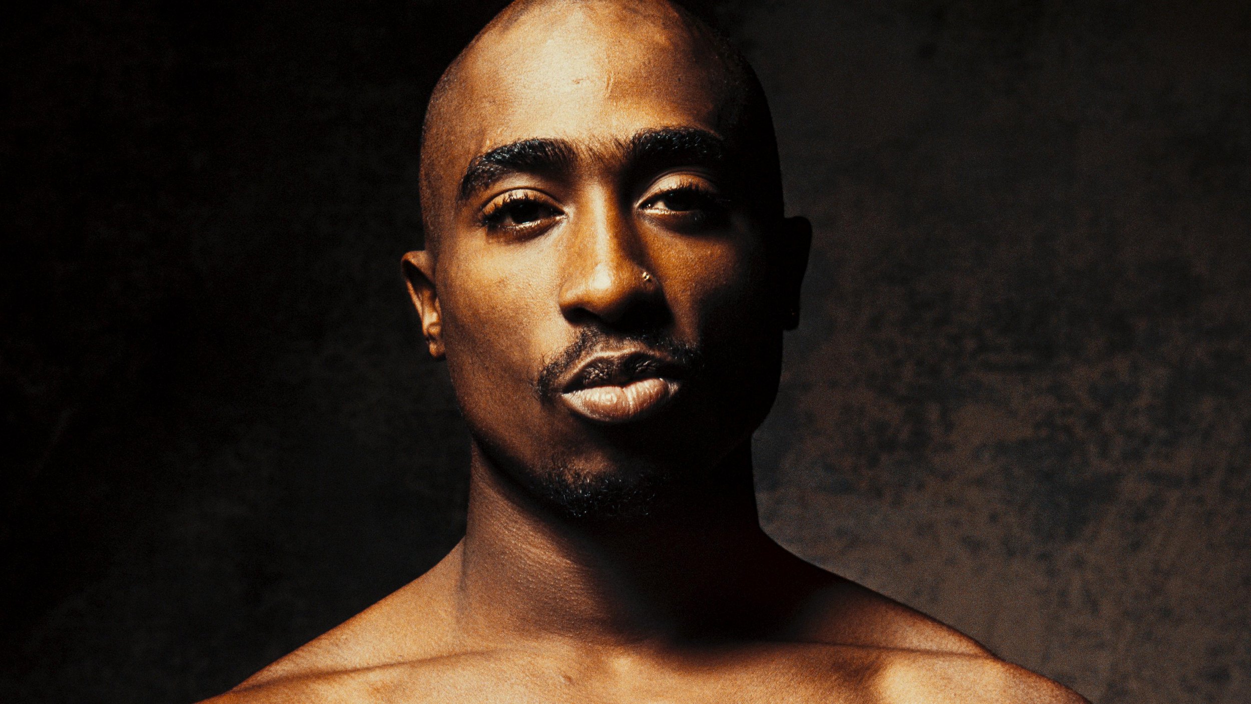
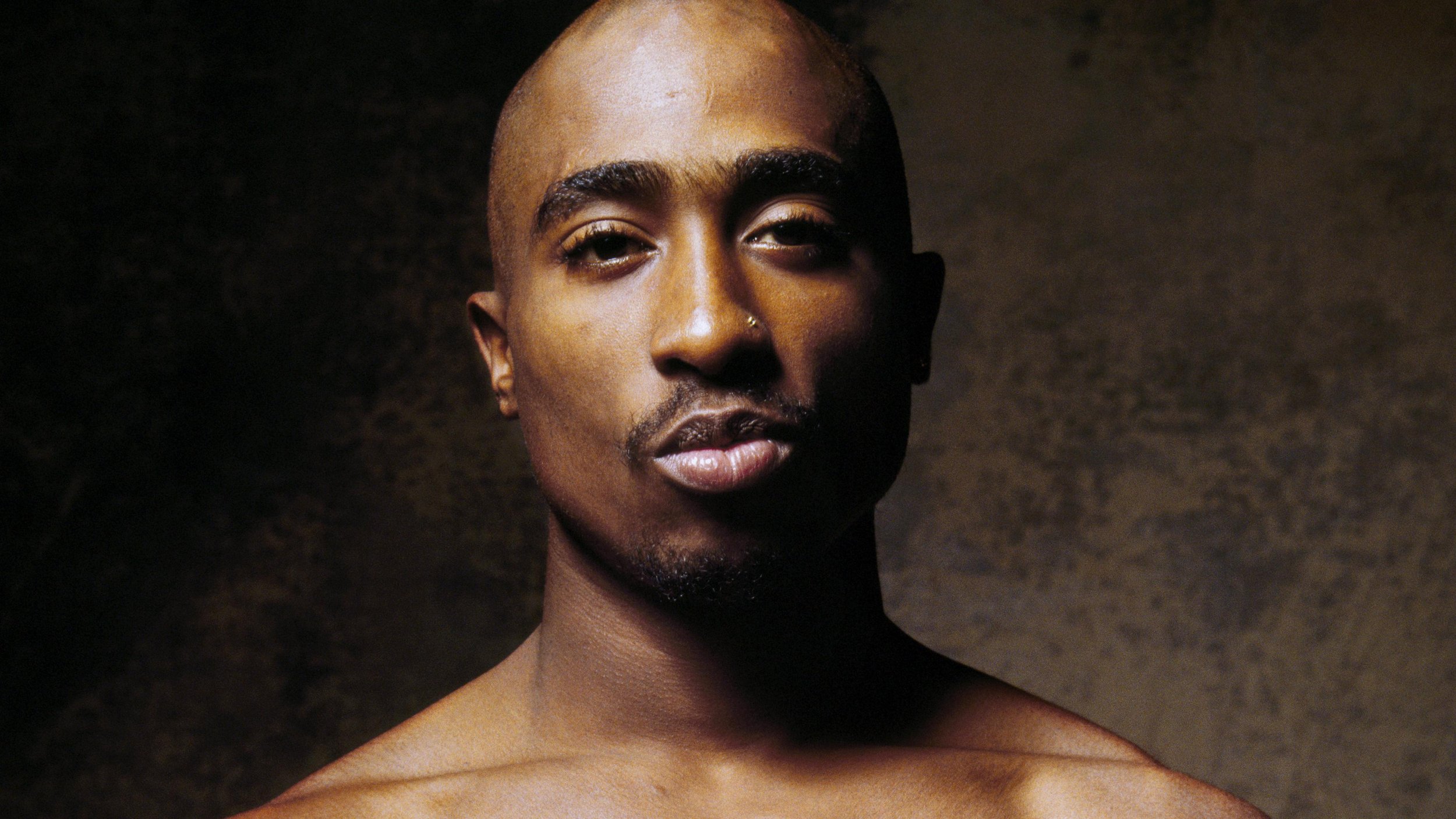
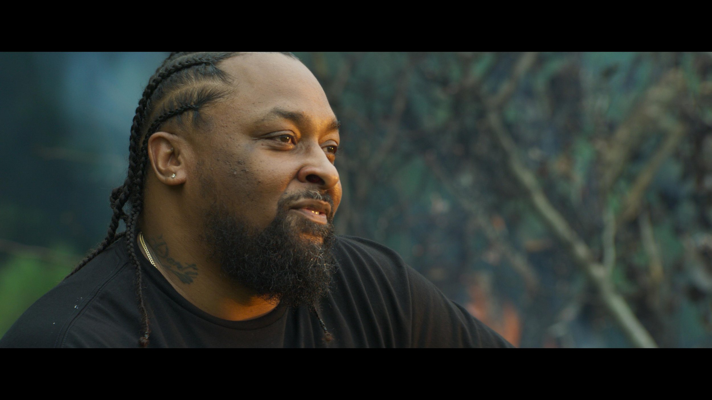
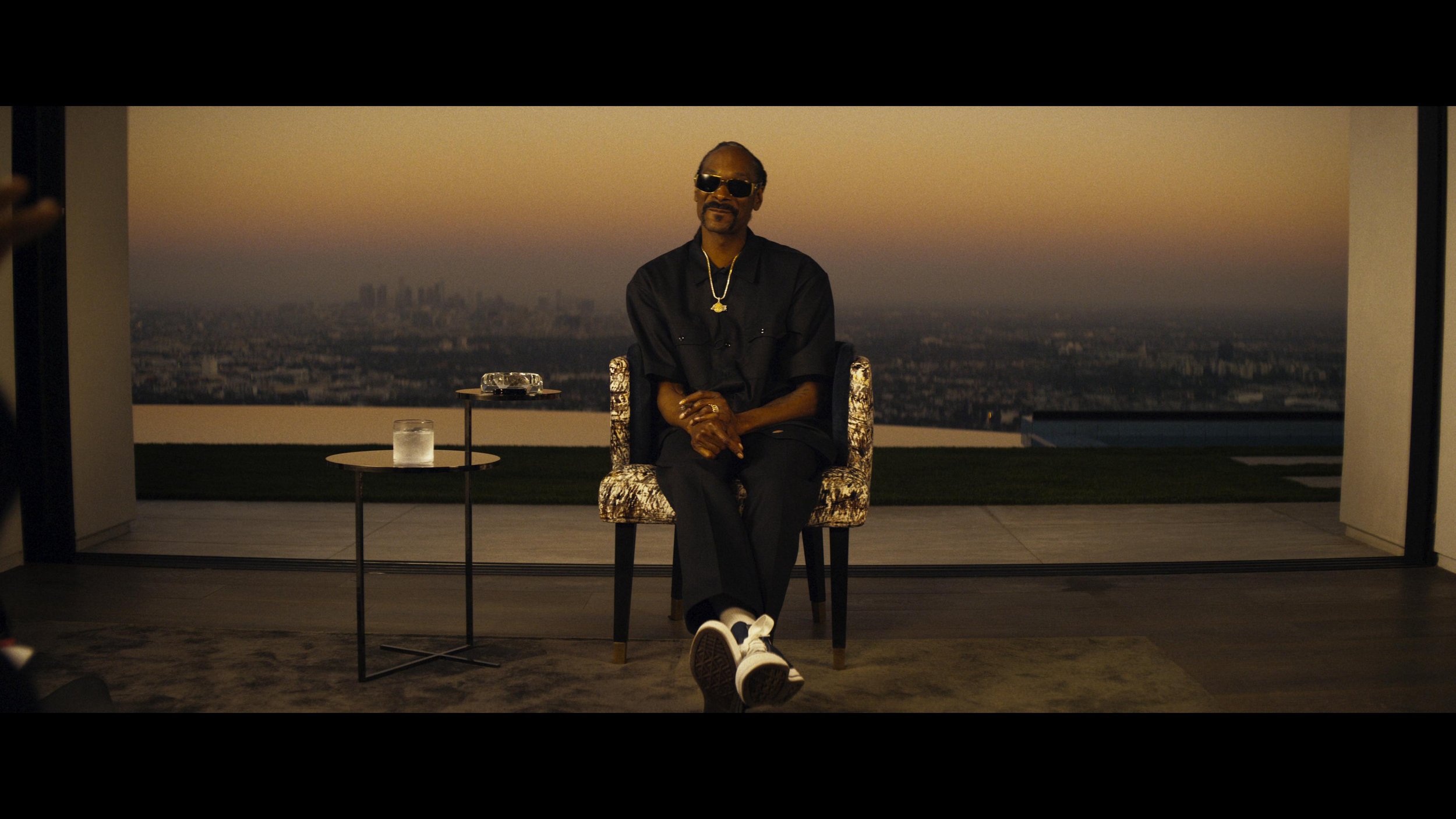
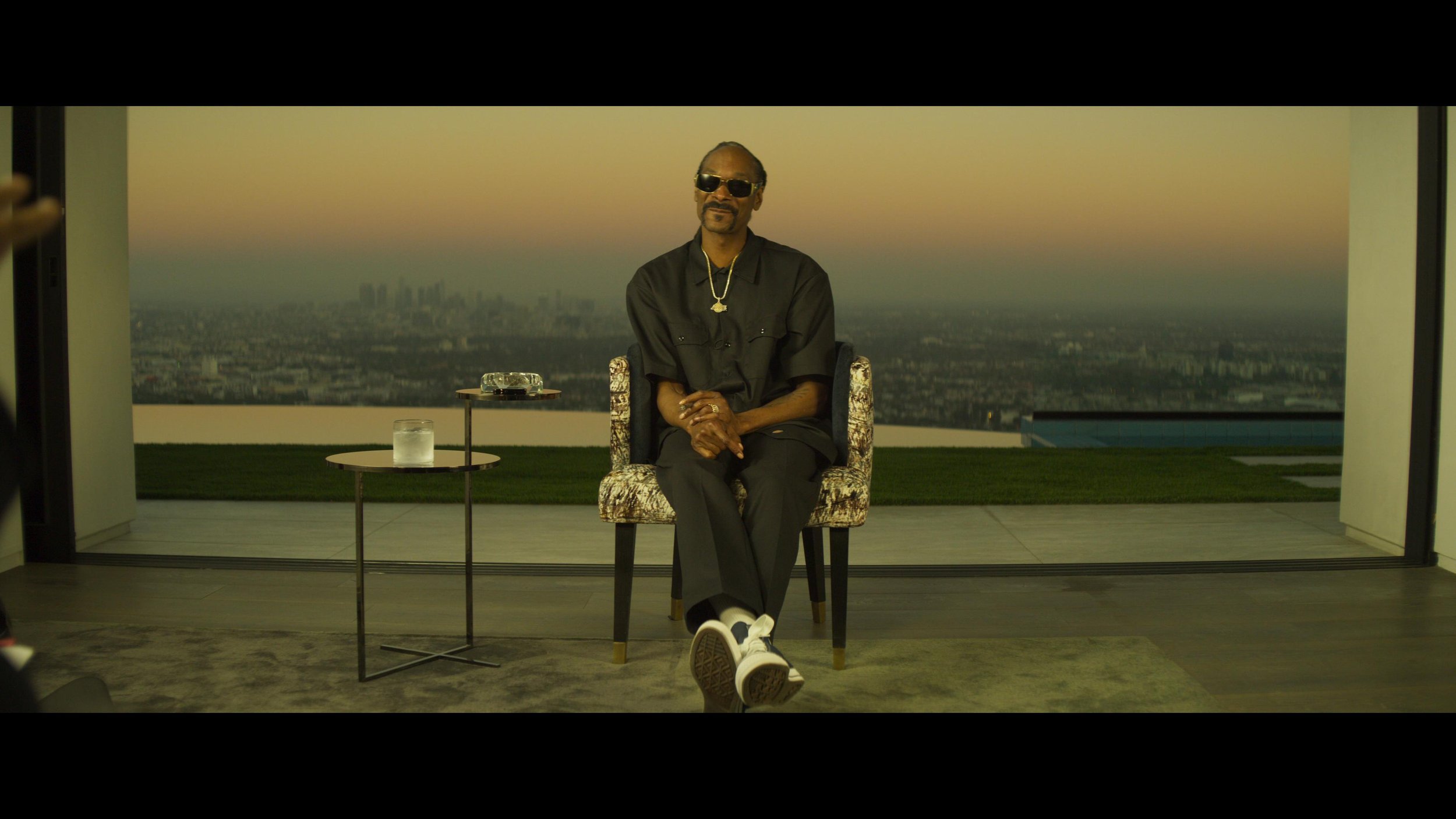
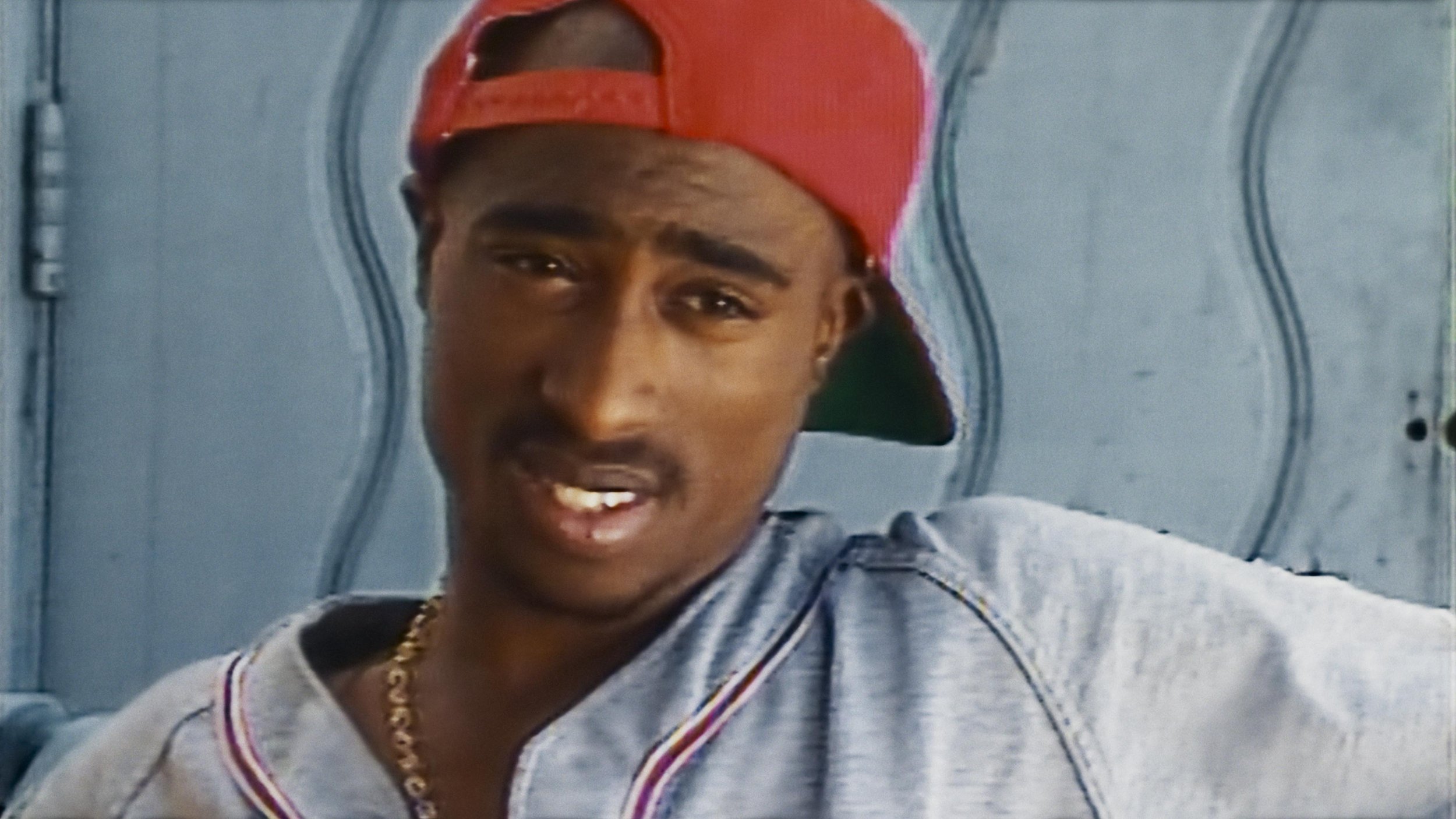
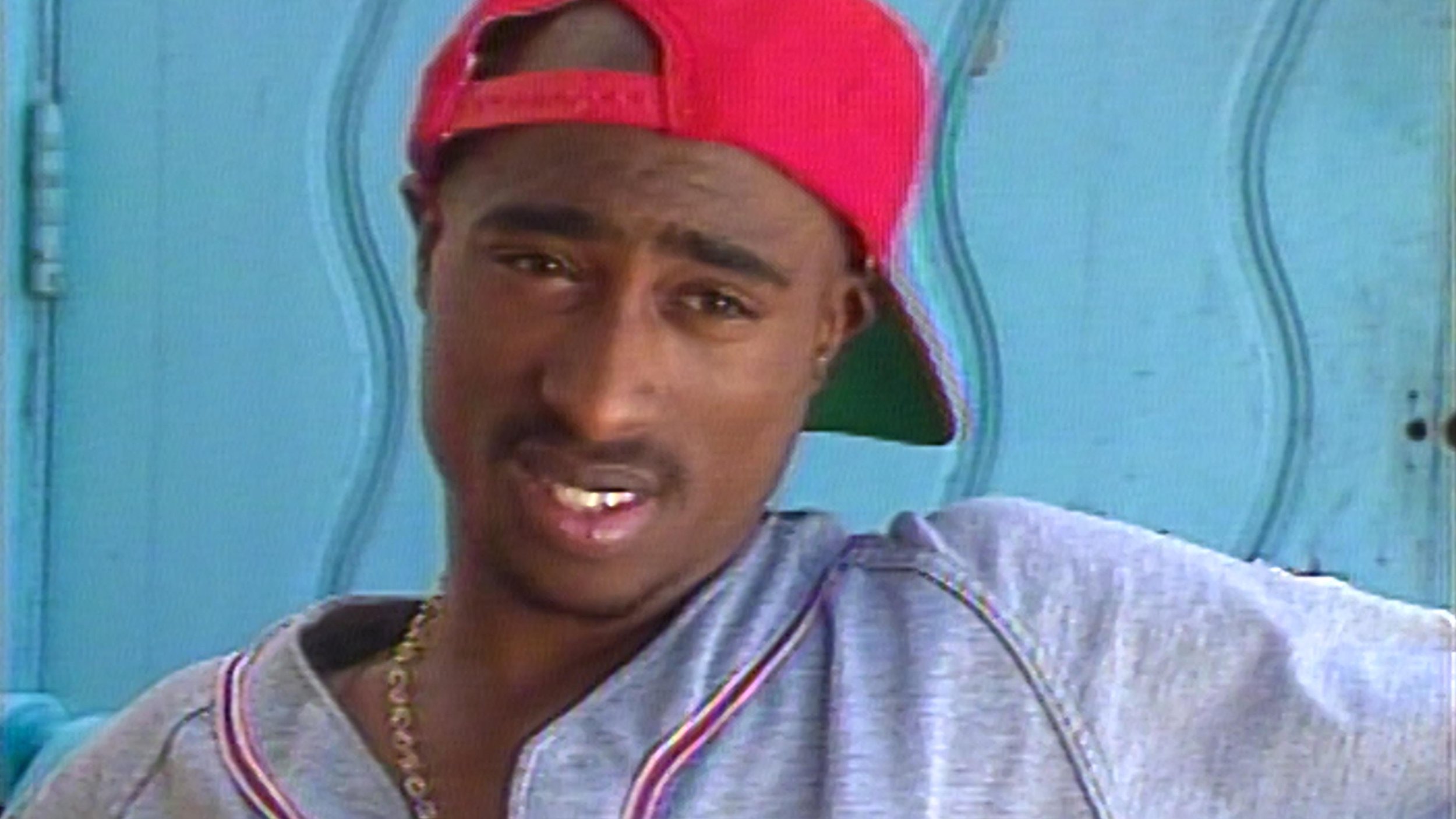
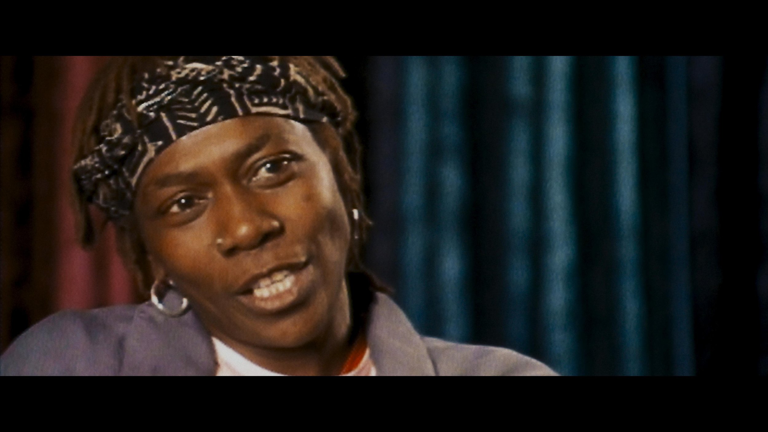
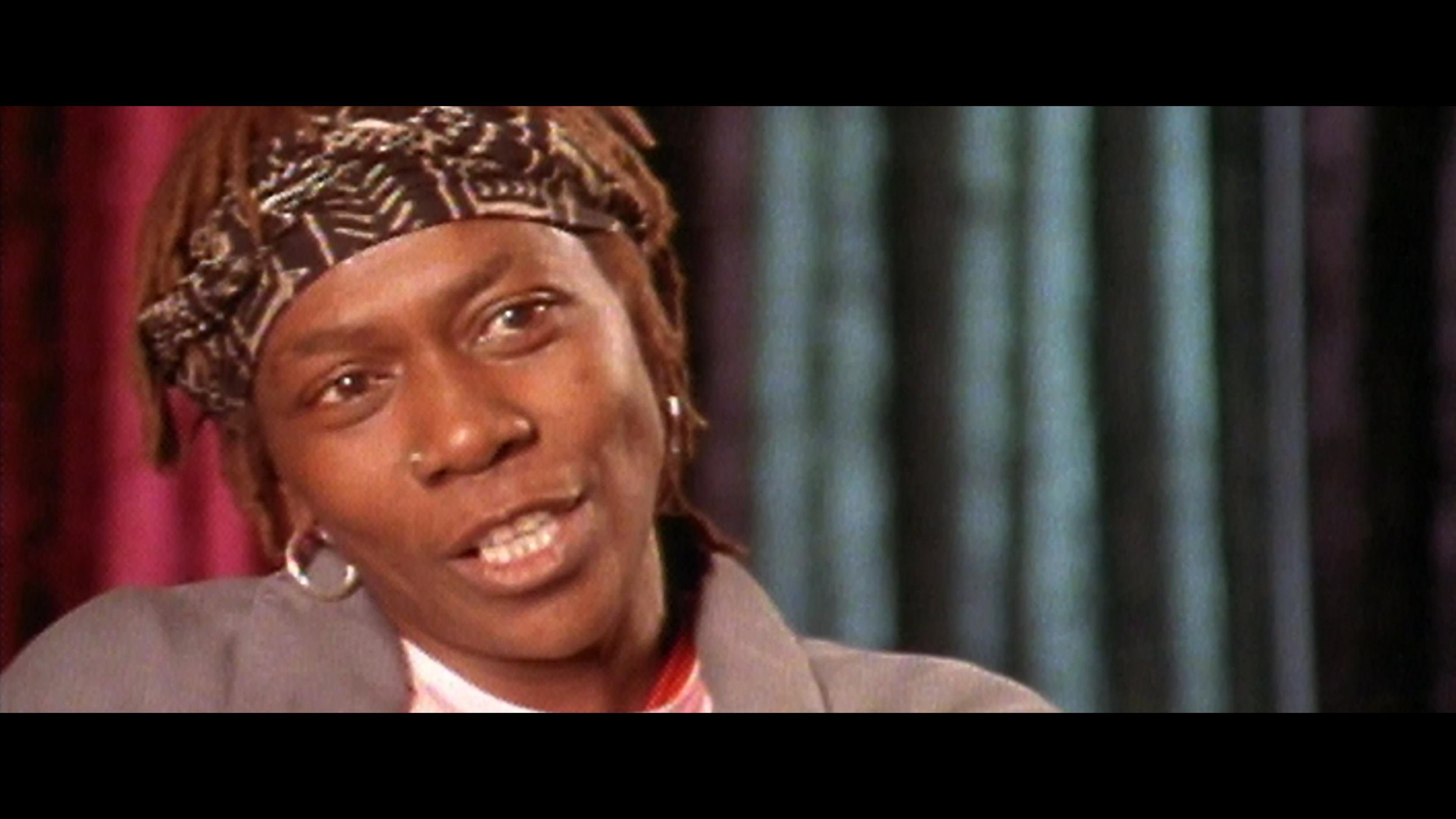
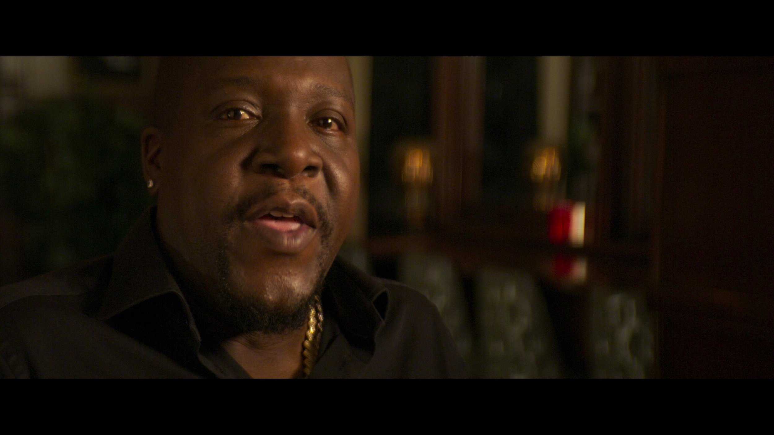
    I’m currently finishing a docuseries directed by Allen Hughes for FX about Tupac Shakur’s life and relationship with his mother called Dear Mama. The interviews have an exciting cognac look that I can’t wait to share. The first part premiered at the Toronto International Film Festival and was very well received.

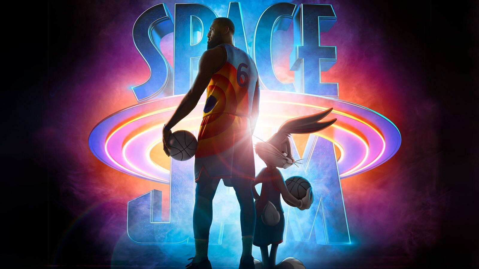
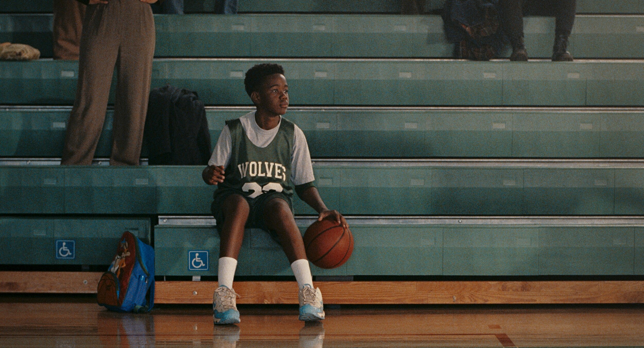
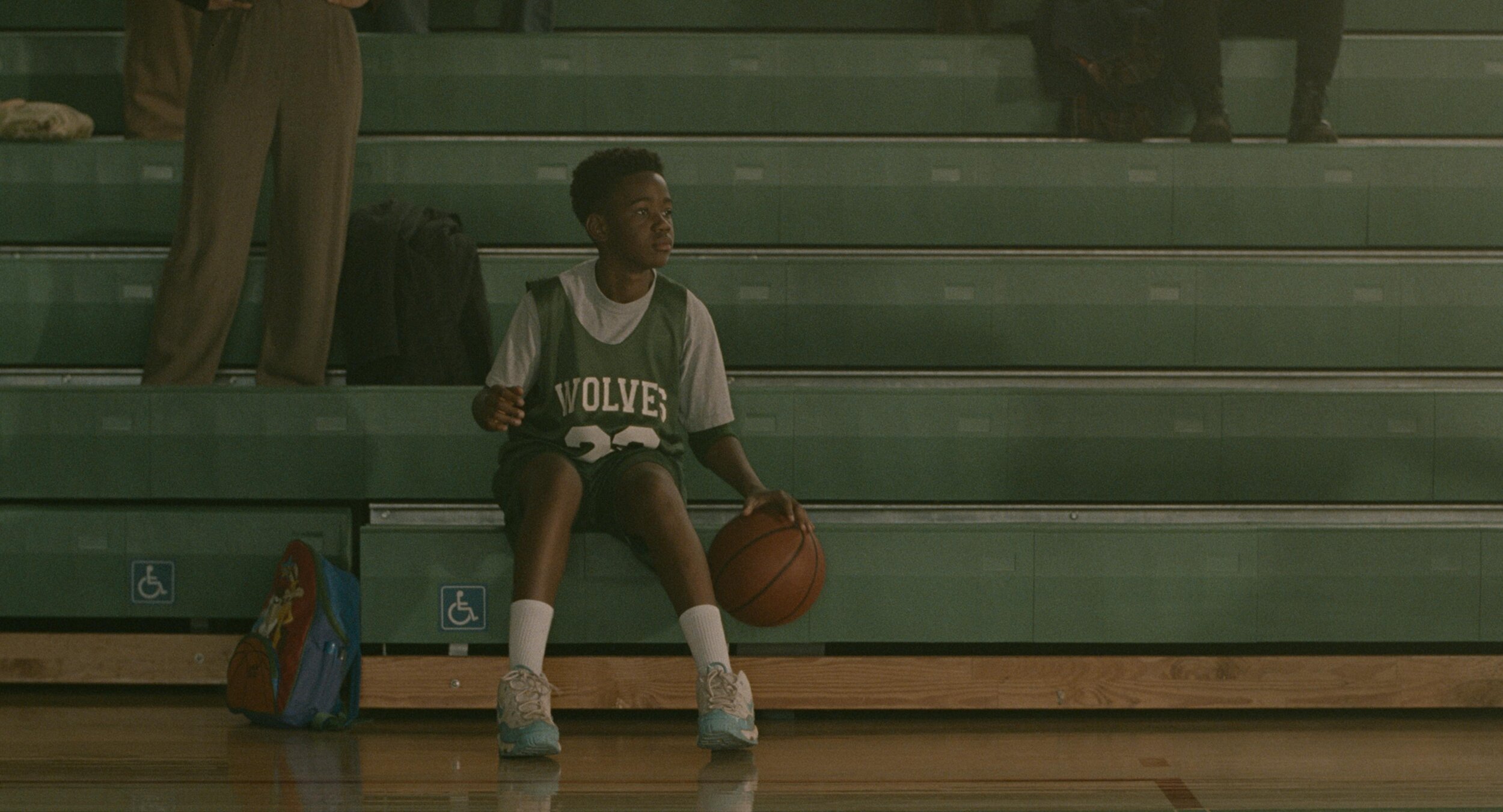
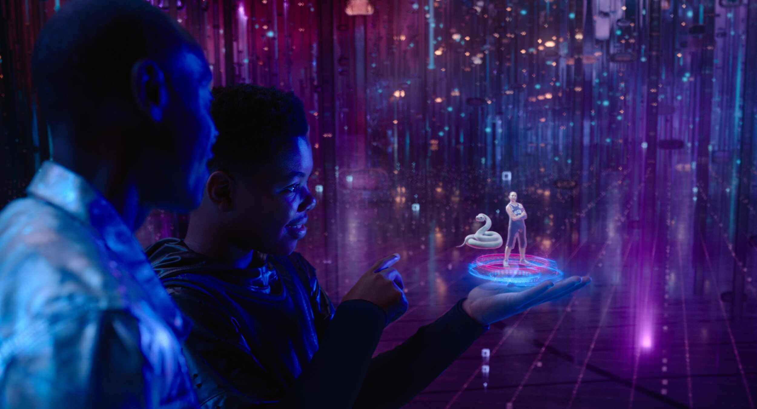
    Later this month, I will be finishing a feature called Sweetwater. It’s about the story of the first black NBA player, Nat “Sweetwater” Clifton. It is a period piece, so a lot of fun in the colour department. We contemplated a black-and-white double X look for the show but ultimately landed on a derivative of an Ektachrome simulation that I had built a while ago. It has a super cool look if I do say so myself.

    We are also supporting pre-production and dailies on A Gun on Second Street. This show is shooting on film, which is always pleasurable and exciting.  The look for the show is a straightforward Kodak film vibe, expertly lensed by Leo Hinstin.

    While we are on the topic of film shows, I’m also supervising the remastering of Superman II (yes, both cuts.) This will be released in early 2023 just in time to get people excited about Michael Shannon’s General Zod in The Flash. Kneel before Zod!

    Additionally, my team and I will return to animation early next year for an upcoming Netflix feature. More on that later at www.johndaro.com.


How to - VR 180 Video Files

Recently a few VR jobs came across my desk. I had done some equirectangular grading in the past, but it was always for VFX plates, Dome Theaters, or virtual production sets. These recent projects were different because they were purposely shot for 180 VR. Sorry, no looking back over your shoulder. The beauty of this format is that it brings back some of the narrative language that we have cultivated over 100+ years of cinema. We can direct your eye through shadow and light or pull your attention with a sound effect and sudden action. All while not having to worry if you are looking in the right direction.

I thought it would be a good idea to share what I have learned working with this type of immersive content. It’s all out there on the web but hopefully, this pulls it all together in one place and saves all of you a bunch of googling.

It all starts with a stitch

First, you will need to choose a rig. There are many off-the-shelf kits you can buy or you can go the homebrew route and cobble together a few cameras. There are also some interesting standalone devices that save you from having to use/manage multiple cameras. In all cases, there will be some post-processing needed. You will need stitching software like Mistika VR or Cara VR for multiple camera rigs.

Stitching is the process of combining multiple cameras together, color balancing them, and then feathering the overlapping pixels to create one seamless equirectangular image. There are a lot of tutorials on stitching and this post is not that.

6 cameras stitched

The red lines are the edges. The green lines are where the feather starts for the overlap.

Equidistant Fisheye

Extremely wide fisheye setups will need to be converted from equidistant fisheye to equirectangular

Want to avoid stitching all together? Use a very wide-angle lens. There are extremely wide fisheye setups that can capture more than 180 degree field of view. These will need to be converted from equidistant fisheye to equirectangular, but other than that, no stitching or post-processing is needed. Canon has just recently released a fantastic dual fisheye product that further simplifies capture. No matter the setup the end result of the post process will be a 2:1 canvas with each eye being a 1:1 equirectangular image placed side by side. This is probably a good time to talk about what an equirectangular image is.

Equirectangular Projection

This type of spherical visualization is basically the map of the globe that you had in school. It’s what happens when you take a sphere, map that to a cylinder, and unroll the cylinder to a flat projection. That is a gross oversimplification, but a good way to visualize what is going on nonetheless. Please see the equations below if you are coding something or if you are just a maths fan.

Transform Definition

Spherical to Planar Transform

This is the concept of 360 video. We work with it in a flat plane during post. Same idea for 180 VR video, but just one hemisphere instead. Click to see higher quality.

Ok Cool, I have VR Videos… Now what?

At this point, your videos are ready for post. I would consider everything up to this point dailies. Now it’s time to edit. All the usual editors we use daily can cut together these video files, but some are better suited than others. Premiere would be my first choice, with Mistika Boutique being a close second. In my workflow, I use both since the two tools have different strengths and weaknesses. Premiere has a clever feature that uses Steam VR and feeds your timeline to a headset. This is indispensable, in my opinion, for that instant feedback one needs while cutting and grading. VR is a different beast. Straight cuts, unless carefully planned out, can be very jarring if not nausea-inducing. Fades work well but are sort of the VR equivalent of “if you can’t solve it dissolve it.” Having all of these transitions live for evaluation and audition in the headset is what separates Premiere from the rest of the pack. SGO has recently released the ability for HMD review similar to Premiere, but I have yet to use the new feature. I will update this post once I take it out for a spin.

9/7/2023 Mistika update

So, I finally took Mistika’s HMD monitoring for a spin. It was super easy to set up. First, you download DEO VR player to your headset. Next, you click the HMD icon in Mistika. This will give an HTTP address with the ip of your machine. Type that into the address bar in DEO VR and ta-da. You end up with super steppy streaming VR video of your current environment.

It was OK to check geometry and color, but It would be hard to use for review. There are a couple of advantages to working this way, though. Multiple headsets are able to connect to the same stream. This is great when you have a room full of folks and everybody in their own headset. With Premiere, we pass the HMD around while everyone else views on the projector or stares at whoever is in the headset, patiently waiting for their turn. Another benefit is remote monitoring. You can technically serve out the ip of your local machine (this will probably need some port forwarding on your router and some VPN shenanigans) to the world. This means someone remote can connect, provided they are on the same network.

Pros

  • Easy setup

  • Multiple viewers at once

  • Remote viewing

  • Instant HMD feedback

Cons

  • Steppy playback

  • Needs a network-attached machine

  • Low resolution to maintain interactivity

Setting up your project

Premiere has a couple of dependencies to enable VR viewing. First, you need to install Steam VR. This is all you need if you are using a Windows Mixed Reality headset. You will need to install the Oculus software if you plan on using the Facebook offerings via Occulus link.

Now that your HMD is set up. Check out this blog post for step-by-step settings to get Premiere ready to edit VR. The settings are the same for 180VR. Just change the Horizontal Capture settings from 360 to 180.

Change “360” to 180 for VR180 editing.

Who’s Daniel and why do I care?

One downside about Premiere is the dreadfully slow rendering of HEVC files. Not to mention the 60mbps limitation. The Adobe dev team knows my feelings on the matter so hopefully, this will be fixed in a future update, but until then here is a crafty workaround. Cinegy is a company that makes a codec called daniel2. They have their own renderer. We don’t really care about their codec but we do like that their Cinegy HEVC render is way faster than Premiere’s native one. Here’s how to install it.

  • download and install

  • go to email and copy the license (it’s free but still needs to be licensed)

  • open the Cinegy license manager and paste the number

  • open a Premiere timeline and, press ctrl m for export, and check to see if Cinegy comes up as an export option.

  • set your bitrate and hit go. I would recommend a bitrate around 130mbps. This allows enough headroom for audio and will not have any issue playing back on the Oculus Quest 2.

The compromise of all this speed is what’s missing from the header of the video file. The file will be missing the flag that lets players know that it is a VR180 file. You can also use Resolve or Mistika for fast HEVC renders as an alternative to Daniel2. No matter how you get your HEVC file you will need to ensure the header is correct. More on this after we sync the audio.

Audio is not my world

I’m a picture guy. Some would even say a big picture guy ;) The one thing I know for sure is that when it comes to audio, I know when it sounds good, but I haven’t a clue on what it takes to get it there. But no more excuses! This is the year that I want to dig deeper. Check back in a few and I hope to update this section with the FB 360 Protools integration information. Until then, the audio is best left to the pros.

Spatial sound can come in different orders with better immersion the higher you go. First-order ambisonics has 4 channels. Second-order has 9, while Third-order files contain 16 tracks. Now it may seem that third order is the way to go, but in my experience, the difference between second-order and third-order isn’t that noticeable on the built-in headset speakers. Then again, I’m, a picture guy. Whatever sound you receive from your mix, you will need to sync it to your HEVC file.

We use the FaceBook 360 app to marry the picture to the spatial sound. The app has some dependencies to install before you can use it.

  1. Python - if you are like me you may have already had this one!

  2. FFMPEG - this link has a tutorial for installing on a Windows machine. Click “code” then “Download Zip.” Uncompress and copy to the FB360 directory

  3. GPAC - make sure you use the legacy 0.8.1 version. This stumped me for a bit the first time.

Now we can run FB360 The first step is to point to your video file. Then choose the right order of ambisonic audio and point to the wav file from the mix. There is also an option to load a standard “head locked” stereo audio track. This can be good for narration, music, or other types of audio that do not need to be assigned a spatial location.

Finally, we hit “Encode.”

It’s not a vaccine but it is an injection

Google VR 180 Creator can be downloaded here. You can’t even find this anymore but it’s super important. There are other options including the original source code for this app, but this little gizmo is by far the easiest way to inject the proper metadata into the header of your HEVC file. This lets players know it’s a side-by-side 180 VR file.

VR180 Creator

Click “Prepare for Publishing. Drag your video in. Set it to side by side and hit export. You will have a new video that has been “injected” with the correct metadata.

How do I view the final product?

Plugin your Oculus Quest into your computer and put it on. Click allow file transfer. Now take off the headset and go to your computer. It will show up as a USB drive. Navigate to the movies directory and simply drag your files across. Now you can unplug your Oculus. Go to Oculus TV/ my media and click your video. If everything was done correctly you are now in a stereo 180 world!

You can also upload to Facebook or Youtube for streaming distribution. Here are two links that contain the specs for both. As with all tech, I’m sure these will change as better headsets are released.

Thank you to the experts that have helped me along the way.

Hopefully, this helps navigate the murky waters of VR just a bit. I’m excited to see what you all create. A big thanks to Hugh Hou for making a ton of really informative videos. A tip of the cap to Tom Peligrini for bringing us all together and leading the charge. I also owe a debt of gratitude to David Raines, for not only introducing Hugh to me but also making sure our VR pictures have all the emotion and immersive sound one could ask for. There’s a pretty great team here at Warner PPCS.

As always, thanks for reading.

JD

Space Jam: A New Legacy - Multiple Worlds, Multiple Deliveries.

Hey Everybody! Space Jam: A New Legacy directed by Malcolm D. Lee is out today. I wanted to take a second to highlight the super slick color workflow which allowed us to work on multiple versions concurrently.

Capture

Space Jam: A New Legacy was masterfully lensed by Salvatore Totino. The two primary capture mediums were 35mm Kodak film and the entire lineup of Arri cameras, mainly the LF. The glass used was Zeiss Supremes and Master Primes. There were also a handful of scans from archival films which were used as plates for animation.

VFX

ILM was running point for the VFXs on this show. Grady Cofer and his team were a dream to work with. There is a reason ILM continues to be the best in class. The knowledge and expertise ILM employs is second to none. Early on Grady connected me with their head of color science, Matthias Scharfenberg. I thought I knew what I was doing when it comes to color science until I saw what Matthias had going on with CTL and Nuke. I learned a lot from our chats. He was super gracious in sending over his Nuke scripts which allowed me to build a Baselight transform that matched ILM’s pipeline. This insured a one-to-one representation of their stellar work.

Two Worlds, One Grade

The show can basically be broken down into two looks. In “Space Jam: A New Legacy” there is the real-world and the Warner Bros Serververse.

We chose an analog celluloid vibe for the real world. The Serververse has a super clean, very 1s and 0s look to it. Most of the real world is shot on film or is Arri Alexa utilizing film emulation curves paired with a grain treatment. Some sequences have a mix of the two. Let me know if you can tell which ones😉.

The look of the digital world changes depending on where the characters are in the Serververse. The base look of the Serververse is the vanilla ACES ODT with restricted primaries in the mid-tones complimented by exaggerating the saturation for highly saturated colors.

All the other looks are riffs off this base LMT with the exception of the library classics. These were graded to look like their existing masters and the new footage was matched in.

Multiple Deliverables, One Timeline

The challenge of this show, beyond the sheer number of VFX and moving parts, was the delivery schedule. The Post Supervisor Lisa Dennis asked to have the theatrical version and the HDR video versions delivered days apart. To hit the dates requested, I graded simultaneously in HDR and SDR. I did most of the heavy lifting in HDR PQ 1000nits. Then I trimmed at 14FL to ensure the reel was ready for filmmaker review. Poping back and forth between outputs was made possible by two great tools. Firstly, I used ACES 1.1 color management to normalize all the different sources into one grading space.

Secondly, I used Baselight’s “Bypass Categories” functionality to if/then the timeline. Basically, I had one timeline that would represent itself differently depending on the output selected. Different layers were toggled for different sources and outputs. The LMTs used often had SDR and HDR versions to further exacerbate the combinations. This was a critical hurdle to overcome and the Baselight gave me the tools to accomplish the organization of a very complicated timeline with ease.

Approvals

The Color sessions were supervised by Malcolm, Sal, and Bob Ducsay. We used Nevion and ClearView for remote sessions, but most of the work was done in-person on the lot here in Burbank. The Animated sequences were supervised by Spike Brandt and Devin Crane. These guys are animation heavyweights, so very cool to be in such good company for an animation nerd like me.

Most of the tweaking on the animation was for continuity fixing. A few of the shots we composited for final in the Baselight. This gave Devin and Spike a little extra creative freedom than a baked shot would have.

Reference for Tweety’s floor

After all the color decisions were made, Malcolm had his final pass and the masters were created. All deliverables from that point were sub-masters from the hero PQ deliverable. These included deliverables such as the Dolby Vision Theatrical version and 709 SDR version derived from the Dolby XML metadata.

Go See It!

Thanks for reading how the look of this candy-colored revival came together. Working on Space Jam was a wild ride. I had to tap into my background in photochemical film processing and knowledge of the latest digital grading techniques to create unique looks for all the different cinematic worlds visited. The film is a nostalgic love letter to the rich history and legacy of the Warner Bros. Studio. I couldn't be more proud of the Warner Color team, especially Leo Ferrini and Paul Lavoie. A big thanks to you guys! Putting this film together was a monumental task and I am ecstatic with end result. Check it out in theaters and on HBO Max today!

Best Practices: Restoring Classics

2020 - The year of Restorations

Now that we seem to be on the other end of the pandemic, I wanted to take a moment to look back on some of the projects that kept me busy. Restorations were the name of game during covid times. With productions shut down and uncertainty in the theatrical marketplace, I had time in my schedule to breathe new life into some of my favorite classics.

Over the last year, I have restored;

Let’s take a look at a couple of these titles and talk about what it means to remaster a film with our contemporary toolset.

The Process

The process for remastering classic titles is very similar to finishing new theatrical work with a couple of additional steps. The first step is to identify and evaluate the best elements to use. That decision is easy for digitally acquired shows from the early 2000’s. In those instances, the original camera files are all that exist and are obviously the best source. Film shows are where it gets particularly ambiguous. There is a debate whether starting from the IP or original negative yields better results. Do we use the original opticals or recreate them from the elements? Black and white seps vs faded camera neg? These questions all need to be answered before you begin the work. Usually I prefer to start with the OCN when available.

Director Scanner

Director Scanner

Arri Scan

Arri Scan

Scanning

Scanning is arguably the most critical part of the process. Quality and success will live or die by the execution of great scans. Image breathing, movement, and general sharpness are issues to look for when evaluating. Scans should not be pretty but rather represent a digital copy of the negative.  In a perfect closed-loop system, a scanned piece of film, once shot back out on a calibrated recorder needs to closely match the original negative.

Digital Restoration

The next step in making an old project shiny and new is to repair any damage to the film from aging or that was inherent in production. this includes painting out splice lines, gate hairs, dirt, and scratches. Film processing issues like breathing or turbulence can also be taken care of in this step. I prefer to postpone flicker removal until the grading step since the contrast will have an effect on the amount of flicker to remove. Some common tools used for restoration include MTI and PF Clean. This work is often outsourced because of the high number of man-hours and labor costs associated with cleaning every frame of film. Some companies that do exceptional restoration work are PrimeFocus and Prasad among others.

Grading

Grading restoration titles is a total sub-discipline from grading as a whole. New theatrical grading starts with references and look development to achieve a certain tone for the film. There is a ton of work that goes into this process. Restoration grading differs since the goal is staying true to that original intent. Not reimagining it. Much like new theatrical grading, a good reference will set you up for success. My preferred reference is a filmmaker-approved answer print.  These were the master prints that best represented the filmmakers’ creative intent.

kinoton-fp30d-696x1024.jpeg

A good practice is to screen the print and immediately set looks for the scans getting as close as possible at 14fl projected. An upgrade to this workflow is to use a projector in the grading suite like a Kinoton. These projectors have remote control and cooling. This allows you to rock and roll the film. You can even freeze-frame and thanks to the built in cooling your film doesn’t burn. Setting up a side-by-side with the film vs digital is the best way to ensure you have a match to the original intent. These corrections need to happen using a good color management system. Aces for example has ODTs for theatrical 48nits which is the equivalent of 14fl. Once you have a match to the original, the enhancement can start.

There would be no point in remastering if it was going to look exactly like the existing master. One great reason to remaster is to take advantage of new advancements in HDR and wide color gamut formats. Film was the original HDR format containing 12 stops of range. The print was the limiting factor, only being able to display 8 of those stops. By switching the ODT to PQ P3D65, we can take advantage of the larger container and let the film display all that it has to offer.

My approach is to let the film land where it was originally shot but tone-mapped for PQ display. This will give you a master that had the original intent of the print but in HDR. I often use an LMT that limits the gamut to that of the emulsion used for original photography. This also ensures that I’m staying true to the film's original pallet. Typically there is some highlight balancing to do since what was white and “clipped” is now visible. Next is to identify and correct any areas where the contrast ratios have been disrupted by the increased dynamic range. For example, if there was a strongly silhouetted shot, the value of the HDR highlight can cause your eye to iris down changing the perception of the deep shadows. In this case, I would roll off the highlights or lift the shadows so the ratio stays consistent with the original. The extra contrast HDR affords is often welcomed but it can cause some unwanted issues too. Grain appearance is another one of those examples.


Grain Management

Film grain is one of those magic ingredients. Just like salt, you miss it when it is not there and too much ruins the dish. Grain needs to be felt but never noticed. It is common for the noise floor to increase once you have stretched the film scan to HDR ranges. Also, the grain in the highlights not previously visible starts to be seen. To mitigate this, a grain management pass needs to be implemented. This can come before the grade, but I like to do this after since any contrast I add will have an effect on the perceived amount of noise. Grain can impart a color cast to your image, especially if there is a very noisy blue channel. Once removed this needs to be compensated for and is a downside of working post grade. It is during this pass that I will also take care of flicker and breathing which the grade also affects. My go-to tool for this is Neat Video. You would think that after a decade of dominance some software company would have knocked Neat off their throne as king of the denoise, but it hasn’t happened yet. I prebake the scans with a Neat pass (since Baselight X doesn’t play nicely with Neat yet.) Next, I stack the Neat’ed scan and the original as layers. This allows me to blend in the amount of grain to taste. The goal of this pass is to keep the grain consistent from shot to shot, regardless of the grade. The other, and most important goal is to make the grain look as it did on the print.

Dolby Trim

After the HDR10 grade is complete, it’s time for the Dolby trim. I use the original 14 FL print match version as a reference for where I want the Dolby trim to clip and crush. Once all the trims have been set, I export out a Dolby XML expecting rec2020 primaries as input. Yes, we graded in P3, but that gamut will be placed into a 2020 container once we export.

Mastering

Once all the work has been completed it’s time to master. Remasters receive the same treatment as new theatrical tiles when it comes to deliverables. The common ones are as follows:

  • Graded PQ P3D65 1000nit 16bit Tiff Files or ACES AP0 EXRs

  • Un-Graded PQ P3D65 16bit Tiff files or ACES AP0 EXRs

  • Graded 2.6 XYZ DCDM 14fl

  • Graded PQ XYZ 108nit 16bit Tiff Files or ACES AP0 EXRs for Dolby Vision Theatrical

  • Bt1886 QT or DPX files created from a Dolby XMLIMF PQ rec2020 limited to P3D65 1000nit

Case Studies

Perfect worlds do exist but we don’t live in one. Every job is a snowflake with its own unique hurdles. Remastering tests a colorists abilities across many disciplines of the job. Stong skills in composting, paint, film manipulation, and general grading is what is required to achieve and maintain the original artistic intent. Here are two films completed recently and a bit on the challenges faced in each.

Teenage Mutant Ninja Turtles

For those of you that don’t know the Ninja Turtles are near and dear to me. Not only was I a child of the 80s, but my Father was in charge of the postproduction on the original cartoons. He also wrote and directed many of them. When this came up for a remaster, I jumped at the chance to get back to my roots.

This film only required an SDR remaster. The output delivery was to be P3 D65 2.6 gamma. I set up the job using Baselight’s color management and worked in T-Log E_Gamut. The DRS was performed by Prasad with additional work by yours truly BECAUSE IT HAD TO BE PERFECT!

dark_1.13.1.jpg

There were two main color hurdles to jump through. First, some scenes were very dark. I used Baseligt’s boost shadow tool to “dig” out detail from the toe of the curve. This was very successful in many of the night scenes that the film takes place in.

Another trick I used was on the Turtle’s skin. You may or may not know, but all the turtles have different skin colors. Also, most folks think they are green, when in fact there is very little green in their skin. They are more of an olive. To make sure the ratio of green to yellow was correct I converted to LAB and graded their skin in that color space. Once happy, I converted it back to T-Log E-Gamut. LAB is a very useful space for affecting yellow tones. In this space, I was able to tweak their skin and nothing else. Sort of like a key and a hue shift all in one.

tmnt_lab.gif

The SDR ended up looking so good that the HDR was finished too. The HDR was quick and painless because of Baselight’s built-in color management. Most of the heavy lifting was already done and only a few tweaks needed.


Space Jam

Space Jam was a formative film from my youth. Not only did I have Jordan’s at the time, but I was also becoming a fledgling animation nerd (thanks Dad) when this film was released.

I set up the project for ACES color management with a Kodak LMT that I had used for other films previously. This reigned in the extreme edge of gamut colors utilized in the animation.

The biggest challenge on this project was cleaning up some of the inherent artifacts from 1990’s film recording technology. Cinesite performed all of the original composites, but at the time they were limited to 1k film recording. To mitigate that in a 4k world, I used Baselight’s texture equalizer and convolutional sharpen to give a bit of snap back to the filmed out sections.

Vishal Chathle supervised the restoration for the studio. Vishal and I boosted the looney tunes to have more color and take advantage of the wider gamut. The standard film shots, of which there were few, were pretty straightforward. Corrected mostly with Baselight’s Basegrade. Basegrade is a fantastic tool where the corrections are performed in linear gamma. This yields a consistent result no matter what your working space is.

Joe Pytka came in to approve the grade. This was very cool for me since not only did I grow up watching this film of his, but also all those iconic Superbowl commercials from the 90’s that he did. A true master of camera. He approved the grade but wished there was something more we could do with the main title. The main title sequence was built using many video effects. To recreate it would have cost a fortune. We had the original film out of it, but it looked pretty low res. What I did to remedy this was to run it through an AI up-rezer that I coded a while ago for large format shows.

The results were astounding. The titles regained some of their crisp edges that I can only presume were lost from the multiple generations of opticals that the sequence went through. The AI was also able to fix the aliasing inherent in the low res original. In the end, I was very proud of the result.

The last step was grain management. This show needed special attention because the grain from the Jordan plate was often different from the grain embedded in the animation plate that he was comped into. In order to make it consistent. I ran two de-grain passes on the scan. The first took care of the general grain from the original neg. The second pass was tuned to clean up Jordan’s grain that had the extra layer of optical grain over the top. It was a complicated noise pattern to take care of. Next, I took the two de-grained plates, roto’ed out Jordan, and re-comp-ed him over the cleaned-up plate. This gave consistency to the comps that were not there in the original.

Another area where we helped the comps were in animation error fixing. Some shots had layers that would disappear for a couple of frames, or because it was hand-drawn, a highlight that would disappear and then reappear. I used Baselight’s built-in paint tool to repair the original animation. One great feature of the paint tool is its ability to paint on two’s. An old animation trick is to only animate at 12fps if there isn’t a lot of motion. Then you shoot each frame twice. This halves the number of frames that need to be drawn. When I was fixing animation issues I would make a paint stroke on the frame and Baselight would automatically hold it for the next one. This cut down my work by half just like the original animators!

I was honored to help restore this piece of animation history. A big thanks to Michael Borquez and Chris Gillaspie for the flawless scanning and deep investigation of the best elements to use. Also a tip of the cap to Vishal Chathle for all the hard work and lending me his eagle eye!

Final Thoughts

Restoration Colorist should be a credit on its own. It’s unfortunate that this work rarely gets recognized and even less frequently gets credit. It is hard enough to deliver a director’s artistic vision from scratch. It’s arguably even harder to stay true to it 30 years later. Thanks for reading and check out these projects on HBO Max soon!

Baselight Tips and Tricks

Hey everybody! Here is a video that Filmlight just released on their website. It’s a great series and I’m happy to have contributed my little bit. Let me know what you think.


VHS Shader

A show that I’m currently working on was asking about a VHS look. It made me think of a sequence I did a while ago for Keanu shot by Jas Shelton. In This sequence, we needed to add Keegan-Michael Key to the Faith music video by George Michael.


Often, as colorists, we are looking to make the image look the best it can. This was a fun sequence because stepping on an image to fit a creative mood or period is sometimes harder then making it shinny and beautiful. When done correctly (I’m looking at you Tim and Eric Awesome Show Great Job) it can be a very effective tool for storytelling.

We uprezed the Digibeta of the music video. I then used a custom shader to add the VHS distress to the Arri Alexa footage of Key. I mixed the shader in using opacity until it felt like it was a good match. Jas and I wanted to go farther, but we got some push back from the suits. I think in the end the sequence came out great and is one of my favorite parts of the film… and the gangster kitty of course! Please find the shader used below if you would like to play.

alllll awwwww Keanu!

alllll awwwww Keanu!


JD_logo_VECTOR.jpg

How To - AAF and EDL Export

AAF and EDL Exporting for Colorists

Here is a quick howto on exporting AAFs and EDLs from an Avid bin. Disclaimer - This is for colorists, not editors!

Exporting an AAF:

First, open your project. Be sure to set the frame rate correctly if you are starting a new project or importing a bin from another.

First, open your project. Be sure to set the frame rate correctly if you are starting a new project or importing a bin from another.

Next, open the bin that contains the sequence you want to export an AAF from.

Next, open the bin that contains the sequence you want to export an AAF from.

Select the timeline and right click it. This sequence should already be cleaned for color. Meaning, camera source on v1, opticals on v2, speed fx on v3, vfx on v4, titles and graphics on v5.

Select the timeline and right click it. This sequence should already be cleaned for color. Meaning, camera source on v1, opticals on v2, speed fx on v3, vfx on v4, titles and graphics on v5.

After you right click, go “Output” -> “Export to File”

After you right click, go “Output” -> “Export to File

Navigate to the path that you want to export to.. Then, click “Options”

Navigate to the path that you want to export to.. Then, click “Options”

In the “Export As” pulldown select “AAF.” Next, un-check “Include Audio Tracks in Sequence” and make sure “Export Method:” is set to “Link to(Don’t Export) Media.” Then click “Save” to save the settings and return to the file browser.

In the “Export As” pulldown select “AAF.” Next, un-check “Include Audio Tracks in Sequence” and make sure “Export Method:” is set to “Link to(Don’t Export) Media.” Then click “Save” to save the settings and return to the file browser.

Give the AAF a name and hit “Save.” That’s it! Your AAF is sitting on the disk now.

Give the AAF a name and hit “Save.” That’s it! Your AAF is sitting on the disk now.

Exporting an EDL:

We should all be using AAFs to make our conform lives easier, but if you need an EDL for a particular piece of software or just want something that is easily read by a human, here you go.

Setup the project and import your bin the same as an AAF. Instead of right-clicking on the sequence, go -> “Tools” -> “List Tool” and it will open a new window. I’m probably dating my self, but back in my day, this was called “EDL Manager.” Li…

Setup the project and import your bin the same as an AAF. Instead of right-clicking on the sequence, go -> “Tools” -> “List Tool” and it will open a new window. I’m probably dating my self, but back in my day, this was called “EDL Manager.” List Tool is a huge improvement since it lets you export multi-track EDLs quickly.

Select “File_129” from the “Output Format:” pull-down. This sets the tape name to 129 characters (128+0 =129) which is the limit for a filename in most operating systems. Next, click the tracks you want to export.

Select “File_129” from the “Output Format:” pull-down. This sets the tape name to 129 characters (128+0 =129) which is the limit for a filename in most operating systems. Next, click the tracks you want to export.

Double-click your sequence in the bin to load your timeline into the record monitor. Then click “Load” in the “List Tool” window. At this point, you can click “Preview” to see your EDL in the “Master EDL” tab. To save, click the “Save List” pull-dow…

Double-click your sequence in the bin to load your timeline into the record monitor. Then click “Load” in the “List Tool” window. At this point, you can click “Preview” to see your EDL in the “Master EDL” tab. To save, click the “Save List” pull-down and choose “To several files.” This option will make one EDL per video track. Choose your file location in the browser and hit save. That’s it. Your EDLs are ready for conforming or notching.

Alternate Software EDL Export

That’s great John, but what if I’m using something else other than Avid?

Here are the methods for EDL exports in Filmlight’s Baselight, BMD DaVinci Resolve, Adobe Premiere Pro, and SGO Mistika in rapid-fire. If you are using anything else… please stop.

Baselight

Open “Shots” view(Win + H) and click the gear pull-down. Next click “Export EDL.” The exported EDL will respect any filters you may have in “Shots” view, which makes it a very powerful tool, but also something to keep an eye on.

Open “Shots” view(Win + H) and click the gear pull-down. Next click “Export EDL.” The exported EDL will respect any filters you may have in “Shots” view, which makes it a very powerful tool, but also something to keep an eye on.

Resolve

In the media manager, right-click your timeline and select “Timelines“ -> “Export“ -> “AAF/XML/EDL“

In the media manager, right-click your timeline and select “Timelines“ -> “Export“ -> “AAF/XML/EDL

Premiere Pro

Make sure your “Tape Name” column is populated.

Make sure your “Tape Name” column is populated.

Make sure to have your Timeline selected. Then go, “File“ -> “Export“ -> “EDL“

Make sure to have your Timeline selected. Then go, “File“ -> “Export“ -> “EDL

The most important setting here is “32 character names.” Sometimes this is called “File32” in other software. Checking this insures the file name in it’s entirety(as long as it’s not longer then 32 characters) will be placed into the tape id locatio…

The most important setting here is “32 character names.” Sometimes this is called “File32” in other software. Checking this insures the file name in it’s entirety(as long as it’s not longer then 32 characters) will be placed into the tape id location of the EDL

Mistika

Set your marks in the Timespace where you want the EDL to begin and end. Then select “Media“ -> “Output“ -> “Export EDL2” -> “Export EDL.“ Once pressed you will see a preview of the EDL on the right.

Set your marks in the Timespace where you want the EDL to begin and end. Then select “Media“ -> “Output“ -> “Export EDL2” -> “Export EDL.“ Once pressed you will see a preview of the EDL on the right.

No matter what the software is, the same rules apply for exporting.

  • Clean your timeline of unused tracks and clips.

  • Ensure that your program has leader and starts at an hour or ##:59:52:00

  • Camera source on v1, Opticals on v2, Speed FX on v3, VFX on v4, Titles and Graphics on v5

Many of us are running lean right now. I hope this helps the folks out there who are working remotely without support and the colorists who don’t fancy editorial or perhaps haven’t touched those tools in a while.

Happy Grading!

JD