Space Jam: A New Legacy - Multiple Worlds, Multiple Deliveries.

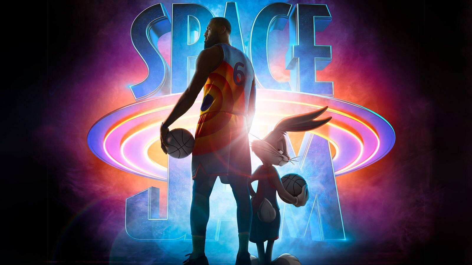
Hey Everybody! Space Jam: A New Legacy directed by Malcolm D. Lee is out today. I wanted to take a second to highlight the super slick color workflow which allowed us to work on multiple versions concurrently.

Capture

Space Jam: A New Legacy was masterfully lensed by Salvatore Totino. The two primary capture mediums were 35mm Kodak film and the entire lineup of Arri cameras, mainly the LF. The glass used was Zeiss Supremes and Master Primes. There were also a handful of scans from archival films which were used as plates for animation.

VFX

ILM was running point for the VFXs on this show. Grady Cofer and his team were a dream to work with. There is a reason ILM continues to be the best in class. The knowledge and expertise ILM employs is second to none. Early on Grady connected me with their head of color science, Matthias Scharfenberg. I thought I knew what I was doing when it comes to color science until I saw what Matthias had going on with CTL and Nuke. I learned a lot from our chats. He was super gracious in sending over his Nuke scripts which allowed me to build a Baselight transform that matched ILM’s pipeline. This insured a one-to-one representation of their stellar work.

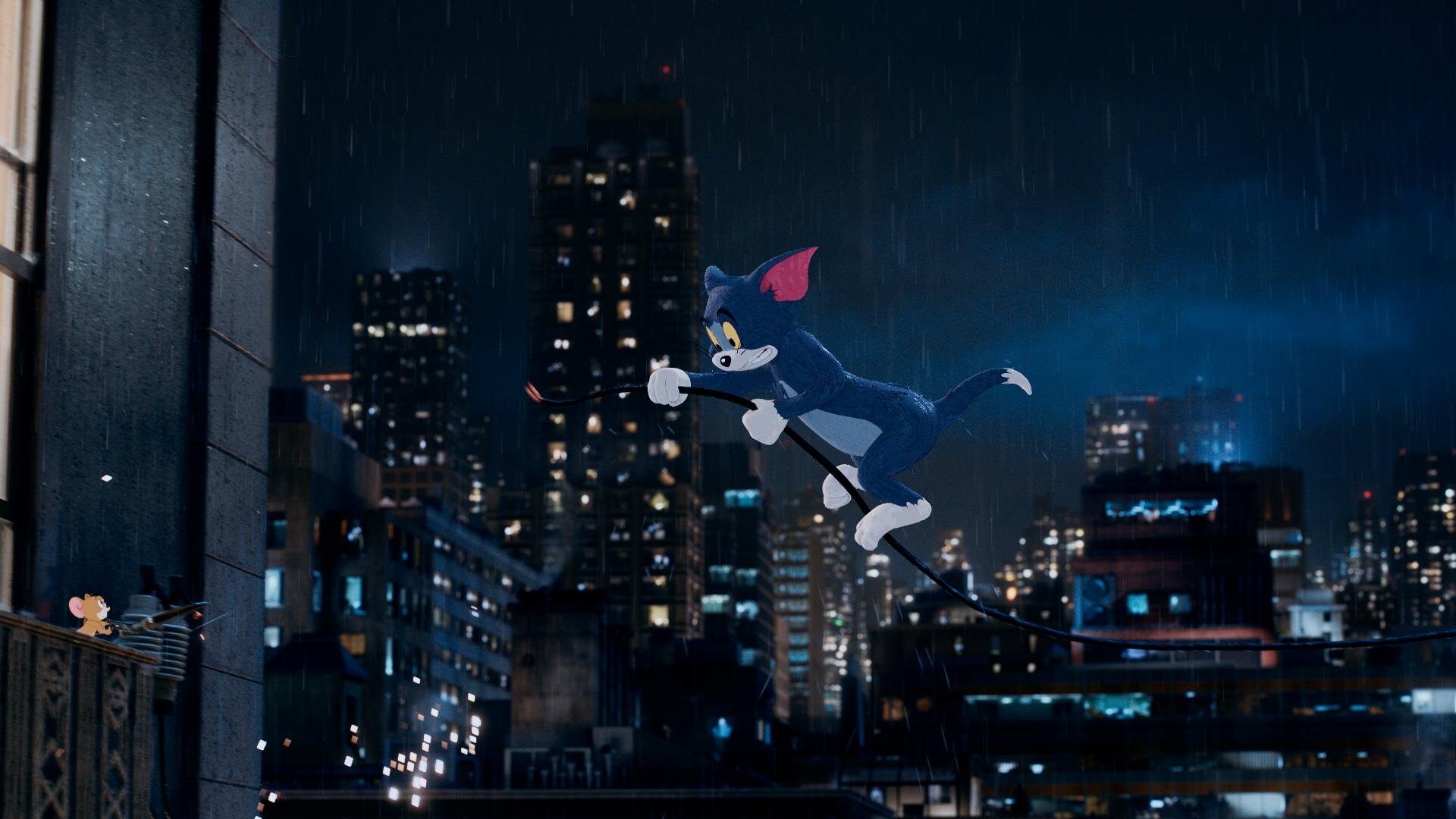
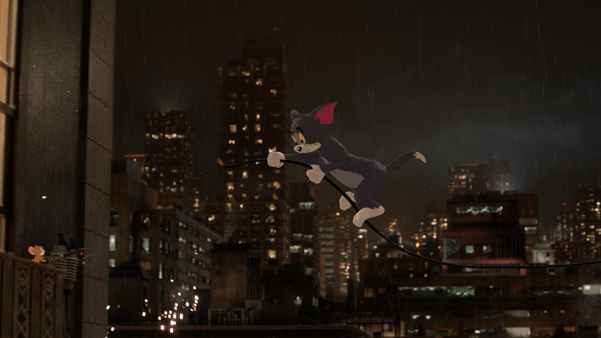
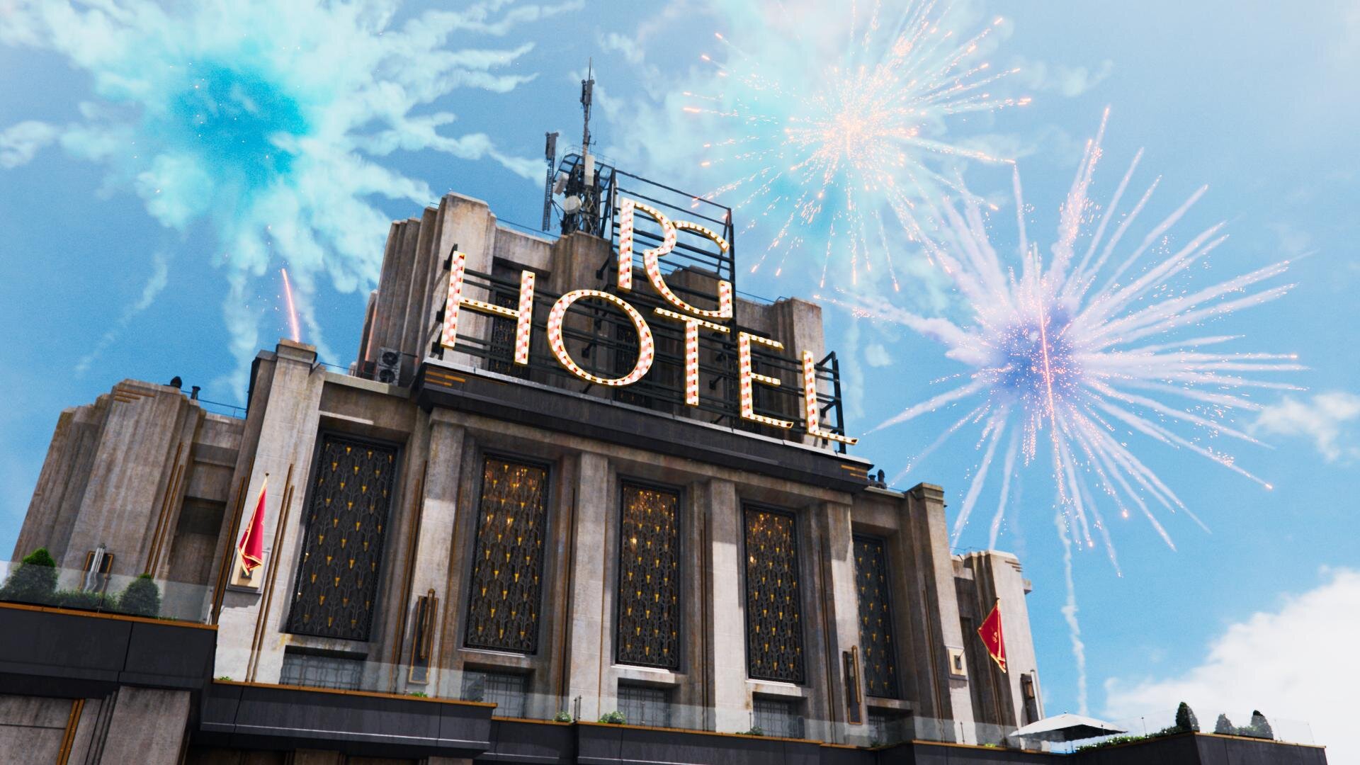
Two Worlds, One Grade

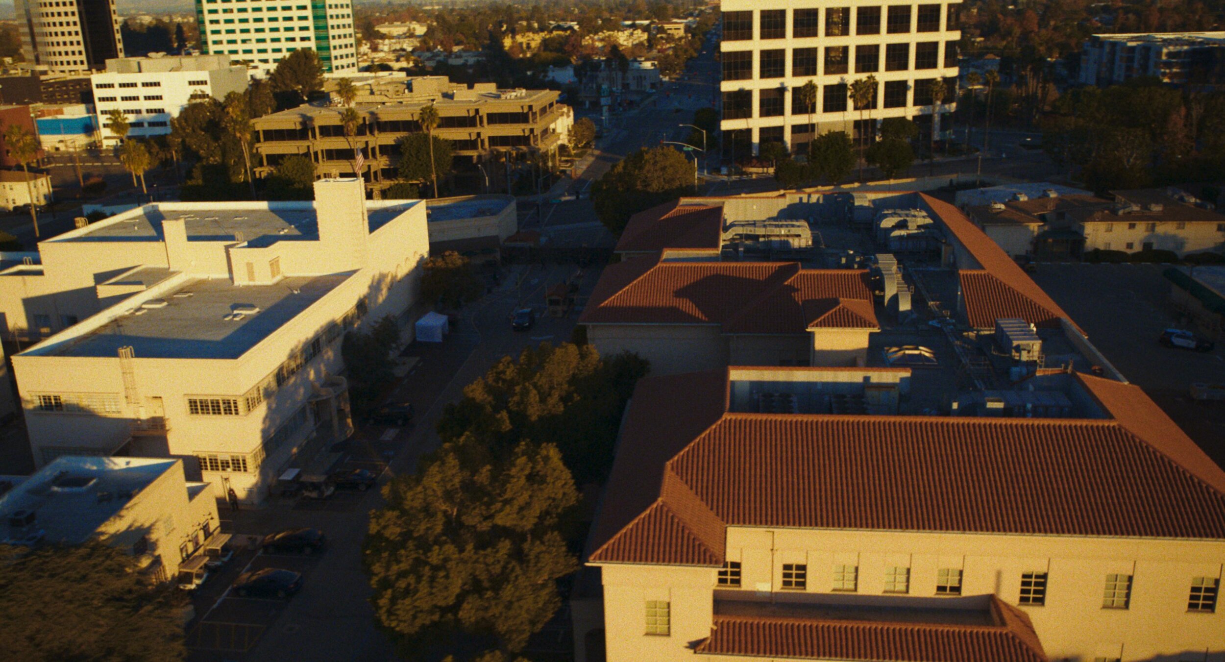
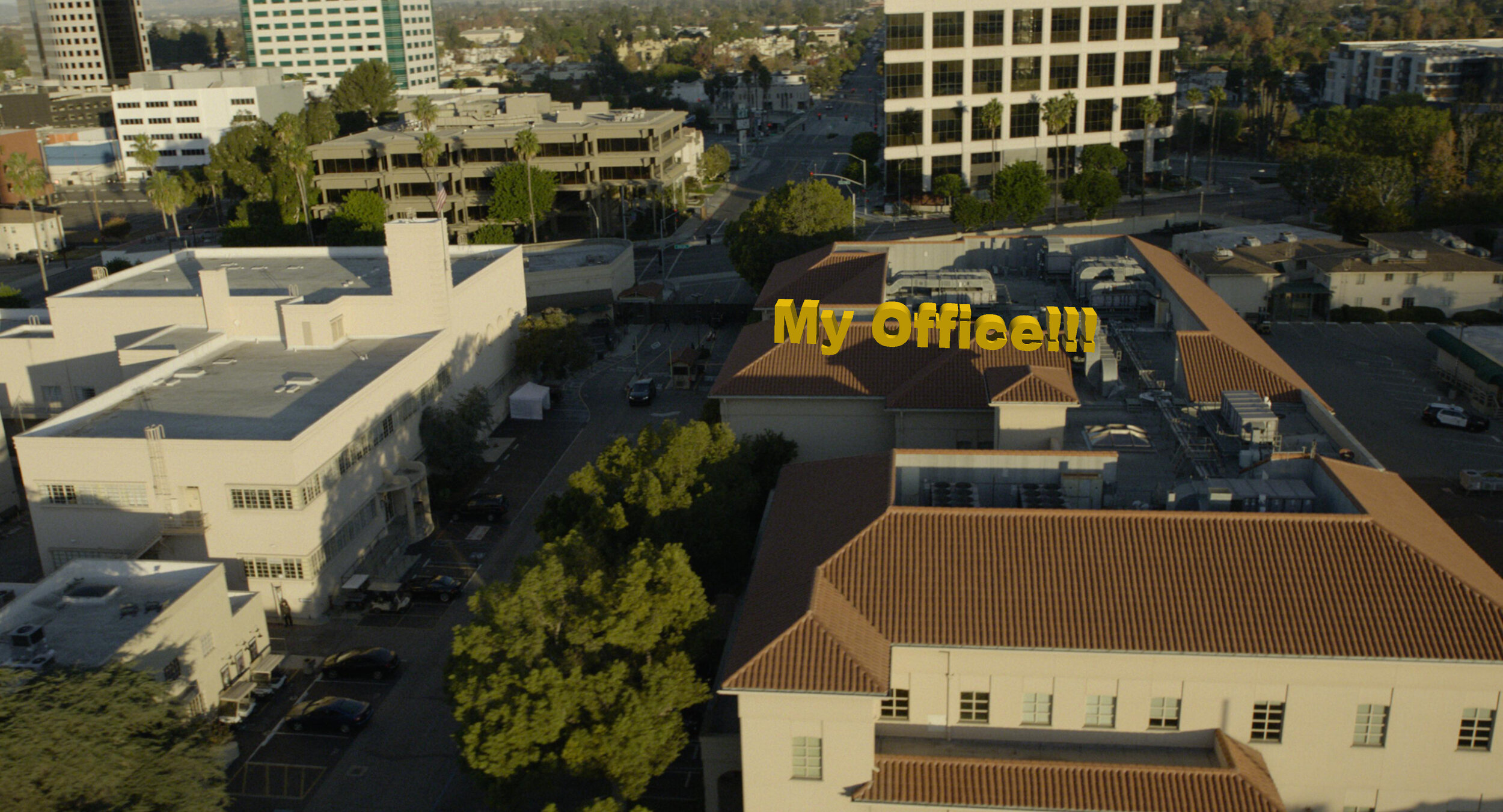
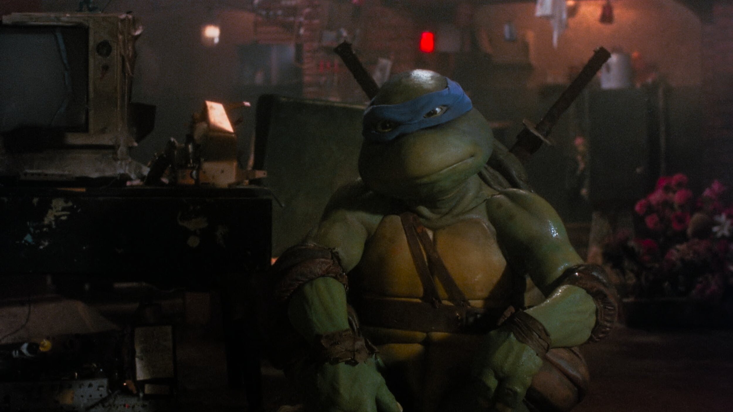
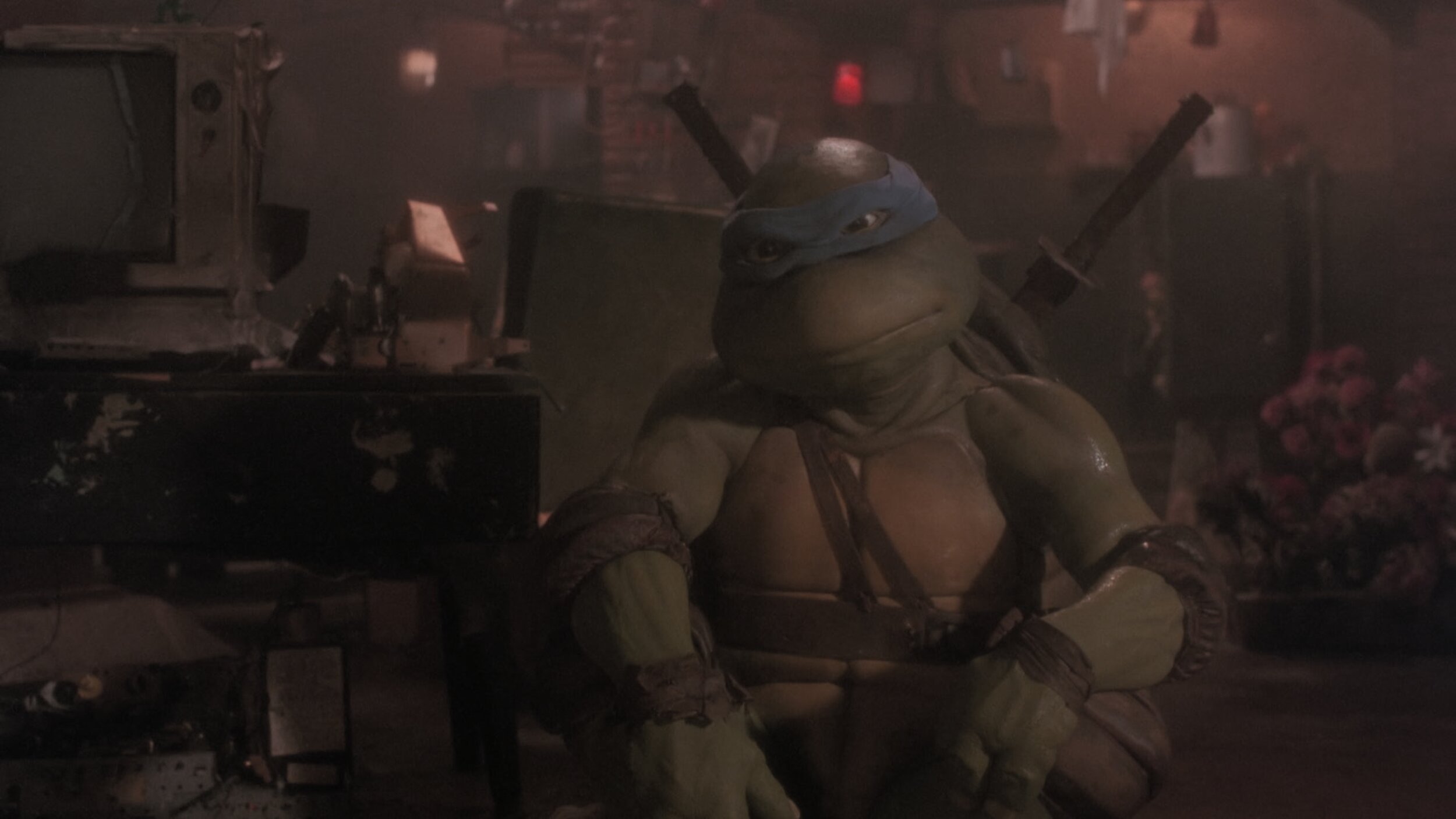
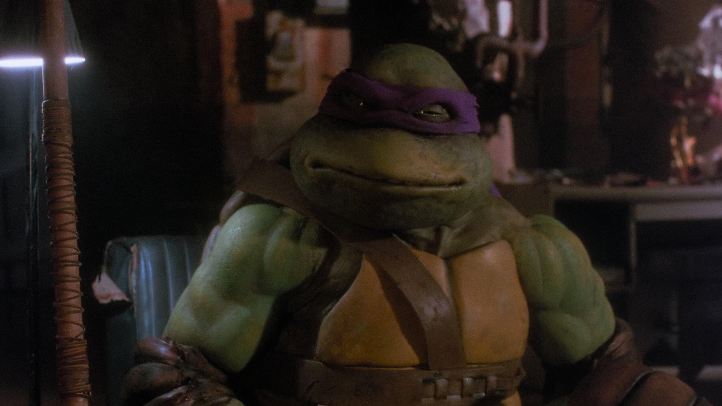
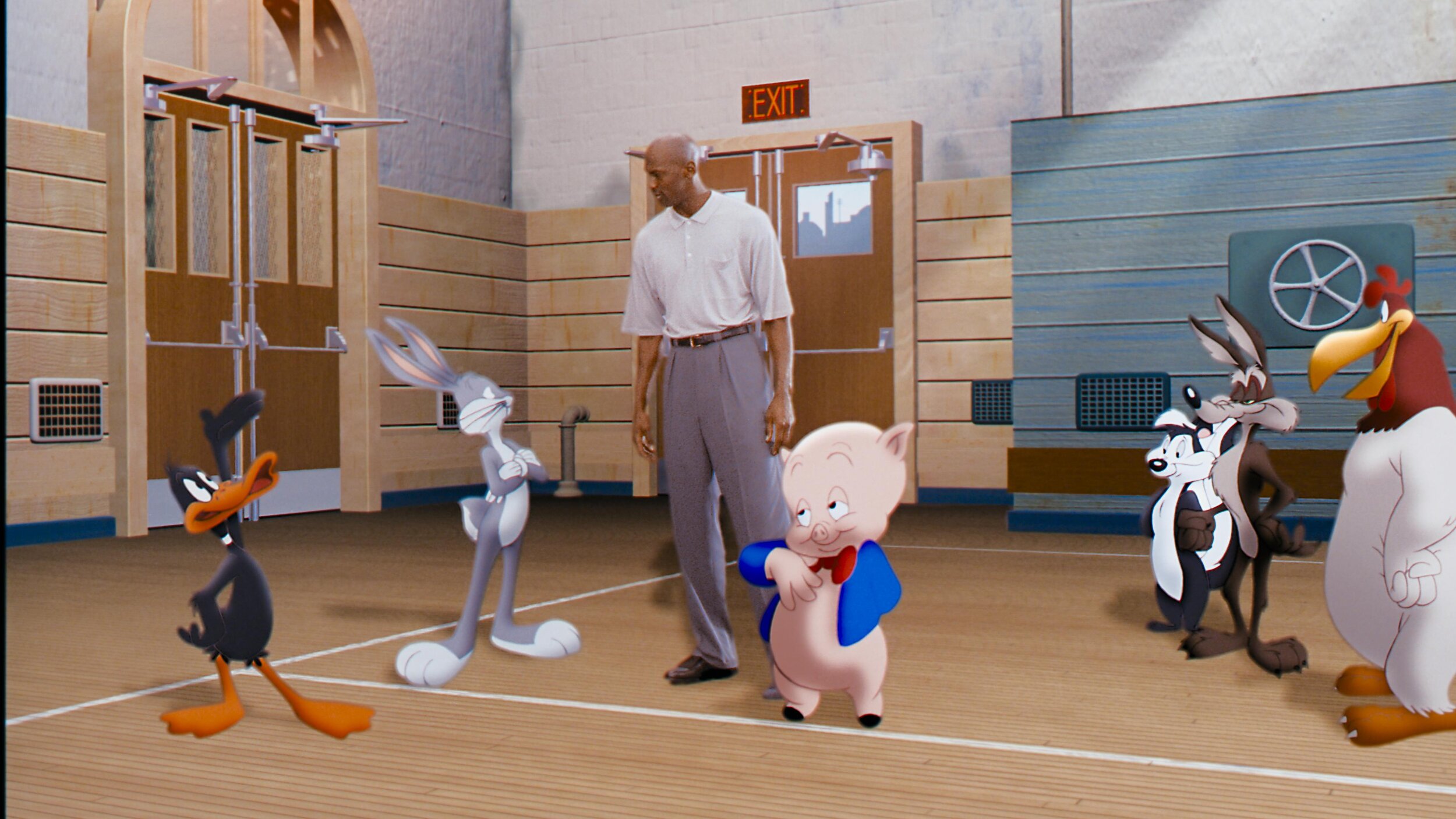
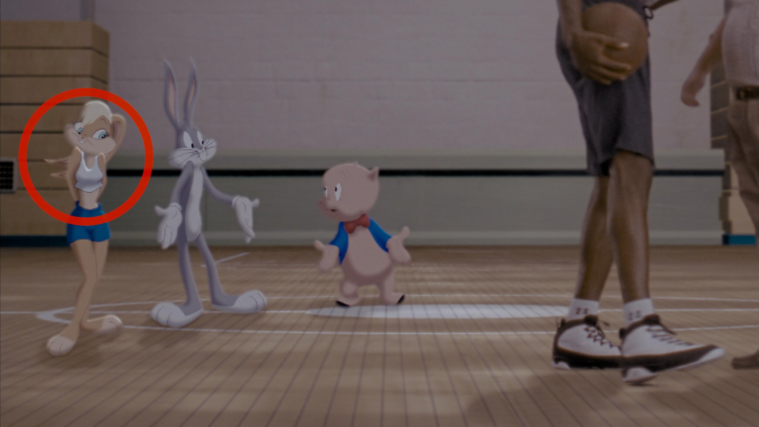
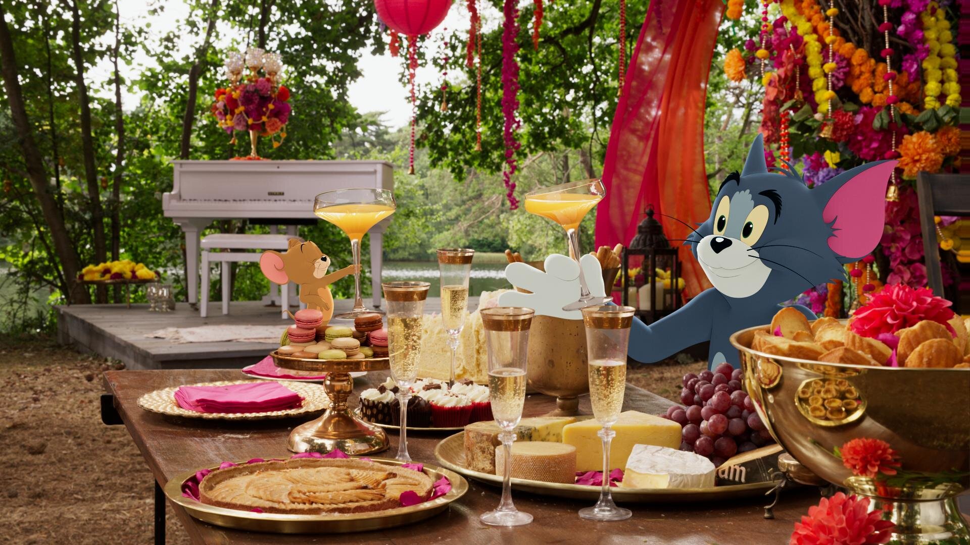
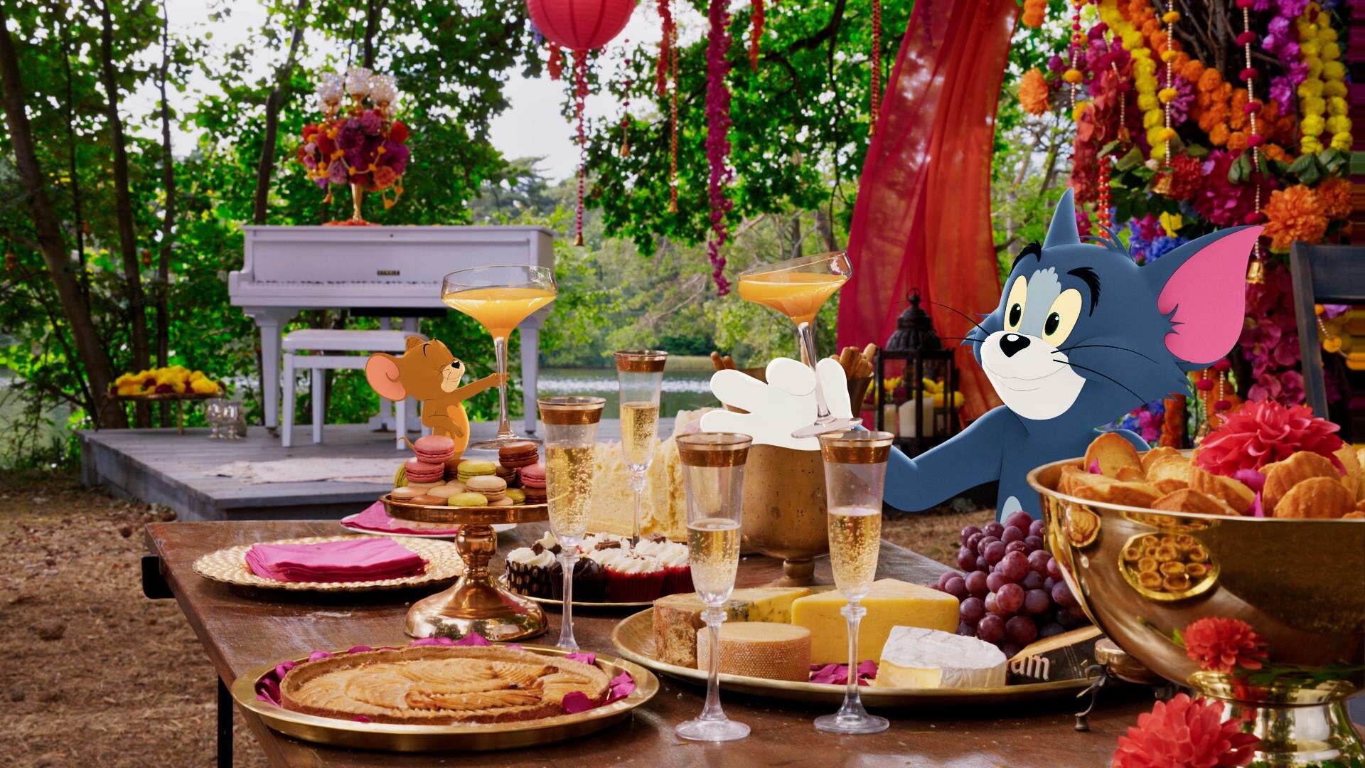
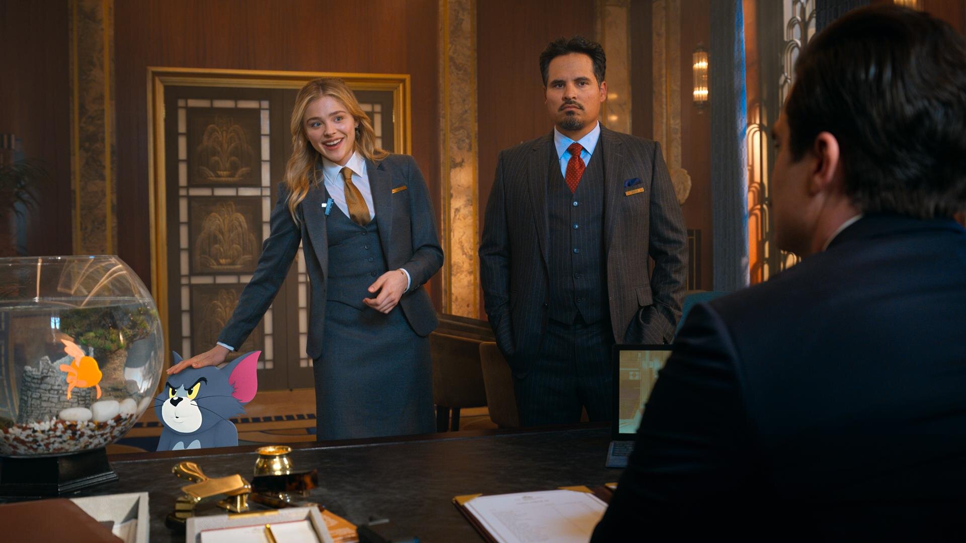
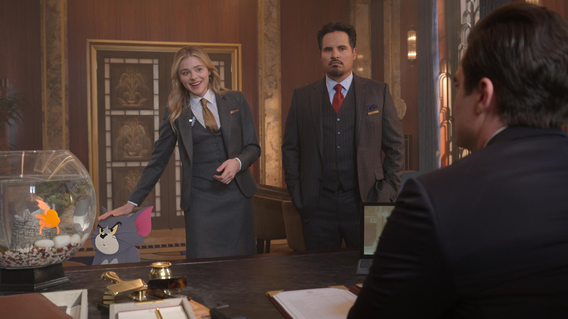
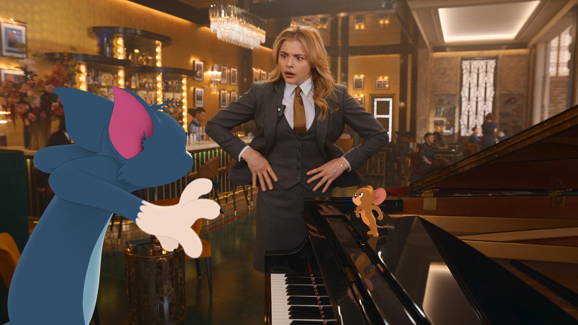
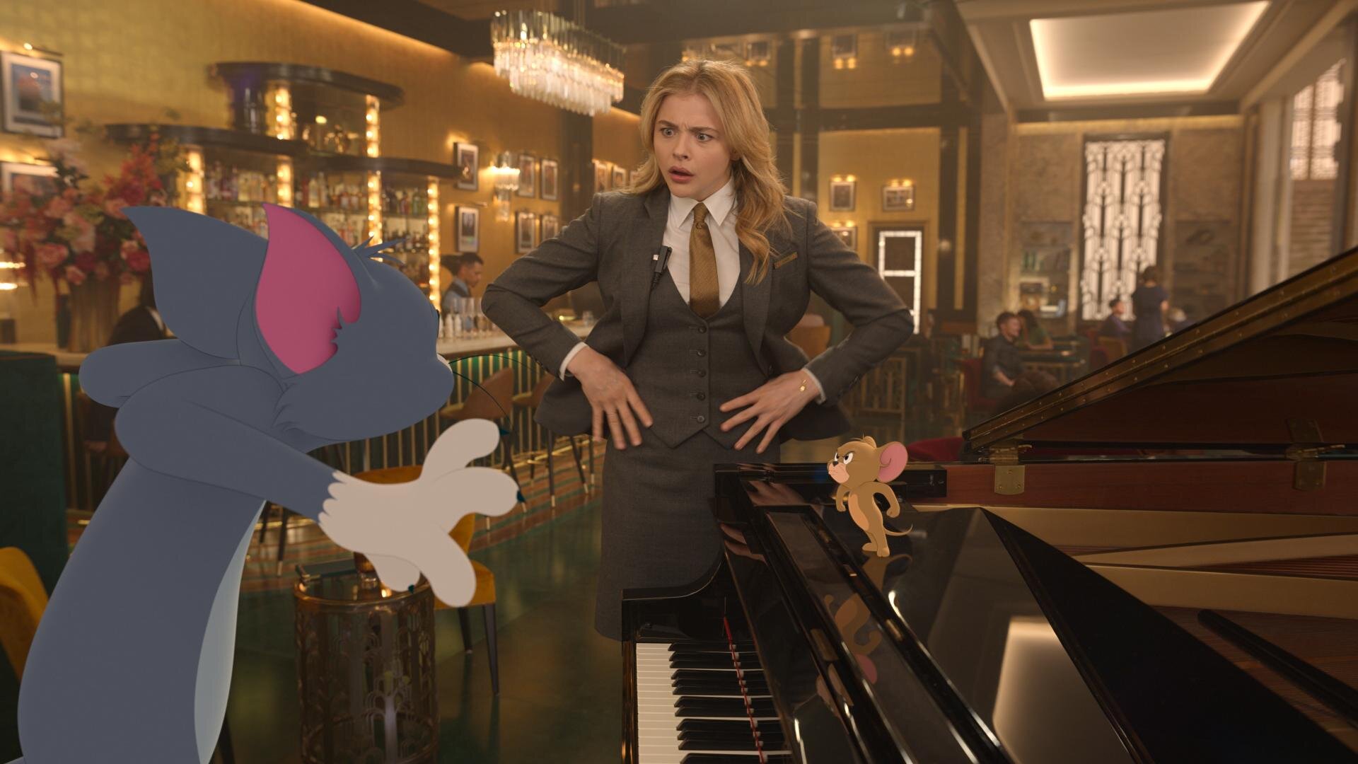
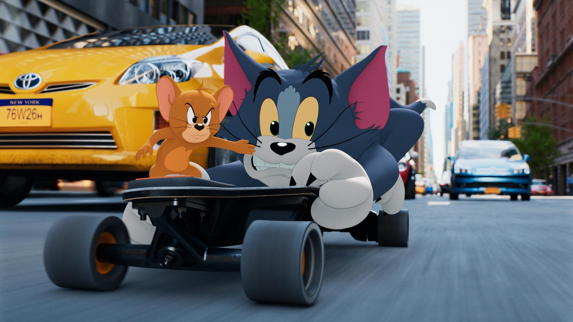
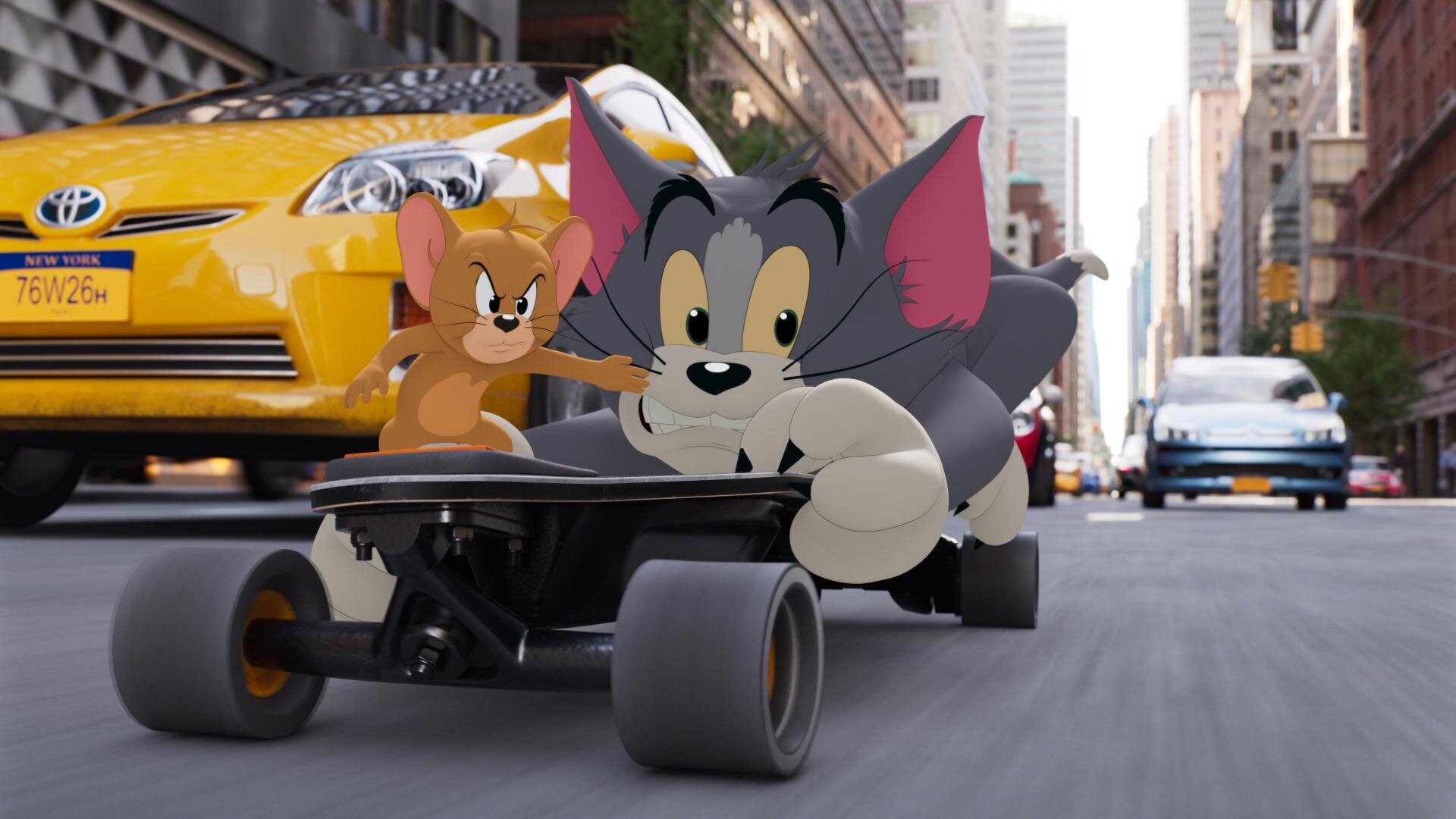
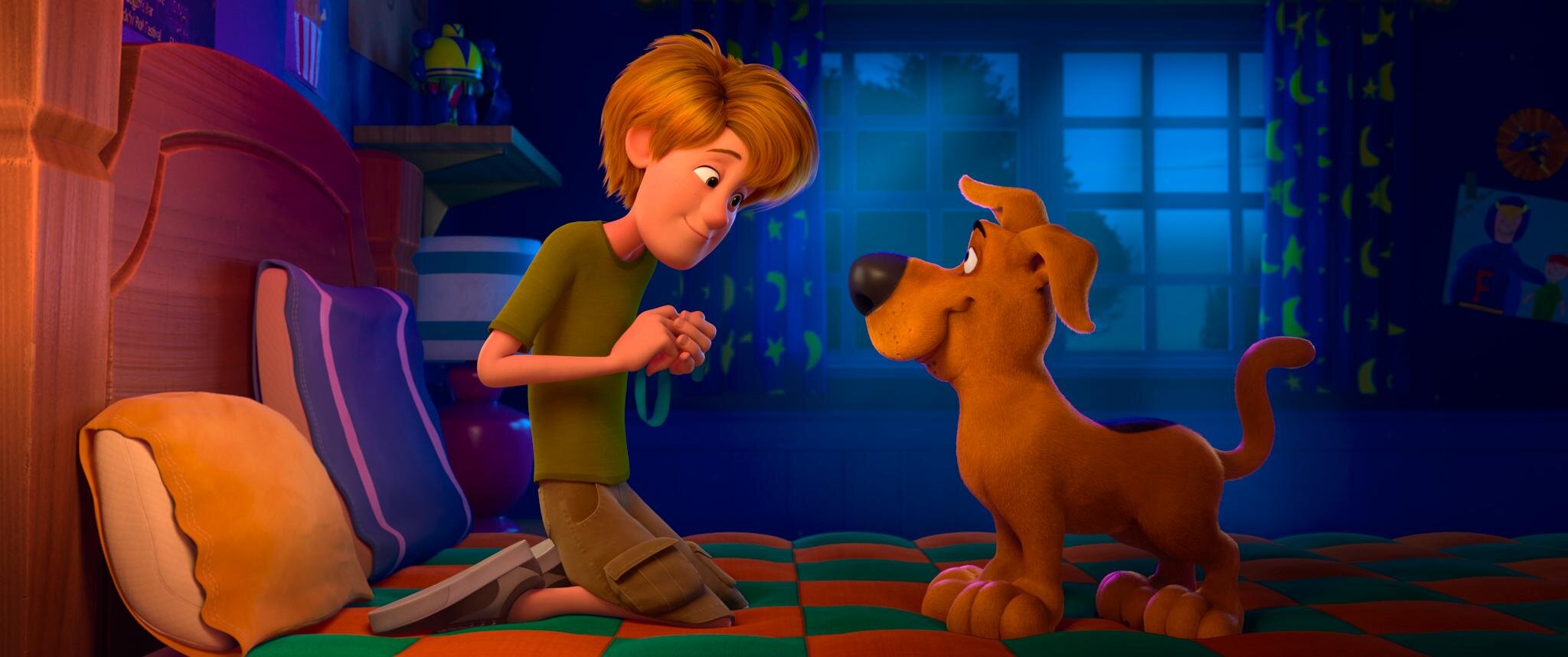
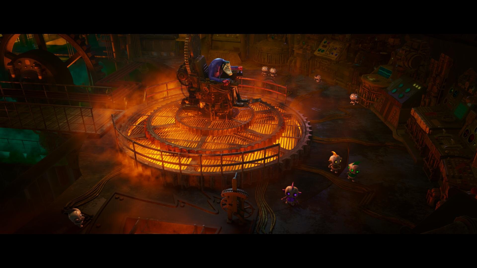
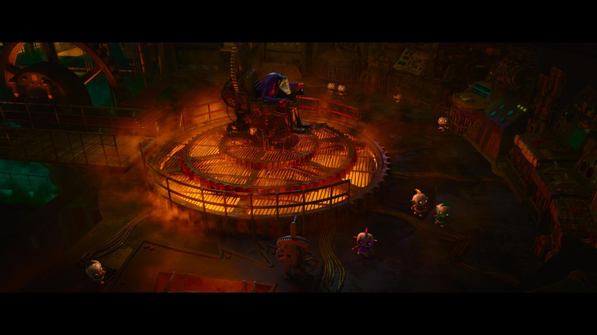
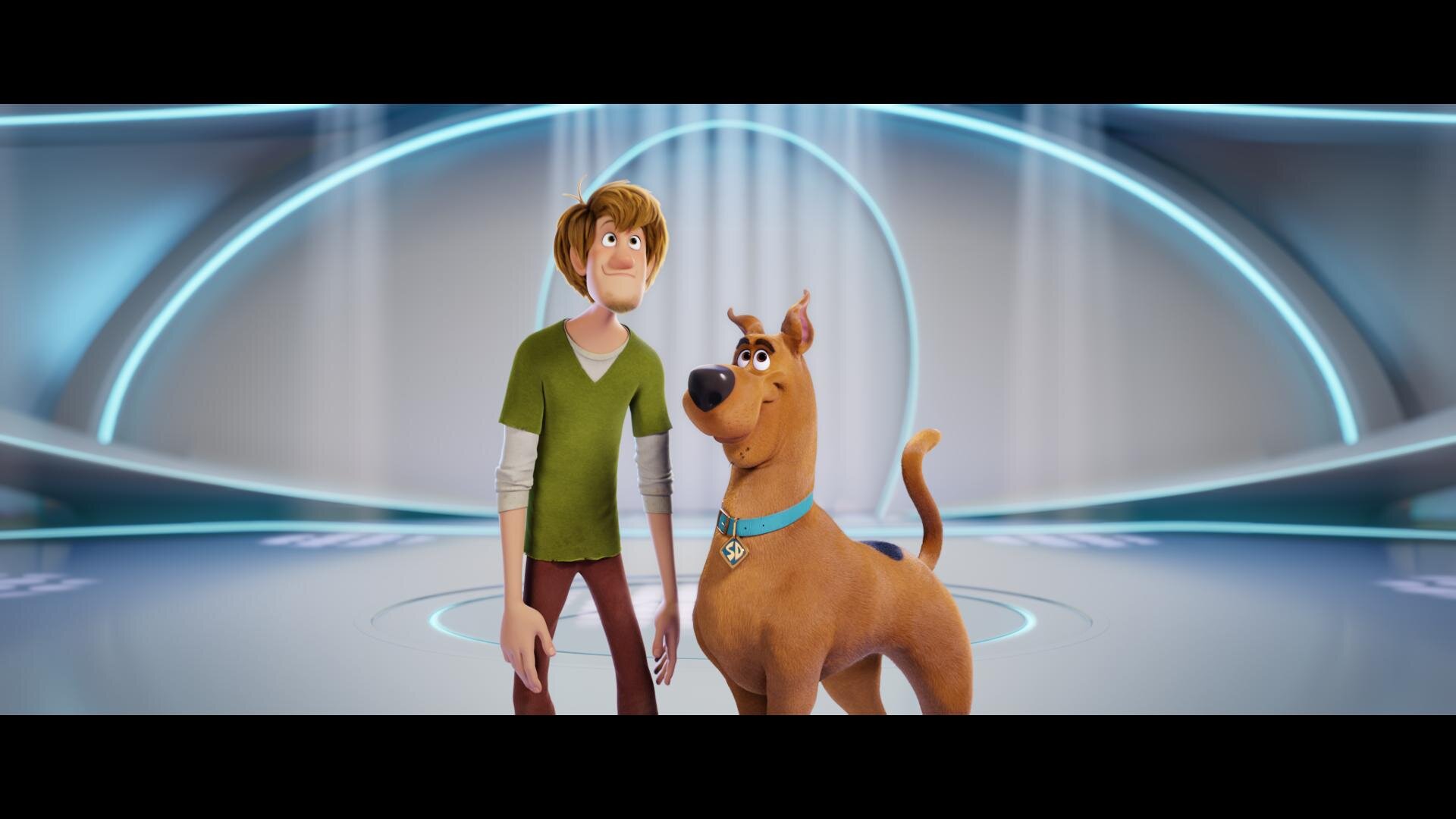
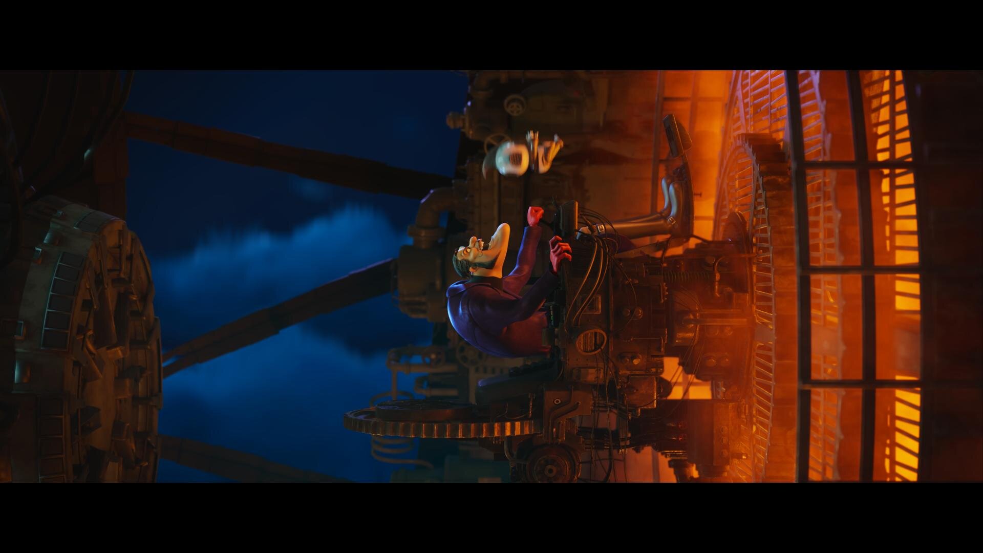
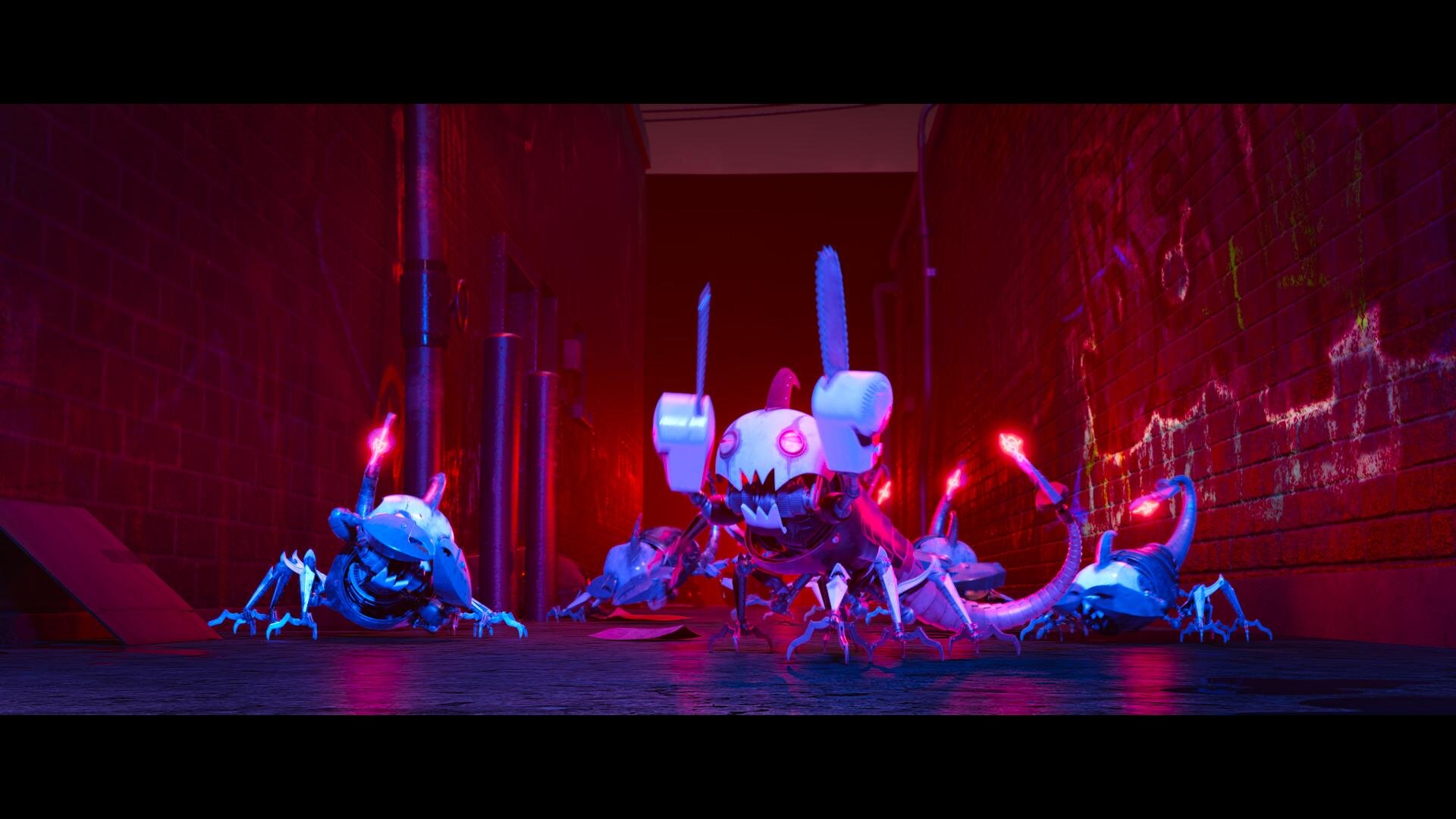
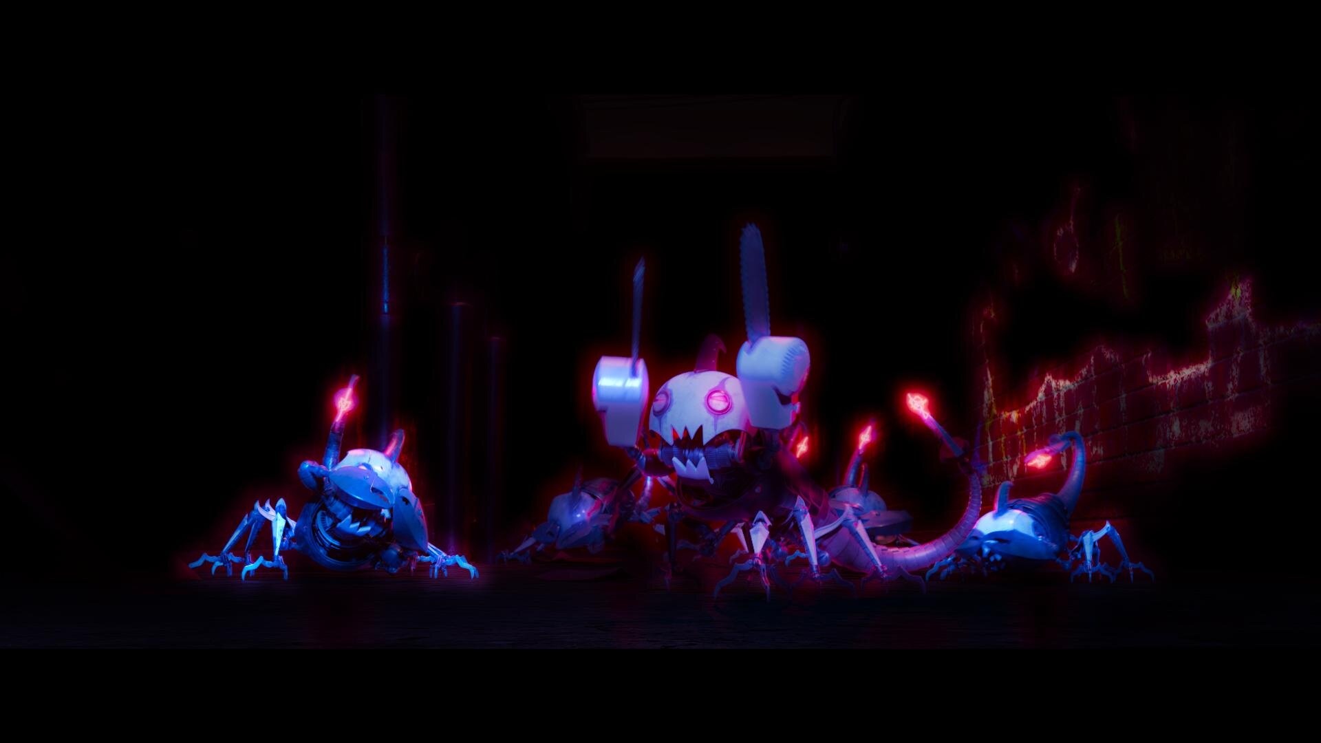
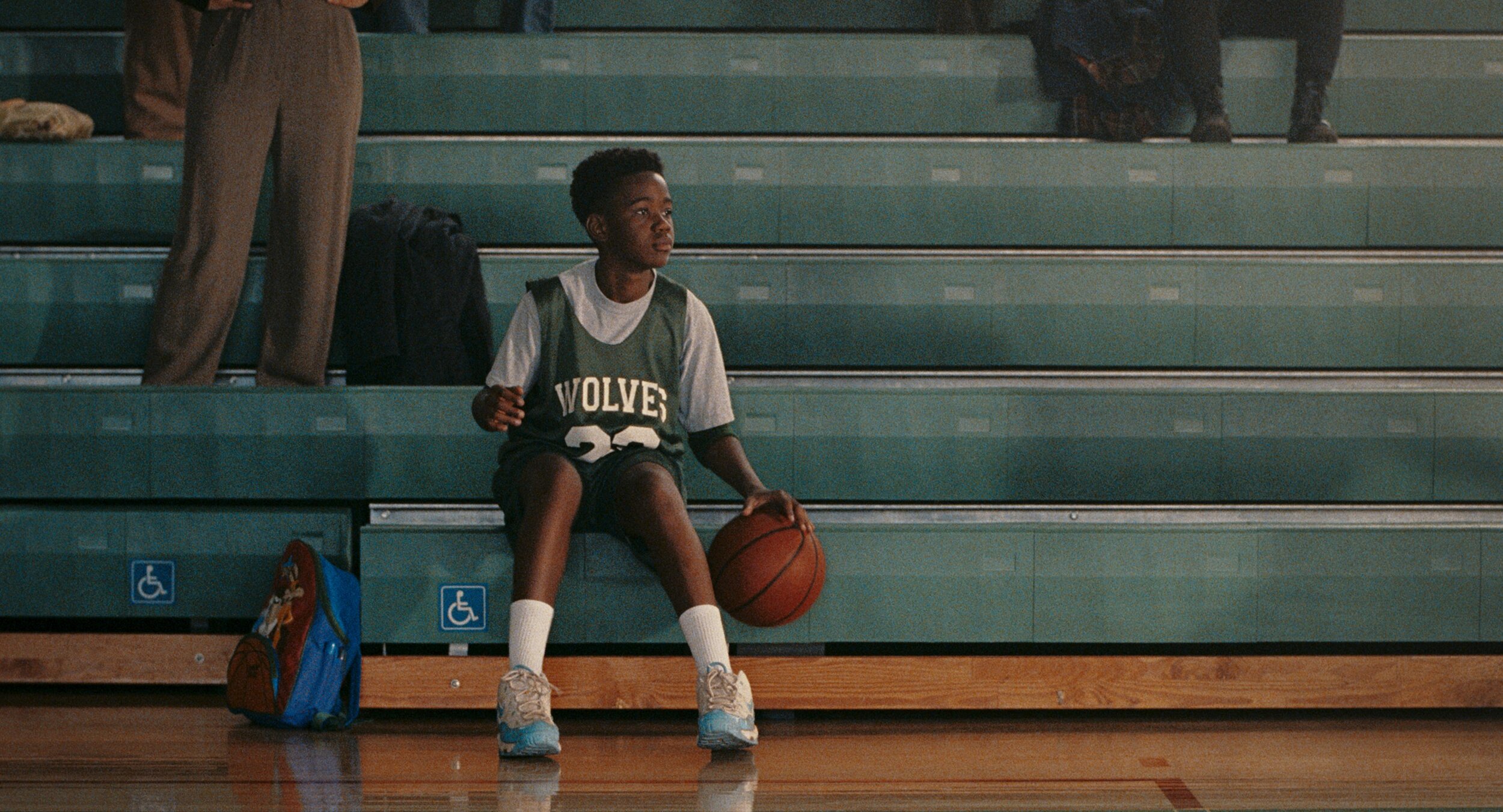
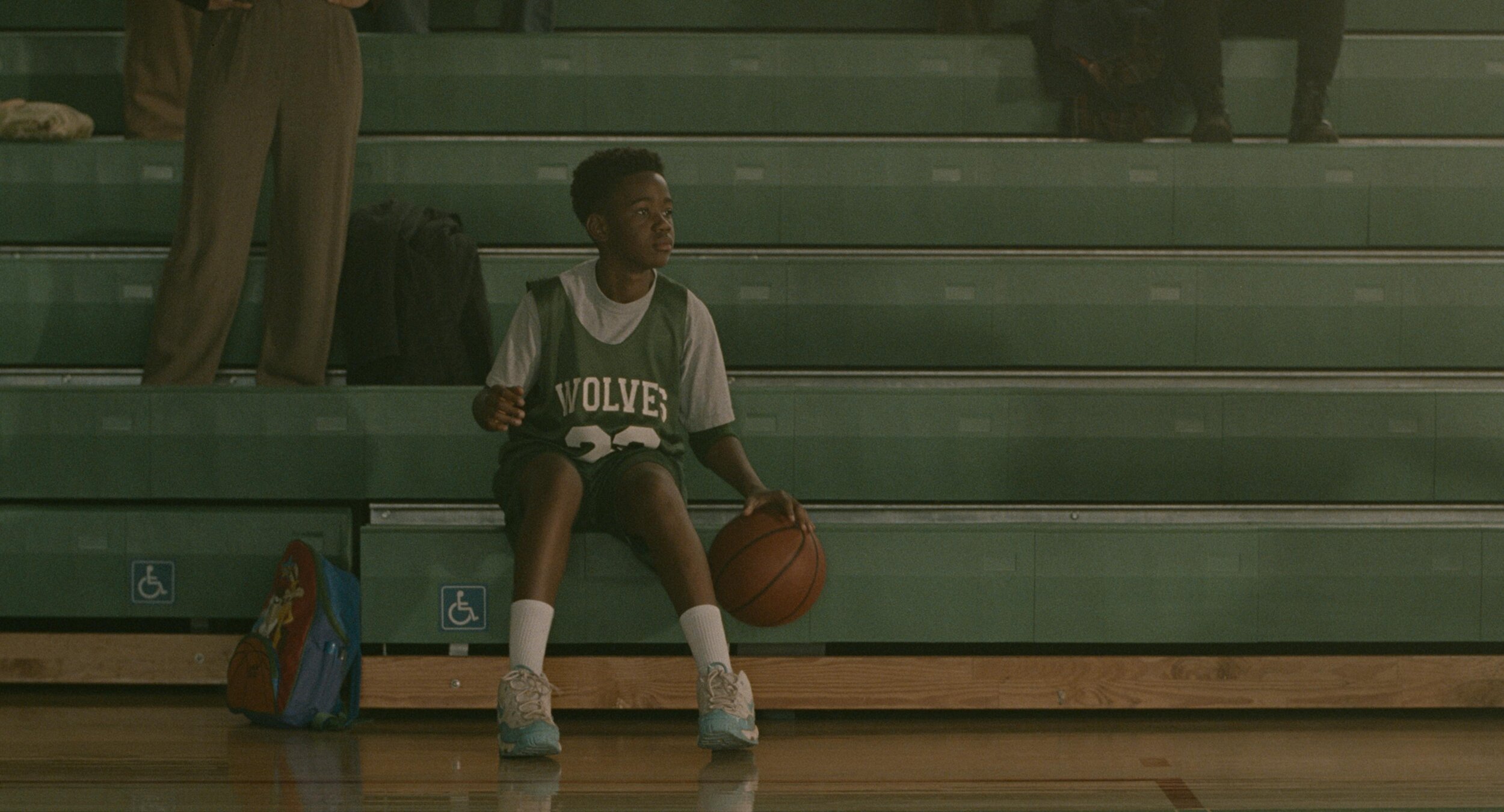
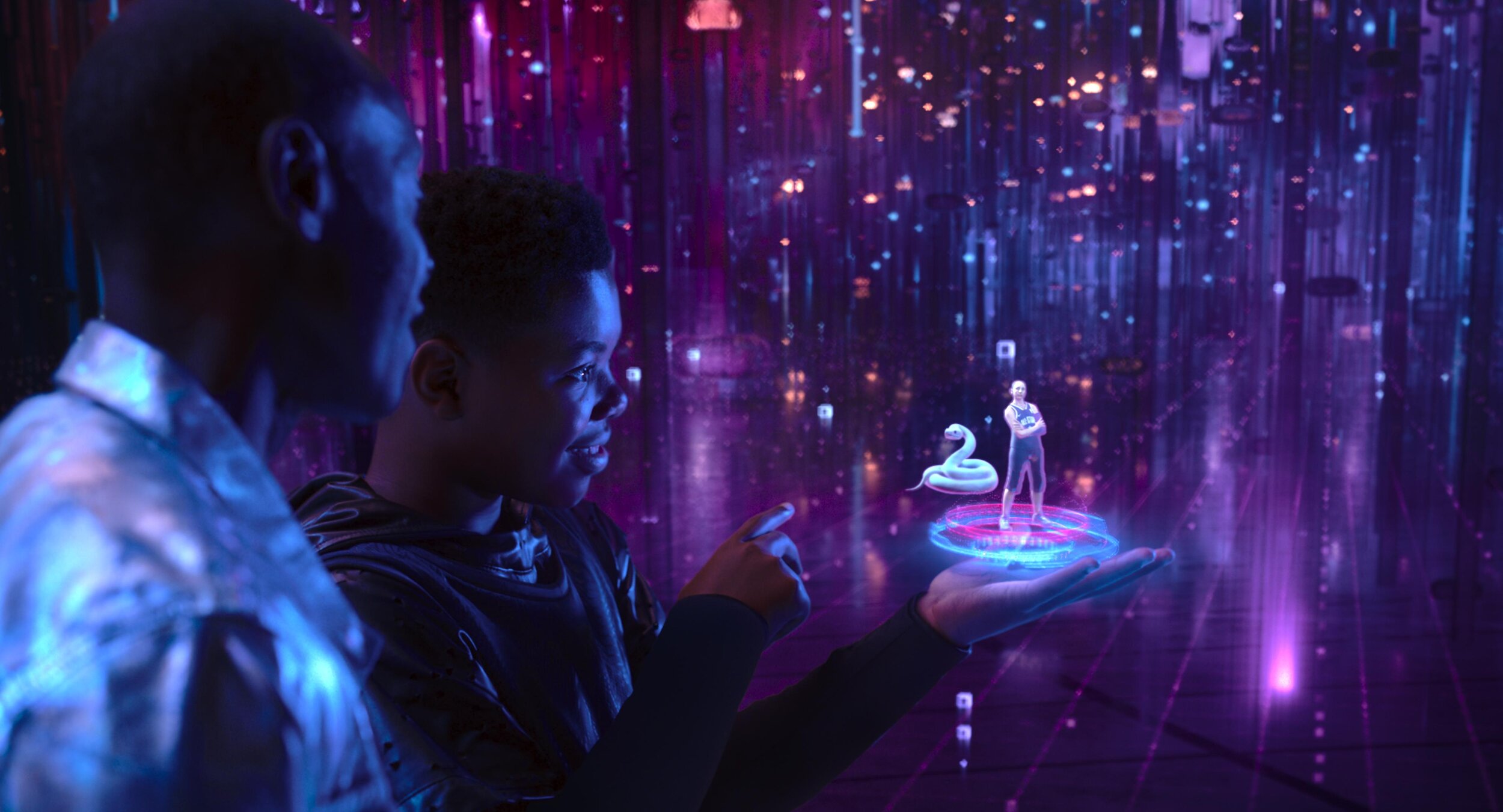
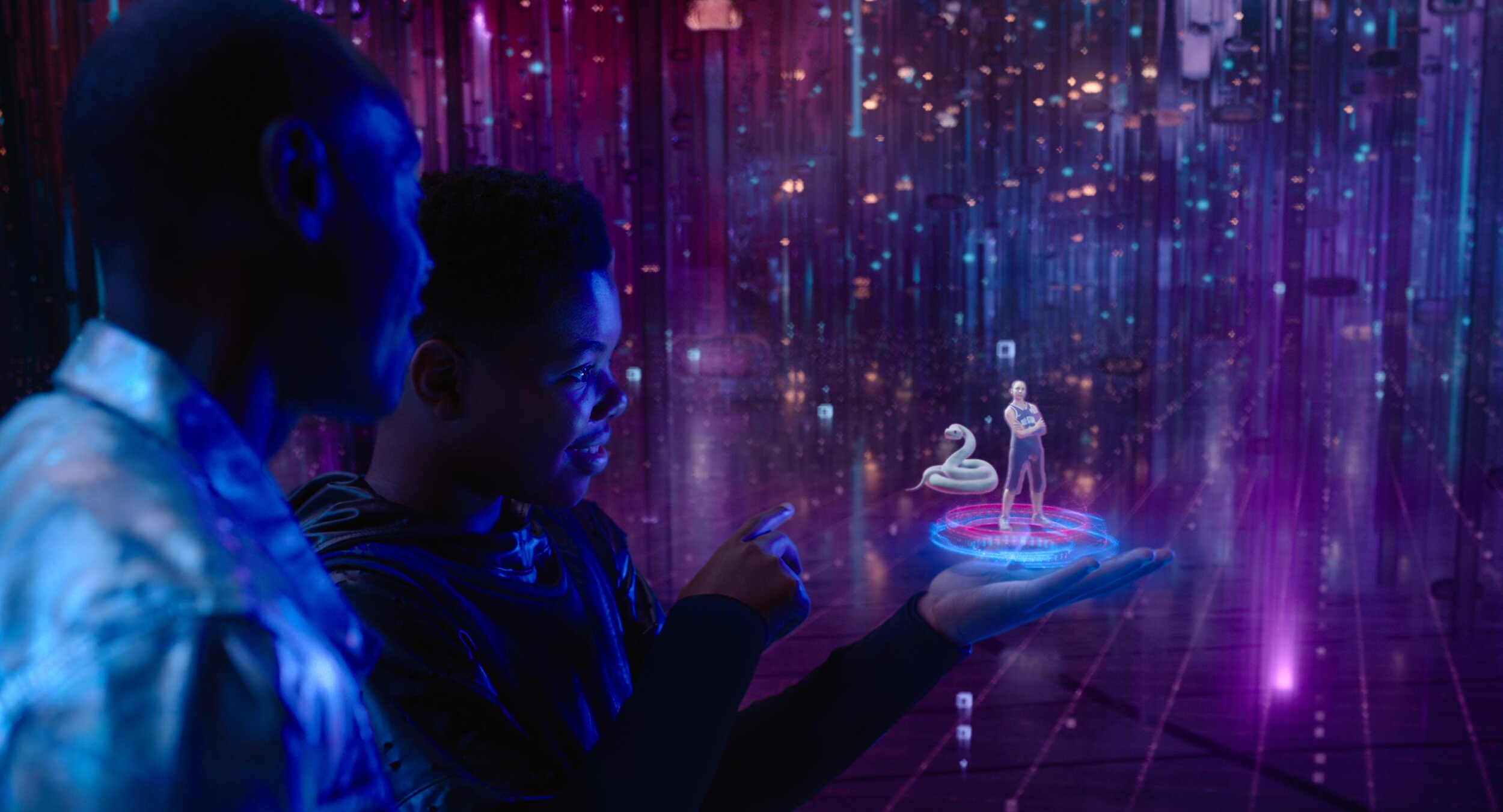
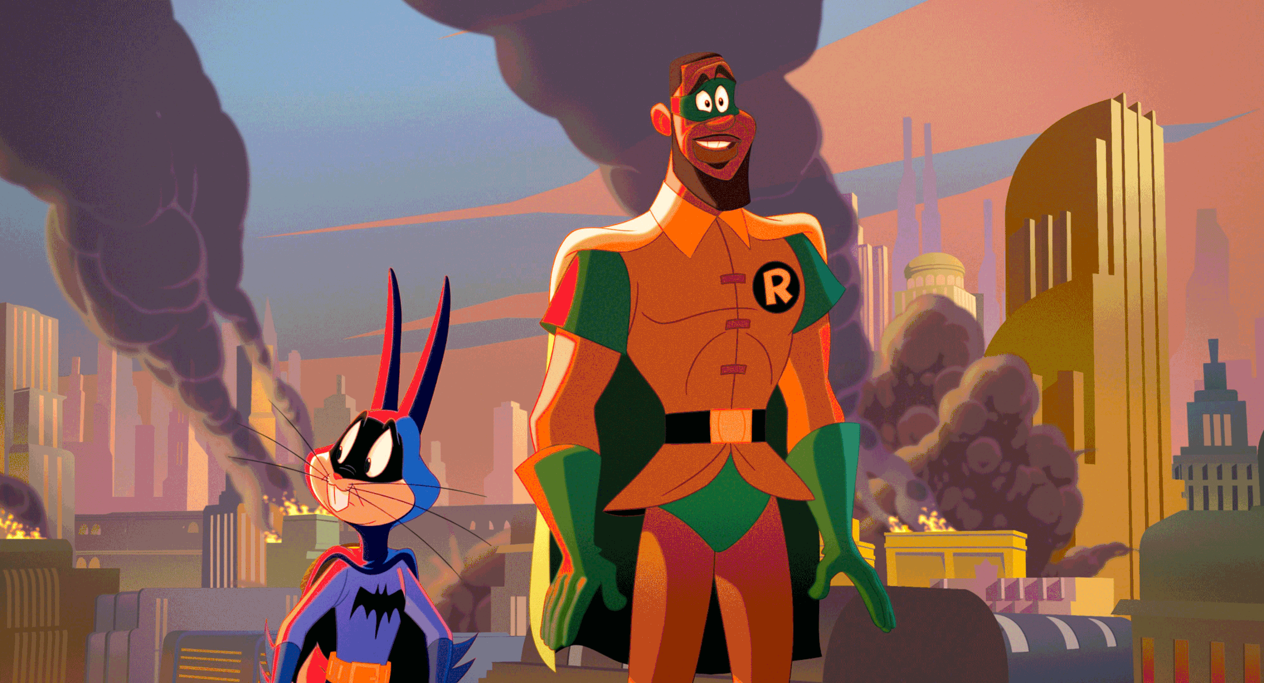
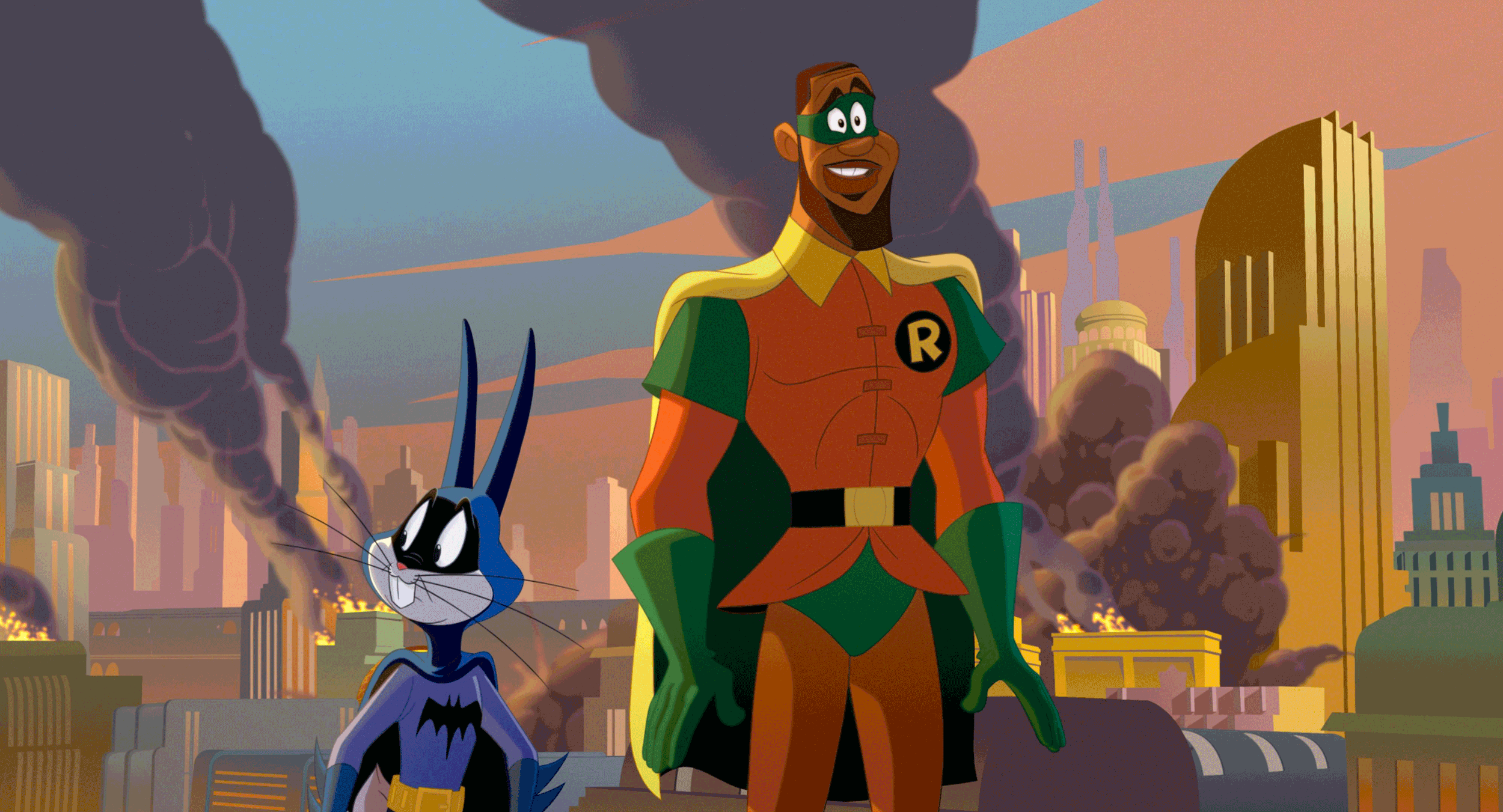
The show can basically be broken down into two looks. In “Space Jam: A New Legacy” there is the real-world and the Warner Bros Serververse.

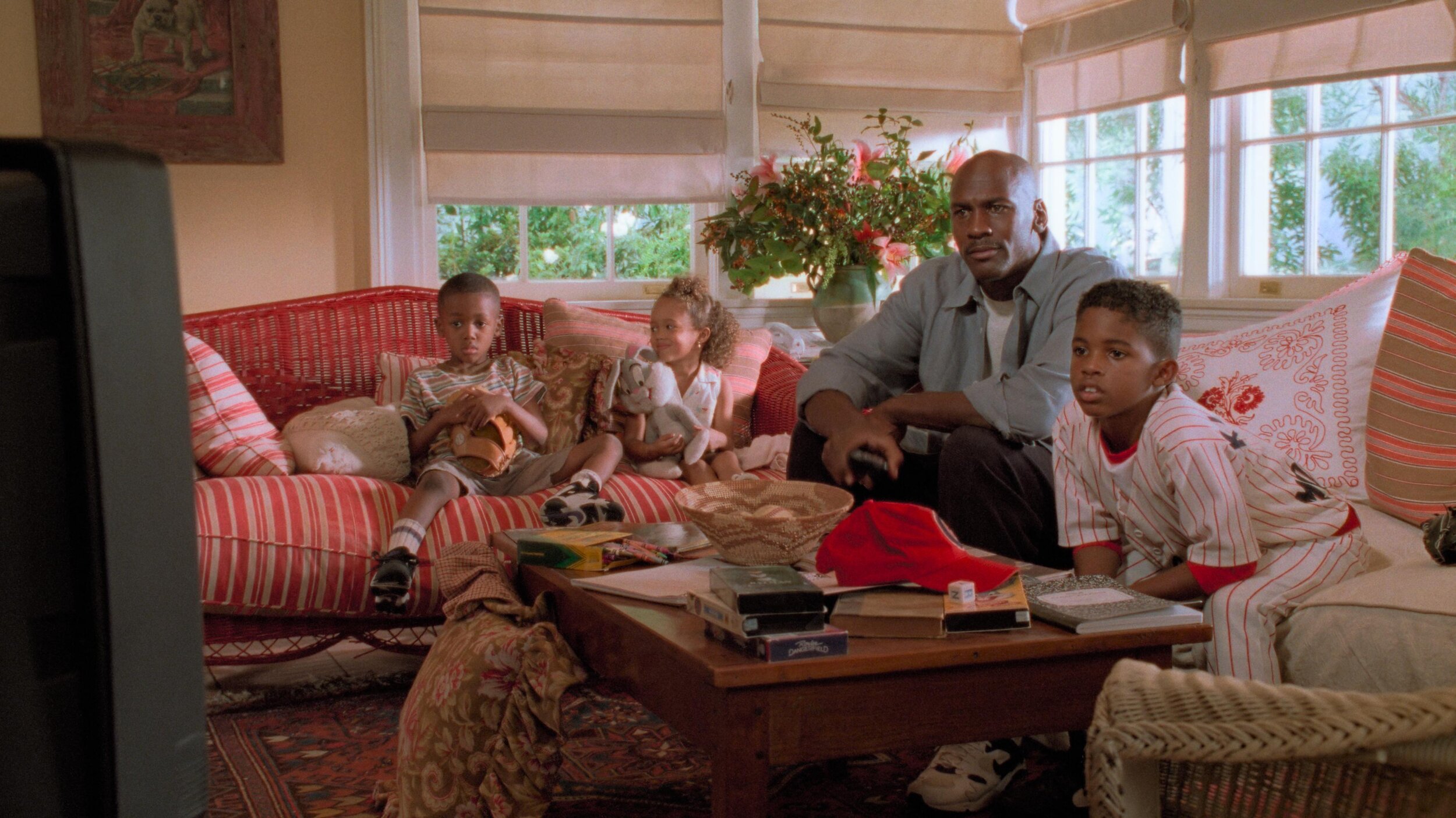
We chose an analog celluloid vibe for the real world. The Serververse has a super clean, very 1s and 0s look to it. Most of the real world is shot on film or is Arri Alexa utilizing film emulation curves paired with a grain treatment. Some sequences have a mix of the two. Let me know if you can tell which ones😉.

The look of the digital world changes depending on where the characters are in the Serververse. The base look of the Serververse is the vanilla ACES ODT with restricted primaries in the mid-tones complimented by exaggerating the saturation for highly saturated colors.

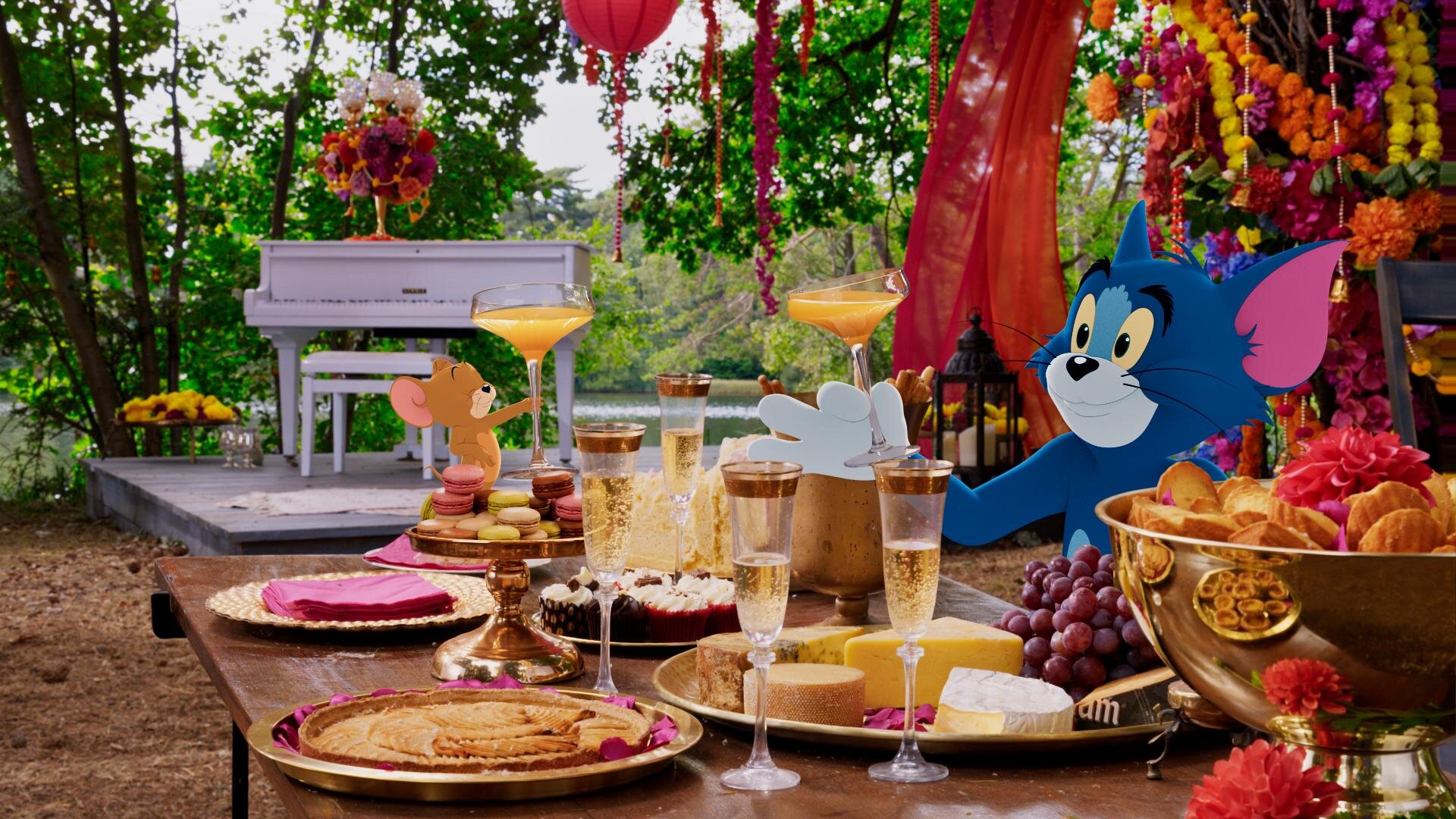
All the other looks are riffs off this base LMT with the exception of the library classics. These were graded to look like their existing masters and the new footage was matched in.

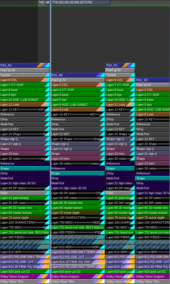
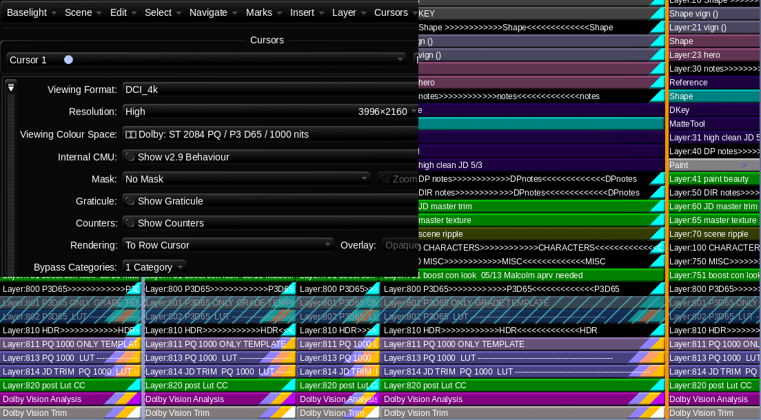
Multiple Deliverables, One Timeline

The challenge of this show, beyond the sheer number of VFX and moving parts, was the delivery schedule. The Post Supervisor Lisa Dennis asked to have the theatrical version and the HDR video versions delivered days apart. To hit the dates requested, I graded simultaneously in HDR and SDR. I did most of the heavy lifting in HDR PQ 1000nits. Then I trimmed at 14FL to ensure the reel was ready for filmmaker review. Poping back and forth between outputs was made possible by two great tools. Firstly, I used ACES 1.1 color management to normalize all the different sources into one grading space.

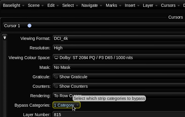
Secondly, I used Baselight’s “Bypass Categories” functionality to if/then the timeline. Basically, I had one timeline that would represent itself differently depending on the output selected. Different layers were toggled for different sources and outputs. The LMTs used often had SDR and HDR versions to further exacerbate the combinations. This was a critical hurdle to overcome and the Baselight gave me the tools to accomplish the organization of a very complicated timeline with ease.

Approvals

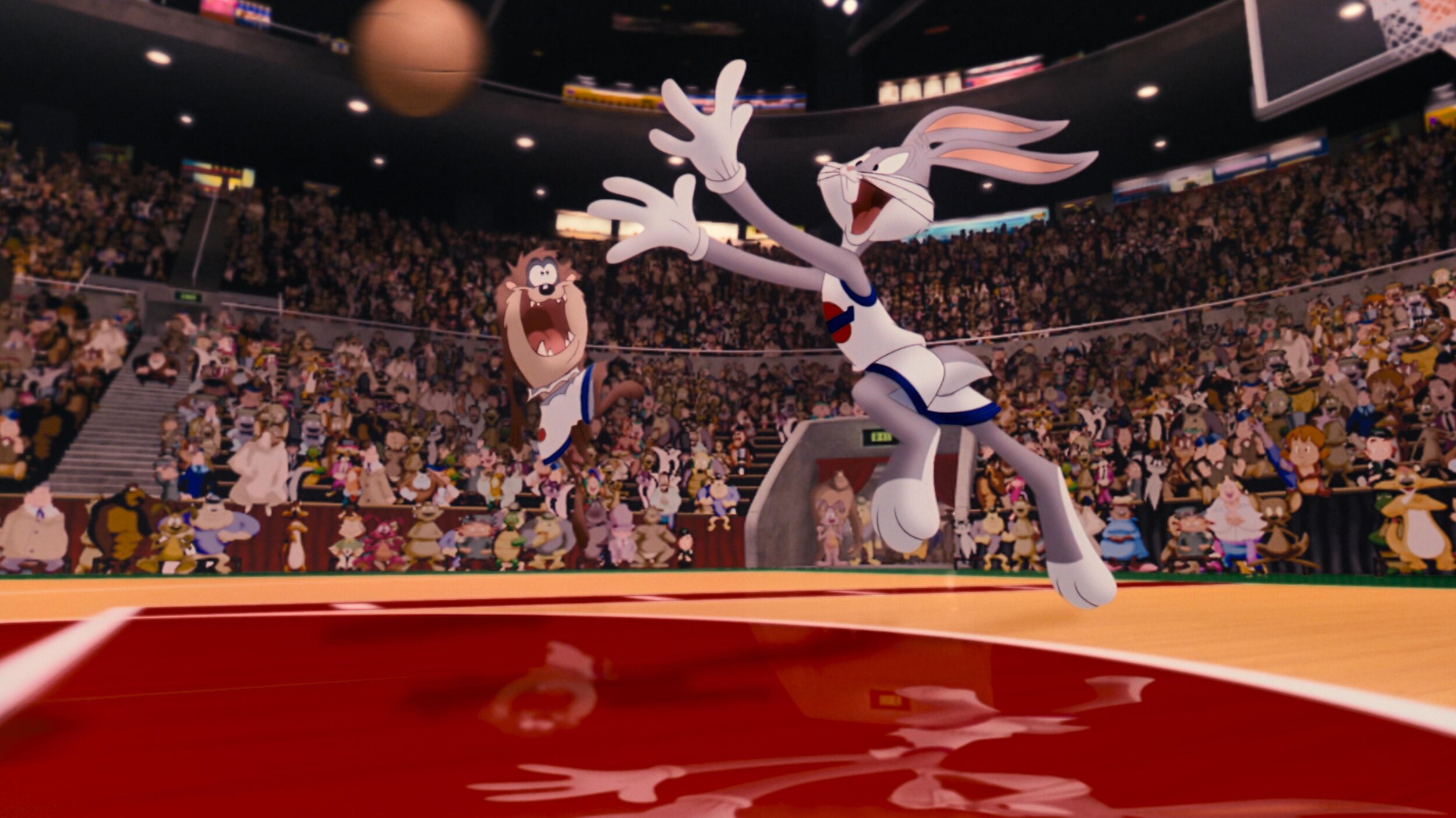
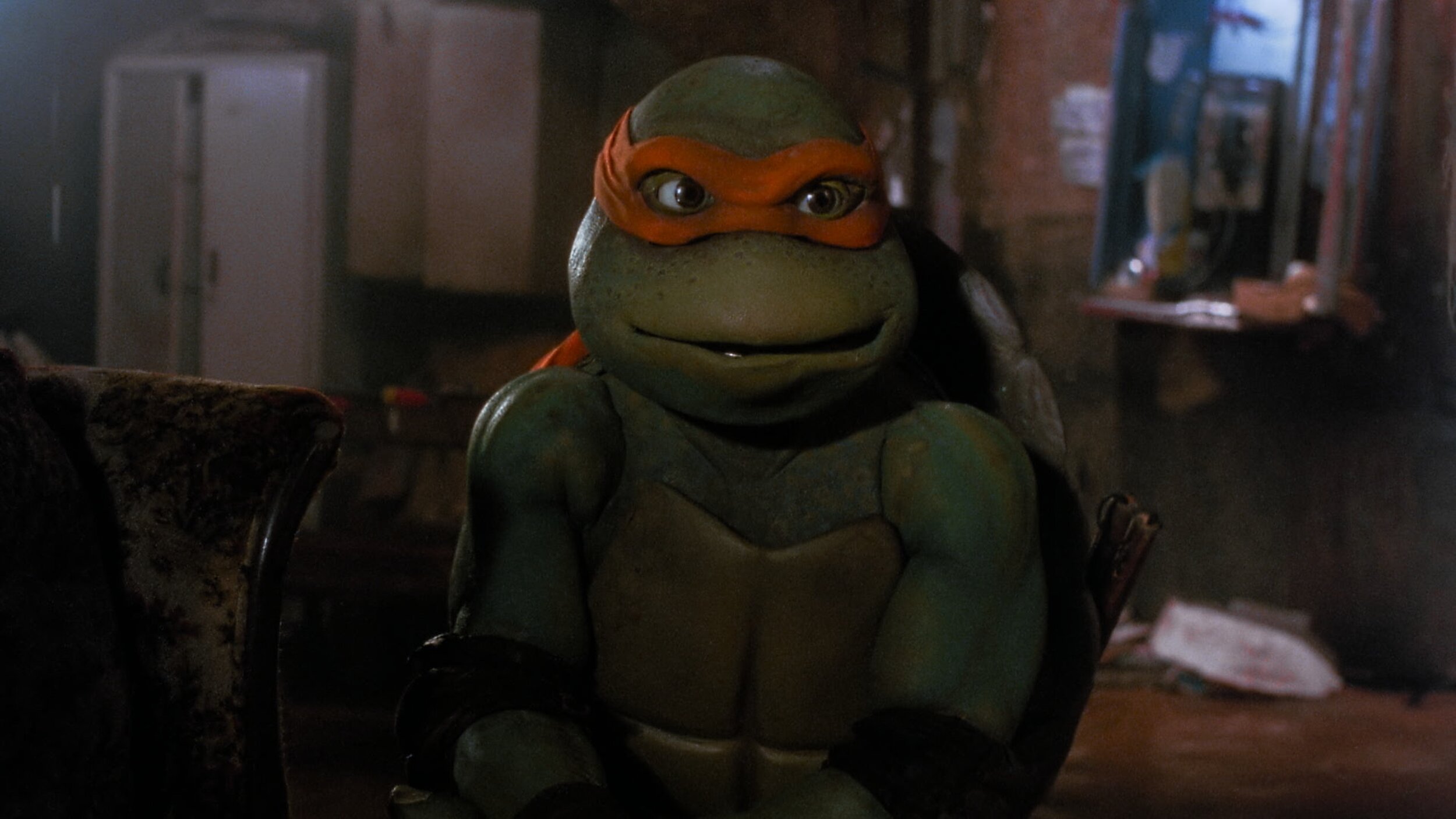
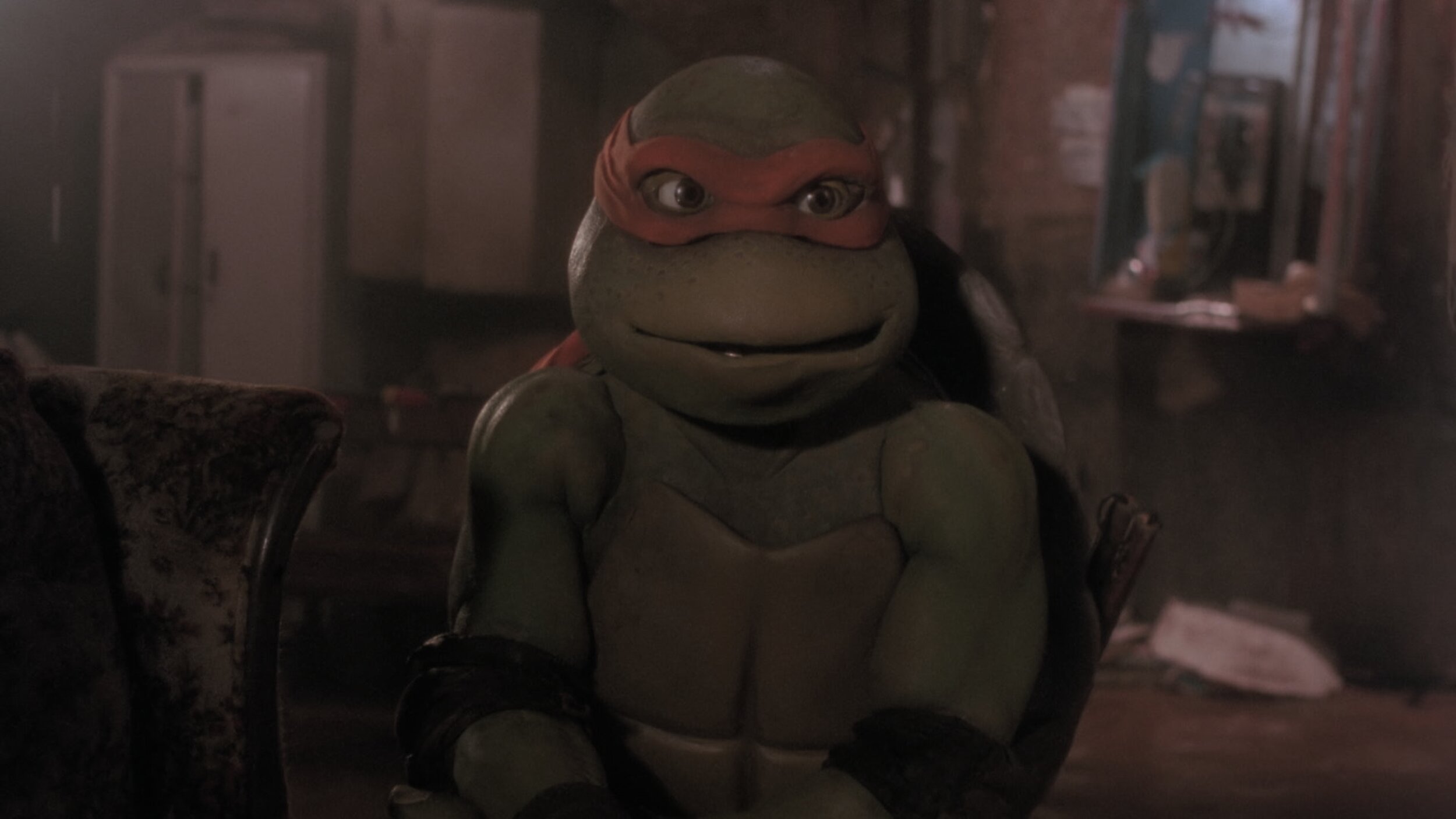
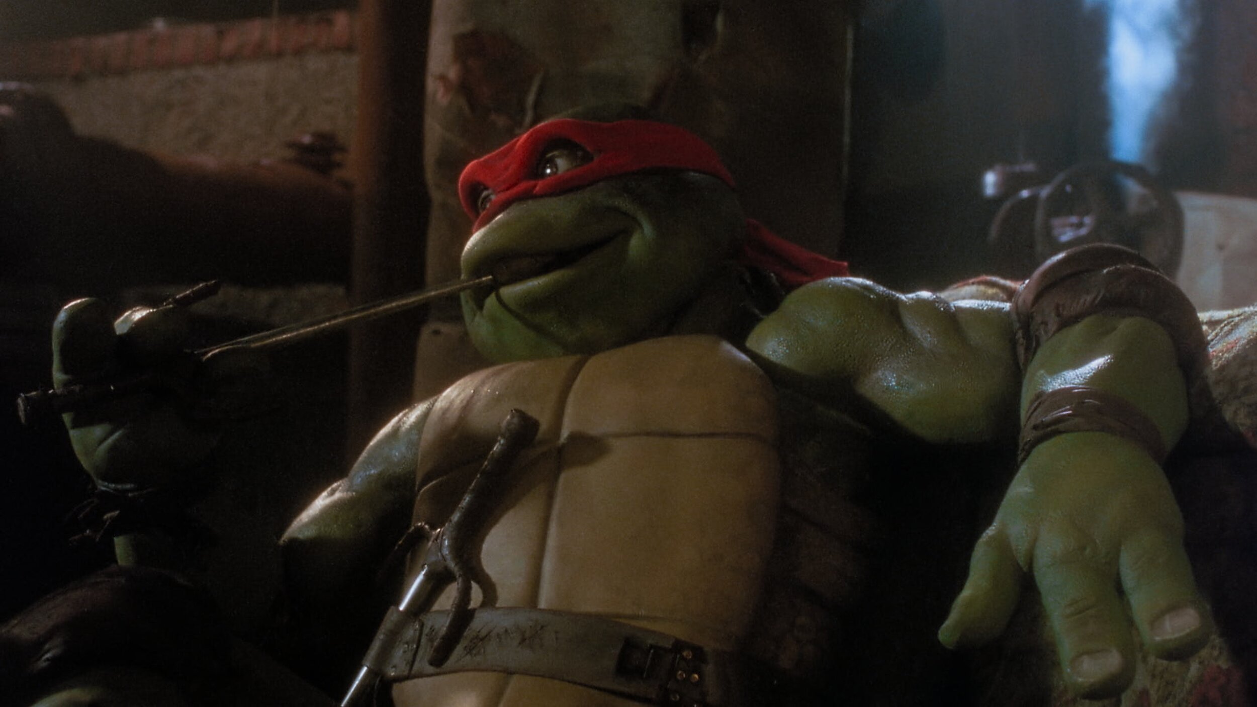
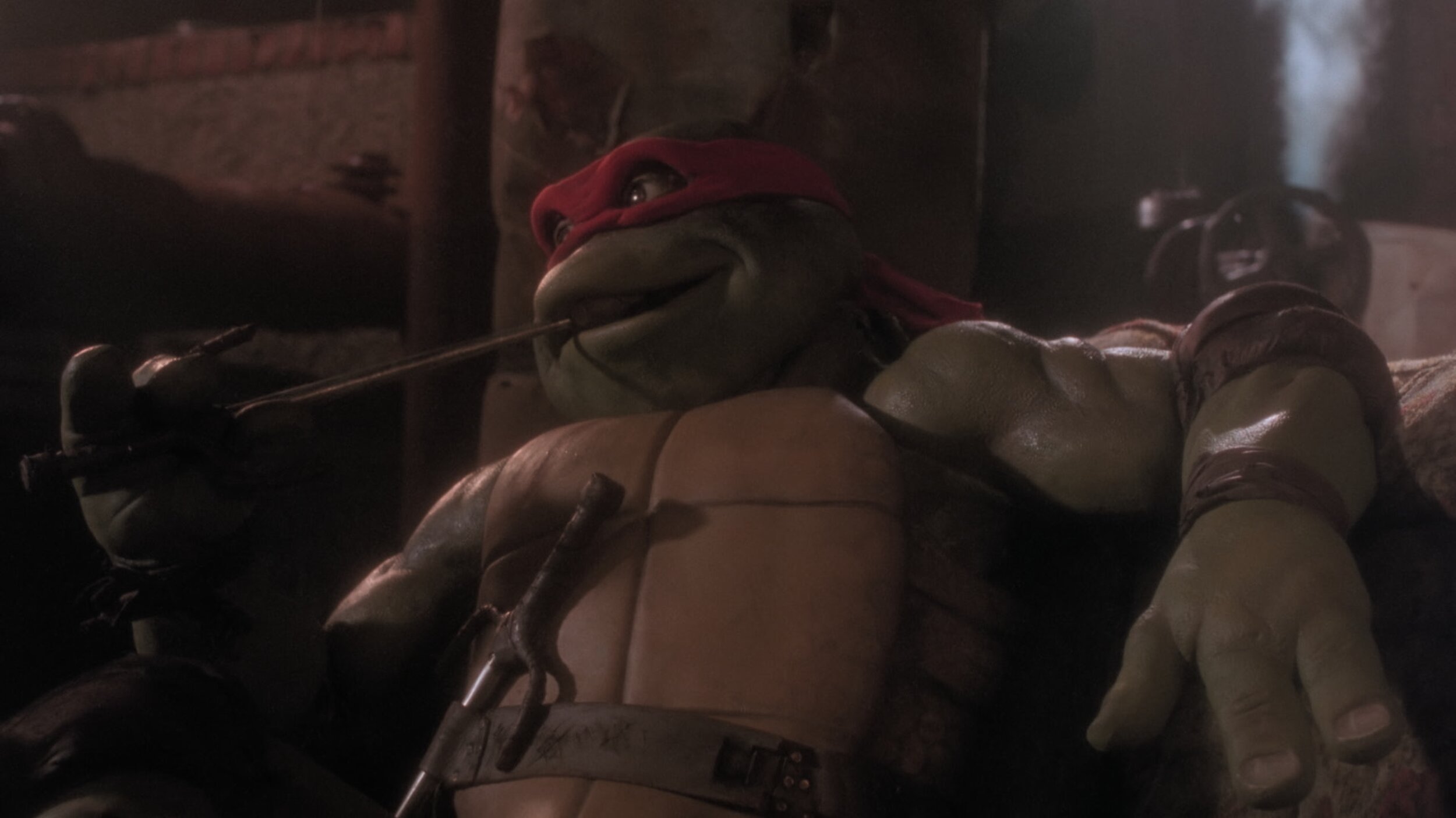
The Color sessions were supervised by Malcolm, Sal, and Bob Ducsay. We used Nevion and ClearView for remote sessions, but most of the work was done in-person on the lot here in Burbank. The Animated sequences were supervised by Spike Brandt and Devin Crane. These guys are animation heavyweights, so very cool to be in such good company for an animation nerd like me.

Most of the tweaking on the animation was for continuity fixing. A few of the shots we composited for final in the Baselight. This gave Devin and Spike a little extra creative freedom than a baked shot would have.

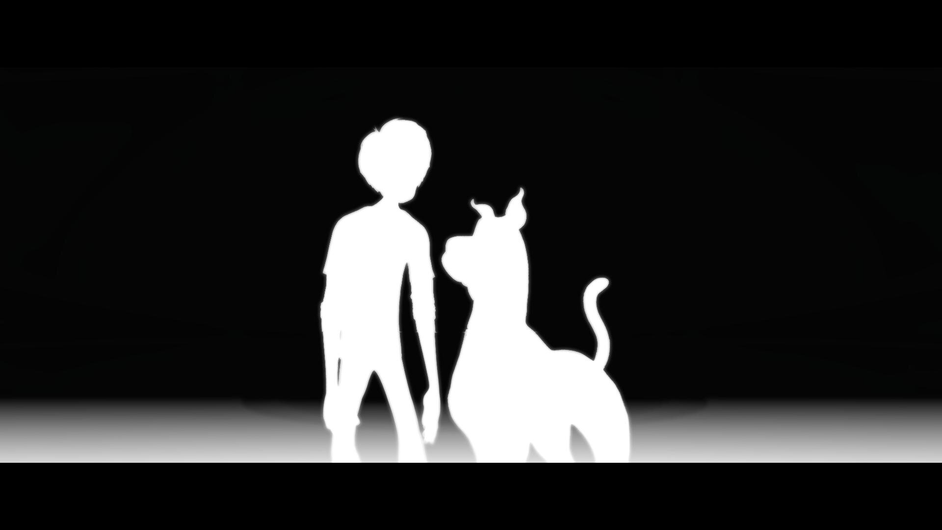
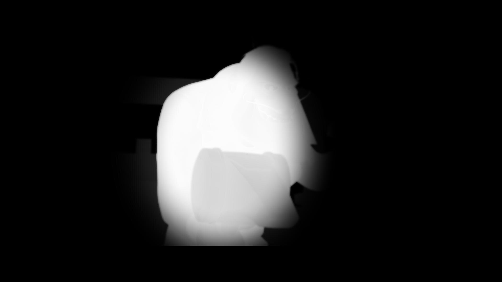
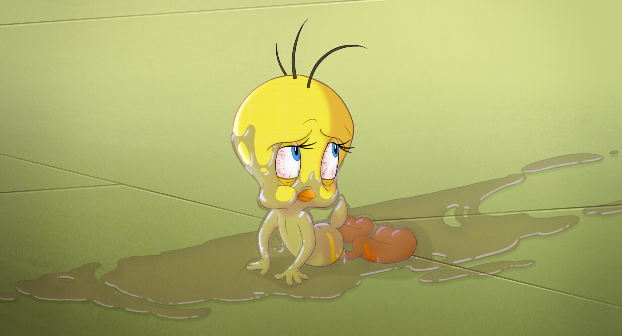
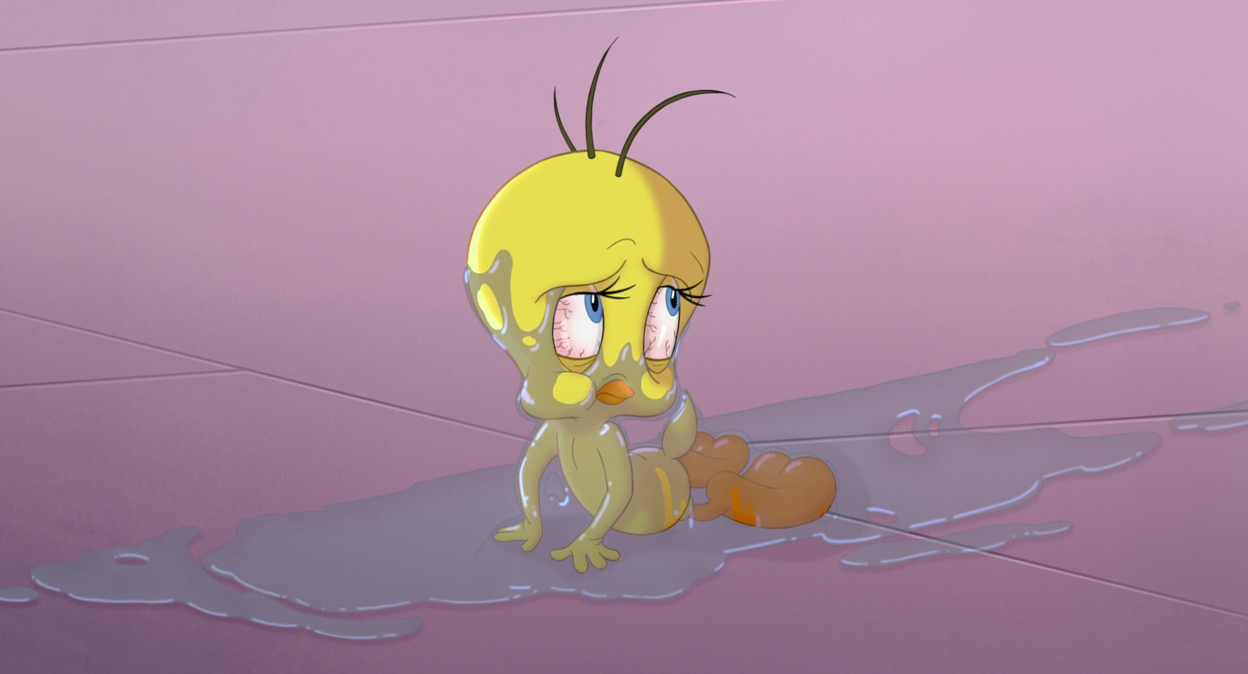
Reference for Tweety’s floor

After all the color decisions were made, Malcolm had his final pass and the masters were created. All deliverables from that point were sub-masters from the hero PQ deliverable. These included deliverables such as the Dolby Vision Theatrical version and 709 SDR version derived from the Dolby XML metadata.

Go See It!

Thanks for reading how the look of this candy-colored revival came together. Working on Space Jam was a wild ride. I had to tap into my background in photochemical film processing and knowledge of the latest digital grading techniques to create unique looks for all the different cinematic worlds visited. The film is a nostalgic love letter to the rich history and legacy of the Warner Bros. Studio. I couldn't be more proud of the Warner Color team, especially Leo Ferrini and Paul Lavoie. A big thanks to you guys! Putting this film together was a monumental task and I am ecstatic with end result. Check it out in theaters and on HBO Max today!

Best Practices: Restoring Classics

2020 - The year of Restorations

Now that we seem to be on the other end of the pandemic, I wanted to take a moment to look back on some of the projects that kept me busy. Restorations were the name of game during covid times. With productions shut down and uncertainty in the theatrical marketplace, I had time in my schedule to breathe new life into some of my favorite classics.

Over the last year, I have restored;

Let’s take a look at a couple of these titles and talk about what it means to remaster a film with our contemporary toolset.

The Process

The process for remastering classic titles is very similar to finishing new theatrical work with a couple of additional steps. The first step is to identify and evaluate the best elements to use. That decision is easy for digitally acquired shows from the early 2000’s. In those instances, the original camera files are all that exist and are obviously the best source. Film shows are where it gets particularly ambiguous. There is a debate whether starting from the IP or original negative yields better results. Do we use the original opticals or recreate them from the elements? Black and white seps vs faded camera neg? These questions all need to be answered before you begin the work. Usually I prefer to start with the OCN when available.

Director Scanner

Director Scanner

Arri Scan

Arri Scan

Scanning

Scanning is arguably the most critical part of the process. Quality and success will live or die by the execution of great scans. Image breathing, movement, and general sharpness are issues to look for when evaluating. Scans should not be pretty but rather represent a digital copy of the negative.  In a perfect closed-loop system, a scanned piece of film, once shot back out on a calibrated recorder needs to closely match the original negative.

Digital Restoration

The next step in making an old project shiny and new is to repair any damage to the film from aging or that was inherent in production. this includes painting out splice lines, gate hairs, dirt, and scratches. Film processing issues like breathing or turbulence can also be taken care of in this step. I prefer to postpone flicker removal until the grading step since the contrast will have an effect on the amount of flicker to remove. Some common tools used for restoration include MTI and PF Clean. This work is often outsourced because of the high number of man-hours and labor costs associated with cleaning every frame of film. Some companies that do exceptional restoration work are PrimeFocus and Prasad among others.

Grading

Grading restoration titles is a total sub-discipline from grading as a whole. New theatrical grading starts with references and look development to achieve a certain tone for the film. There is a ton of work that goes into this process. Restoration grading differs since the goal is staying true to that original intent. Not reimagining it. Much like new theatrical grading, a good reference will set you up for success. My preferred reference is a filmmaker-approved answer print.  These were the master prints that best represented the filmmakers’ creative intent.

kinoton-fp30d-696x1024.jpeg

A good practice is to screen the print and immediately set looks for the scans getting as close as possible at 14fl projected. An upgrade to this workflow is to use a projector in the grading suite like a Kinoton. These projectors have remote control and cooling. This allows you to rock and roll the film. You can even freeze-frame and thanks to the built in cooling your film doesn’t burn. Setting up a side-by-side with the film vs digital is the best way to ensure you have a match to the original intent. These corrections need to happen using a good color management system. Aces for example has ODTs for theatrical 48nits which is the equivalent of 14fl. Once you have a match to the original, the enhancement can start.

There would be no point in remastering if it was going to look exactly like the existing master. One great reason to remaster is to take advantage of new advancements in HDR and wide color gamut formats. Film was the original HDR format containing 12 stops of range. The print was the limiting factor, only being able to display 8 of those stops. By switching the ODT to PQ P3D65, we can take advantage of the larger container and let the film display all that it has to offer.

My approach is to let the film land where it was originally shot but tone-mapped for PQ display. This will give you a master that had the original intent of the print but in HDR. I often use an LMT that limits the gamut to that of the emulsion used for original photography. This also ensures that I’m staying true to the film's original pallet. Typically there is some highlight balancing to do since what was white and “clipped” is now visible. Next is to identify and correct any areas where the contrast ratios have been disrupted by the increased dynamic range. For example, if there was a strongly silhouetted shot, the value of the HDR highlight can cause your eye to iris down changing the perception of the deep shadows. In this case, I would roll off the highlights or lift the shadows so the ratio stays consistent with the original. The extra contrast HDR affords is often welcomed but it can cause some unwanted issues too. Grain appearance is another one of those examples.


Grain Management

Film grain is one of those magic ingredients. Just like salt, you miss it when it is not there and too much ruins the dish. Grain needs to be felt but never noticed. It is common for the noise floor to increase once you have stretched the film scan to HDR ranges. Also, the grain in the highlights not previously visible starts to be seen. To mitigate this, a grain management pass needs to be implemented. This can come before the grade, but I like to do this after since any contrast I add will have an effect on the perceived amount of noise. Grain can impart a color cast to your image, especially if there is a very noisy blue channel. Once removed this needs to be compensated for and is a downside of working post grade. It is during this pass that I will also take care of flicker and breathing which the grade also affects. My go-to tool for this is Neat Video. You would think that after a decade of dominance some software company would have knocked Neat off their throne as king of the denoise, but it hasn’t happened yet. I prebake the scans with a Neat pass (since Baselight X doesn’t play nicely with Neat yet.) Next, I stack the Neat’ed scan and the original as layers. This allows me to blend in the amount of grain to taste. The goal of this pass is to keep the grain consistent from shot to shot, regardless of the grade. The other, and most important goal is to make the grain look as it did on the print.

Dolby Trim

After the HDR10 grade is complete, it’s time for the Dolby trim. I use the original 14 FL print match version as a reference for where I want the Dolby trim to clip and crush. Once all the trims have been set, I export out a Dolby XML expecting rec2020 primaries as input. Yes, we graded in P3, but that gamut will be placed into a 2020 container once we export.

Mastering

Once all the work has been completed it’s time to master. Remasters receive the same treatment as new theatrical tiles when it comes to deliverables. The common ones are as follows:

  • Graded PQ P3D65 1000nit 16bit Tiff Files or ACES AP0 EXRs

  • Un-Graded PQ P3D65 16bit Tiff files or ACES AP0 EXRs

  • Graded 2.6 XYZ DCDM 14fl

  • Graded PQ XYZ 108nit 16bit Tiff Files or ACES AP0 EXRs for Dolby Vision Theatrical

  • Bt1886 QT or DPX files created from a Dolby XMLIMF PQ rec2020 limited to P3D65 1000nit

Case Studies

Perfect worlds do exist but we don’t live in one. Every job is a snowflake with its own unique hurdles. Remastering tests a colorists abilities across many disciplines of the job. Stong skills in composting, paint, film manipulation, and general grading is what is required to achieve and maintain the original artistic intent. Here are two films completed recently and a bit on the challenges faced in each.

Teenage Mutant Ninja Turtles

For those of you that don’t know the Ninja Turtles are near and dear to me. Not only was I a child of the 80s, but my Father was in charge of the postproduction on the original cartoons. He also wrote and directed many of them. When this came up for a remaster, I jumped at the chance to get back to my roots.

This film only required an SDR remaster. The output delivery was to be P3 D65 2.6 gamma. I set up the job using Baselight’s color management and worked in T-Log E_Gamut. The DRS was performed by Prasad with additional work by yours truly BECAUSE IT HAD TO BE PERFECT!

dark_1.13.1.jpg

There were two main color hurdles to jump through. First, some scenes were very dark. I used Baseligt’s boost shadow tool to “dig” out detail from the toe of the curve. This was very successful in many of the night scenes that the film takes place in.

Another trick I used was on the Turtle’s skin. You may or may not know, but all the turtles have different skin colors. Also, most folks think they are green, when in fact there is very little green in their skin. They are more of an olive. To make sure the ratio of green to yellow was correct I converted to LAB and graded their skin in that color space. Once happy, I converted it back to T-Log E-Gamut. LAB is a very useful space for affecting yellow tones. In this space, I was able to tweak their skin and nothing else. Sort of like a key and a hue shift all in one.

tmnt_lab.gif

The SDR ended up looking so good that the HDR was finished too. The HDR was quick and painless because of Baselight’s built-in color management. Most of the heavy lifting was already done and only a few tweaks needed.


Space Jam

Space Jam was a formative film from my youth. Not only did I have Jordan’s at the time, but I was also becoming a fledgling animation nerd (thanks Dad) when this film was released.

I set up the project for ACES color management with a Kodak LMT that I had used for other films previously. This reigned in the extreme edge of gamut colors utilized in the animation.

The biggest challenge on this project was cleaning up some of the inherent artifacts from 1990’s film recording technology. Cinesite performed all of the original composites, but at the time they were limited to 1k film recording. To mitigate that in a 4k world, I used Baselight’s texture equalizer and convolutional sharpen to give a bit of snap back to the filmed out sections.

Vishal Chathle supervised the restoration for the studio. Vishal and I boosted the looney tunes to have more color and take advantage of the wider gamut. The standard film shots, of which there were few, were pretty straightforward. Corrected mostly with Baselight’s Basegrade. Basegrade is a fantastic tool where the corrections are performed in linear gamma. This yields a consistent result no matter what your working space is.

Joe Pytka came in to approve the grade. This was very cool for me since not only did I grow up watching this film of his, but also all those iconic Superbowl commercials from the 90’s that he did. A true master of camera. He approved the grade but wished there was something more we could do with the main title. The main title sequence was built using many video effects. To recreate it would have cost a fortune. We had the original film out of it, but it looked pretty low res. What I did to remedy this was to run it through an AI up-rezer that I coded a while ago for large format shows.

The results were astounding. The titles regained some of their crisp edges that I can only presume were lost from the multiple generations of opticals that the sequence went through. The AI was also able to fix the aliasing inherent in the low res original. In the end, I was very proud of the result.

The last step was grain management. This show needed special attention because the grain from the Jordan plate was often different from the grain embedded in the animation plate that he was comped into. In order to make it consistent. I ran two de-grain passes on the scan. The first took care of the general grain from the original neg. The second pass was tuned to clean up Jordan’s grain that had the extra layer of optical grain over the top. It was a complicated noise pattern to take care of. Next, I took the two de-grained plates, roto’ed out Jordan, and re-comp-ed him over the cleaned-up plate. This gave consistency to the comps that were not there in the original.

Another area where we helped the comps were in animation error fixing. Some shots had layers that would disappear for a couple of frames, or because it was hand-drawn, a highlight that would disappear and then reappear. I used Baselight’s built-in paint tool to repair the original animation. One great feature of the paint tool is its ability to paint on two’s. An old animation trick is to only animate at 12fps if there isn’t a lot of motion. Then you shoot each frame twice. This halves the number of frames that need to be drawn. When I was fixing animation issues I would make a paint stroke on the frame and Baselight would automatically hold it for the next one. This cut down my work by half just like the original animators!

I was honored to help restore this piece of animation history. A big thanks to Michael Borquez and Chris Gillaspie for the flawless scanning and deep investigation of the best elements to use. Also a tip of the cap to Vishal Chathle for all the hard work and lending me his eagle eye!

Final Thoughts

Restoration Colorist should be a credit on its own. It’s unfortunate that this work rarely gets recognized and even less frequently gets credit. It is hard enough to deliver a director’s artistic vision from scratch. It’s arguably even harder to stay true to it 30 years later. Thanks for reading and check out these projects on HBO Max soon!

Baselight Tips and Tricks

Hey everybody! Here is a video that Filmlight just released on their website. It’s a great series and I’m happy to have contributed my little bit. Let me know what you think.


Finishing Scoob!

Scoob!” is out today. Check out my work on the latest Warner Animation title. Here are some highlights and examples of how we pushed the envelope of what is possible in color today.

Scoob-Expected-Release-Date-Cast-Plot-and-every-other-detail.png

Building the Look

ReelFX was the animation house tasked with bringing “Scoob!” from the boards to the screen. I had previously worked with them on “Rock Dog” so there was a bit of a shorthand already in place. I already had a working understanding of their pipeline and the capabilities of their team. When I came on-board, production was quite far along with the show look. Michael Kurinsky (Production Designer) had already been iterating through versions addressing lighting notes from Tony Cervone (Director) through a LUT that ReelFX had created. This was different from “Smallfoot” where I had been brought on during lighting and helped in the general look creation from a much earlier stage. The color pipeline for “Scoob!” was Linear Arri Wide Gamut EXR files -> Log C Wide Gamut working space ->Show LUT -> sRGB/709. Luckily for me, I would have recommended something very similar. One challenge was the LUT was only a forward transform with no inverse and only built for rec.709 primaries. We needed to recreate this look targeting P3 2.6 and ultimately rec.2020 PQ.

Transform Generation

Those of you that know me, know that I kind of hate LUTs. My preference is to use curves and functional math whenever possible. This is heavier on the GPUs but with today’s crop of ultra-fast processing cards, it hardly matters. So, my first step was to take ReelFX’s LUT and match the transform using curves. I went back and forth with Mike Fortner from ReelFX until we had an acceptable match.

My next task was to take our new functional forward transform and build an inverse. This is achieved by finding the delta from a 1.0 slope and multiplying that value by a -1. Inverse transforms are very necessary for today’s deliverable climate. For starters, you will often receive graphics, logos, and titles in display referred spaces such as P3 2.6 or rec.709. The inverse show LUT allows you to place these into your working space.

Curve and it’s inverse function

Curve and it’s inverse function

After the Inverse was built, I started to work on the additional color spaces I would be asked to deliver. This included the various forward transforms to p3 2.6 for theatrical, rec.2020 limited to P3 with a PQ curve for HDR, and rec.709 for web/marketing needs. I took all of these transforms and baked them into a family DRT. This is a feature in Baselight where the software will automatically use the correct transform based on your output. A lot of work up front, but a huge time saver on the back end; plus less margin for error since it is set programmatically.

Trailers First

The first piece that I colored with the team were the trailers. This was great since it afforded us the opportunity to start developing workflows that we would use on the feature.

My friend in the creative marketing world once said to me “I always feel like the trailer is used as the test.” That’s probably because the trailer is the first picture that anybody will see. You need to make sure it’s right before it’s released to the world.

Conform

Conform is one aspect of the project where we blazed new paths. It’s common to have 50 to 60 versions of a shot as it gets ever more refined and polished through the process. This doesn’t just happen in animation. Live-action shows with lots of VFX (read: photo-real animation) go through this same process.

We worked with Filmlight to develop a workflow where the version tracking was automated. In the past, you would need an editor to be re-conforming or hand dropping in shots as new versions came in. On “Scoob!”, a database was queried and the correct shot if available was automatically placed in the timeline. Otherwise, if not available, the machine would use the latest version delivered to keep us grading until the final arrives. This saves a huge amount of time (read: money).

Grading

Coloring for animation

I often hear, “It’s animation… doesn’t it come to you already correct?” Well, yes and no. What we do in the bay for animation shows is color enhancement; not color correction. Often, we are taking what was rendered and getting it that last mile to where the Director, Production Designer, and Art Director envisioned the image to be.

This includes windows and lighting tricks to direct the eye and enhance the story. Also, the use of secondaries to further stretch the distance between two complementary colors, effectively adding more color contrast. Speaking of contrast, it was very important to Tony, that we never were too crunchy. He always wanted to see into the blacks.

These were the primary considerations when coloring “Scoob!” Take what is there and make it work the best it can to promote the story the director is telling. Which takes me to my next tool and technique that was used extensively.

Deep Pixels and Depth Mattes

I’ve always said, if you want to know what we will be doing in color five years from now, look at what VFX is doing today. Five years ago in VFX deep pixels or voxels as they are sometimes referred, was all the rage. Today they are a standard part of any VFX or Animation pipeline. Often they are thrown away because color correctors either couldn’t use them or it was too cumbersome. Filmlight has recently developed tools that allow me to take color grading to a whole other dimension.


A standard pixel has 5 values R,G,B and XY. A Voxel has 6 values RGB and XYZ. Basically for each pixel in a frame, there is another value that describes where it is in space. This allows me to “select” a slice of the image to change or enhance.

This matte also works with my other 2D qualifiers turning my circles and squares into spheres and cubes. This allows for corrections like “more contrast but only to the foreground” or desaturate the character behind Scooby, but in front of Velma.


Using the depth mattes along with my other traditional qualifiers all but eliminated the need for standard alpha style mattes. This not only saves a ton of time in color since I’m only dealing with one matte but also generates savings in other departments. For example with fewer mattes, your EXR file size is substantially smaller, saving on data management costs. Additionally, on the vendor side, ReelFX only had to render one additional pass for color instead of a matte per character. Again, a huge saving of resources.

I’m super proud of what we were able to accomplish on “Scoob!” using this technique and I can’t wait to see what comes next as this becomes standard for VFX deliveries. A big thank you to ReelFX for being so accommodating to my mad scientist requests.

Corona Time

Luckily, we were done with the theatrical grade before the pandemic hit. Unfortunately, we were far from finished. We were still owed the last stragglers from ReelFX and had yet to start the HDR grade.

Remote Work

We proceeded to set up a series of remote options. First, we set up a calibrated display at Kurinsky’s house. Next, I upgraded my connection to my home color system to allow for faster upload speeds. A streaming session would have been best but we felt that would put too many folks in close contact since it does take a bit of setup. Instead, I rendered out high-quality Prores XQ files. Kurinsky would then give notes on the reels over Zoom or email. I would make changes, rinse and repeat. For HDR, Kurinsky and I worked off a pair of x300s. One monitor was set for 1000nit rec.2020 PQ and the other for the 100nit 709 Dolby trim pass. I also made H.265 files that would play off a thumb drive once plugged into an LG E-series OLED. Finally, Tony approved the 1.78 pan and scan in the same way.

I’m very impressed with how the whole team managed to not only complete this film but finish it to the highest standards under incredibly trying times. An extra big thank you to my right-hand man Leo Ferrini who was nothing but exceptional during this whole project. Also, my partner in crime, Paul Lavoie, whom I have worked with for over 20 years. Even though he was at home, it felt like he was right there with me. Another big thanks.

Check Out the Work

Check out the movie at the link below and tell me what you think.

https://www.scoob.movie/

https://www.scoob.movie/


Thanks for reading!

-John Daro