It’s finally here.
After years of advocacy, IMDb and IMDbPro have officially launched a dedicated "Color Department" category. This is a monumental and long-overdue step forward for our craft.
For decades, the work of professional colorists, the artists who help shape the final look, mood, and emotional impact of a film has often been bundled under generic categories like "Additional Crew" or "Editorial Department." While we are proud collaborators with every department, this old system obscured the unique artistic and technical contributions that are core to our profession. It made it harder for audiences to find us, for producers to credit us properly, and for new talent to see a clear path.
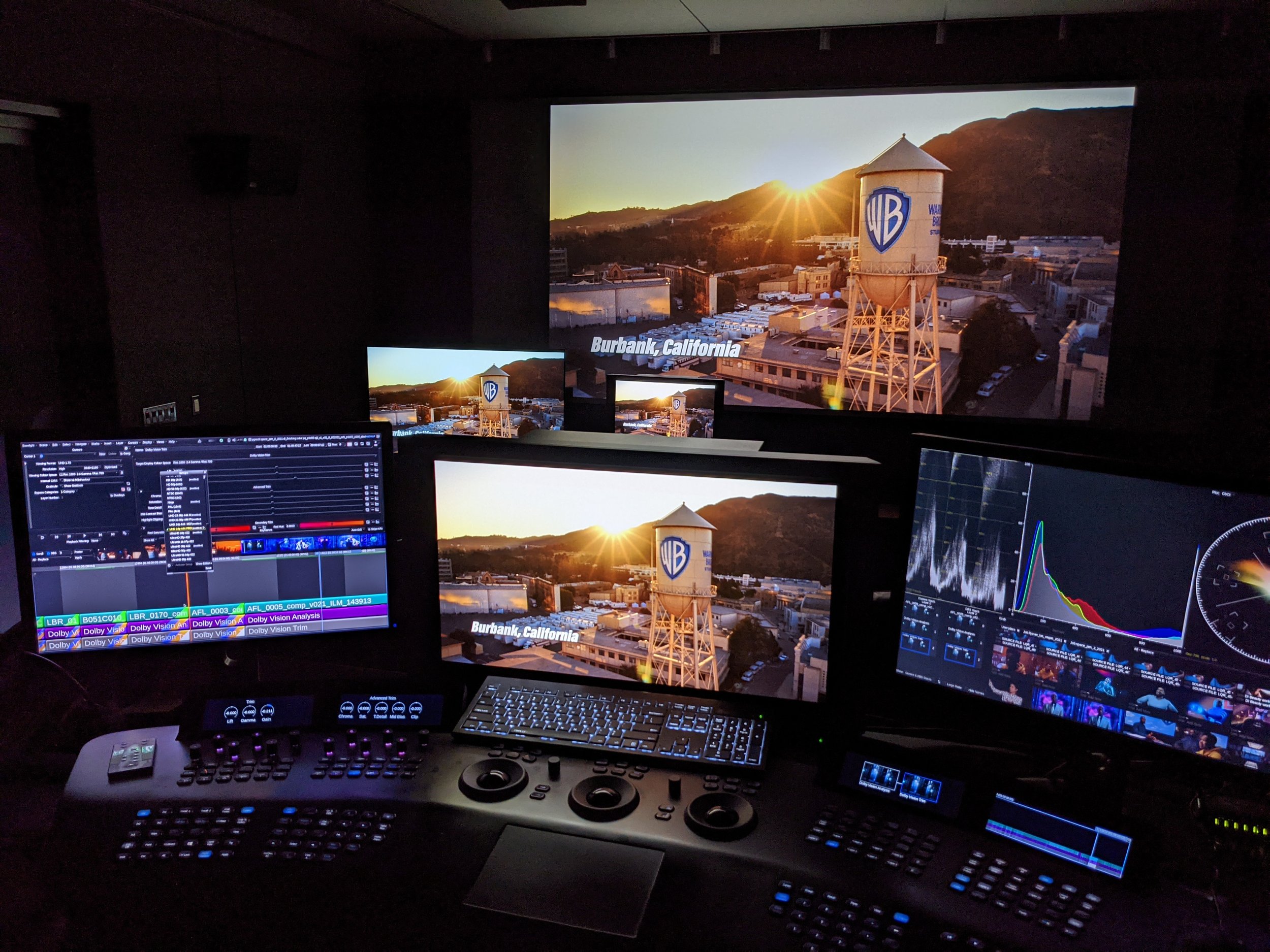
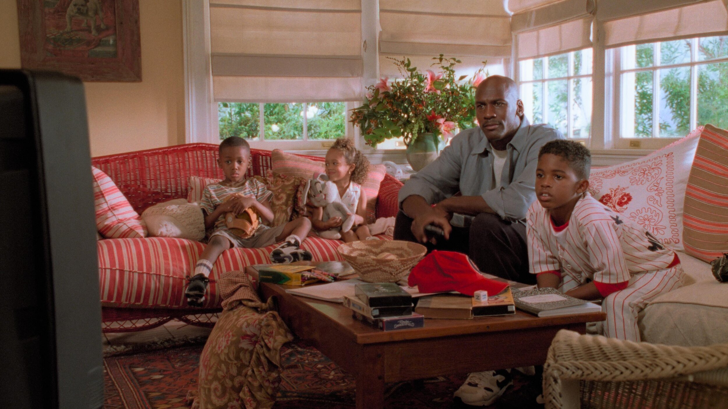
When a change like this happens, it makes you reflect on your own body of work. I find myself thinking back to Contagion. This was back when the 'Intermediate' in Digital Intermediate really meant something. It was an intermediate step to a final film print.

We had all this text over picture that needed a very specific, saturated "warning / danger" red. It looked fantastic on the digital projector, but that red was completely out of gamut for celluloid; you just couldn't hit it on film. I'll always remember the challenge of working with my mentor and film timer, Dan Muscarella, tweaking the look-up tables to land on a red Steven was content with for the final prints. I say content, not happy or elated… content. Ahh, the good ole' days of the film lab.
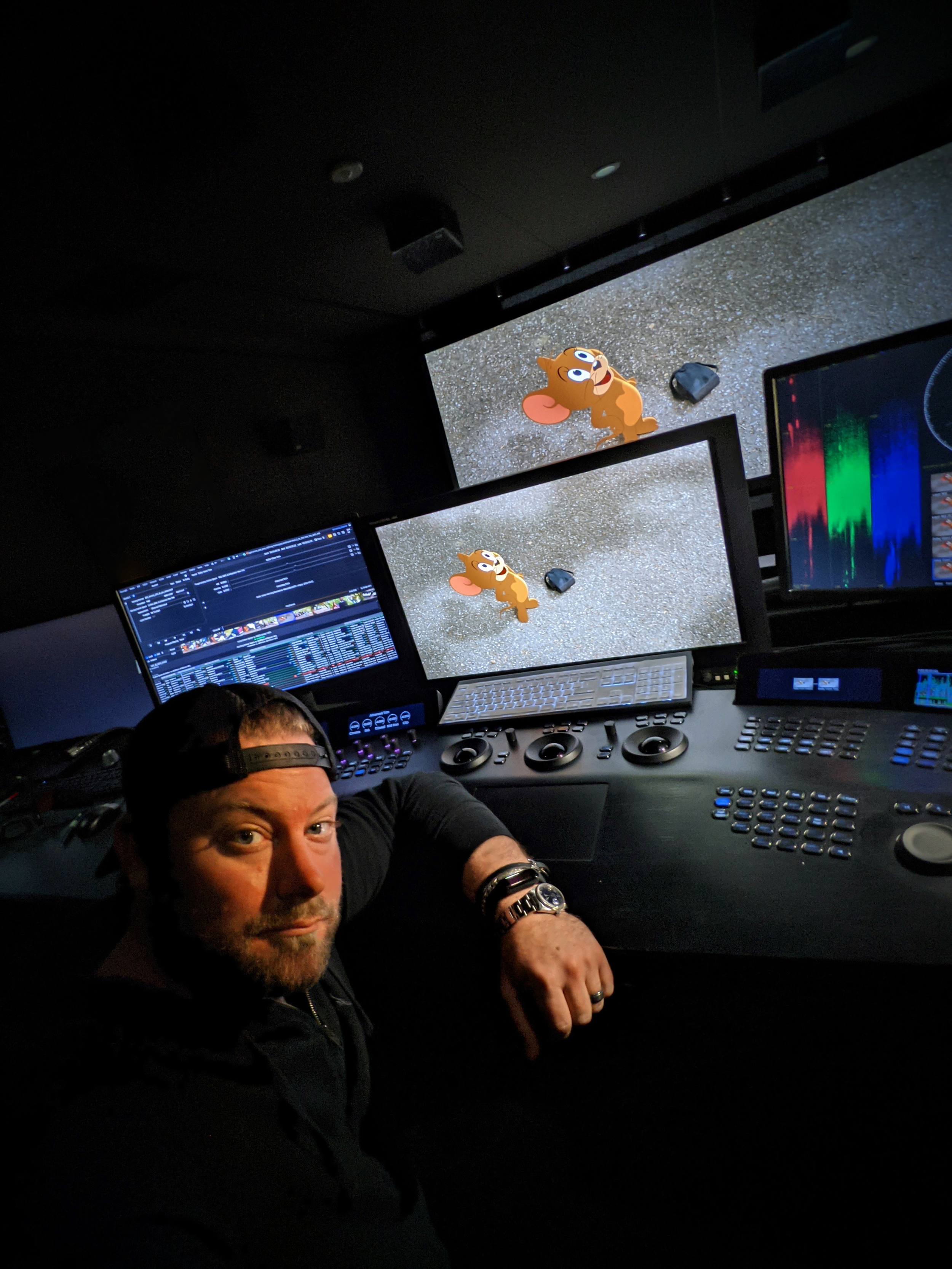
That kind of problem-solving, that invisible craft, is at the heart of what we do. To know that this film, and all the unseen work that went into it, will now be correctly and clearly categorized under my primary profession with the rest of my team... that's what this is all about.


This is more than just a database update; it's about visibility and acknowledgement
To all my fellow colorists: log in to your IMDbPro account, update your page, and officially set your profession to "Color Department." Let’s make our new home visible.