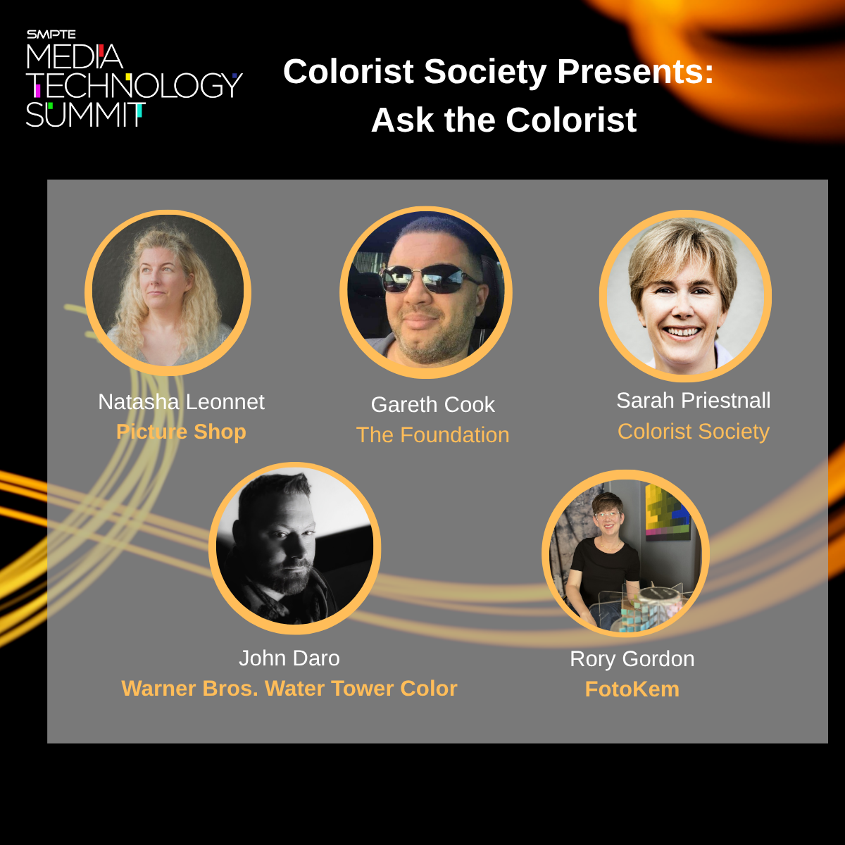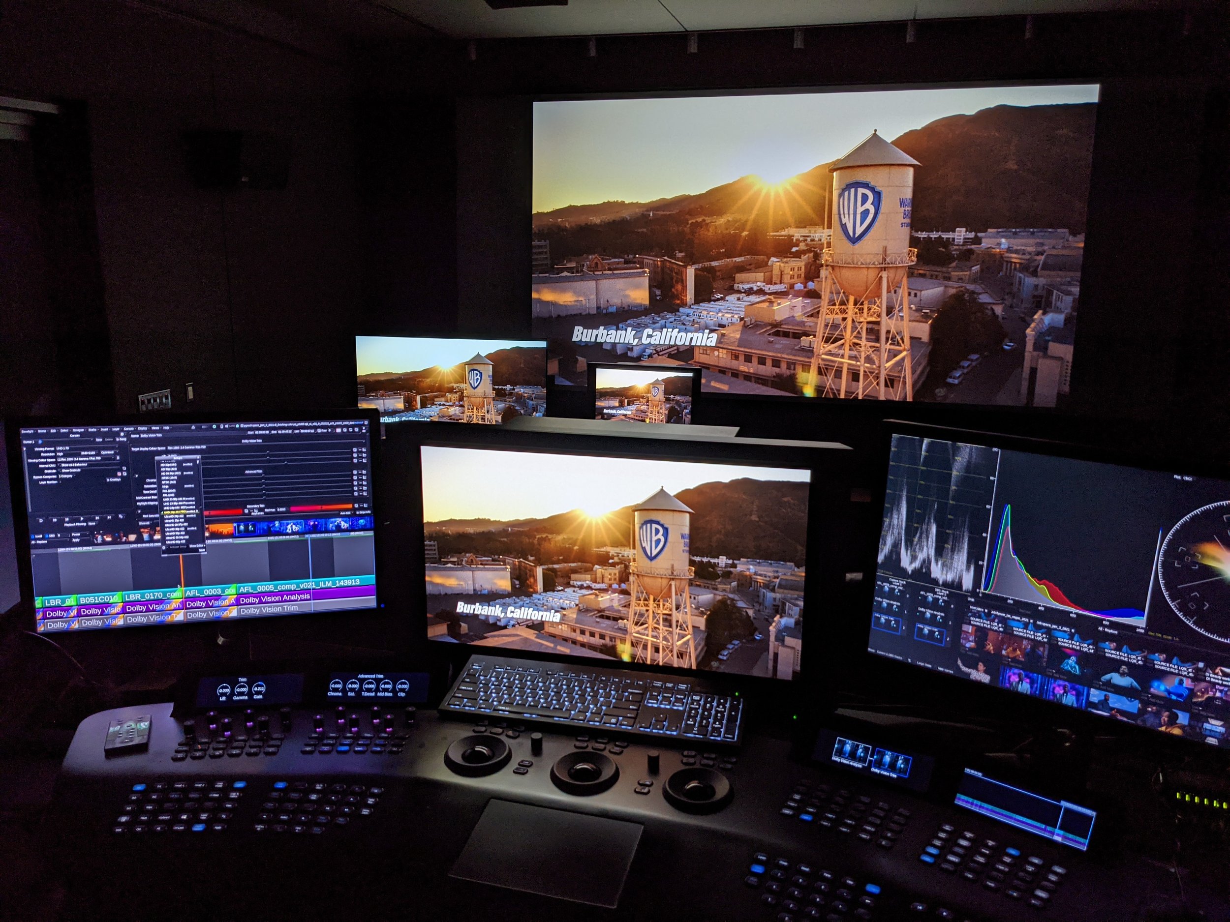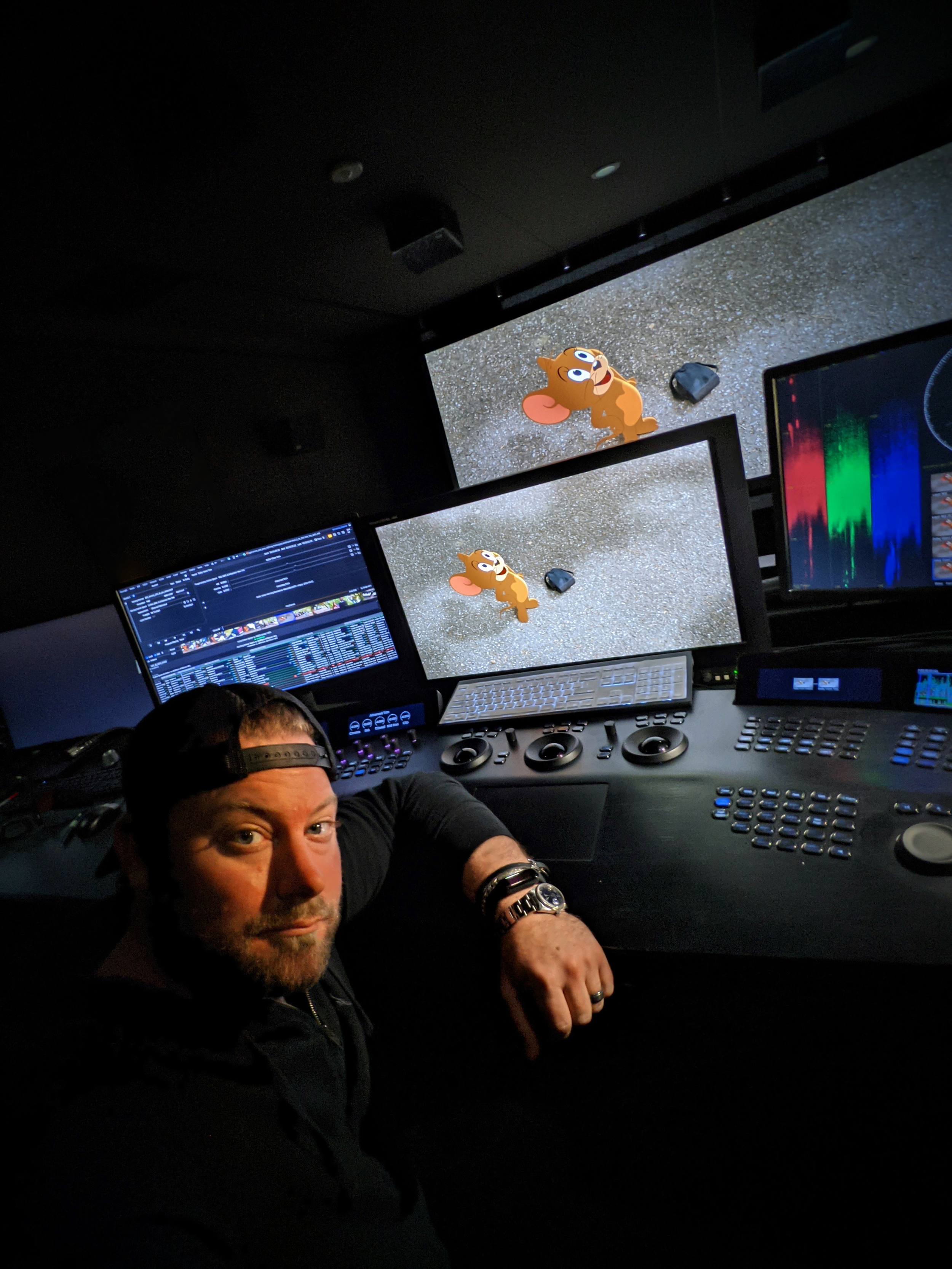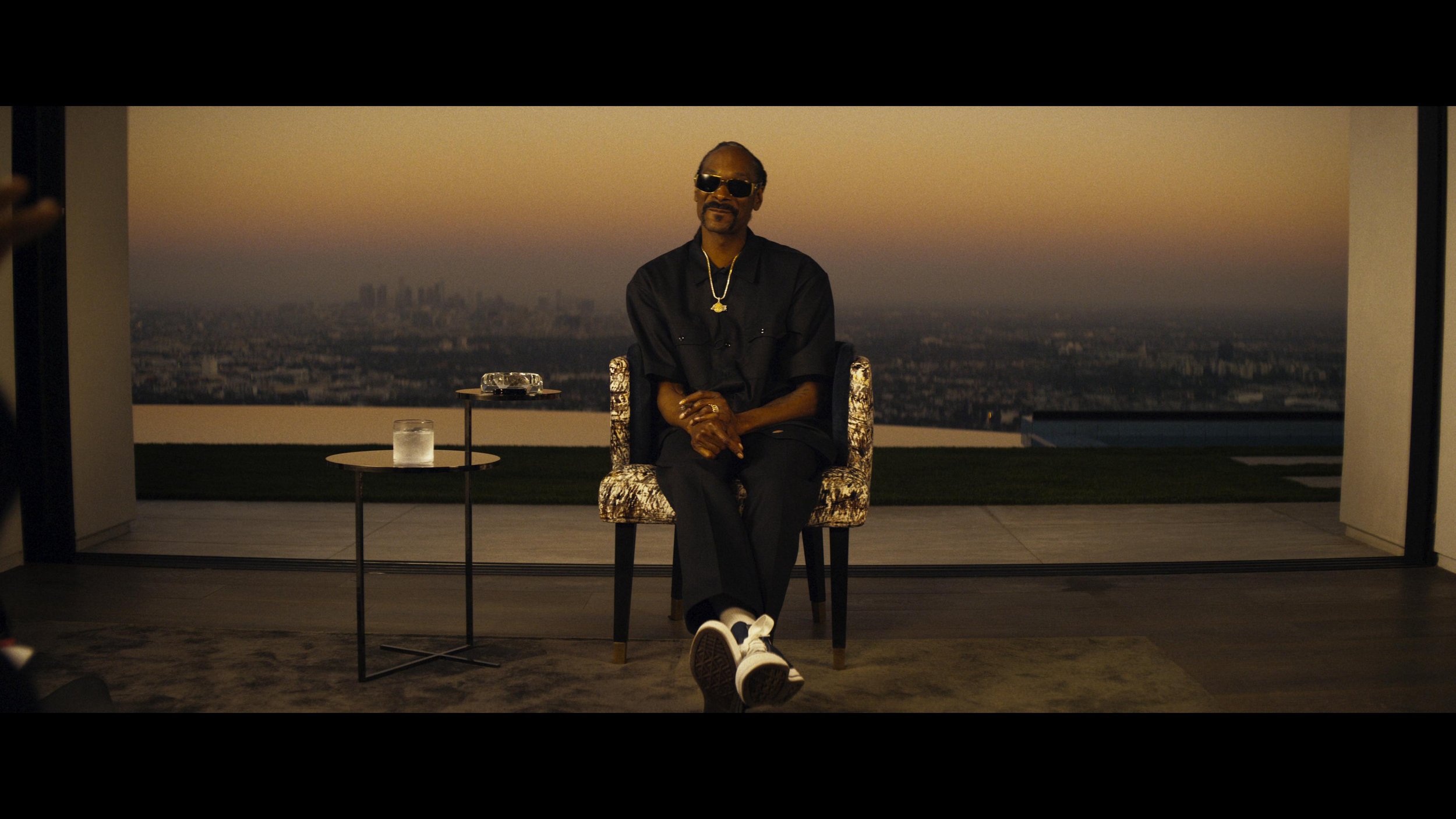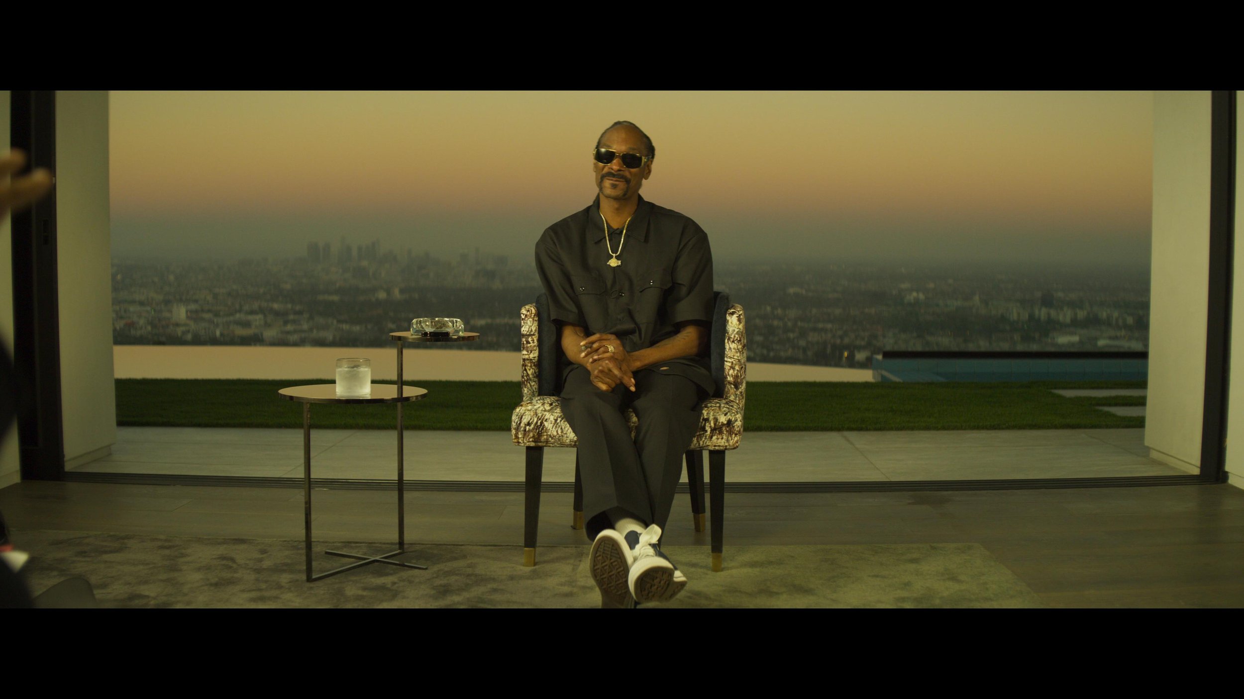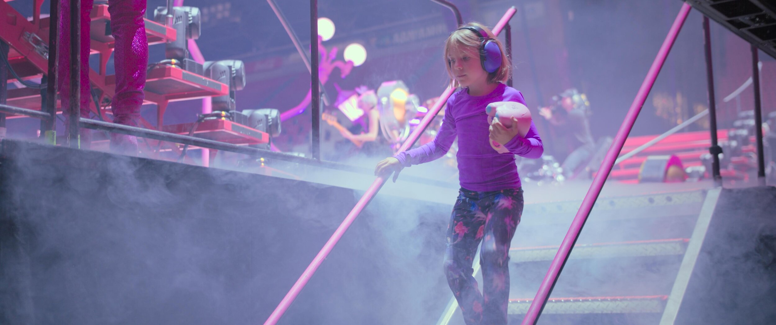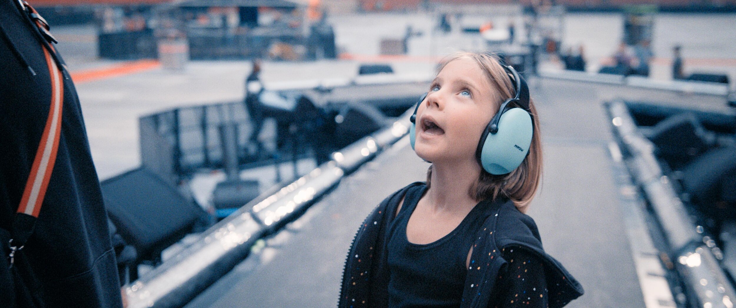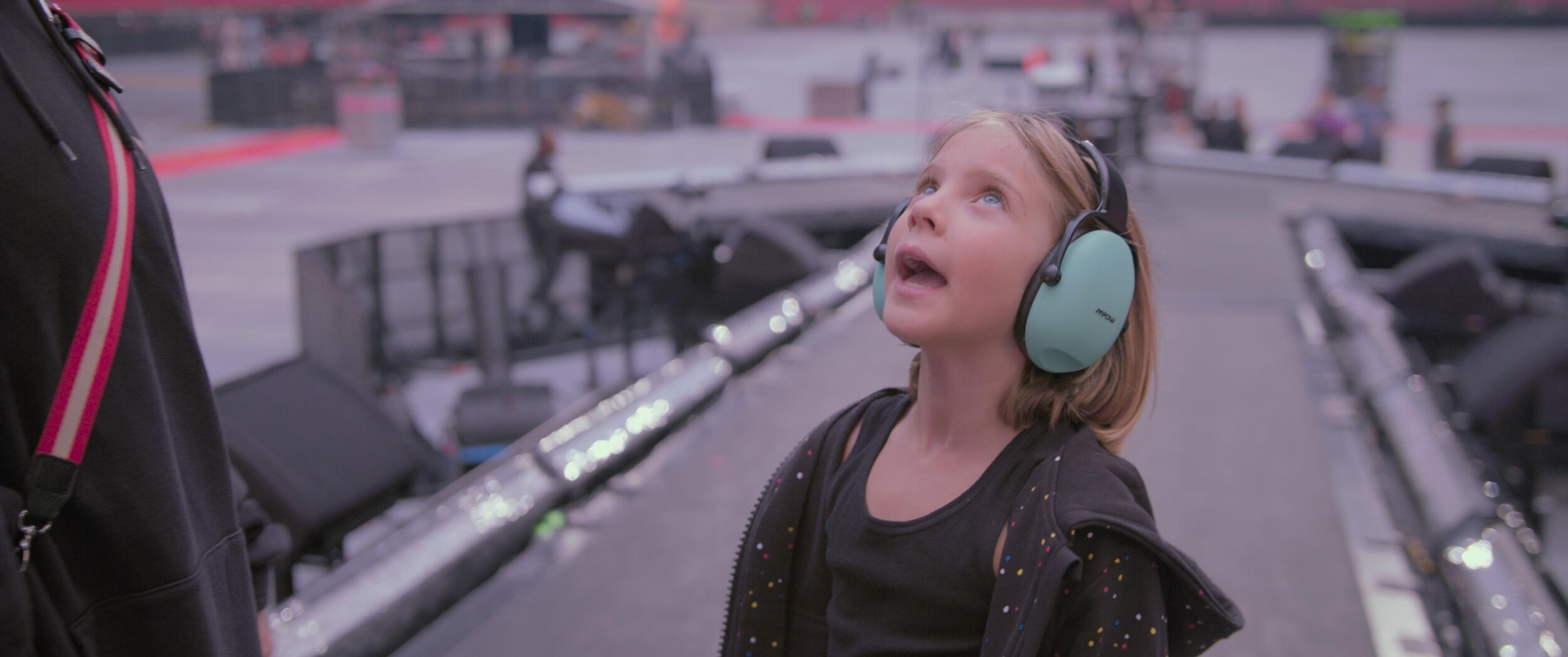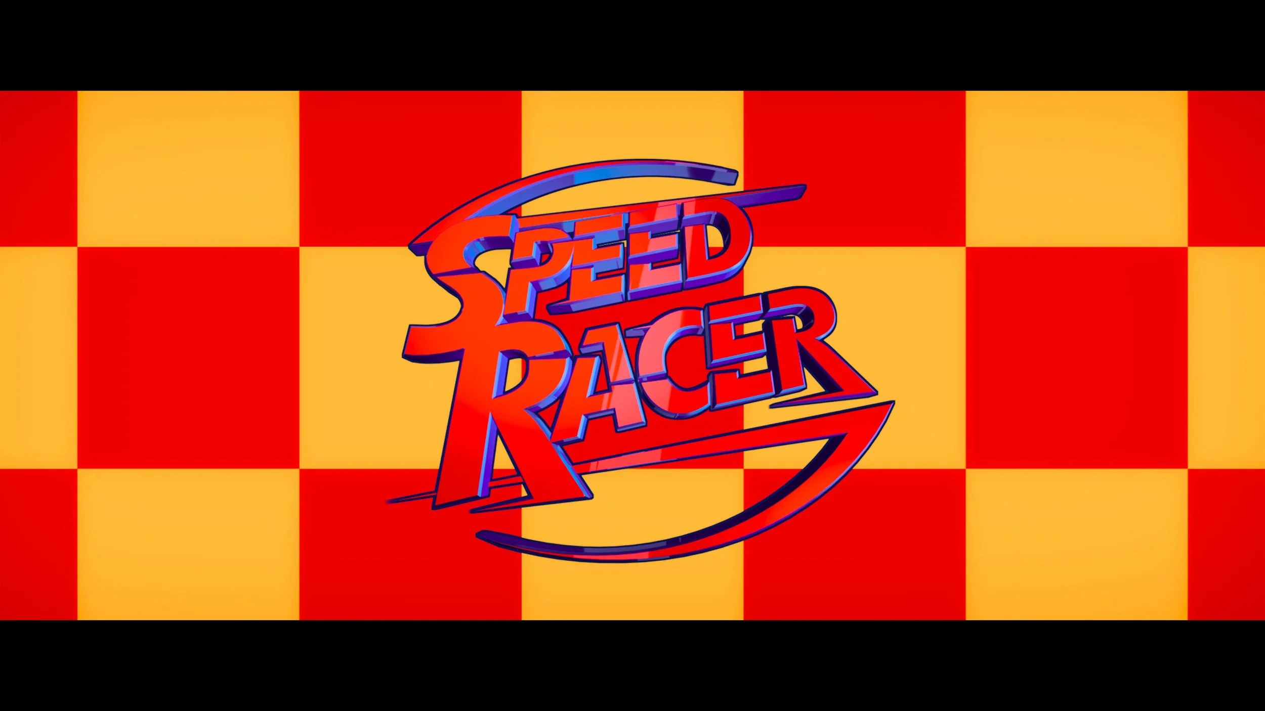
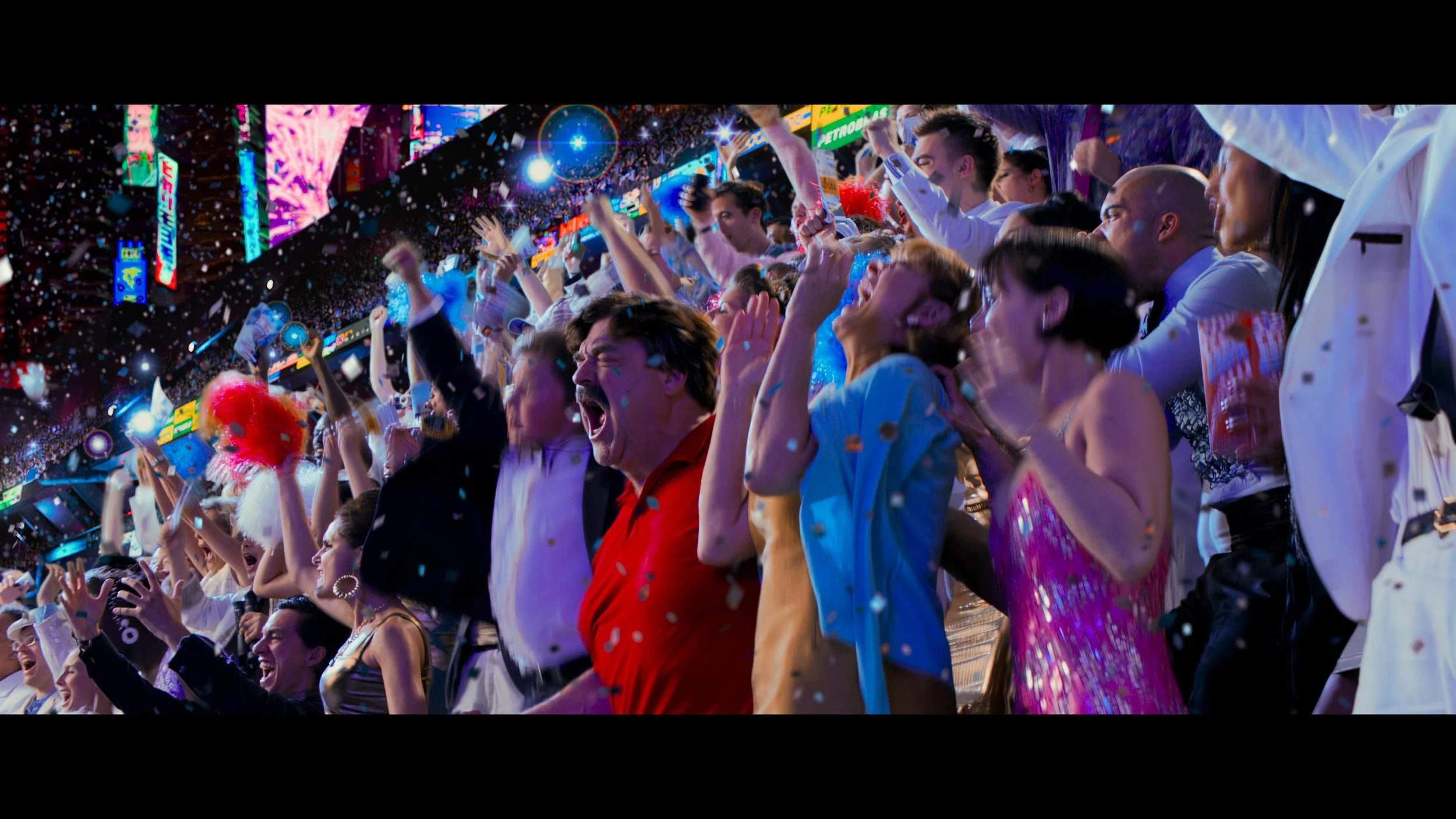
When the Wachowskis unleashed Speed Racer upon the world, it was a visual assault in the best possible way. A hyper-kinetic, candy-colored dreamscape that was years ahead of its time. Over here at the Water Tower, getting the chance to revisit and remaster this title for a modern home release was an absolute thrill. I regularly dive into the technical weeds of color grading, and this project pushed the boundaries of what we can do with archival files and modern display tech.
Starting at the Source: The 2K Filmout
Our starting point for the remaster was the original 2K Academy aperture Filmout Camera files. Because the original source was 2K, the first major hurdle was getting the resolution up to a pristine UHD standard without introducing artificial artifacts or losing the original texture of the image.
4x Zoom
To achieve this, we ran the files through our proprietary in-house up-rezzing tool called Samurai. Samurai is incredible for this specific use case because it intelligently targets and sharpens high-frequency detail to give you that crisp 4K bite, while leaving the rest of the picture unaltered and organic.

Building the Look: JIB and the Expanded Gamut
Once we had our UHD foundation, it was time to build the color pipeline. Using our custom in-house tool, JIB, I built a brand-new show LUT specifically tailored for this HDR pass.
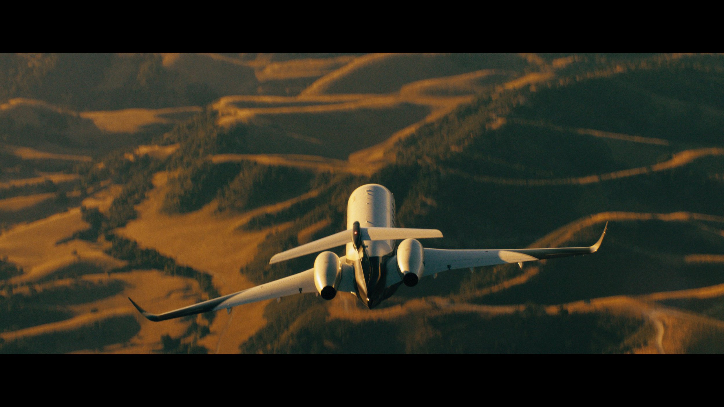
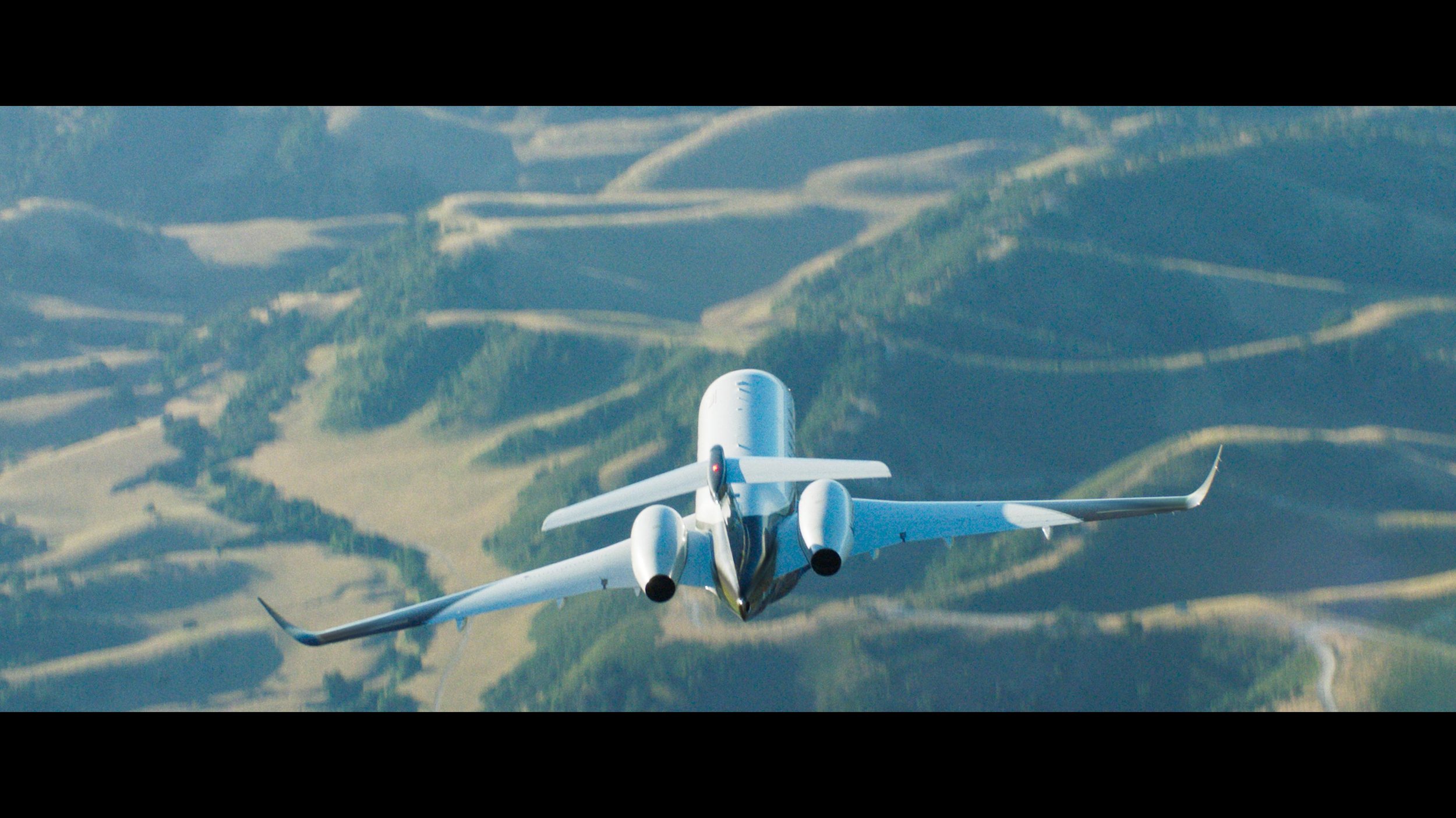
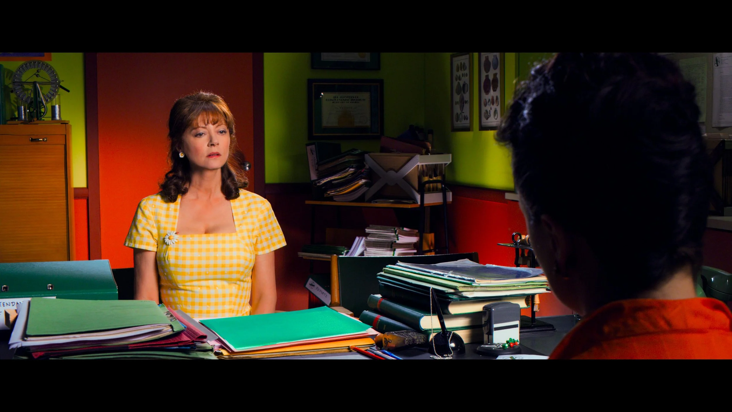
We took the original filmout log source material and placed it into P3 color space. From there, I slightly lifted mid-grey. The original grade is famously dense, and this subtle lift gave the blacks a little more room to breathe, opening up the contrast ratio just enough to take advantage of HDR dynamics without washing out the shadows.
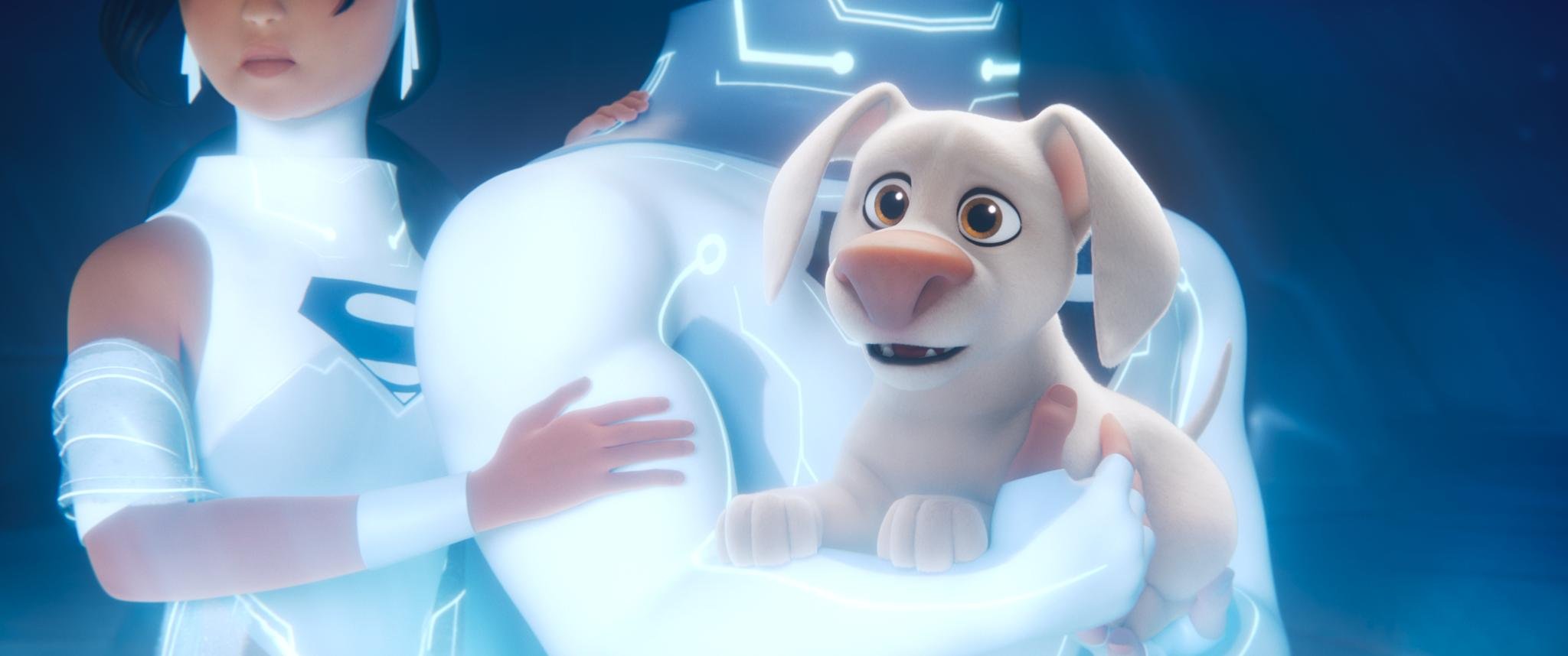
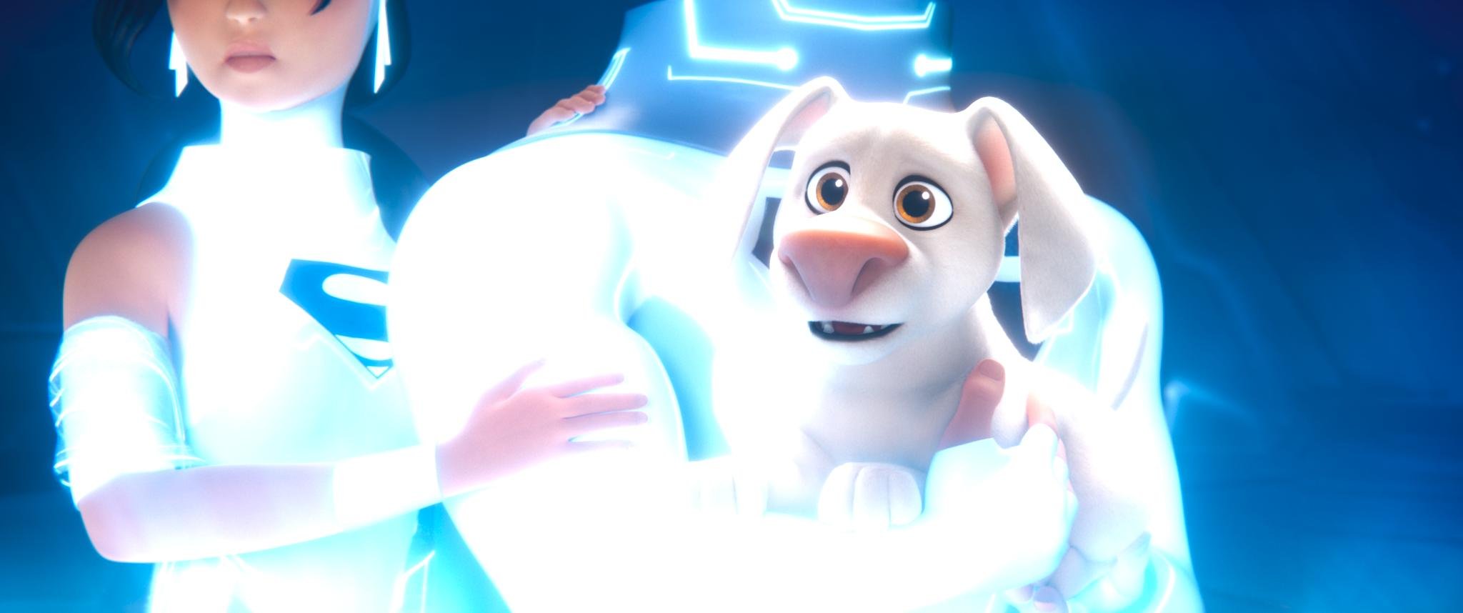
709 Original vs New JIB ACES Show LMT

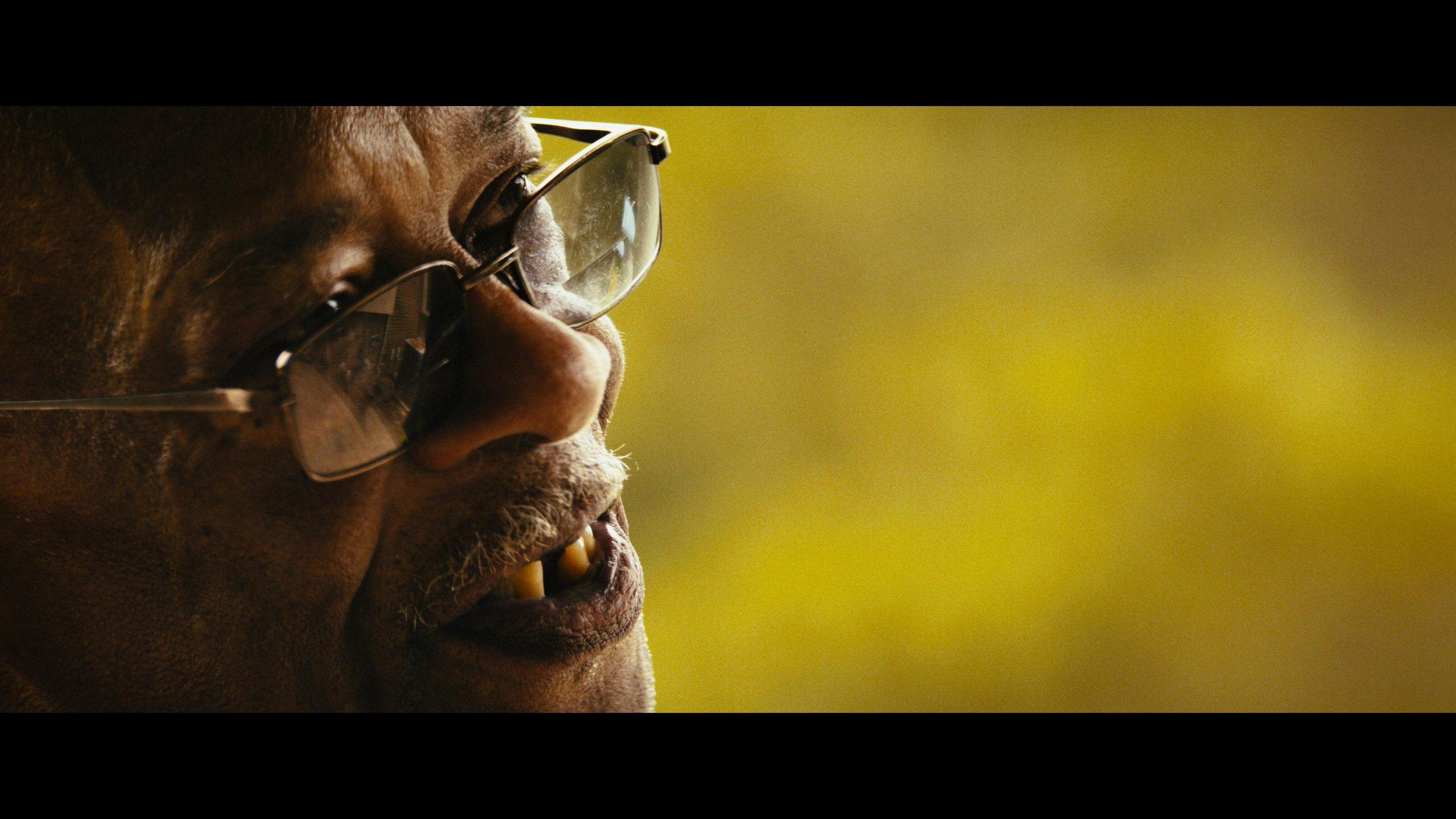
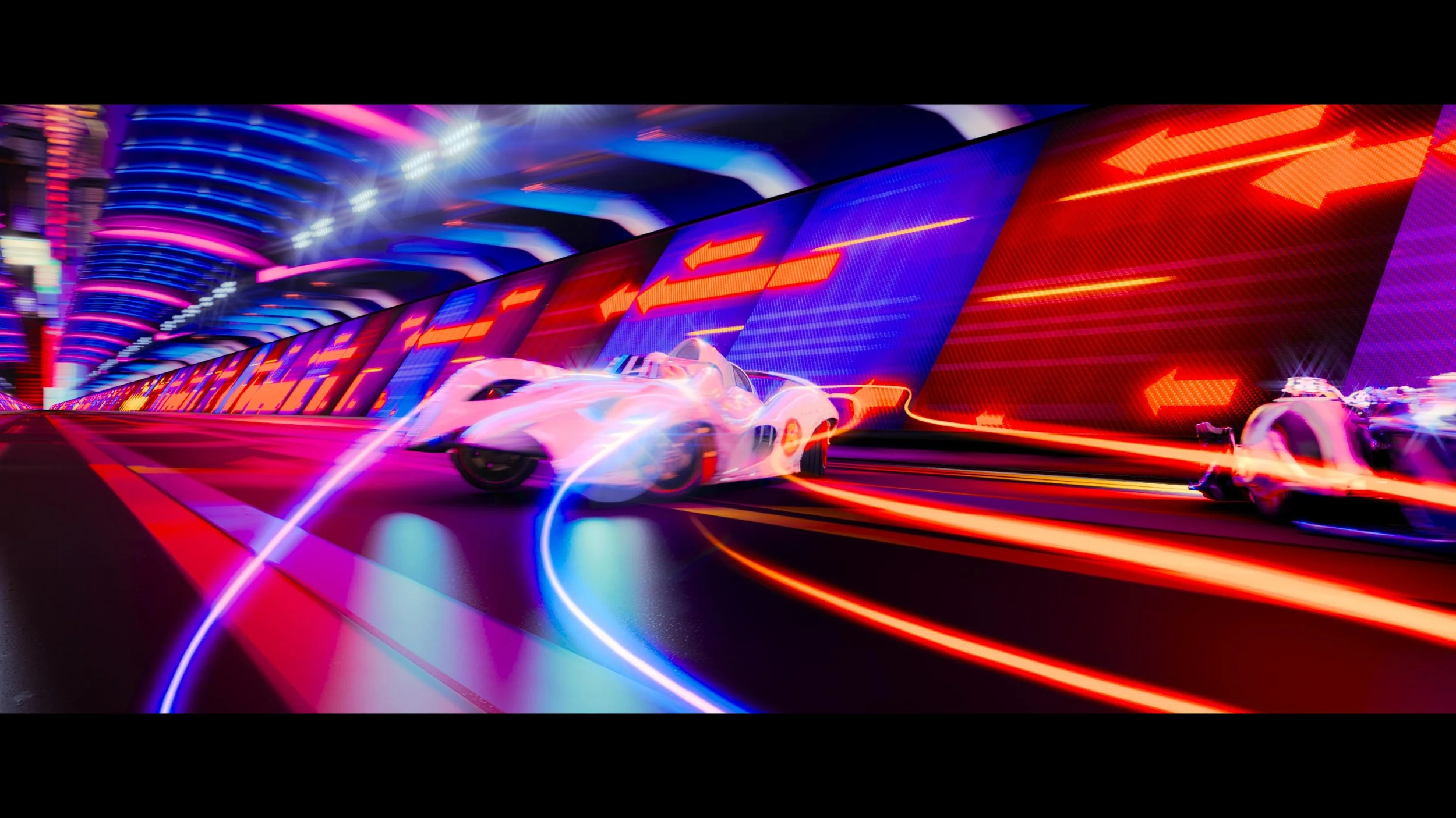
Breaking the Gamut Barrier: Into the 2020s
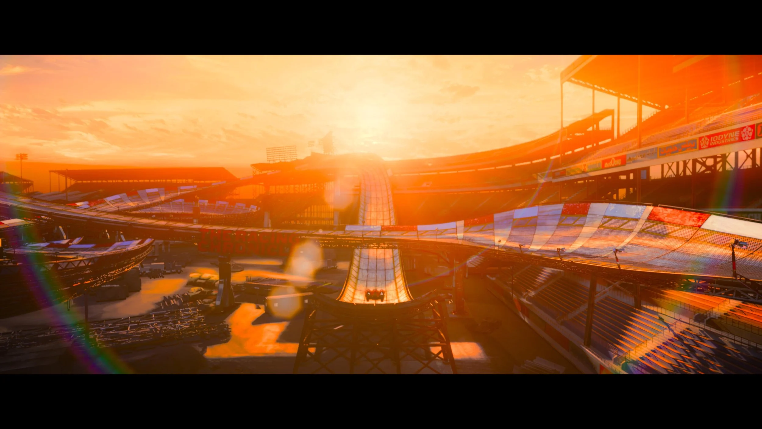
Here is where things get really exciting for the color nerds out there. In some rare, highly specific instances, we actually pushed the grade outside the P3 gamut and into extreme 2020 colors.
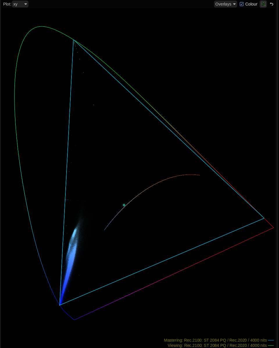
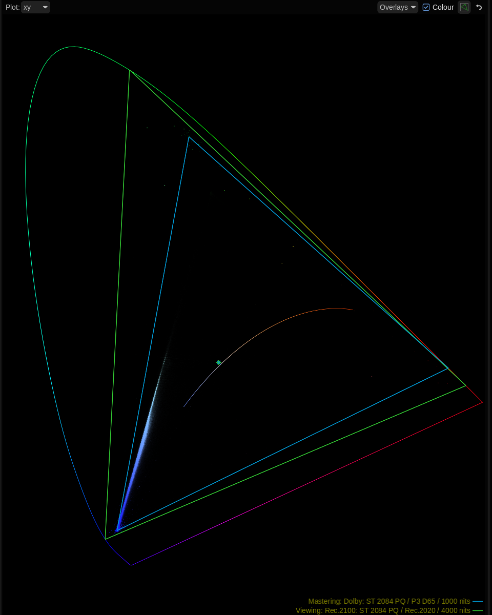
To my knowledge, this is a first for a Remastered Warner Bros. disc. I felt the timing was finally right; with modern display manufacturers like LG and Samsung producing consumer panels capable of rendering these extreme wide-gamut colors, it was time to let Speed Racer completely off the leash.
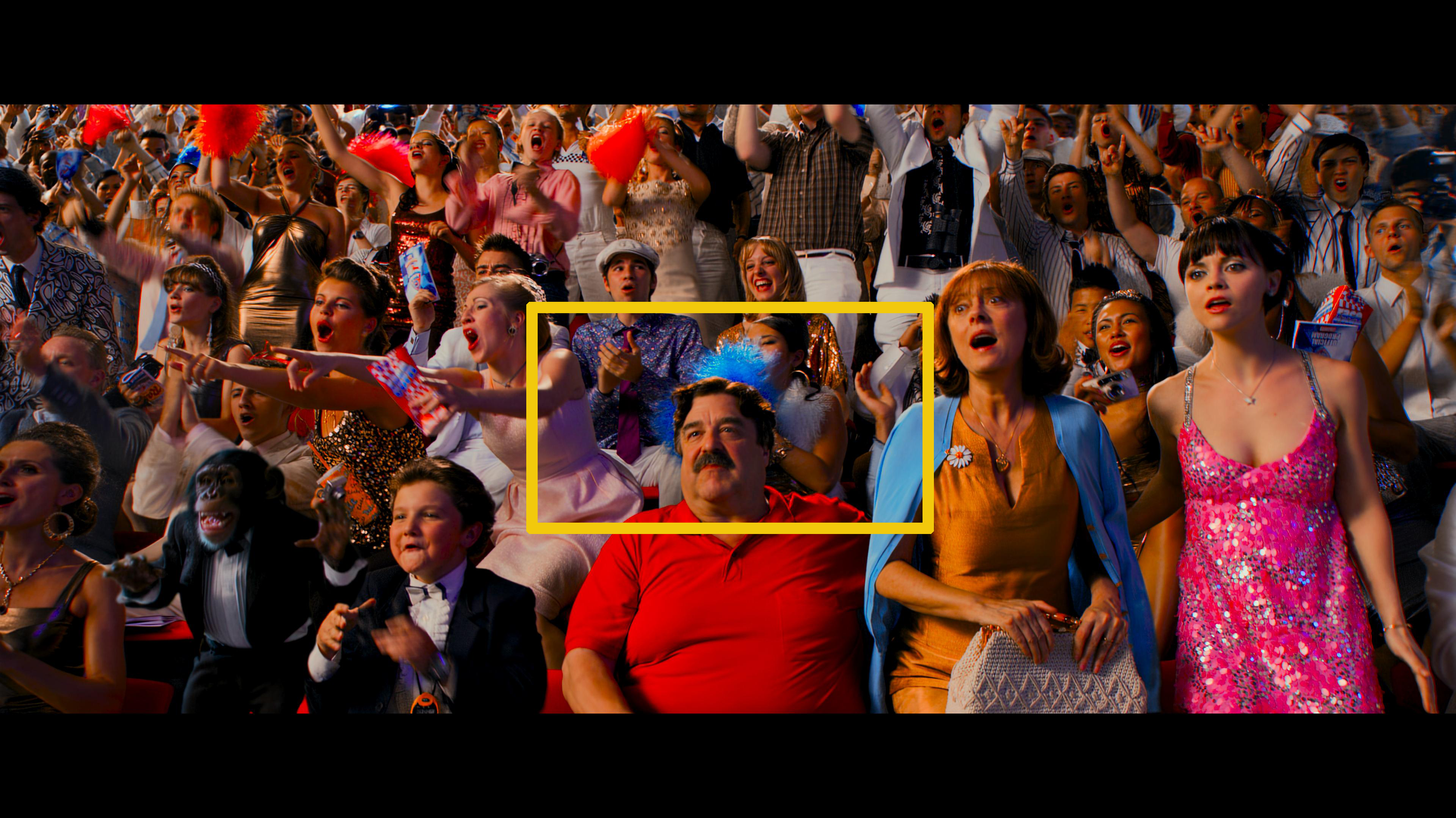
"When I watch you do some of the things you do, you just take my breath away.”
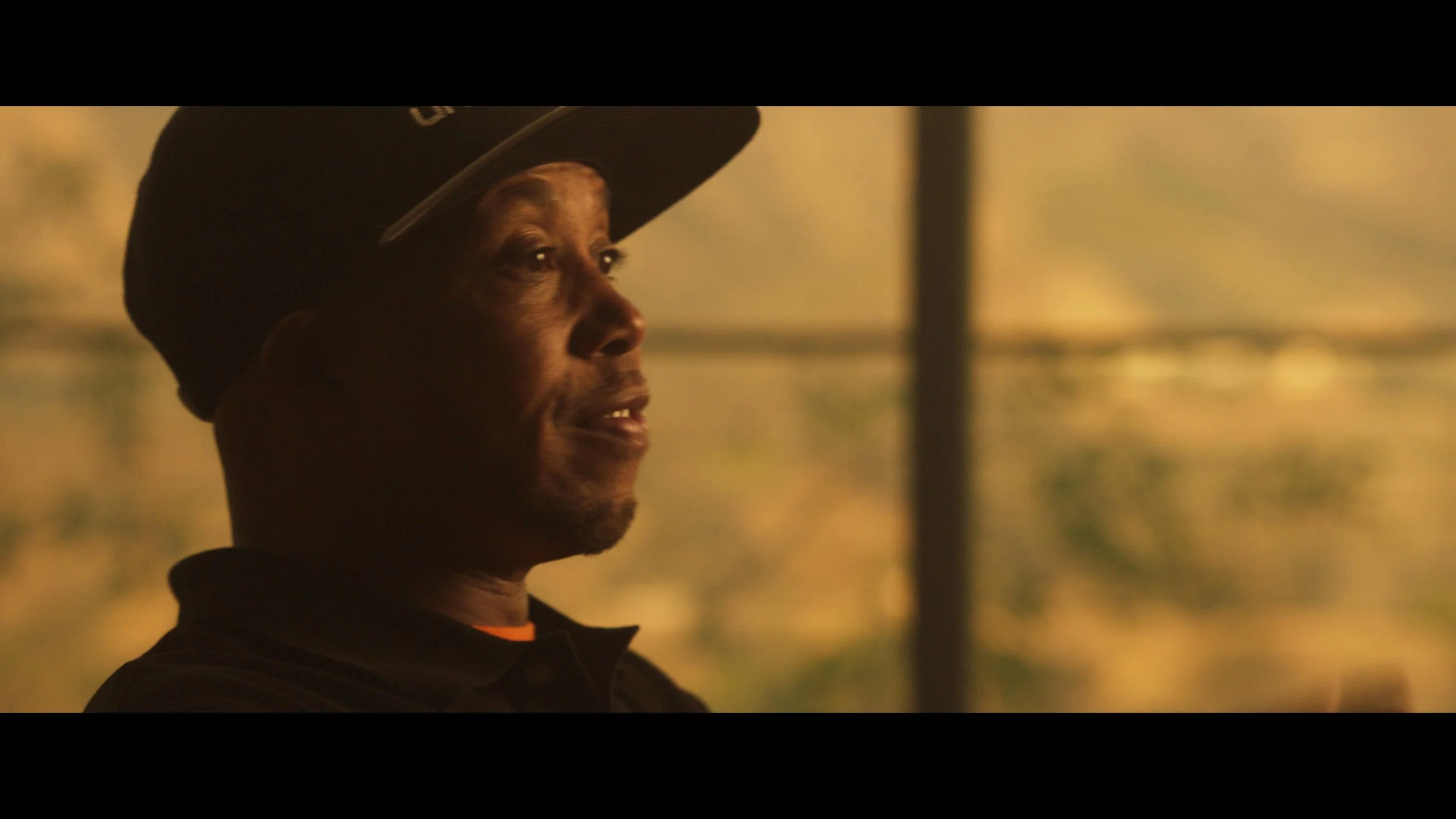
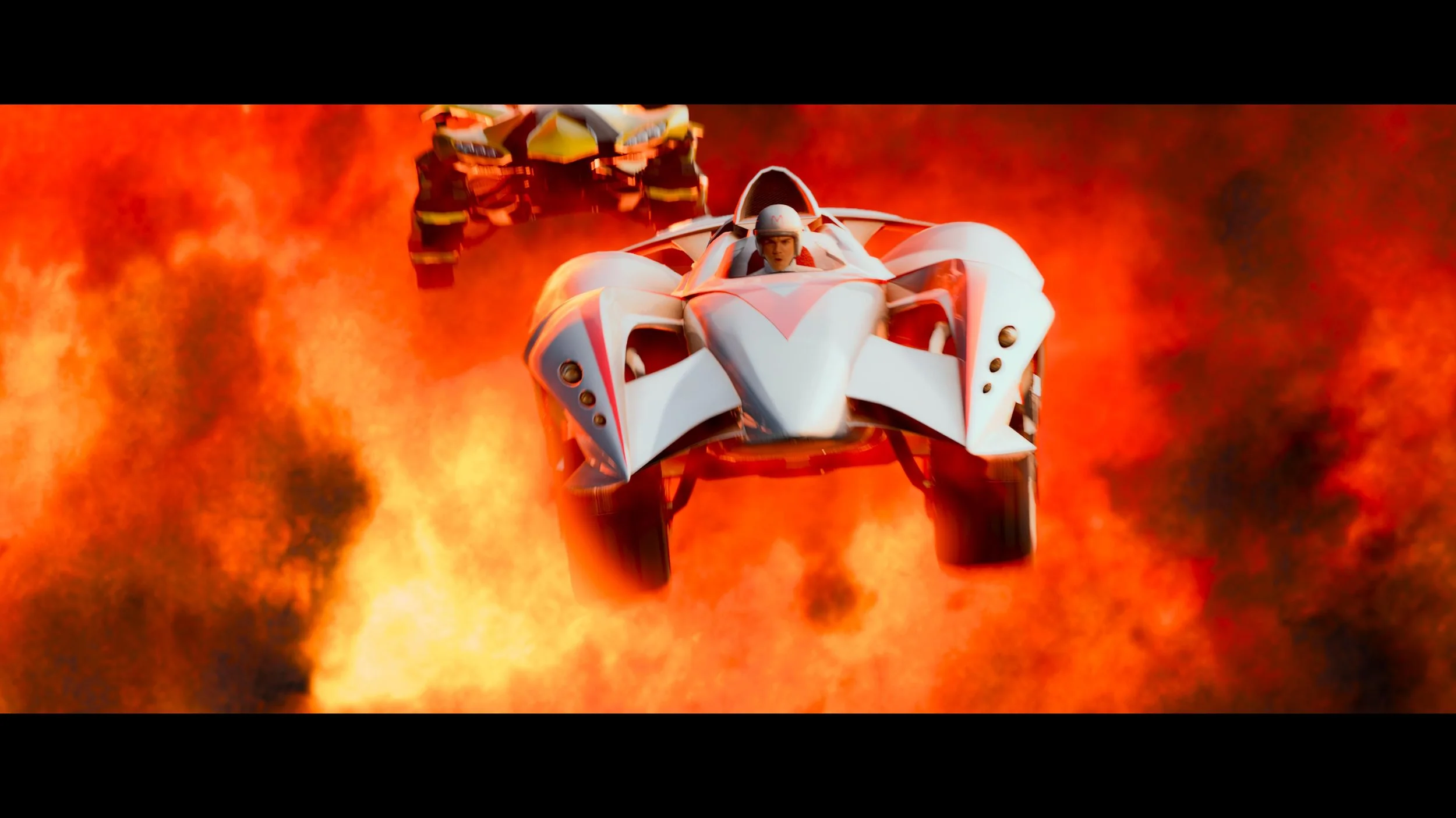
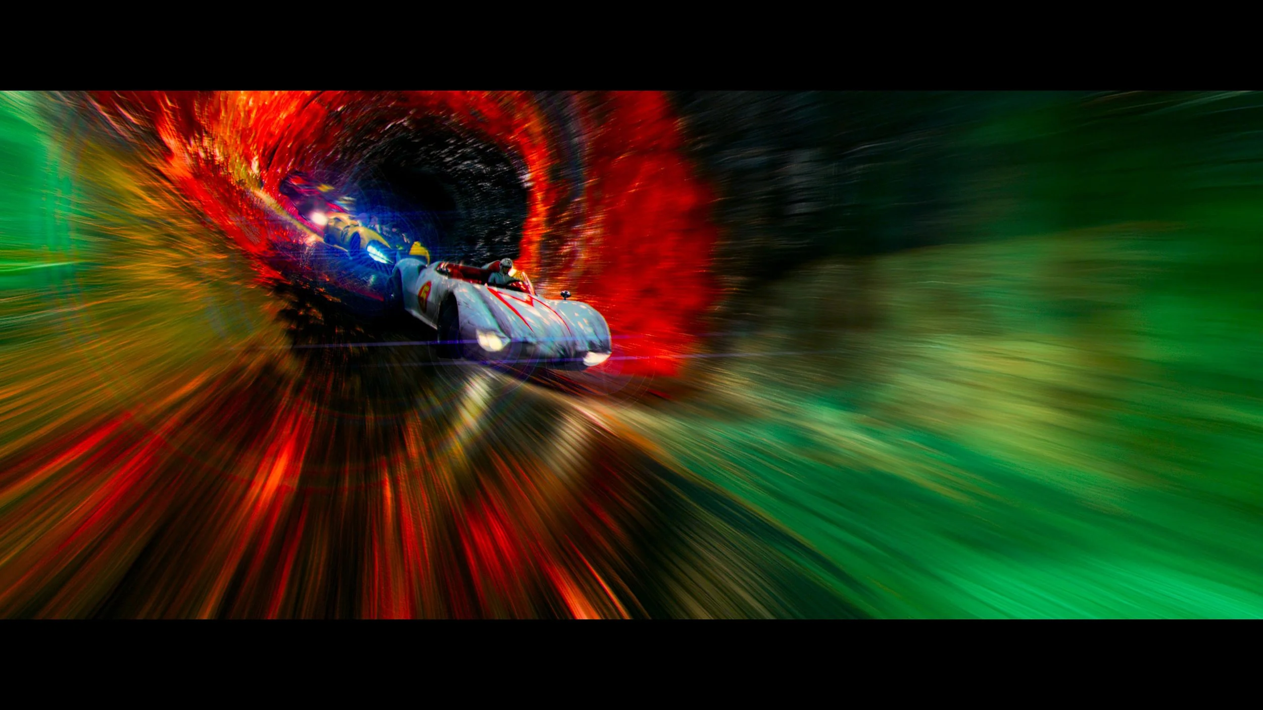
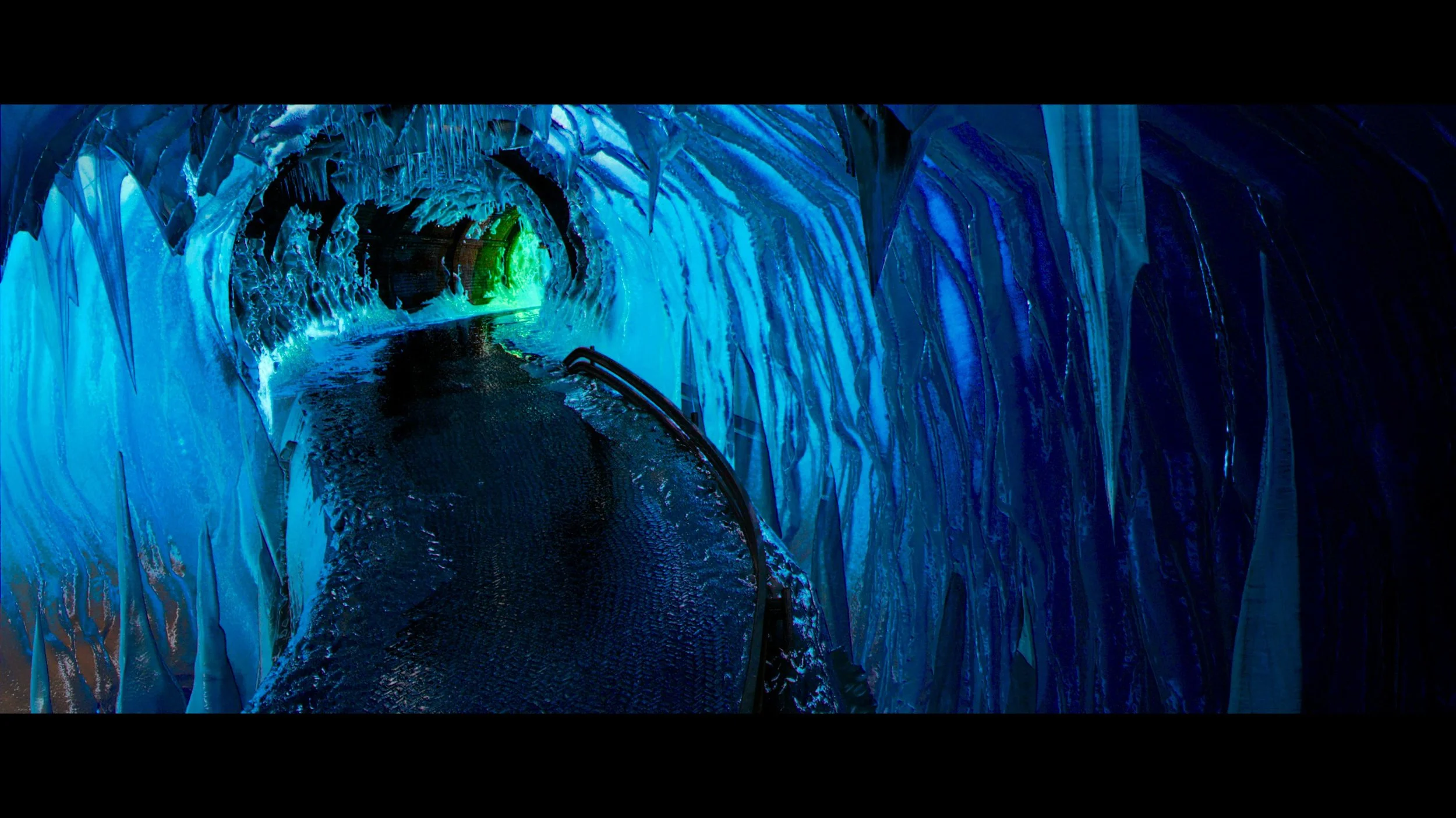
If you want to see what Rec. 2020 looks like in action, look out for the vibrant, toxic green of Snake Oiler’s car and gear, or the hyper-saturated, piercing cyan blue of the Ice Cave sequence. These colors simply could not be reproduced on older standard dynamic range displays, and seeing them light up a modern OLED panel is breathtaking.
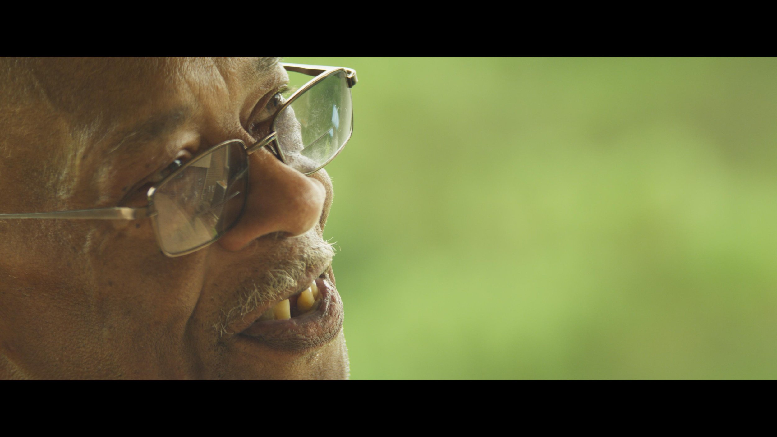
Kissing 4000 Nits: The Most Aggressive HDR Grade Yet
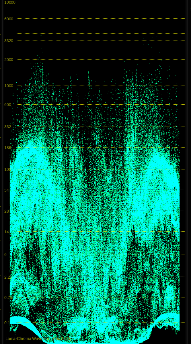
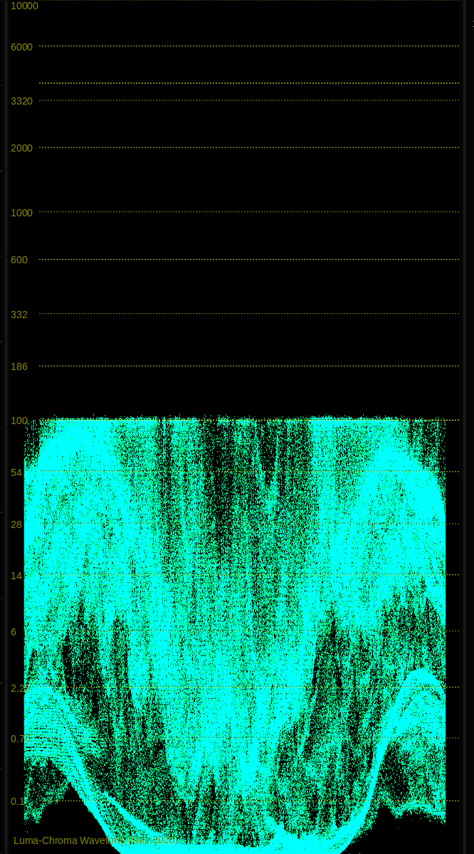
Speed Racer is a film built on extremes, and I wanted the luminance to match the saturation. There are select moments in this film where I applied the most aggressive HDR grade I have ever done.
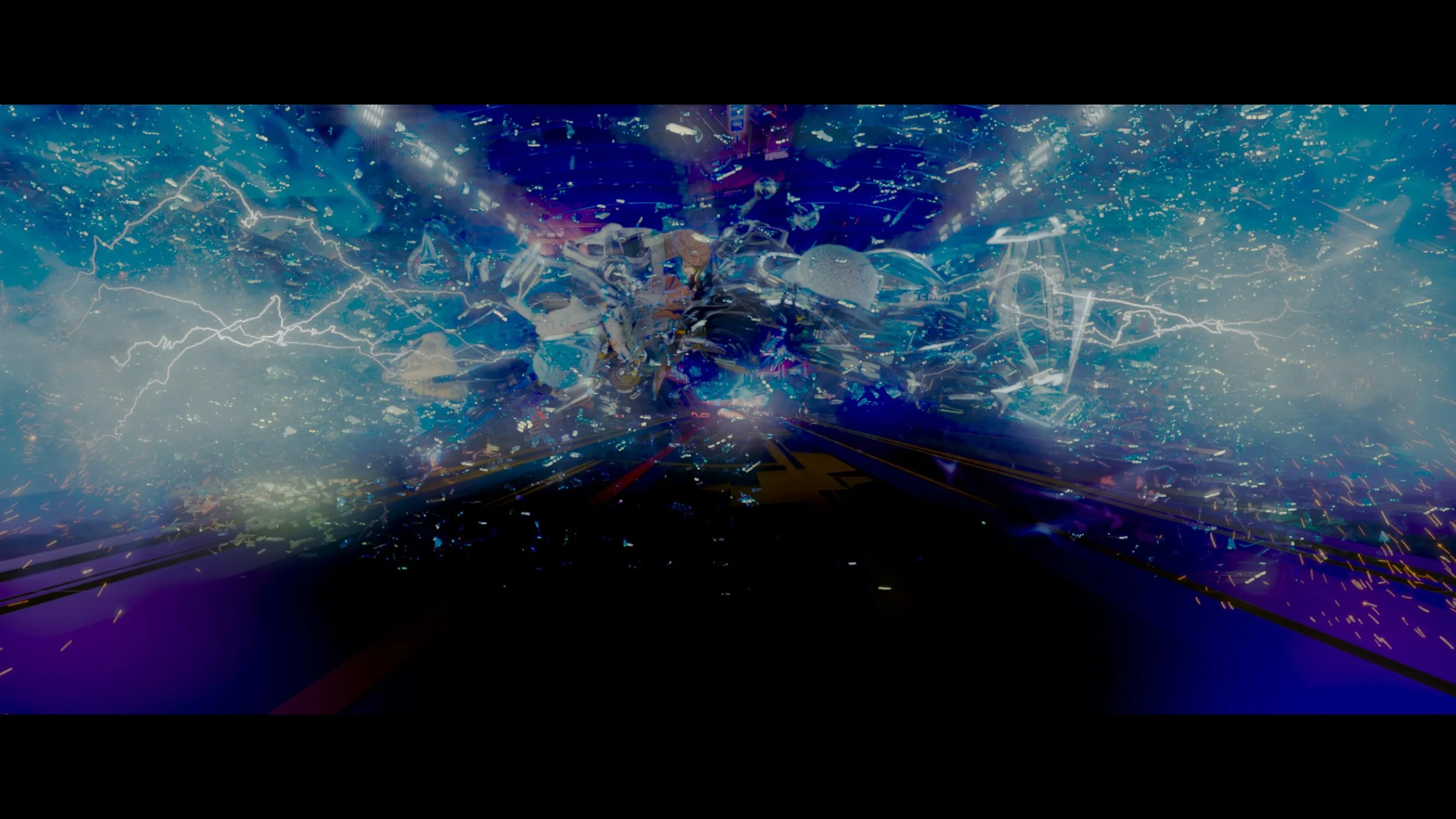
The standout example is the sequence featuring the intense, Tesla-coil-style lightning strikes. If there was ever an element in cinematic history motivated to kiss 4000 nits, it’s those electrical kicks from the Bernoulli Convergenator. The sheer blinding energy of the lightning popping off the screen at 4000 nits creates a visceral, immersive viewing experience. "Transponder schmonder. You want real kick, you go Bernoulli!"
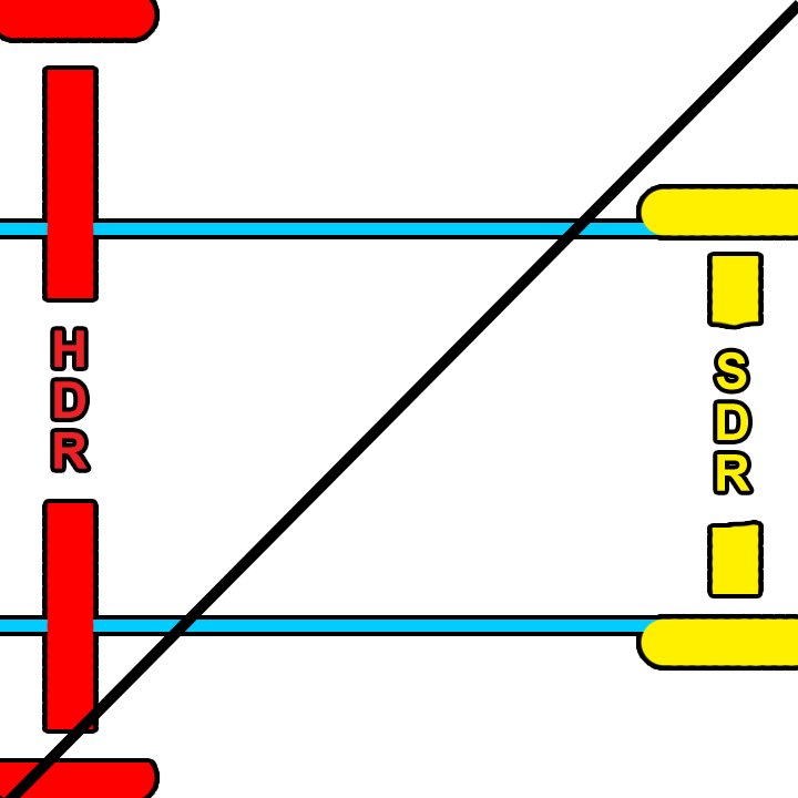
PQ 100 nit 709 vs PQ 4000 nit 2020

If you missed the recent IMAX re-release, don't fret. You can bring the race home and experience the absolute limits of your television today in glorious, mind-melting 4000-nit Rec. 2020. Start calibrating those panels now.


Thanks for reading and happy grading. Go Speed Go!
JD