Better Pixels.
Over the last decade we have had a bit of a renaissance in imaging display technology. The jump from SD to HD was a huge bump in image quality. HD to 4k was another noticeable step in making better pictures, but had less of an impact from the previous SD to HD jump. Now we are starting to see 8k displays and workflows. Although this is great for very large screens, this jump has diminishing returns for smaller viewing environments. In my opinion, we are to the point where we do not need more pixels, but better ones. HDR or High Dynamic Range images along with wider color gamuts are allowing us to deliver that next major increase in image quality. HDR delivers better pixels!

Stop… What is dynamic range?
When we talk about the dynamic range of a particular capture system, what we are referring to is the delta between the blackest shadow and the brightest highlight captured. This is measured in Stops typically with a light-meter. A Stop is a doubling or a halving of light. This power of 2 way of measuring light is perfect for its correlation to our eyes logarithmic nature. Your eyeballs never “clip” and a perfect HDR system shouldn’t either. The brighter we go the harder it becomes to see differences but we never hit a limit.
Unfortunately digital camera senors do not work in the same way as our eyeballs. Digital sensors have a linear response, a gamma of 1.0 and do clip. Most high-end cameras convert this linear signal to a logarithmic one for post manipulation.

I was never a huge calculus buff but this one thought experiment has served me well over the years.

Say you are at one side of the room. How many steps will it take to get to the wall if each time you take a step, the step is half the distance of your last. This is the idea behind logarithmic curves.

It will take an infinite number of steps to reach the wall, since we can always half the half.

Someday we will be able to account for every photon in a scene, but until that sensor is made we need to work within the confines of the range that can be captured
For example if the darkest part of a sampled image are the shadows and the brightest part is 8 stops brighter, that means we have a range of 8 stops for that image. The way we expose a sensor or a piece of celluloid changes based on a combination of factors. This includes aperture, exposure time and the general sensitivity of the imaging system. Depending on how you set these variables you can move the total range up or down in the scene.
Let’s say you had a scene range of 16 stops. This goes from the darkest shadow to direct hot sun. Our imaging device in this example can only handle 8 of the 16 present stops. We can shift the exposure to be weighted towards the shadows, the highlights, or the Goldilocks sweet spot in the middle. There is no right or wrong way to set this range. It just needs to yield the picture that helps to promote the story you are trying to tell in the shot. A 16bit EXR file can handle 32 stops of range. Much more than any capture system can deliver currently.
Latitude is how far you can recover a picture from over or under exposure. Often latitude is conflated with dynamic range. In rare cases they are the same but more often than not your latitude is less then the available dynamic range.
Film, the original HDR system.
Film from its creation always captured more information than could be printed. Contemporary stocks have a dynamic range of 12 stops. When you print that film you have to pick the best 8 stops to show via printing with more or less light. The extra dynamic range was there in the negative but was limited by the display technology.
Flash forward to our digital cameras today. Cameras form Arri, Red, Blackmagic, Sony all boast dynamic ranges over 13 stops. The challenge has always been the display environment. This is why we need to start thinking of cameras not as the image creators but more as the photon collectors for the scene at the time of capture. The image is then “mapped” to your display creatively.
Scene referred grading.
The problem has always been how do we fit 10 pounds of chicken into an 8 pound bag? In the past when working with these HDR camera negatives we were limited to the range of the display technology being used. The monitors and projectors before their HDR counterparts couldn’t “display” everything that was captured on set even though we had more information to show. We would color the image to look good on the device for which we were mastering. “Display Referred Grading,” as this is called, limits your range and bakes in the gamma of the display you are coloring on. This was fine when the only two mediums were SDR TV and theatrical digital projection. The difference between 2.4 video gamma and 2.6 theatrical gamma was small enough that you could make a master meant for one look good on the other with some simple gamma math. Today the deliverables and masters are numerous with many different display gammas required. So before we even start talking about HDR, our grading space needs to be “Scene Referred.” What this means is that once we have captured the data on set, we pass it through the rest of the pipeline non-destructively, maintaining the relationship to the original scene lighting conditions. “No pixels were harmed in the making of this major motion picture.” is a personal mantra of mine.
I’ll add the tone curve later.
There are many different ways of working scene-referred. the VFX industry has been working this way for decades. The key point is we need to have a processing space that is large enough to handle the camera data without hitting the boundaries i.e. clipping or crushing in any of the channels. This “bucket” also has to have enough samples (bit-depth) to be able to withstand aggressive transforms. 10-bits are not enough for HDR grading. We need to be working in a full 16-bit floating point.

This is a bit of an exaggeration, but it illustrates the point. Many believe that a 10 bit signal is sufficient enough for HDR. I think for color work 16 bit is necessary. This ensures we have enough steps to adequately describe our meat and potatoes part of the image in addition to the extra highlight data at the top half of the code values.
Bit-depth is like butter on bread. Not enough and you get gaps in your tonal gradients. We want a nice smooth spread on our waveforms.
Now that we have our non destructive working space we use transforms or LUTs to map to our displays for mastering. ACES is a good starting point for a working space and a set of standardized transforms, since it works scene referenced and is always non destructive if implemented properly. The gist of this workflow is that the sensor linearity of the original camera data has been retained. We are simply adding our display curve for our various different masters.
Stops measure scenes, Nits measure displays.
For measuring light on set we use stops. For displays we use a measurement unit called a nit. Nits are a measure of peak brightness not dynamic range. A nit is equal to 1 cd/m2. I’m not sure why there is two units with different nomenclature for the same measurement, but for displays we use the nit. Perhaps candelas per meter squared, was just too much of a mouthful. A typical SDR monitor has a brightness of 100 nits. A typical theatrical projector has a brightness of 48 nits. There is no set standard for what is considered HDR brightness. I consider anything over 600nits HDR. 1000nits or 10 times brighter than legacy SDR displays is what most HDR projects are mastered to. The Dolby Pulsar monitor is capable of displaying 4000 nits which is the highest achievable today. The PQ signal accommodates values up to 10,000 nits
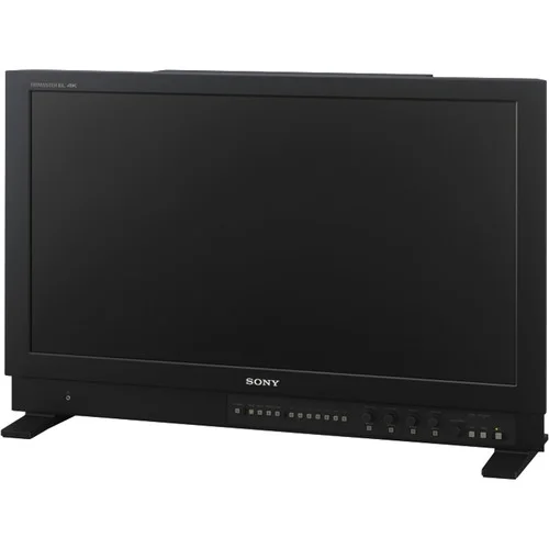
The Sony x300 has a peak brightness of 1000 nits and is current gold standard for reference monitors.
The Dolby Pulsar is capable of 4000 nit peak white
P-What?

Rec2020 color primaries with a D65 white point
The most common scale to store HDR data is the PQ Electro-Optical Transfer Function. PQ stands for perceptual quantizer. the PQ EOTF was standardized when SMPTE published the transfer function as SMPTE ST 2084. The color primaries most often associated with PQ are rec2020. BT.2100 is used when you pair the two, PQ transfer function with rec2020 primaries and a D65 white point. This is similar to how the definition of BT.1886 is rec709 primaries with an implicit 2.4 gamma and a D65 white point. It is possible to have a PQ file with different primaries than rec2020. The most common variance would be P3 primaries with a D65 white point. Ok, sorry for the nerdy jargon but now we are all on the same page.

HDR Flavors
There are four main HDR flavors in use currently. All of them use a logarithmic approach to retain the maxim amount of information in the highlights.
Dolby Vision
Dolby Vision is the most common flavor of HDR out in the field today. The system works in three parts. First you start with your master that has been graded using the PQ EOTF. Next you “analyse“ the shots in in your project to attach metadata about where the shadows, highlights and meat and potatoes of your image are sitting. This is considered layer 1 metadata. Next this metadata is used to inform the Content Mapping Unit or CMU how best to “convert” your picture to SDR and lower nit formats. The colorist can “override” this auto conversion using a trim that is then stored in layer 2 metadata commonly referred to as L2. The trims you can make include lift gamma gain and sat. In version 4.0 out now, Dolby has given us the tools to also have secondary controls for six vector hue and sat. Once all of these settings have been programmed they are exported into an XML sidecar file that travels with the original master. Using this metadata, a Dolby vision equipped display can use the trim information to tailor the presentation to accommodate the max nits it is capable of displaying on a frame by frame basis.
HDR 10
HDR 10 is the simplest of the PQ flavors. The grade is done using the PQ EOTF. Then the entire show is analysed. The average brightness and peak brightness are calculated. These two metadata points are called MaxCLL - Maximum Content Light Level and MaxFALL - Maximum Frame Average Light Level. Using these a down stream display can adjust the overall brightness of the program to accommodate the displays max brightness.
HDR 10+
HDR 10+ is similar to Dolby Vision in that you analyse your shots and can set a trim that travels in metadata per shot. The difference is you do not have any color controls. You can adjust points on a curve for a better tone map. These trims are exported as an XML file from your color corrector.
HLG
Hybrid log gamma is a logarithmic extension of the standard 2.4 gamma curve of legacy displays. The lower half of the code values use 2.4 gamma and the top half use log curve. Combing the legacy gamma with a log curve for the HDR highlights is what makes this a hybrid system. This version of HDR is backwards compatible with existing display and terrestrial broadcast distribution. There is no dynamic quantification of the signal. The display just shows as much of the signal as it can.

Deliverables
Deliverables change from studio to studio. I will list the most common ones here that are on virtually every delivery instruction document. Depending on the studio, the names of these deliverables will change but the utility of them stays the same.
PQ 16-bit Tiffs
This is the primary HDR deliverable and derives some of the other masters on the list. These files typically have a D65 white point and are either Rec2020 or p3 limited inside of a Rec2020 container.
GAM
The Graded Archival Master has all of the color work baked in but does not have the any output transforms. This master can come in three flavors all of which are scene referred;
ACES AP0 - Linear gamma 1.0 with ACES primaries, sometimes called ACES prime.
Camera Log - The original camera log encoding with the camera’s native primaries. For example, for Alexa, this would be LogC Arri Wide Gamut.
Camera Linear - This flavor has the camera’s original primaries with a linear gamma 1.0
NAM
The non-graded assembly master is the equivalent of the VAM back in the day. It is just the edit with no color correction. This master needs to be delivered in the same flavor that your GAM was.
ProRes XQ
This is the highest quality ProRes. It can hold 12-bits per image channel and was built with HDR in mind.
Dolby XML
This XML file contains all of the analysis and trim decisions. For QC purposes it needs to be able to pass a check from Dolby’s own QC tool Metafier.
IMF
Inter-operable Master Format files can do a lot. For the scope of this article we are only going to touch on the HDR delivery side. The IMF is created from an MXF made from jpeg 2000s. The jp2k files typically come from the PQ tiff master. It is at this point that the XML file is married with picture to create one nice package for distribution.
Near Future
Currently we master for theatrical first for features. In the near future I see the “flippening” occurring. I would much rather spend the bulk of the grading time on the highest quality master rather than the 48nit limited range theatrical pass. I feel like you get a better SDR version by starting with the HDR since you have already corrected any contamination that might have been in the extreme shadows or highlights. Then you spend a few days “trimming” the theatrical SDR for the theaters. The DCP standard is in desperate need of a refresh. 250Mbps is not enough for HDR or high resolution masters. For the first time in film history you can get a better picture in your living room than most cinemas. This of course is changing and changing fast.
Sony and Samsung both have HDR cinema solutions that are poised to revolutionize the way we watch movies. Samsung has their 34 foot onyx system which is capable of 400nit theatrical exhibition. You can see a proof of concept model in action today if you live in the LA area. Check it out at the Pacific Theatres Winnetka in Chatsworth.
Sony has, in my opinion, the wining solution at the moment. They have a their CLED wall which is capable of delivering 800 nits in a theatrical setting. These types of displays open up possibilities for filmmakers to use a whole new type of cinematic language without sacrificing any of the legacy story telling devices we have used in the past.
For example, this would be the first time in the history of film where you could effect a physiologic change to the viewer. I have often thought about a shot I graded for The “Boxtrolls” where the main character, Eggs, comes out from a whole life spent in the sewers. I cheated an effect where the viewers eyes were adjusting to a overly bright world. To achieve this I cranked the brightness and blurred the image slightly . I faded this adjustment off over many shots until your eye “adjusted” back to normal. The theatrical grade was done at 48nits. At this light level, even at it’s brightest the human eye is not iris’ed down at all, but what if I had more range at my disposal. Today I would crank that shot until it made the audiences irises close down. Then over the next few shots the audience would adjust back to the “new brighter scene and it would appear normal. That initial shock would be similar to the real world shock of coming from a dark environment to a bright one.
Another such example that I would like to revisit is the myth of “L’Arrivée d’un train en gare de La Ciotat.” In this early Lumière picture a train pulls into a station. The urban legend is that this film had audiences jumping out of their seats and ducking for cover as the train comes hurling towards them. Imagine if we set up the same shot today but in a dark tunnel. We could make the head light so bright in HDR that coupled with the sound of a rushing train would cause most viewers, at the very least, to look away as it rushes past. A 1000 nit peak after your eyes have been acclimated to the dark can appear shockingly bright.
I’m excited for these and other examples yet to be created by filmmakers exploring this new medium. Here’s to better pixels and constantly progressing the art and science of moving images!
Please leave a comment below if there are points you disagree with or have any differing views on the topics discussed here.
Thanks for reading,