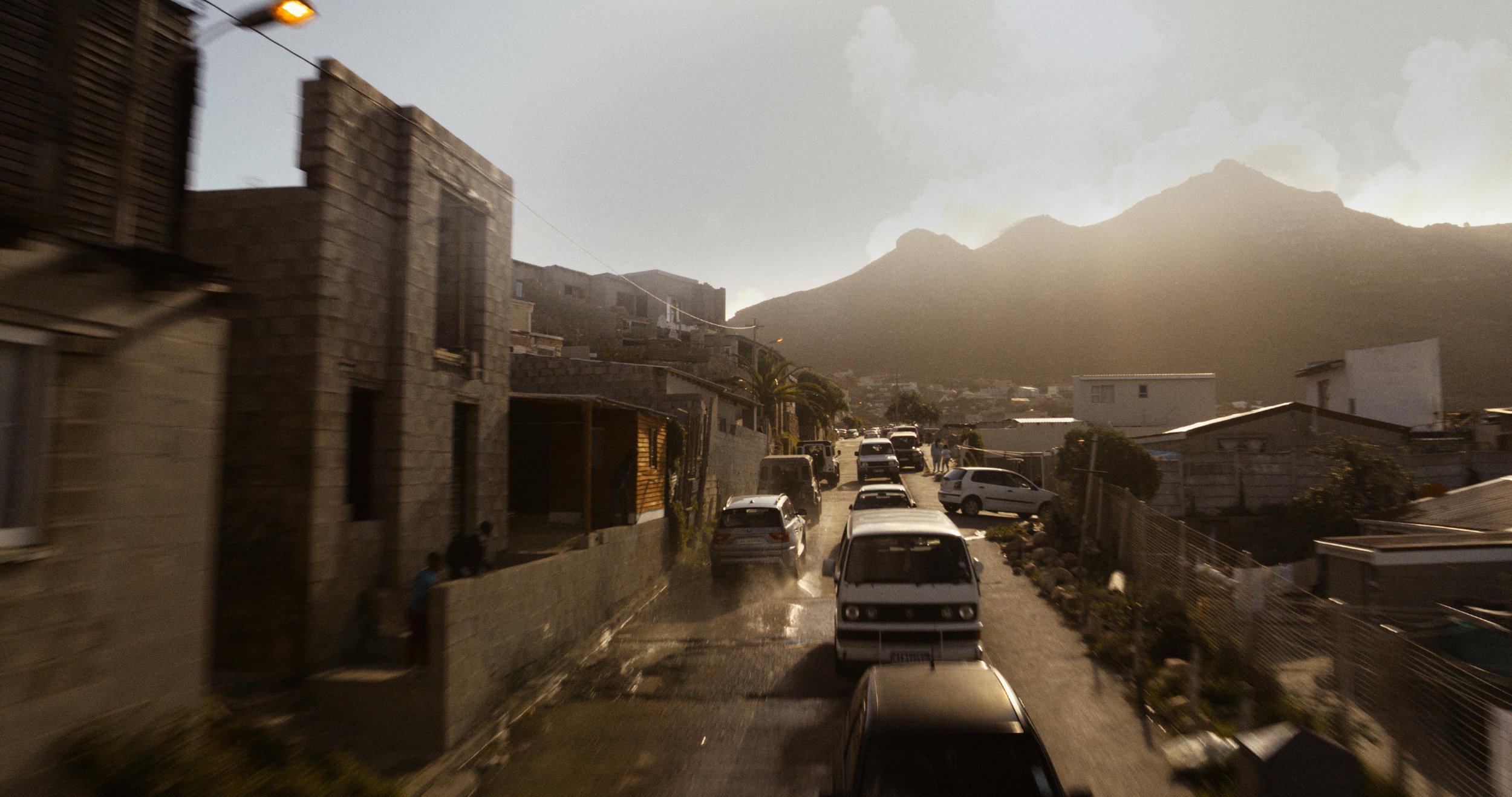
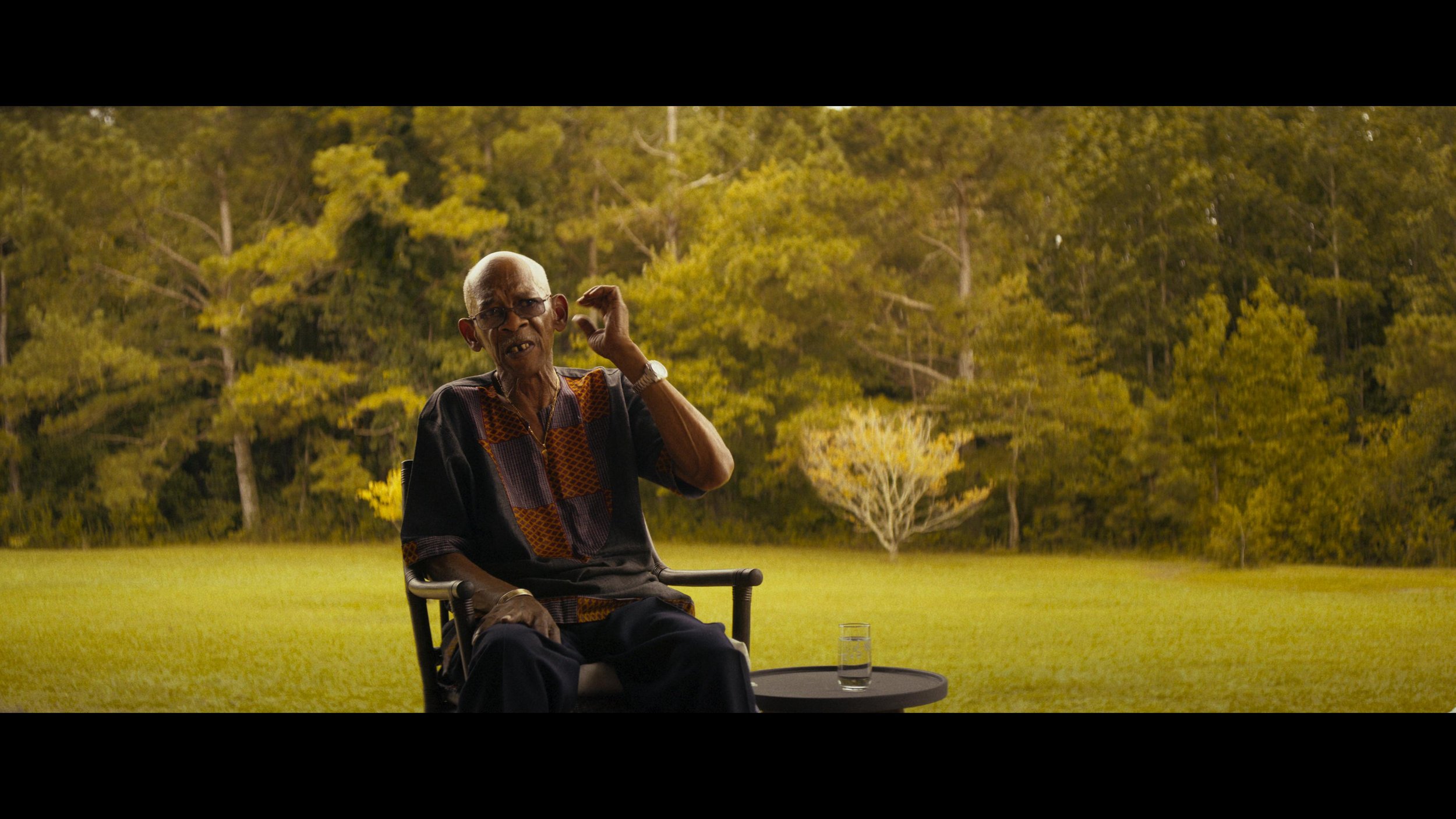
Colored these shots for the best in the business Deva Studios
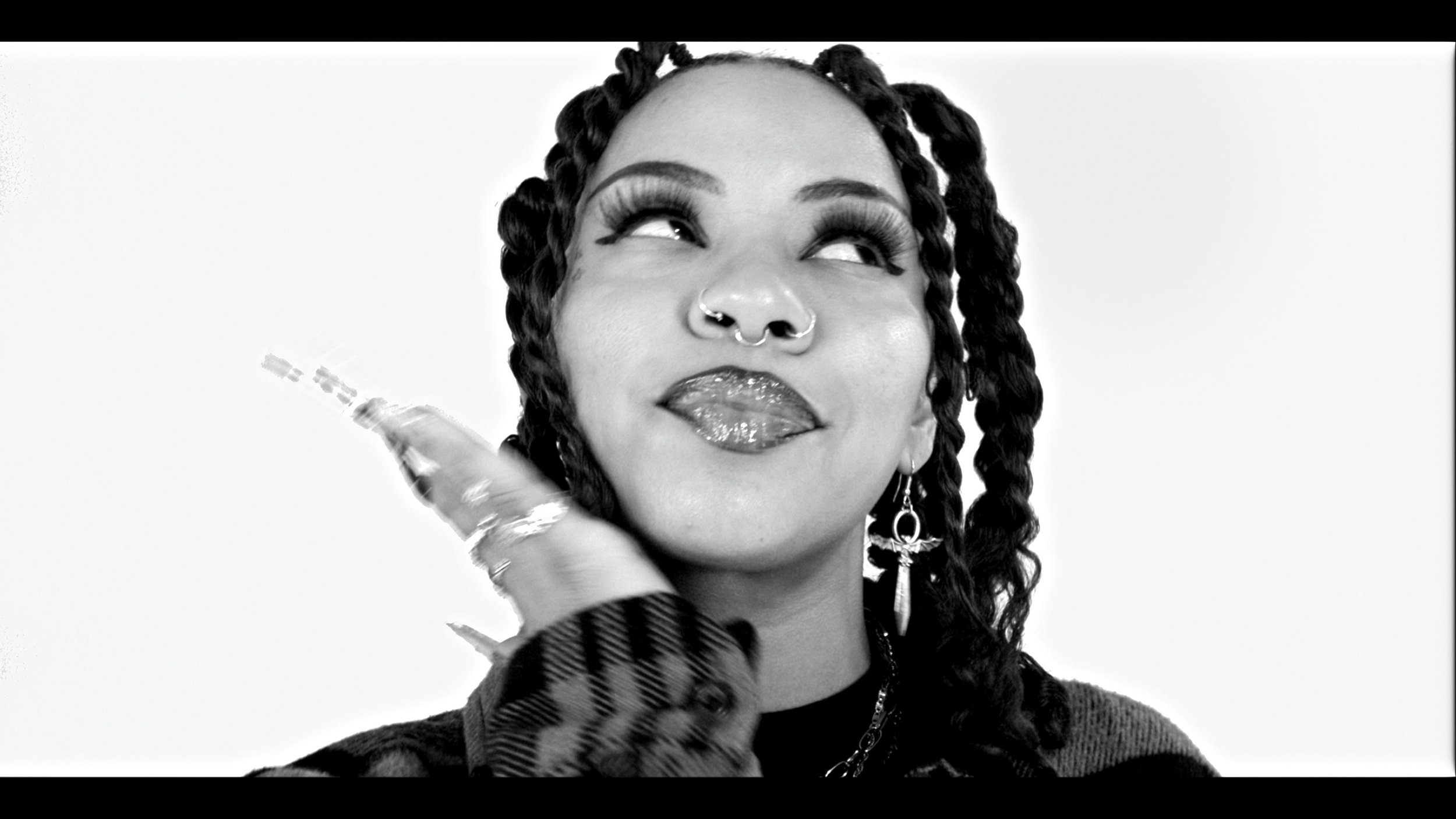
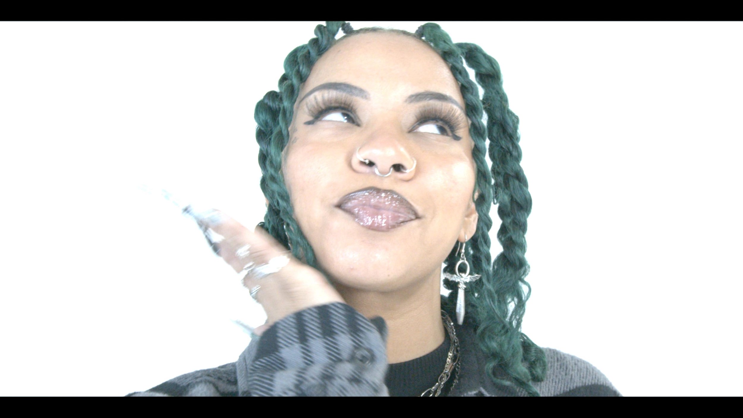
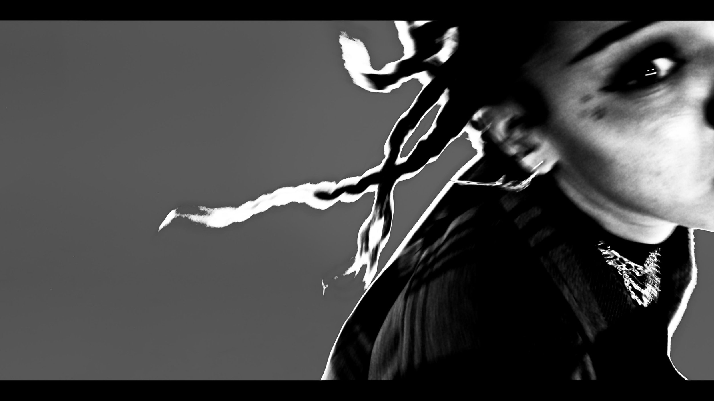
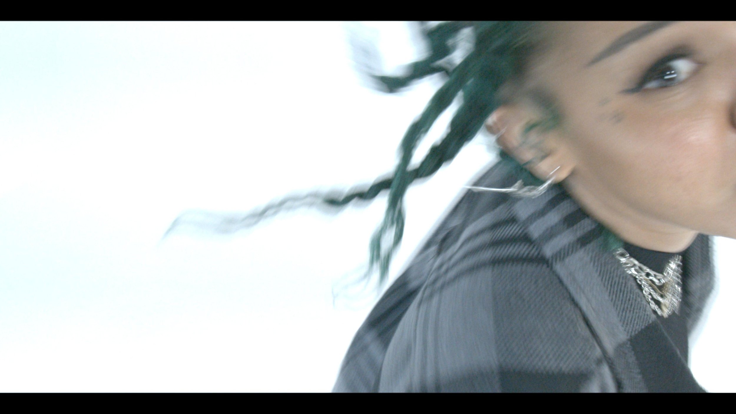
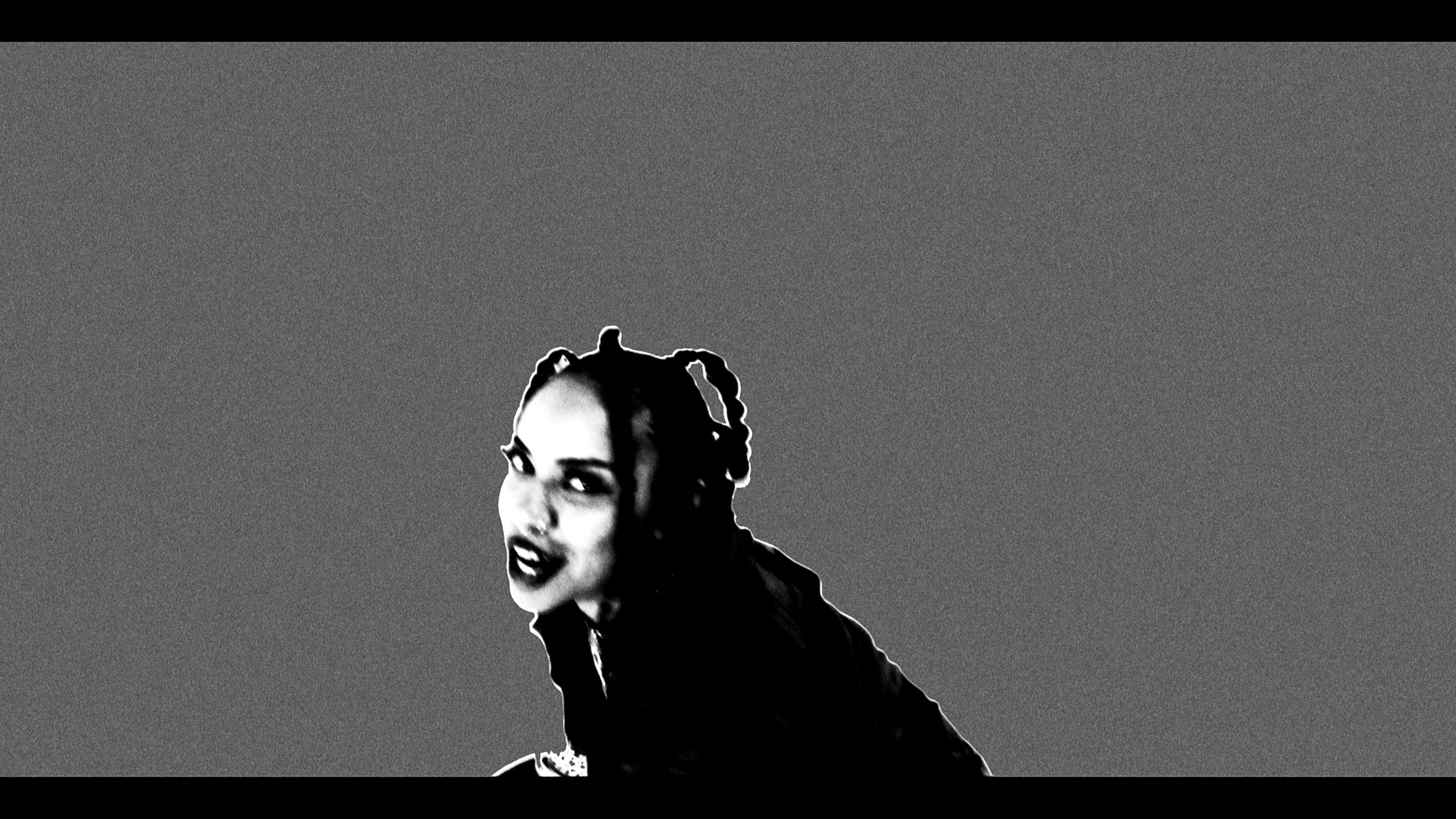
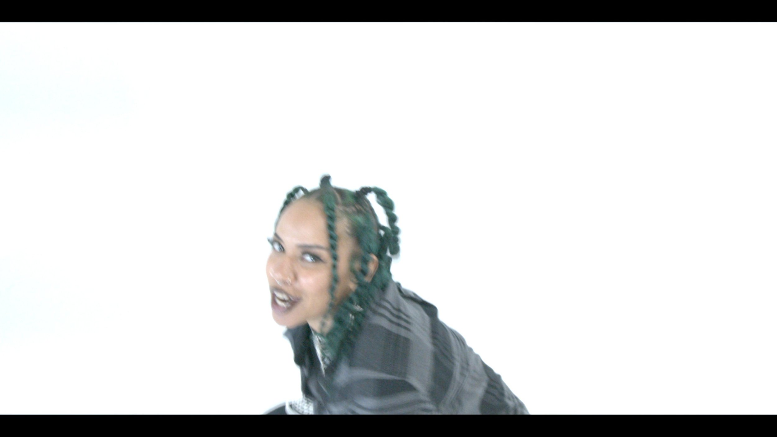
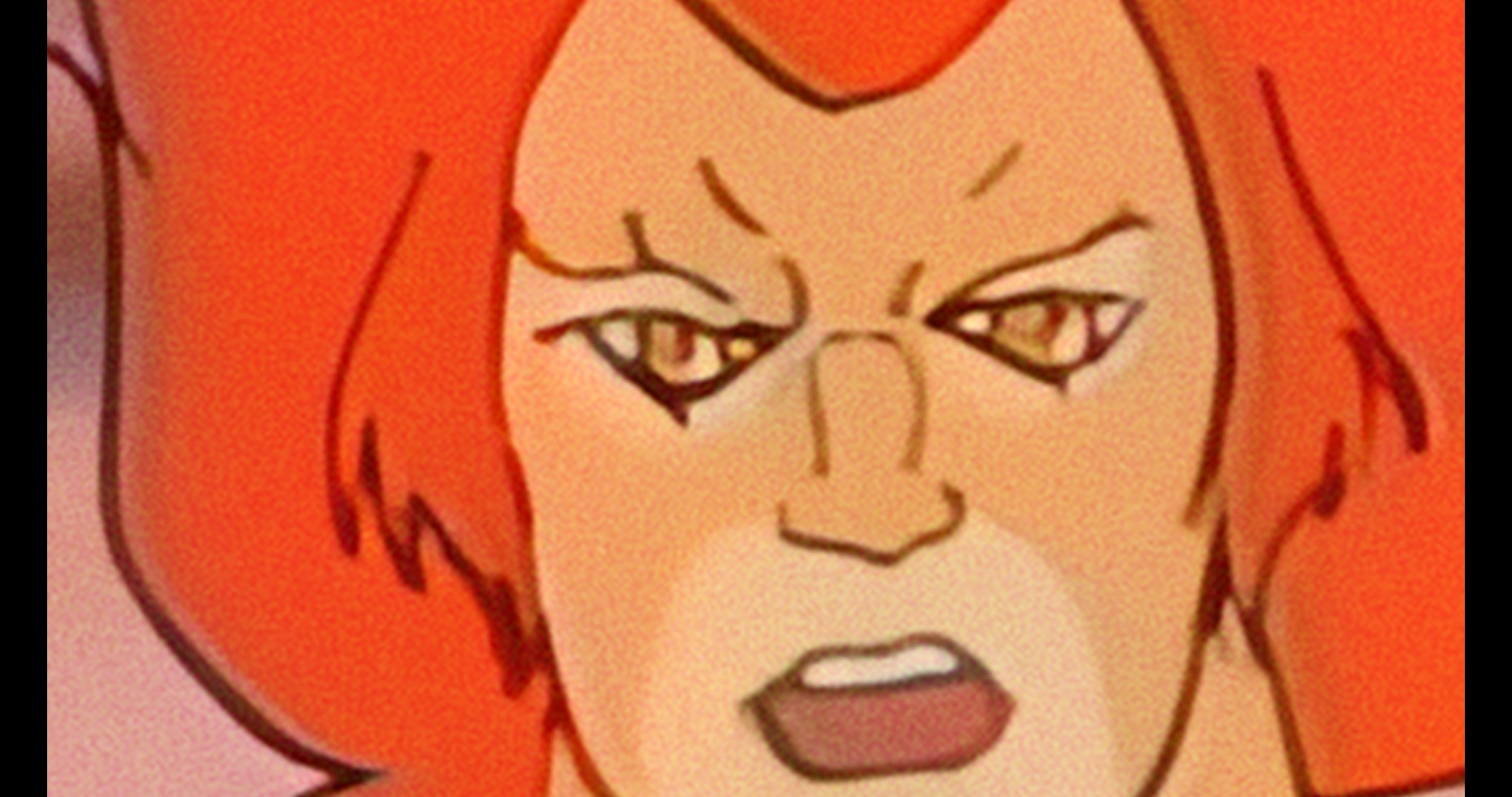
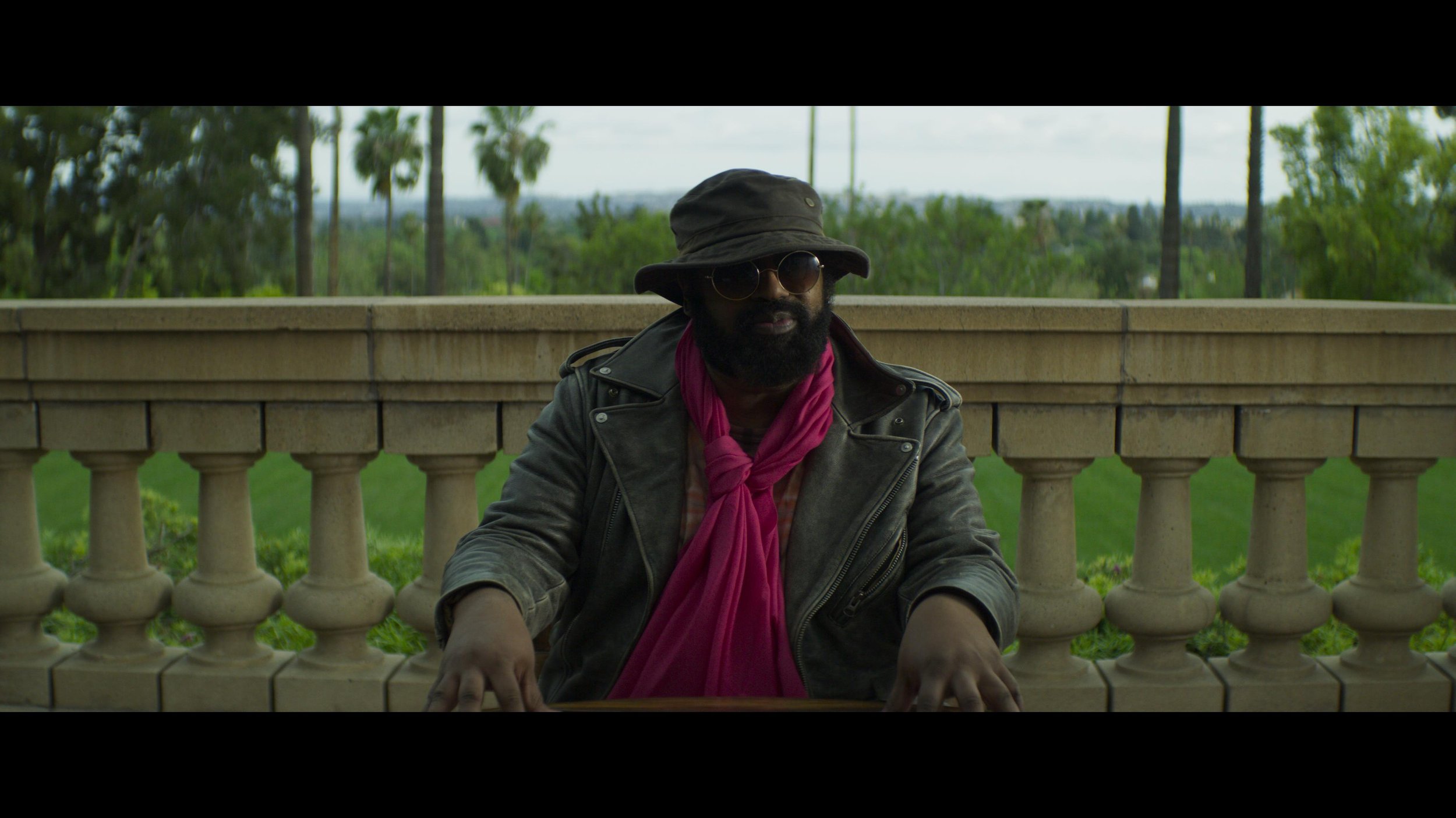
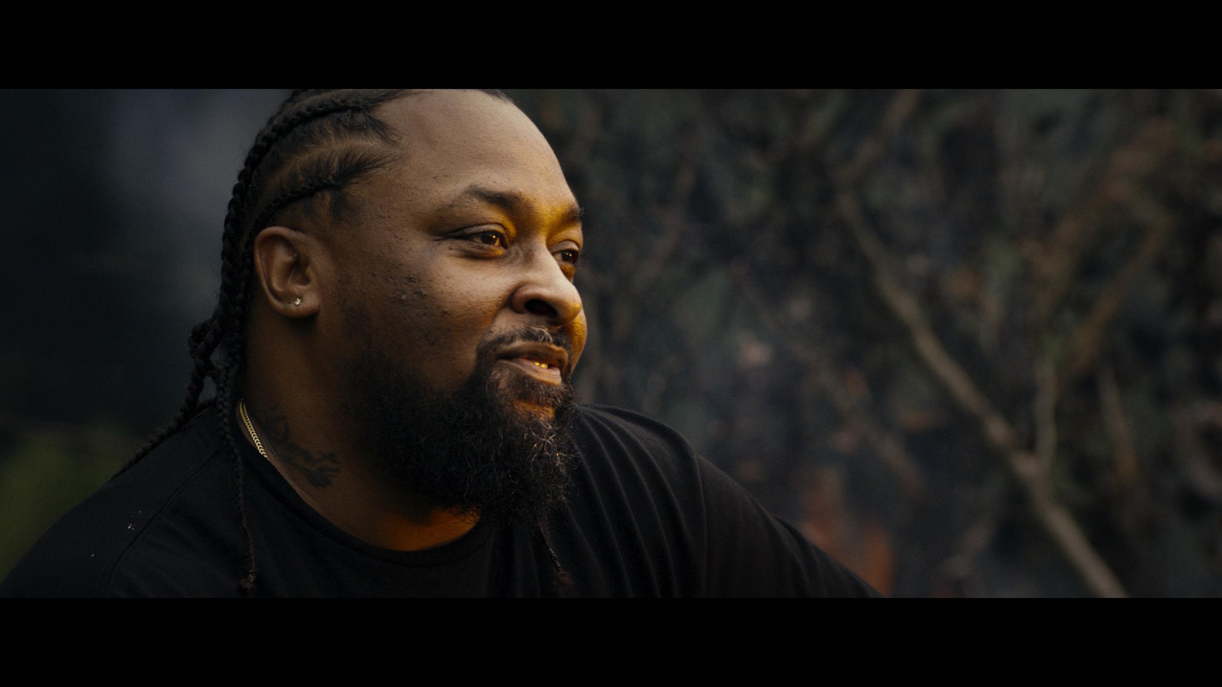
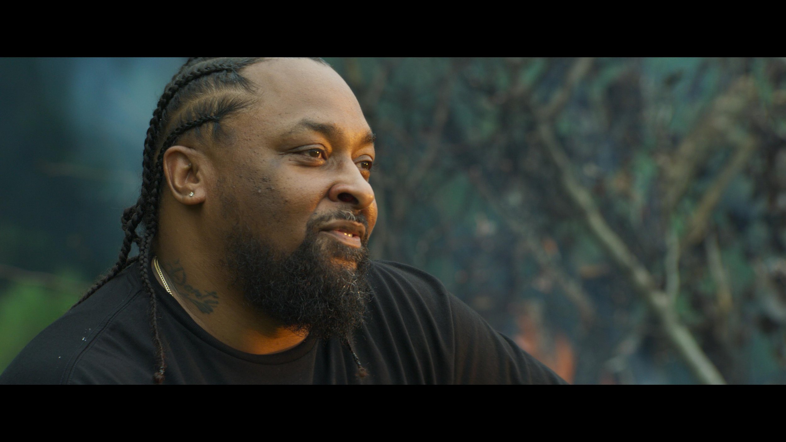
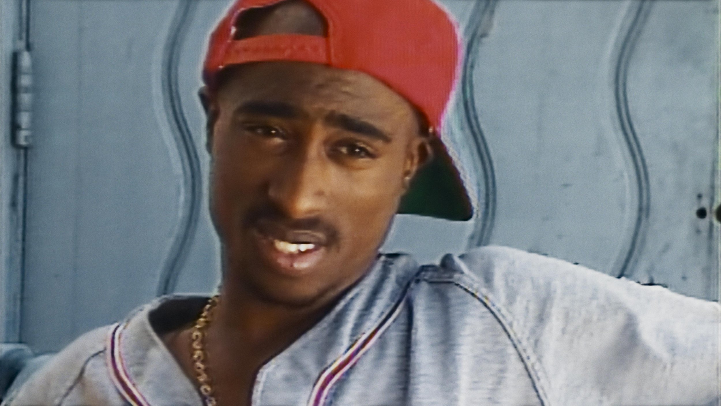
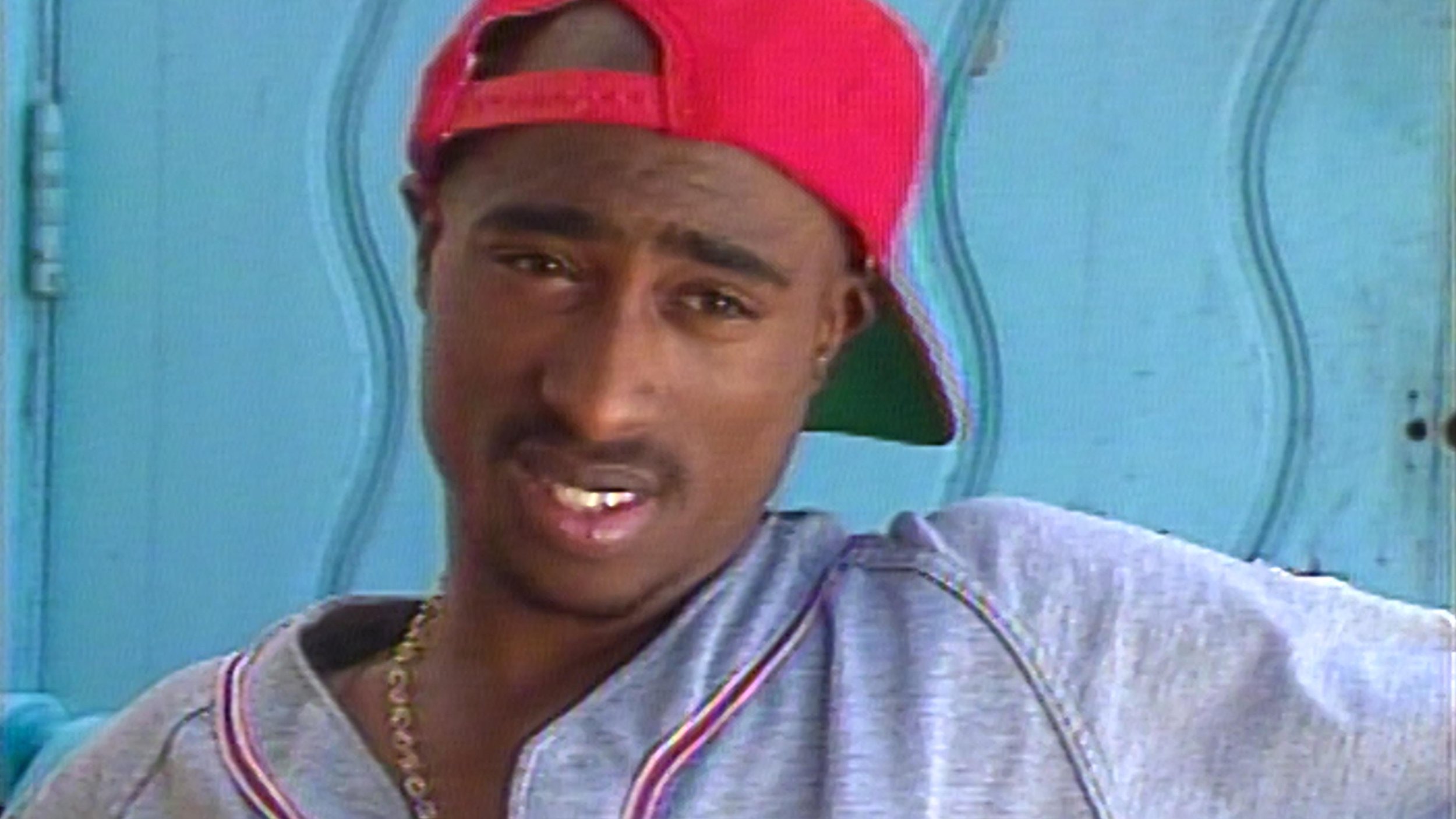
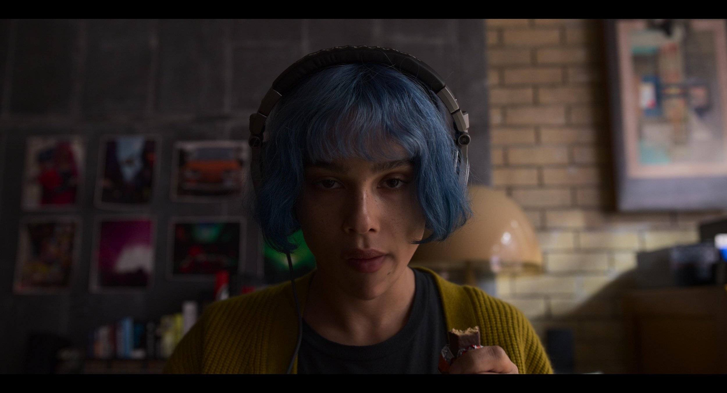
8AE - Really Really
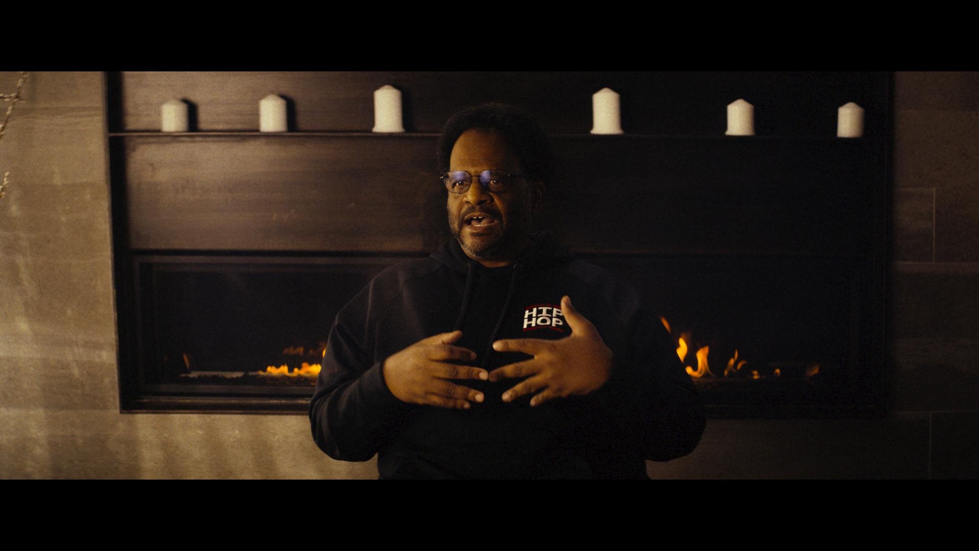
I was happy to help out my old friend 8AE on this one. My favorite aspect of this project was the custom shader we created for a distressed graphic rendering. She’s a super creative person and it was a blast getting the look to where she wanted it to be. Check out the video below.
Los Angeles native 8AE (pronouced "bae") is a 2 time Grammy nominated artist and songwriter. She co-wrote on Metro Boomin's Billboard #1, GRAMMY nominated album "Heroes and Villains" and was a feature on the Creed 3 soundtrack single "Culture".
HDR - Flavors and Best Practices
Better Pixels.
Over the last decade we have had a bit of a renaissance in imaging display technology. The jump from SD to HD was a huge bump in image quality. HD to 4k was another noticeable step in making better pictures, but had less of an impact from the previous SD to HD jump. Now we are starting to see 8k displays and workflows. Although this is great for very large screens, this jump has diminishing returns for smaller viewing environments. In my opinion, we are to the point where we do not need more pixels, but better ones. HDR or High Dynamic Range images along with wider color gamuts are allowing us to deliver that next major increase in image quality. HDR delivers better pixels!

Stop… What is dynamic range?
When we talk about the dynamic range of a particular capture system, what we are referring to is the delta between the blackest shadow and the brightest highlight captured. This is measured in Stops typically with a light-meter. A Stop is a doubling or a halving of light. This power of 2 way of measuring light is perfect for its correlation to our eyes logarithmic nature. Your eyeballs never “clip” and a perfect HDR system shouldn’t either. The brighter we go the harder it becomes to see differences but we never hit a limit.
Unfortunately digital camera senors do not work in the same way as our eyeballs. Digital sensors have a linear response, a gamma of 1.0 and do clip. Most high-end cameras convert this linear signal to a logarithmic one for post manipulation.

I was never a huge calculus buff but this one thought experiment has served me well over the years.

Say you are at one side of the room. How many steps will it take to get to the wall if each time you take a step, the step is half the distance of your last. This is the idea behind logarithmic curves.

It will take an infinite number of steps to reach the wall, since we can always half the half.

Someday we will be able to account for every photon in a scene, but until that sensor is made we need to work within the confines of the range that can be captured
For example if the darkest part of a sampled image are the shadows and the brightest part is 8 stops brighter, that means we have a range of 8 stops for that image. The way we expose a sensor or a piece of celluloid changes based on a combination of factors. This includes aperture, exposure time and the general sensitivity of the imaging system. Depending on how you set these variables you can move the total range up or down in the scene.
Let’s say you had a scene range of 16 stops. This goes from the darkest shadow to direct hot sun. Our imaging device in this example can only handle 8 of the 16 present stops. We can shift the exposure to be weighted towards the shadows, the highlights, or the Goldilocks sweet spot in the middle. There is no right or wrong way to set this range. It just needs to yield the picture that helps to promote the story you are trying to tell in the shot. A 16bit EXR file can handle 32 stops of range. Much more than any capture system can deliver currently.
Latitude is how far you can recover a picture from over or under exposure. Often latitude is conflated with dynamic range. In rare cases they are the same but more often than not your latitude is less then the available dynamic range.
Film, the original HDR system.
Film from its creation always captured more information than could be printed. Contemporary stocks have a dynamic range of 12 stops. When you print that film you have to pick the best 8 stops to show via printing with more or less light. The extra dynamic range was there in the negative but was limited by the display technology.
Flash forward to our digital cameras today. Cameras form Arri, Red, Blackmagic, Sony all boast dynamic ranges over 13 stops. The challenge has always been the display environment. This is why we need to start thinking of cameras not as the image creators but more as the photon collectors for the scene at the time of capture. The image is then “mapped” to your display creatively.
Scene referred grading.
The problem has always been how do we fit 10 pounds of chicken into an 8 pound bag? In the past when working with these HDR camera negatives we were limited to the range of the display technology being used. The monitors and projectors before their HDR counterparts couldn’t “display” everything that was captured on set even though we had more information to show. We would color the image to look good on the device for which we were mastering. “Display Referred Grading,” as this is called, limits your range and bakes in the gamma of the display you are coloring on. This was fine when the only two mediums were SDR TV and theatrical digital projection. The difference between 2.4 video gamma and 2.6 theatrical gamma was small enough that you could make a master meant for one look good on the other with some simple gamma math. Today the deliverables and masters are numerous with many different display gammas required. So before we even start talking about HDR, our grading space needs to be “Scene Referred.” What this means is that once we have captured the data on set, we pass it through the rest of the pipeline non-destructively, maintaining the relationship to the original scene lighting conditions. “No pixels were harmed in the making of this major motion picture.” is a personal mantra of mine.
I’ll add the tone curve later.
There are many different ways of working scene-referred. the VFX industry has been working this way for decades. The key point is we need to have a processing space that is large enough to handle the camera data without hitting the boundaries i.e. clipping or crushing in any of the channels. This “bucket” also has to have enough samples (bit-depth) to be able to withstand aggressive transforms. 10-bits are not enough for HDR grading. We need to be working in a full 16-bit floating point.

This is a bit of an exaggeration, but it illustrates the point. Many believe that a 10 bit signal is sufficient enough for HDR. I think for color work 16 bit is necessary. This ensures we have enough steps to adequately describe our meat and potatoes part of the image in addition to the extra highlight data at the top half of the code values.
Bit-depth is like butter on bread. Not enough and you get gaps in your tonal gradients. We want a nice smooth spread on our waveforms.
Now that we have our non destructive working space we use transforms or LUTs to map to our displays for mastering. ACES is a good starting point for a working space and a set of standardized transforms, since it works scene referenced and is always non destructive if implemented properly. The gist of this workflow is that the sensor linearity of the original camera data has been retained. We are simply adding our display curve for our various different masters.
Stops measure scenes, Nits measure displays.
For measuring light on set we use stops. For displays we use a measurement unit called a nit. Nits are a measure of peak brightness not dynamic range. A nit is equal to 1 cd/m2. I’m not sure why there is two units with different nomenclature for the same measurement, but for displays we use the nit. Perhaps candelas per meter squared, was just too much of a mouthful. A typical SDR monitor has a brightness of 100 nits. A typical theatrical projector has a brightness of 48 nits. There is no set standard for what is considered HDR brightness. I consider anything over 600nits HDR. 1000nits or 10 times brighter than legacy SDR displays is what most HDR projects are mastered to. The Dolby Pulsar monitor is capable of displaying 4000 nits which is the highest achievable today. The PQ signal accommodates values up to 10,000 nits
The Sony x300 has a peak brightness of 1000 nits and is current gold standard for reference monitors.
The Dolby Pulsar is capable of 4000 nit peak white
P-What?

Rec2020 color primaries with a D65 white point
The most common scale to store HDR data is the PQ Electro-Optical Transfer Function. PQ stands for perceptual quantizer. the PQ EOTF was standardized when SMPTE published the transfer function as SMPTE ST 2084. The color primaries most often associated with PQ are rec2020. BT.2100 is used when you pair the two, PQ transfer function with rec2020 primaries and a D65 white point. This is similar to how the definition of BT.1886 is rec709 primaries with an implicit 2.4 gamma and a D65 white point. It is possible to have a PQ file with different primaries than rec2020. The most common variance would be P3 primaries with a D65 white point. Ok, sorry for the nerdy jargon but now we are all on the same page.

HDR Flavors
There are four main HDR flavors in use currently. All of them use a logarithmic approach to retain the maxim amount of information in the highlights.
Dolby Vision
Dolby Vision is the most common flavor of HDR out in the field today. The system works in three parts. First you start with your master that has been graded using the PQ EOTF. Next you “analyse“ the shots in in your project to attach metadata about where the shadows, highlights and meat and potatoes of your image are sitting. This is considered layer 1 metadata. Next this metadata is used to inform the Content Mapping Unit or CMU how best to “convert” your picture to SDR and lower nit formats. The colorist can “override” this auto conversion using a trim that is then stored in layer 2 metadata commonly referred to as L2. The trims you can make include lift gamma gain and sat. In version 4.0 out now, Dolby has given us the tools to also have secondary controls for six vector hue and sat. Once all of these settings have been programmed they are exported into an XML sidecar file that travels with the original master. Using this metadata, a Dolby vision equipped display can use the trim information to tailor the presentation to accommodate the max nits it is capable of displaying on a frame by frame basis.
HDR 10
HDR 10 is the simplest of the PQ flavors. The grade is done using the PQ EOTF. Then the entire show is analysed. The average brightness and peak brightness are calculated. These two metadata points are called MaxCLL - Maximum Content Light Level and MaxFALL - Maximum Frame Average Light Level. Using these a down stream display can adjust the overall brightness of the program to accommodate the displays max brightness.
HDR 10+
HDR 10+ is similar to Dolby Vision in that you analyse your shots and can set a trim that travels in metadata per shot. The difference is you do not have any color controls. You can adjust points on a curve for a better tone map. These trims are exported as an XML file from your color corrector.
HLG
Hybrid log gamma is a logarithmic extension of the standard 2.4 gamma curve of legacy displays. The lower half of the code values use 2.4 gamma and the top half use log curve. Combing the legacy gamma with a log curve for the HDR highlights is what makes this a hybrid system. This version of HDR is backwards compatible with existing display and terrestrial broadcast distribution. There is no dynamic quantification of the signal. The display just shows as much of the signal as it can.

Deliverables
Deliverables change from studio to studio. I will list the most common ones here that are on virtually every delivery instruction document. Depending on the studio, the names of these deliverables will change but the utility of them stays the same.
PQ 16-bit Tiffs
This is the primary HDR deliverable and derives some of the other masters on the list. These files typically have a D65 white point and are either Rec2020 or p3 limited inside of a Rec2020 container.
GAM
The Graded Archival Master has all of the color work baked in but does not have the any output transforms. This master can come in three flavors all of which are scene referred;
ACES AP0 - Linear gamma 1.0 with ACES primaries, sometimes called ACES prime.
Camera Log - The original camera log encoding with the camera’s native primaries. For example, for Alexa, this would be LogC Arri Wide Gamut.
Camera Linear - This flavor has the camera’s original primaries with a linear gamma 1.0
NAM
The non-graded assembly master is the equivalent of the VAM back in the day. It is just the edit with no color correction. This master needs to be delivered in the same flavor that your GAM was.
ProRes XQ
This is the highest quality ProRes. It can hold 12-bits per image channel and was built with HDR in mind.
Dolby XML
This XML file contains all of the analysis and trim decisions. For QC purposes it needs to be able to pass a check from Dolby’s own QC tool Metafier.
IMF
Inter-operable Master Format files can do a lot. For the scope of this article we are only going to touch on the HDR delivery side. The IMF is created from an MXF made from jpeg 2000s. The jp2k files typically come from the PQ tiff master. It is at this point that the XML file is married with picture to create one nice package for distribution.
Near Future
Currently we master for theatrical first for features. In the near future I see the “flippening” occurring. I would much rather spend the bulk of the grading time on the highest quality master rather than the 48nit limited range theatrical pass. I feel like you get a better SDR version by starting with the HDR since you have already corrected any contamination that might have been in the extreme shadows or highlights. Then you spend a few days “trimming” the theatrical SDR for the theaters. The DCP standard is in desperate need of a refresh. 250Mbps is not enough for HDR or high resolution masters. For the first time in film history you can get a better picture in your living room than most cinemas. This of course is changing and changing fast.
Sony and Samsung both have HDR cinema solutions that are poised to revolutionize the way we watch movies. Samsung has their 34 foot onyx system which is capable of 400nit theatrical exhibition. You can see a proof of concept model in action today if you live in the LA area. Check it out at the Pacific Theatres Winnetka in Chatsworth.
Sony has, in my opinion, the wining solution at the moment. They have a their CLED wall which is capable of delivering 800 nits in a theatrical setting. These types of displays open up possibilities for filmmakers to use a whole new type of cinematic language without sacrificing any of the legacy story telling devices we have used in the past.
For example, this would be the first time in the history of film where you could effect a physiologic change to the viewer. I have often thought about a shot I graded for The “Boxtrolls” where the main character, Eggs, comes out from a whole life spent in the sewers. I cheated an effect where the viewers eyes were adjusting to a overly bright world. To achieve this I cranked the brightness and blurred the image slightly . I faded this adjustment off over many shots until your eye “adjusted” back to normal. The theatrical grade was done at 48nits. At this light level, even at it’s brightest the human eye is not iris’ed down at all, but what if I had more range at my disposal. Today I would crank that shot until it made the audiences irises close down. Then over the next few shots the audience would adjust back to the “new brighter scene and it would appear normal. That initial shock would be similar to the real world shock of coming from a dark environment to a bright one.
Another such example that I would like to revisit is the myth of “L’Arrivée d’un train en gare de La Ciotat.” In this early Lumière picture a train pulls into a station. The urban legend is that this film had audiences jumping out of their seats and ducking for cover as the train comes hurling towards them. Imagine if we set up the same shot today but in a dark tunnel. We could make the head light so bright in HDR that coupled with the sound of a rushing train would cause most viewers, at the very least, to look away as it rushes past. A 1000 nit peak after your eyes have been acclimated to the dark can appear shockingly bright.
I’m excited for these and other examples yet to be created by filmmakers exploring this new medium. Here’s to better pixels and constantly progressing the art and science of moving images!
Please leave a comment below if there are points you disagree with or have any differing views on the topics discussed here.
Thanks for reading,
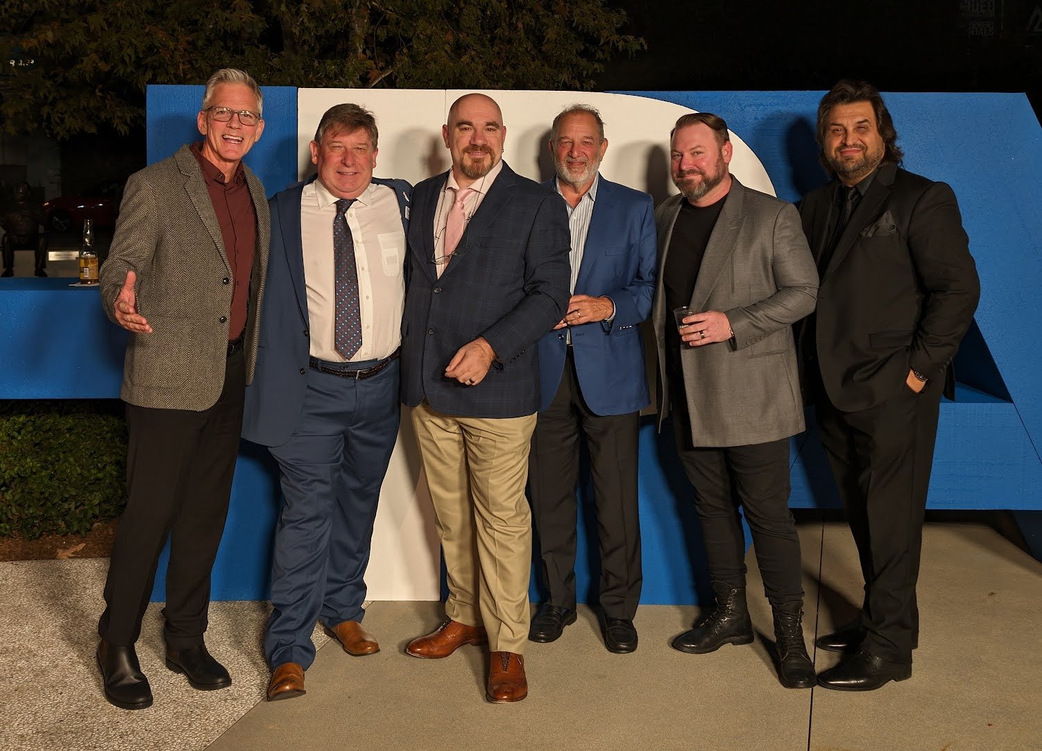
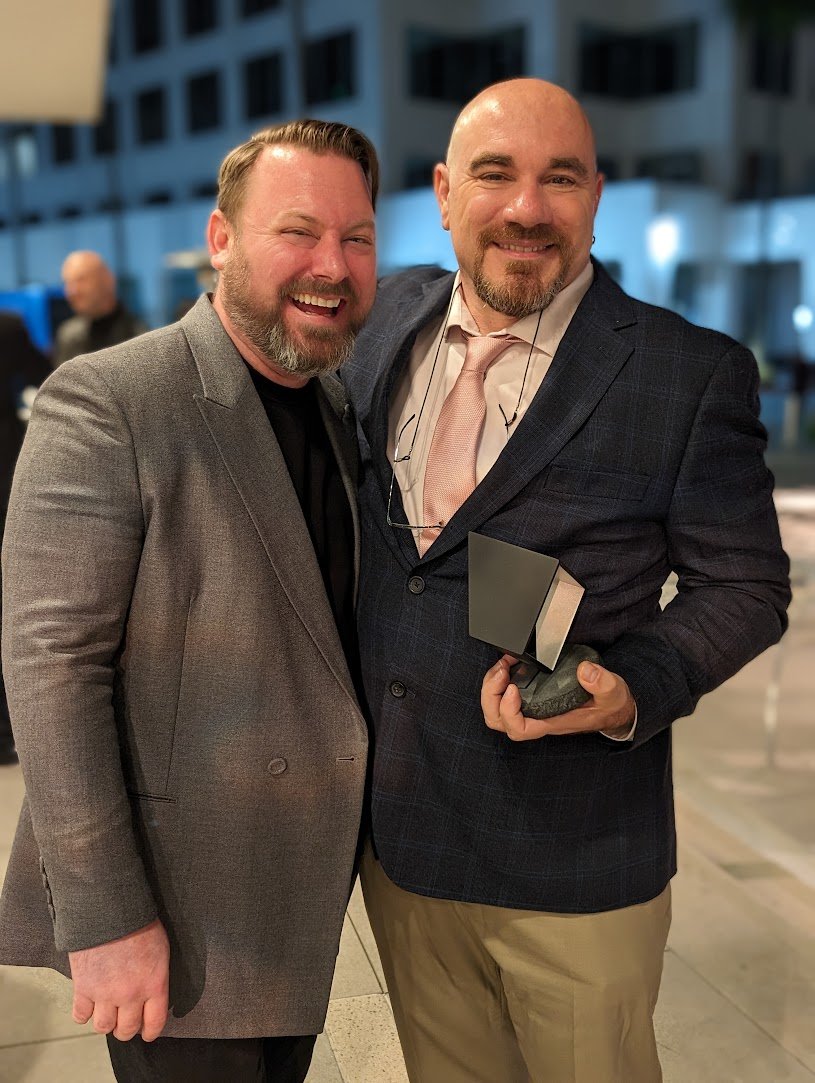
Big Congratulations to tonight's HPA winners
Cheers to my old Fotokem mentors for taking down wins tonight. Stoked to see the judges get it right this year with awards for Kostas Theodosiou (Oppenheimer) and Walter Volpatto (Winning Time: The Rise of the Lakers Dynasty)


Come join us at the Linwood Dunn Theater for a SMPTE Hollywood and Colorist Society Hollywood Oct. 5 event.


Location
Academy of Motion Picture Arts & Sciences Linwood Dunn Theater
1313 Vine Street Los Angeles, CA 90028
SMPTE Hollywood Section will explore best practices for HDR/SDR workflows at its October meeting. Hosted by SMPTE Hollywood Section and Colorist Society Hollywood in association with the Academy of Motion Picture Arts and Sciences, this event will include technical presentations and a panel discussion from some of the industry’s top colorists, workflow specialists and innovators. The free event is scheduled for Thursday, October 5 at 6:00pm at AMPAS’s Linwood Dunn Theater in Hollywood.
"Standards exist regarding SDR and HDR encoding but there are no established best practices for content creation."
Presenters will offer answers to such questions as:
• What does it mean for HDR and SDR versions to “match”? Should they?
• Which deliverable comes first?
• What’s the best way to manage LUTs and looks?
• Can ACES be a creative and technical facilitator for HDR/SDR workflows?
• The event will also offer a sneak peek at the latest HDR and SDR Output Transforms being considered for the ACES 2.0 release.
The evening will begin with presentations from colorists John Daro, CSH, Lead Digital Intermediate Colorist, Warner Post Production Creative Services; Lynette Duensing, CSH, Senior Colorist, Instinctual LLC Hollywood; and Laura Jans Fazio, Senior Colorist/Studio Post-Division, NBC Universal, Juan Cabrera, CSH, Supervising Colorist, Lightbenders; The following panel discussion will feature Daro, Duensing, Fazio, Cabrera and Annie Chang, VP/Creative Technologies, Universal Pictures and ACES Co-Chair. Marc Zorn, Content Protection & Production Security, Marvel Studios, will moderate.
6:00 PM Networking Reception
7:00 PM Program Begins
As always, SMPTE meetings are free and open to all, even non-members. Each guest must register separately.
Sign up to be notified about future SMPTE Hollywood Events: https://go.smpte.org/subscribe
Post Perspective - Color Pipeline: Virtual Roundtable
Here is a Q&A I was recently included in. Check out the full article here at postperspective.com
Warner Bros. Post Creative Services Colorist John Daro
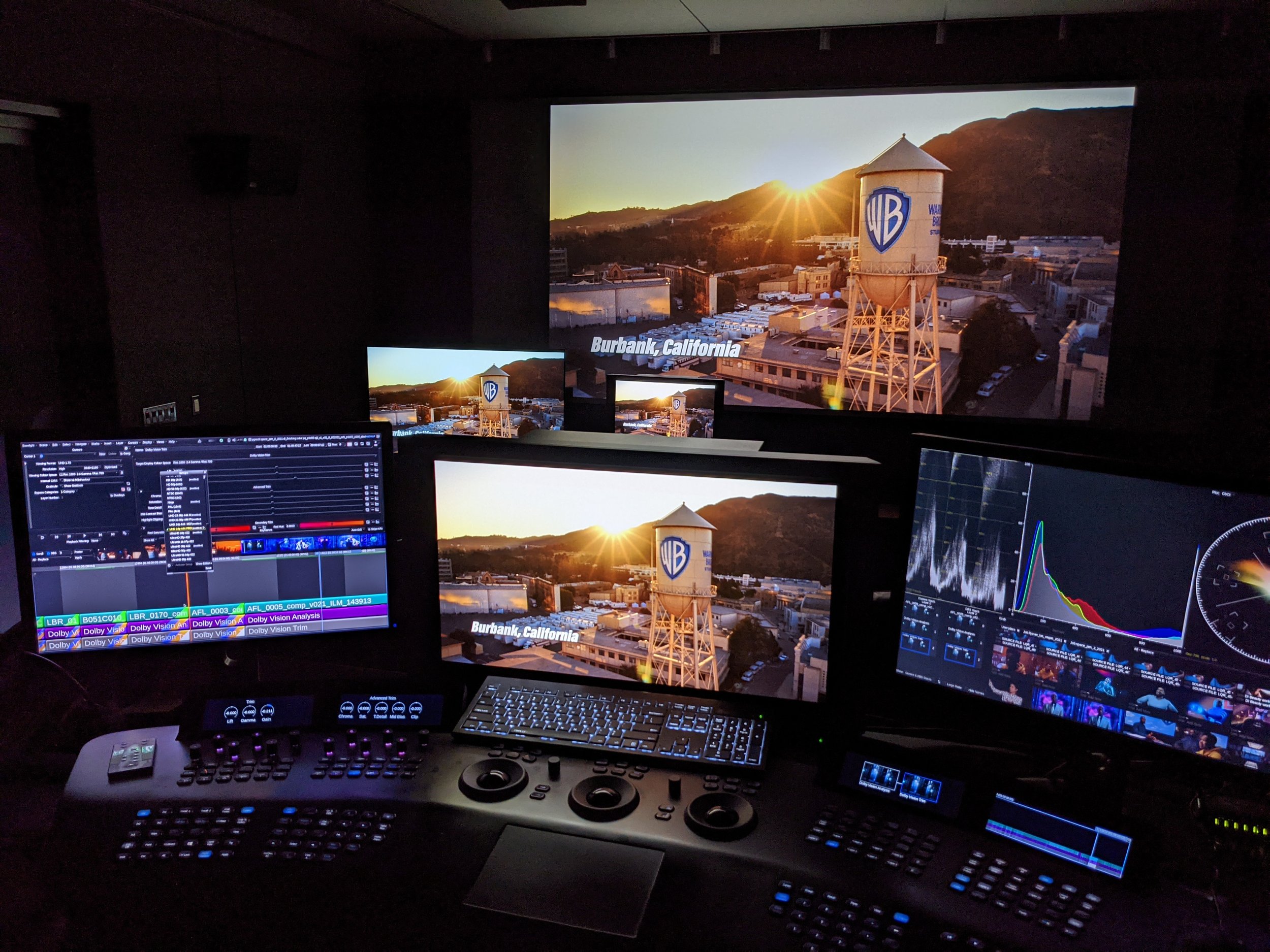
My mission control station at HQ
Warner Bros. Post Production Creative Services is a post house on the Warner Bros. lot in Burbank. “We specialize in feature films and high-end episodic projects, with picture and sound finishing under one roof. We also have editorial space and visual effects offices just one building over, so we truly are a one-stop shop for post.”
What does your setup look like tools-wise?
I have been a devotee of FilmLight’s Baselight for the past five years. It is the beating heart of my DI theater, where I project images onto a 4K Christie projector and monitor them on two Sony X300s. For that “at-home” consumer experience, I also have a Sony A95K.
Although I spend 90% of my time on Baselight, there are a few other post-software necessities for my craft. I call my machine the “Swiss army box,” a Supermicro chassis with four Nvidia A6000s. I use this machine to run Resolve, Mistika, Photoshop, and Nuke. It also makes a fine dev box for my custom Python tools.
I always say, “It’s not the sword; it’s the samurai.” Use the right tool for the right job, but if you don’t have the right tool, then use what you’ve got.
Do you work in the cloud? If so, can you describe that workflow and the benefits?
Not really. For security reasons, our workstations are air-gapped and disconnected from the outside world. All media flows through our IO department. However, one cloud tool I do use is Frame.io, especially for the exchange of notes back and forth. I really like how everything is integrated into the timeline. It’s a super-efficient way to collaborate. In addition to those media uploads, the IO team also archives finished projects and raw scans to the cloud.

I do think cloud workflows are gaining steam, and I definitely have my eye on the space. I can envision a future where we send a calibrated Sony X3110 to a client and then use Baselight in the cloud to send JPEG XS straight to the display for remote approvals. It’s a pretty slick workflow, and it also gets us away from needing the big iron to live on-prem.
Working this way takes geography out of the equation too. I would love to work from anywhere on the planet. Bring on the Tiki drinks with the little umbrellas somewhere in the tropics with a laptop and a Mini Panel. All joking aside, it does open the talent pool to the entire world. You will be able to get the best artists regardless of their location. That’s an exciting prospect, and I can’t wait to see what the future holds for this new way of looking at post.
Do you often create LUTs for a project? How does that help?
I mostly work with curves and functions to do my transforms, but when on-set or editorial needs a preview of what the look will be in the room, I do bake LUTs out. They are especially critical for visual effects reviews and dailies creation.
There’s a film project that I’m working on right now. We’re doing a scan-once workflow on that show to avoid overly handling the negative. Once scanned, there is light CDL grading, and a show LUT is applied to the raw scans to make editorial media. The best looks are the ones that have been developed early and help to maintain consistency throughout the entire workflow. That way, you don’t get any surprises when you get into the final grade. Temp love is a thing… LUTs help you avoid loving the wrong thing.
Do you use AI as part of your daily job? In what way?

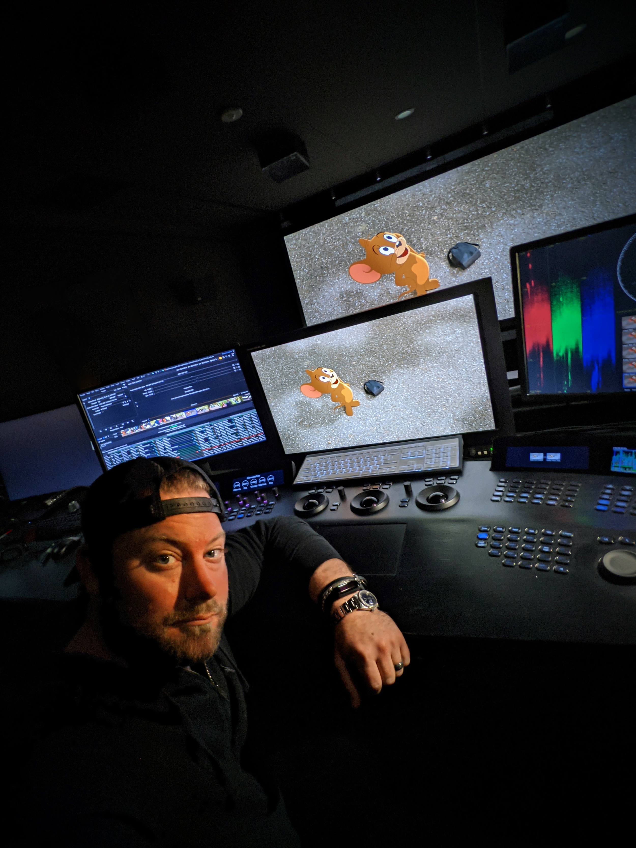
Superman II Restoration
I do use a bit of AI in my daily tasks, but it’s the AI that I’ve written myself. Originally, I started trying to make an automated dust-buster for film restoration. I failed miserably at that, but I did learn how to train a neural net, and that led to my first helpful tool.
I used an open-source image library to train an AI up-rezer. Although this is commonplace now, back then, it was scratching an itch that hadn’t been scratched yet. To this day, I do think my up-rezer is truer to the image and less “AI”-feeling than what’s available off the shelf.
After the up-rezer, I wrote Match Grader in 2020, which essentially takes the look and vibe from one shot and applies it to another. I don’t use it for final grading, but it can be very useful in the look-dev process.

Building on what I had learned coding Match Grader, I subsequently developed a process to use machine vision to create a depth channel. This turns your Power Windows from circles and squares into spheres and cubes. It is a very powerful tool for adding atmosphere to images. When these channels are available to me, one of my favorite moves is to desaturate the background while increasing the contrast in the foreground. This adds dimension to your image and helps to draw your eye to the characters where it was intended.
These channels can also aid in stereo compositing, but it’s been a minute since I have had a 3D job cross my desk that wasn’t for VR.

Machine vision segmentation with YOLO. 16fps @4k
Lately, I have been tinkering with an open-source library called YOLO (You Only Look Once.) This software was originally developed for autonomous driving, but I found it useful for what we do in color. Basically, it’s a very fast image segmenter. It returns a track and a matte for what it identifies in the frame. It doesn’t get everything right all the time, but it is very good with people, thankfully. You wouldn’t use these mattes for compositing, but they are great for color, especially when used as a garbage matte to key into.
I have also recently refreshed my AI uprezer. I built in some logic that is somewhat “intelligent” about the source coming in. This way the process is not a one size fits-all operation.


SamurAI Image Restoration
It can auto-detect interlace and cadence now and can perform a general analysis of the quality of the picture. This allowed me to throttle the strength and end up with the perfect amount of enhancement on a case-by-case basis. The new tool is named SamurAI.

If given an example from another show or work of art, what is the best way to emulate that?
It’s good to be inspired, but you never want to be derivative. Often, we take many examples that all have a common theme or feeling and amalgamate them into something new.
That said, sometimes there are projects that do need a literal match. Think film emulation for a period effect. People can approach it in two ways. First — the easiest way, while also being more complicated — is to get a hold of some of the stock you are emulating. Next, you expose it with color and density patches and then develop and measure the strip. If you read enough points, then you can start to interpolate curves from the data.

FilmLight can help with this, and back in my lab days, that is exactly whose software we used. Truelight was essential back in the early days of DI, when the “I” was truly the intermediate digital step between two analog worlds.
The second way I approach this task would be to use my Match Grader software. I can push the look of our references to some of the production footage. Match Grader is a bit of a black box in that it returns a completed graded image but not the recipe for getting there. This means the next step would be to bring it into the color corrector and match it using curves, keys, and scopes. The advantage of doing it this way instead of just matching it to the references is that you are working with the same picture, which makes it easier to align all the values perfectly.
Oh, or you can just use your eyeballs. 😉
Do your workflows include remote monitoring?
Not only do they include it, but there was a time in the not-too-distant past when that was the only option. We use all the top solutions for remote sessions, including Streambox, Sohonet ClearView, Colorfront and T-VIPS. The choice really comes down to what the facility on the catching side has and the location of the client. At the moment, my preference is Streambox. It checks all the boxes, from 4K to HDR. For quick approvals, ClearView is great because all we need on the client side is a calibrated iPad Pro.
What film or show or spot resonates with you from a color perspective?
Going back to my formative years, I have always been drawn to the austere beauty of Gattaca. The film’s use of color is simply flawless. Cinematographer Sławomir Idziak is one of my favorites, and he has profoundly influenced my work. I love Gattaca’s early flashbacks, in particular. I have been gravitating in that direction ever since I saw the picture.

Gattaca

Magic Mike

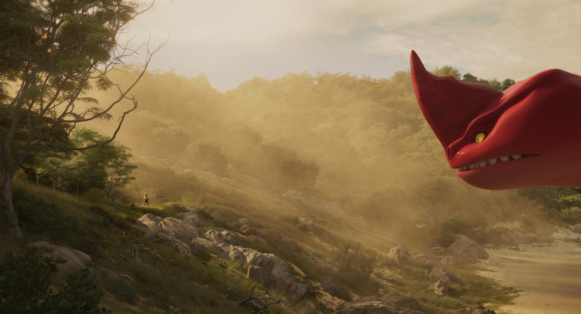
The Sea Beast
You can see a bit of Gattaca‘s influence in my own work on Steven Soderbergh’s Magic Mike and even a little bit on the animated film The Sea Beast, directed by Chris Williams.

Gattaca

The Sea Beast
I am always looking for new ways to push the boundaries of visual storytelling, and there are a ton of other films that have inspired me, but perhaps that’s a conversation for another time. I am grateful for the opportunity to have worked on projects that I have, and I hope that my work will continue to evolve, inspire and be inspired in the years to come.


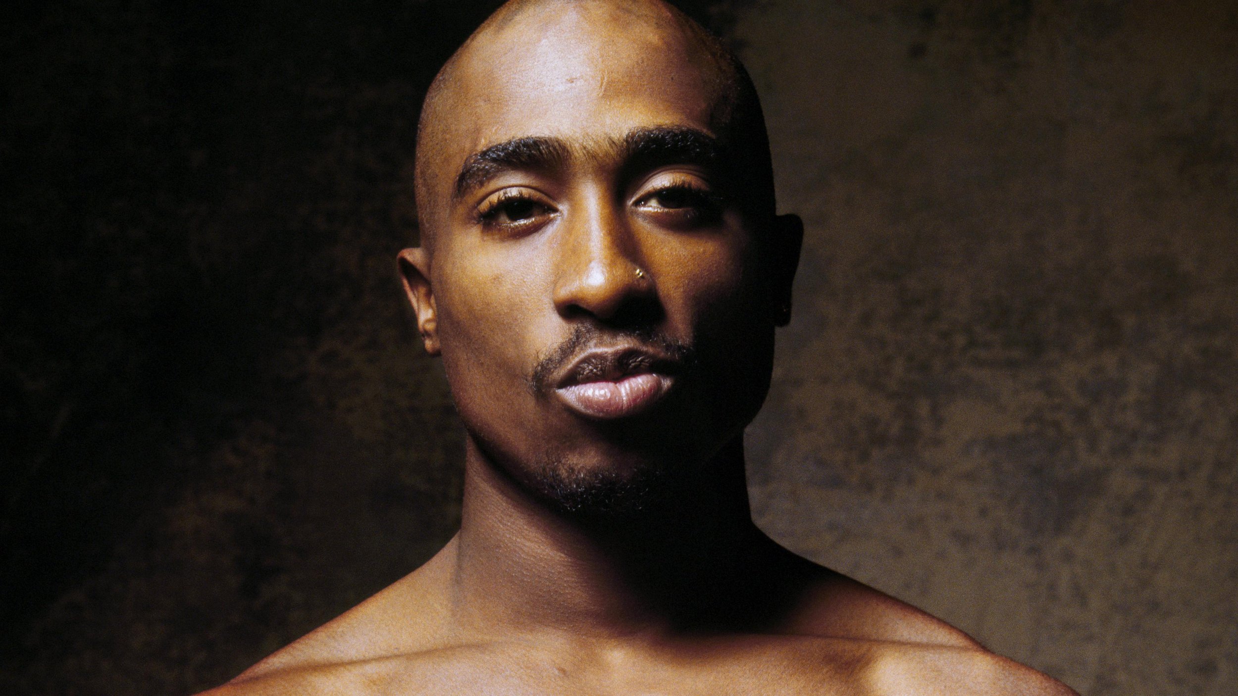
Congratulations "Dear Mama" Emmy Nomination
“Dear Mama” Emmy nomination for Best Documentary or Nonfiction Series

Congratulations to Allen Hughes and the Dear Mama team on their well-deserved recognition. I am crossing my fingers for an Emmy win on the day!
https://www.hollywoodreporter.com/tv/tv-news/2023-emmys-nominations-nominees-list-1235533766/

100 Years of Warner Bros.
The team and I just finished up this documentary on the last 100 years of my favorite studio. I might be slightly biased, but I really enjoyed the piece and learned a ton about where I work. You can check out the trailer below and see it on Max May 25th. The stuff dreams are made of.
This was an ACES project mastered in Rec.2020 at 1000 nits. The Dolby system was used to create the 48nit theatrical version playing at the Cannes film festival and the 100nit 709 version that sourced the trailer above.
Dear Mama
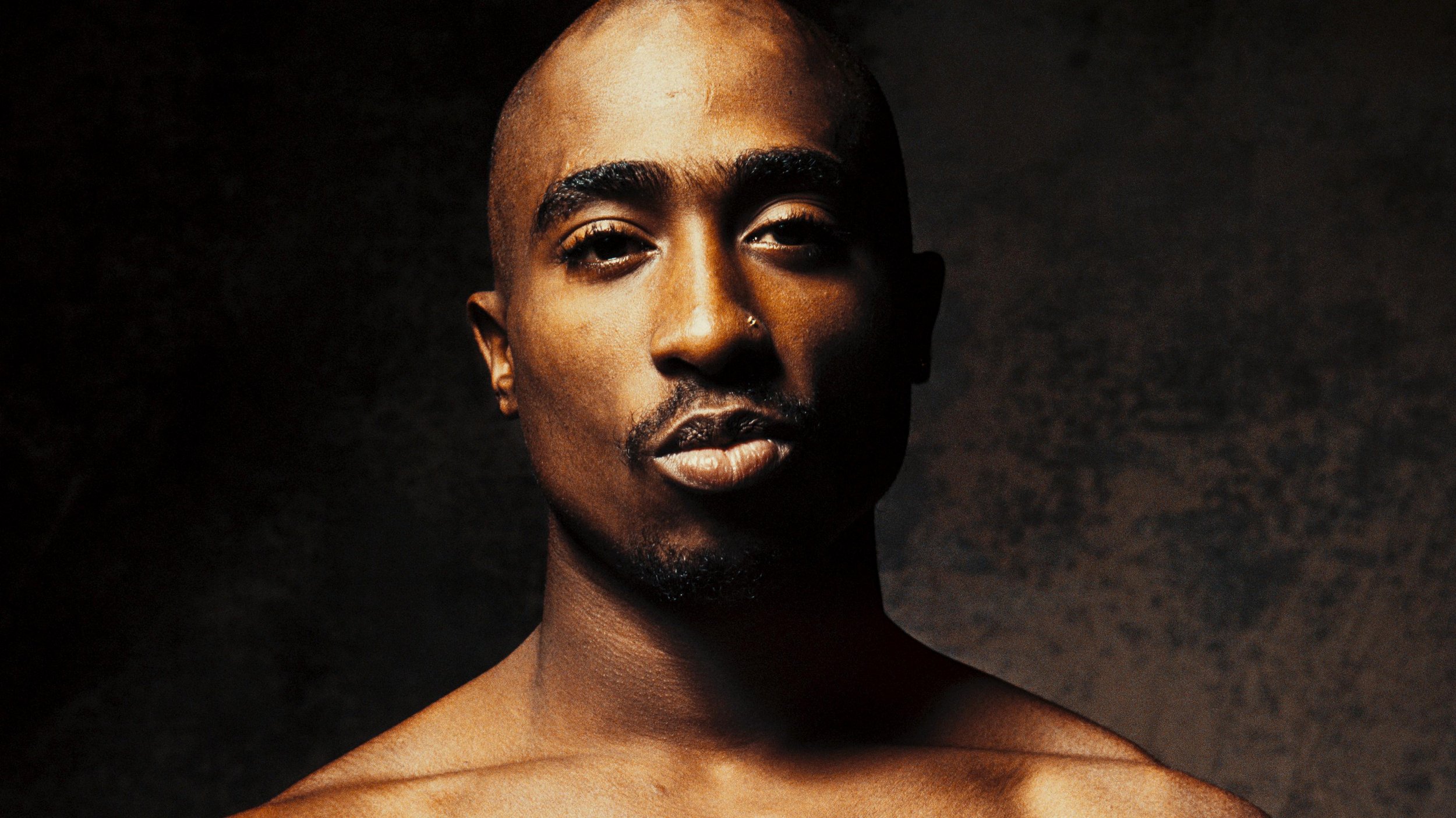
7/12 - Update: “Dear Mama” Emmy nomination for Best Documentary or Nonfiction Series
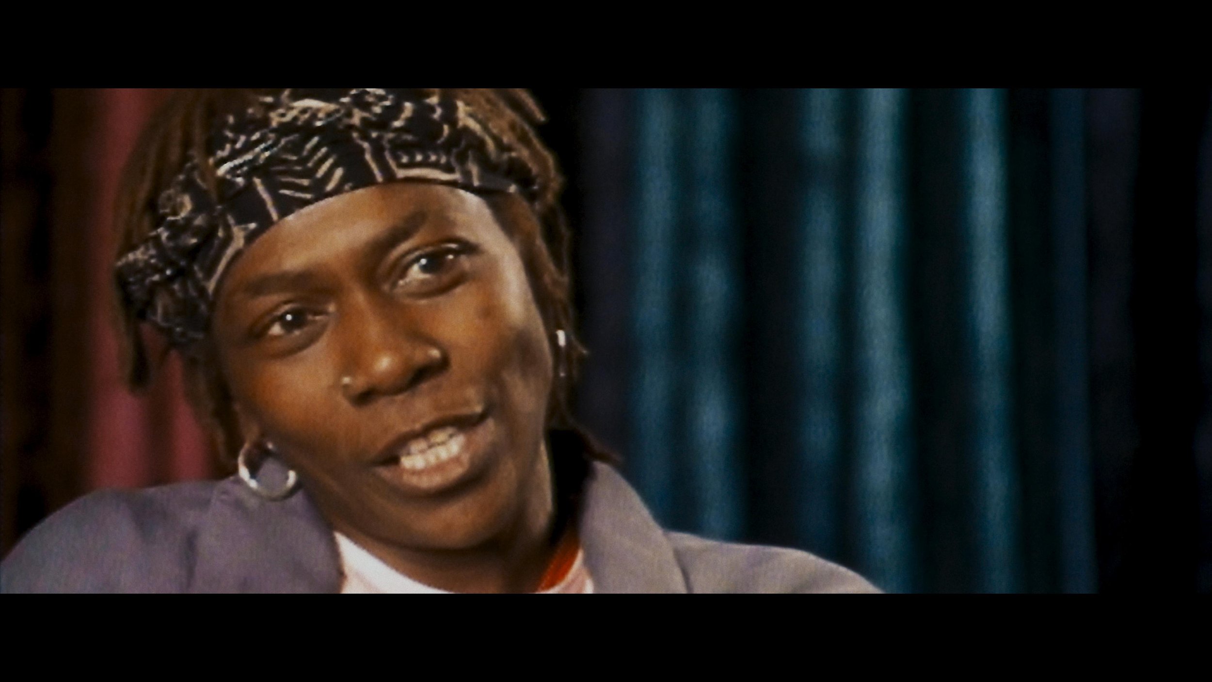
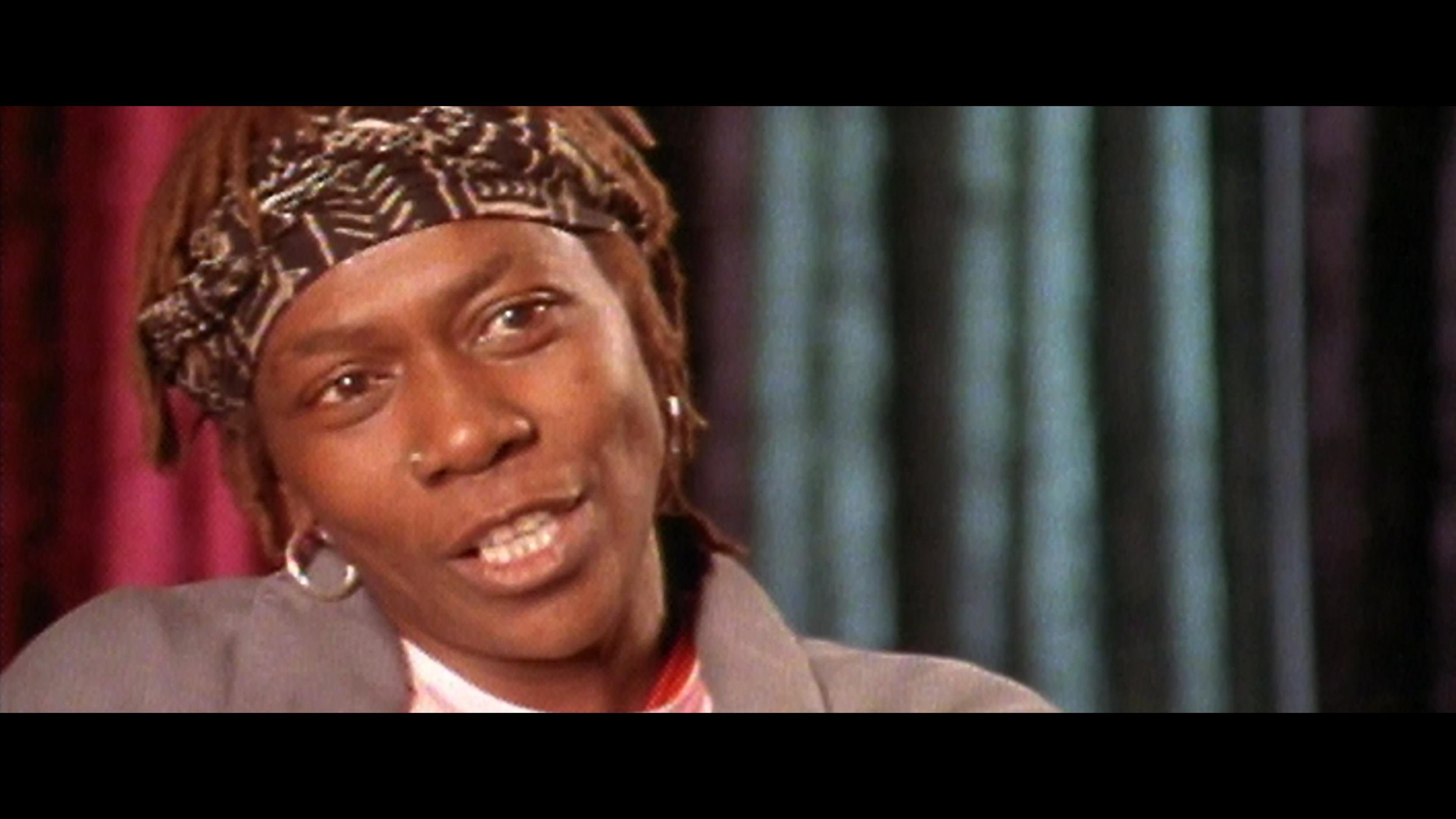
Well, if you are my age and grew up in the ’90s, you listened to Tupac. Even all of us white boys from Camarillo knew every word to every song. His music really was the soundtrack to the last decade of the millennium and my youth.
Tonight is the final installment of “Dear Mama.” FX’s most-watched unscripted show.
Perfect for a Mother’s Day weekend! Please go check it out on FX tonight or streaming on Hulu.
Allen Hughes directed this insightful docuseries. Fitting because Allen and his brother directed Tupac’s early music videos. Sure, there was a bit of drama, but that adds to the flavor of the story. That connection to the material made Hughes the quintessential choice for captaining this ship. Tupac wasn’t any one thing; more like an eclectic stew of many influences and identities. One thing is for sure. Dude was thug life for real.

Cognac hues or Hughes as it were
Allen was clear on the look and vibe he wanted for the series. Cognac was the word. We spent a couple of weeks developing a look that feels like you have filtered the light through a fine liquor. We also used Live Grain to achieve that end-of-the-film-era perfect Kodak grain structure of the 90s.
Documentary grading is an entirely different beast. Here are a few tips for you to tackle your next interview-based production.
Color management - I preach this a lot, but even more critical with many different sources.
Sounds basic, but group your interviews.
Normalize the frame rate upfront.
AI up-rez is like salt; a little is good, but too much ruins the dish. Don’t be afraid to let some pictures just look old.
Build a KEM reel of all interview setups. Having the A and B cam shots together in the timeline will help you reference grades quickly.
The first step was look development. Allen had already shot some of the interviews we used to refine the look. I built an LMT that had the cognac golden vibe. I used that look and the ACES standard outputs to create a 709 LUT for Avid media creation. Eric DeAzevedo was the operator responsible for many terabytes of dailies. We also normalized all the archival footage to 23.98 during the dailies step. Cortex was used to make the mxf files and bins. We had to double-hop to render in LiveGrain since it wasn’t supported in Cortex at the time.

Early on, we were still in the late stages of the COVID lockdown. I built a reel of every interview setup and had a ClearView session with Hughes and Josh Garcia (Producer). This scene was super critical to our success going forward. It set the bible for the show's look and ensured that Allen’s vision was consistent through the many days of shooting. At the start of each episode, I applied our base settings using a “Fuzzy” match. (yes, that is a real Baselight thing.) Basically, “Fuzzy” is a setting that allows the machine to match grades presumed to be from the same camera roll rather than a timecode approach. This put all the interviews 90% of the way there from the get-go. The next step was to sort the timeline by clip name and time of day. I would then work through a pass where I would track the shapes and balance out any inconsistencies in lighting as the sun hung lower throughout the day. The archival footage didn’t have as graceful of a strategy applied. Each shot was its own battle as the quality differed from source to source. My main goal was to ensure that it was cohesive and told the story Allen was crafting.
The first deliverable out of the gate was a theatrical version for the Toronto International Film Festival. I graded in ACES cc going out to PQ 1000nits. Then that was run through the DoVi analysis, and a P3D65 48nit version was trimmed. Finally, we applied a P3D65 to XYZ lut on the output render to create the DCDM.

The biggest challenge of this show was keeping up with editorial. As you can imagine, documentary storytelling is honed in the edit bay. The edit was constantly being updated as shots were cleared or discovered. Back at my shop, Leo Ferrini would constantly update my project to chase editorial. Multi-Paste (Remote Grades for our Resolve friends) was clutch in this situation. We took the old grades and copied them across. Leo would categorize the new material so I could sort the scene for the changes. The timelines constantly evolved and took shape until we got Allen in for the final grade. Allen has a great eye and religiously kept us in the world he had envisioned. We paid particular attention to eye-trace and ensured the information from each visual told a straightforward story without distraction. Next was a pass of Dolby trimming to take the approved PQ to 709. We would send that 709 file to Allen and get notes before creating the final IMF for delivery.
A super big thanks to Paul Lavoie for managing this one. There were many moving parts on this production but thanks to him, I rarely felt it. It’s a blessing to have a partner that doesn’t mind getting his hands dirty even though he’s one of the suits😜.
Be sure to check out this killer doc about one of our generation’s most prolific artists, told through Hughes's equally unparalleled artistic voice. Allen is a true master of many formats but has solidified his place as one of the best documentarians. Thanks for taking the time to peek behind the curtain, and let me know what you think.
Here are some more before and afters. Mellow yella’ Dan Muscarella would have been proud.
Cheers to "The Sea Beast" Best Animated Feature Film Nomination!
Sending a big cheers and congratulations to Netflix and The Sea Beast crew for their nomination today. The film is a beautiful culmination of an elite group of artists' fantastic work. I am super grateful and proud to have been a part of the team.

Cheers to "The Sea Beast" Best Animated Feature Film Oscar Nomination!
Flippers crossed for a win on the day!
Best Animated Feature Film Nominations
“Guillermo del Toro’s Pinocchio,” Guillermo del Toro, Mark Gustafson, Gary Ungar and Alex Bulkley
“Marcel the Shell With Shoes On,” Dean Fleischer Camp, Elisabeth Holm, Andrew Goldman, Caroline Kaplan and Paul Mezey
“Puss in Boots: The Last Wish,” Joel Crawford and Mark Swift
“The Sea Beast,” Chris Williams and Jed Schlanger
“Turning Red,” Domee Shi and Lindsey Collins


How To - Dolby Vision
Dolby Vision - How To and Best Practices
What is Dolby Vision
Dolby Vision is a way to dynamically map HDR to different display targets. At its core, the system analyzes your media and transforms it to ranges less than your mastering target, typically SDR 100 nits.
Project Setup
The first step is to license your machine. Once that is in place you need to set up your project. Go into settings and set your CMU(Content Mapping Unit) version. Back in the day, we used an external box, but nowadays the software does it internally. You will also need to set which version. V4 is the current iteration whereas V2.9 is a legacy version that some older TVs use. Finally set your Mastering Display. That is a Sony x300 in my case which is set up for PQ P3 D65 1000 nits.
Baselight Project Setup
Resolve Project Setup
It’s not what you said, it’s your tone
The goal is to make our HDR master look good on an SDR display. To do this we need to tone map our HDR ranges to the corresponding SDR ranges. This is a nonlinear relationship and our shadows mid-tones and highlights will land in the wrong areas if we don’t tone map them first. See below for an example of an SDR image that has not been tone mapped correctly. You can see the highlights are way too hot. Now we could use a curve and shape our image to a discreet master for SDR, but most studios and streamers are requesting a Dolby delivery regardless if a separate SDR grade was made. Plus, Dolby does a pretty decent job of getting you there quickly since the v4 release.
The first step is to analyze your footage. This will result in three values that will set a tone curve, min, max, and average. These values inform the system how to shape the curve to get a reasonable rendering of your HDR master in SDR.

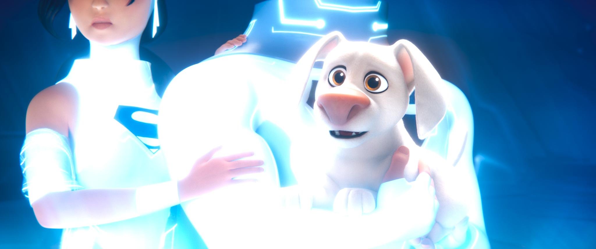

Image courtesy of Dolby
Tone mapping from HDR to SDR
What we are trying to do here is fit 10 pounds of chicken into an 8-pound bag. Something has to give, usually the bones but the goal is to keep as much chicken as you can. Rather than toss data out, we instead compress it. The system calculates the min, max, and average light levels. The idea is to keep your average or the “meat and potatoes” of your shot intact while compressing the top and bottom ranges. The end result is an SDR image that resembles your HDR only flatter.

How a colorist goes about the analysis is just as important as the analysis itself. This is going to get into a religious debate more than a technical one and everything from this point on is my opinion based on my experiences with the tech. Probably not what Dolby would say.
The original design of the system wanted you to analyze every shot independently. The problem with this approach is it can take a consistent grade and make it inconsistent depending on the content. Say you had two shots from the same scene.
One side of the coverage was shooting the character with a blown-out window behind them. The other side shoots into the darker part of the house. Now even though you as a colorist have balanced them to taste, the Dolby analysis will have two very different values for these shots. To get around this, I find it is better to average the analysis for each scene vs doing independent shots. The first colorist I saw work this way was my good friend and mentor Walter Volpatto. He went toe to toe with Dolby because his work was getting QC rejections based on his method. He would analyze only a grey ramp with the d-min and d-max values representing his media and apply that to his entire timeline. His thought process was if it was one transform to HDR it should be one transform down.
Most studio QC operations now accept this approach as valid metadata (Thank you, Wally!) While I agree with his thought process, I tend to work based on one analysis per scene. Resolve has this functionality built in. When I’m working in Baselight I set it up this way and copy the scene averaged analysis to every shot in preparation for the trim.
Scene average analysis in Baselight.
Setting the tone
Now that your analysis is complete it’s time to trim. First, you need to set what display output your trim is targeting and the metadata flag for the intended distribution. You can also set any masking that was used so the analysis doesn’t calculate the black letterbox pixels. The most common targets are 709 100nits, P3 48nits, and PQ 108nits. The 709 trim is for SDR home distribution whereas the other two are for theatrical distribution. The reason we want to keep the home video and cinema trims separate is that displays that fall in between two trim targets will be interpolated. You can see that the theatrical 108nit trim is very close to the home video 100nit trim. These two trims will be represented very differently due to the theatrical grade being intended for a dark theater vs home viewing with dim surround lighting conditions. Luckily Dolby recognized this and that is why we have separation of church and state now. The process for completing these trims is the same though, only the target changes.
Trim the fat
Saturation plus lift gamma gain is the name of the game. You also have advanced tools for highlight clipping and mid-tone contrast. Additionally, you have very basic secondary controls to manipulate the hue and saturation of the six vectors.
Baselight Dolby trim controls.
Resolve Dolby trim controls.
These secondary controls are very useful when you have extremely saturated colors that are on the boundaries of your gamut. I hope Dolby releases a way to only target the very saturated color values instead of the whole range of a particular vector, but for now, these controls are all we have.
Mid tone offset
Another tool that affects the analysis data but could be considered a trim is the mid-tone offset. A good way to think about this tool is a manual shifting of what your average is. This slides the curve up or down from the midpoint.
I usually find the base analysis and subsequent standard conversion a little thick for my taste. I start by finding a pleasing trim value that works for a majority of shots. Then I ripple that as a starting place and trim from there until I’m happy with the system’s output. The below before and after shows the standard analysis output vs where I ended up with the trim values engaged.


It’s time to export once you are happy with the trims for all of your needed outputs. This is done by exporting the XML recipes that when paired with your PQ master will create all the derivative versions.
XML
Here are two screenshots of where to find the XML export options in Baselight and Resolve.
Rightclick on your timeline -> timelines - >export -> Dolby XML
Shots View -> Gear Icon ->Export Dolby Vision Metadata… This will open a menu to let you choose your location and set primaries for the file.
The key here is to make sure that you are exporting an XML that reflects your deliverable, not your DSM. For example, I typically export PQ P3 D65 tiffs as the graded master files. These are then taken into Transkoder, placed into a rec 2020 container, and married with the XML to create an IMF. It’s important to export a rec2020 XML instead of a P3 one so that when it is applied to your deliverable it yields the intended results. You can always open your XML in a text editor if you are unsure of your declared primaries. I have included a screen grab of what the XML should look like for the Rec2020 primaries on the left and P3 primaries on right. Always go by the numbers because filenames can lie.
Rec2020 XML vs P3 D65
There is beauty in the simplicity of this system. Studios and streamers love the fact there is only one serviceable master. As a colorist, I love the fact that when there is a QC fix you only need to update one set of files and sometimes the XML. That’s a whole lot better than in the height of the 3D craze where you could have up to 12 different masters and that is not even counting the international versions. I remember finishing Katie Perry’s “Part of Me” in 36 different versions. So in retrospect, Dolby did us all a great service by transmuting all of those versions we used to painstakingly create into one manageable XML sidecar file.
Thanks for reading
I bet in the future these trim passes end up going the way of the 4x3 version. Especially with the fantastic HDR displays available from Samsung, Sony, and LG at continually lower price points. Remember the Dolby system only helps you at home if it is something other than what the media was mastered at. Until then, I hope this helps.
Check out this Dolby PDF for more information and deeper dive into the definition of the various XML levels. As always thanks for reading.
-JD
Questioning Color
I was recently interviewed for an article on the power of color. The questions were very thought-provoking, and some topics I hadn’t thought about in years. I think it’s always a good practice to periodically approach the profession with a kindergarten mindset, ask the important “why’s”, and question or reaffirm first principles.
You can check out the article here and see the complete list of questions and my responses below.
Hopefully, this helps my fellow hue benders out there. Let me know if you disagree with anything in the comments. I always appreciate new ways of looking at things.
John Daro, Senior Colourist, Warner Bros
John Daro is a Lead Digital Intermediate (DI) colourist at Warner Post Production Creative Services, a division of Warner Media. He has supervised the finishing and grading of many feature films, television pilots, commercials, and music videos for clients, including all the major studios, in addition to independent productions.
Daro started his career at the film lab FotoKem. His first notable achievement was architecting a direct-to-disk dailies pipeline. From that role, he moved on to film scanning-recording and, with the DI process's creation, his current position as a finishing colourist. His past jobs gave him a mastery over colour transforms, and he started to couple those strengths with the art of cinematography. He continued to pioneer post-production techniques, including 3D conversion and the early days of HDR imaging. As a founding team member of their digital film services department, he helped FotoKem achieve its status as one of the premier post houses in the film and television post-production industry.
In this interview, Daro talks to us about how colour can be used to shape an audience’s interpretation of a film and provides examples of how he’s used colour to help communicate a narrative in the past.
How do you think colour shapes the way audiences perceive film?
It's funny that you asked how colour shapes the audience's perception because, in a way, the colour process is literally “shaping” what we want you to see and what we don't. At its most basic, colour finishing is the process of highlighting and subduing certain key areas which directs the viewer’s attention to where the filmmakers intended. Before digital colour grading, cinematographers highlighted these key areas through shadow, light, depth of field and lens effects. Photochemical timing changes were limited to colour and density. Nowadays, the sky's the limit with shapes, articulate roto masks and matte channels. Ultimately, the end goal of all these tools is to make it feel natural and true to the story and highlight key moments necessary for the viewer to absorb the supporting narrative. It's an old cliche, but a picture tells a thousand words.
How have you used colour to communicate with an audience?
A couple of examples that popped into my mind involve using dynamics to simulate coming out of a bright area. I think I used this technique most effectively in Laika’s The Boxtrolls. When Eggs, the film’s protagonist, came out of the sewer for the first time, we applied a dynamic luminance adjustment to simulate what your eyes would do when adjusting to a bright light coming from the darkness.
Another example is Steven Soderbergh's Contagion, where colour choices define geographical location to help the viewer know where they were without needing additional information. I also used this technique in Natalie Portman’s adaptation of Amos Oz’s A Tale of Love and Darkness. For this film, we were dipping through memories and a fantasy world. Colour choices defined the real world versus the world inside the character’s head.
Can you talk us through your involvement in choosing and implementing a colour palette for a specific scene/film?
So many of these decisions are decided upfront through lighting, production design and wardrobe. It's always a pleasure to be brought in on a project early enough to have been part of those conversations and understand the motivation behind the choices. I feel there's great value for everybody to be on the same page and know how specific colours on the set will render in the final output.
Look development can have many muses. A style guide, concept art and a reference deck are great tools. I like to start by picking two or three key colours that are important to the story, symbolize a character, or represent a message. Then the objective is to find the best way to shift and enhance to make a split complementary palette. Contrast and simplicity are at the heart of the finest design in my opinion.
Do you think colour is the backbone of emotion in film?
I don't think so, no. I think sound is. Smell would be even more evocative, but luckily for the Jackass movies, smell-o-vision didn't catch on!
I prefer to grade with the latest mix. It's the sum of all the parts that make a great cinematic symphony. Colour and sound must be playing in concert, similar in tone or in contrast but always together.
I think that kind of sensory feeling might be ingrained in our DNA. Whenever I hear the opening to Peter and the Wolf, I visualize spring greens. It doesn't work the other way, however. I don't hear Peter and the Wolf every time I see green. Colour must be taken in context. Green can make you feel safe and calm like a lush field of grass blowing in the wind does. At the same time, it can evoke feelings of jealousy or sickness. It all depends on context and the motivation behind the story being told.
How do you know when a specific colour scheme does or doesn’t work?
There are a few academic reasons I could give you. For example, certain colours clash with other colours. Certain colour harmonies are not particularly pretty, but that doesn't mean that you can't use those mismatches. Especially if what you're going for is to make the viewer uncomfortable or uneasy. Colour is subjective; balance is not.
Ultimately, the real answer is feeling it in your gut. You know when it’s right. I have an internal rule when taking my passes. The reel is done when I can watch it down and have less than three tweaks to make. You are never really finished. Most often, you just run out of time.
How do you work with the director and cinematographer to achieve a specific look in a film?
I first watch a rough cut or read the script and get an idea of the story. Next, I take camera tests and start to build a basic look. The goal with this V1 transform is to find something that works for the cinematographer and gets them repeated results in different lighting conditions. Obviously, it should also have an aesthetically pleasing visual component. It's important when building a look to ensure that the camera still behaves as expected regarding sensitivity and dynamic range. You don’t want to bake anything that could hamper the original photography. Essentially, make sure mid-grey still maps to mid-grey.
Once we have dailies, the process begins again, where I might have a V2, V3, or V4 version of the look that we're going for. I put those in a still gallery on a server for remote viewing, and we constantly update the conversation forum page with feedback from the creatives. I maintain before and afters of all versions to ensure we improve and never go backwards creatively. The last step is to ensure that the look works for the story once the film is assembled. Tweaks are made to the show look and certain scenes get special treatments for effect.
CDLs are a vital part of this process as well. Grading your dailies is very important for ensuring that there are no surprises when everyone gets to the DI theatre. I've had past experiences where producers see something that has the final grade, but it's too far of a departure from what the look was in editorial. To combat this reaction, we always want to ensure that the look is consistently maintained from the first shot out of the camera through to the final finish.
How can colour set the tone for a scene?
To set the tone, it's all about warmer, colder, brighter, or darker. As I've already touched on, it's really important to pick a few colours that you want to enhance and then let the background support that enhancement, whether through a complimentary value or making it recede. They're also the obvious washes that you can do. For example, if you make a scene very red, the warmth invokes a sense of romance or love. It can also yield a literal hot vibe. Something very cold, very desaturated invokes a sense of bleakness or a dystopian feeling. Magenta's a weird one because it can be warm and cold at the same time. Depends on the context and how it's used. Green-yellow also functions similarly. It can seem sickly and off, but it can also be romantic and warm, depending on what side of the hue you're on. I don't know where these generalities came from, but they're almost universal at this point. My gut is that human evolution has something to do with it. I think the responses to these colours helped us survive at some point. When I say it’s in our DNA, I do mean just that.
What technical difficulties do you come across with undertaking this critical part of film production?
You can avoid many technical difficulties by ensuring you’re doing no harm to your pixels. The most important thing is that you have a colour-managed pipeline, in that you’re never working on what the film looks like, but rather what the film was captured as. Make sure you’re always working in a photon real-world scene-referred way. At that point, the displays don’t matter as much. They simply target what you’re trying to hit. They can always be adjusted after the fact if there are technical concerns. I always work with soft display-referred transforms that gradually roll off your highs and also have a nice toe in the black. This generally helps cut down on the number of technical issues.
Past that, it's all about keeping your eye on the scopes and ensuring there are no technical glitches in the actual capture or renders like quantization, dead pixels, hits or bad frames. All it takes is an eye for detail and a great QC department.
How does your role as colourist differ when working on animation compared with live action films?
At the core, the two are very similar. The same principles that make a strong image still hold true regardless of how the image was created. Modern render engines are very good at doing what light does. So much so that a lot of DoP buddies of mine are pre-vising lighting setups virtually.
Nowadays, that line is being blurred even further, where some films can be comprised of mostly VFX shots. Many of these setups, especially with the advent of digi doubles, are not very different from a fully animated picture.
Now, if we’re defining a “live-action” shot as being something captured with a camera, and no further manipulation, then the biggest difference comes from the workflow. For example, if you take a live-action setup that has been shot with clouds and maybe some inconsistent lighting situations, your first step is technical colour correction just to balance the shots together. You don't have this problem with animation, but you do have a similar situation where you might have many artists working on the same scene. This can sometimes lead to slight inconsistencies that must be smoothed out.
A huge advantage of CG-originated shots is that they tend to have advanced matte channels. These could be as simple as a matte for the main character or as complicated as depth or normals. These additional tools allow for more complex grades but also increase the time that you spend on each shot.
Can you tell us about your grading suite? What could you not be without while at work?
My grading suite looks like a hot mess. Imagine the Great Wall of monitors. I have two x300s, and two GUI monitors for Baselight, one extra wide LG for what I call my Swiss Army box and an admin computer. The most important display is my Christie 4k projector. I also have an LG C2 to simulate a consumer experience.
The most important machine in my tool set is the Swiss Army box. Essentially, it's a super micro chassis with four a6000s that has every single piece of post-production software that has ever been useful. I also use this box for coding and the development of my own in-house tools. I would consider this machine mission-critical. Second to that, the next most important piece of gear would be an external scope. Your eyes can lie to you, but scopes never do. Software scopes have made huge advancements in recent years. I can't say I use the external one every day, but when you need one, there really isn't a substitute.
How does Baselight aid your role as a colourist?
There's a lot of great software out there and I always say use the right tool for the right job. For most of my jobs, that ends up being Baselight. The reasons are straightforward. Firstly, the colour science in the machine is second to none. Next, I appreciate the simplicity of the interface. When colouring long form, most of what you're doing is manipulating groups of many shots. Baselight makes this very easy to do. The other thing I can't live without is how Baselight organises and categorises. When you get towards the end of the project, things get hectic, and it's very nice to be able to sort and view in any way that a project demands. Often this has to do with missing visual effects or work I need to get to after the session. I use categories and marks so that I always know what the status of a scene is at any given time. This organisation also aids in communication. I can always keep post supervisors up to date with reports. Additionally, my in-house team always knows what needs to be done and what is already completed based on the organisation that we have put in place. I've always felt that Baselight was built by people who do the job of colour – not by committees or nonpracticing theoreticians.
What are you working on now/next?
I’m currently finishing a docuseries directed by Allen Hughes for FX about Tupac Shakur’s life and relationship with his mother called Dear Mama. The interviews have an exciting cognac look that I can’t wait to share. The first part premiered at the Toronto International Film Festival and was very well received.
Later this month, I will be finishing a feature called Sweetwater. It’s about the story of the first black NBA player, Nat “Sweetwater” Clifton. It is a period piece, so a lot of fun in the colour department. We contemplated a black-and-white double X look for the show but ultimately landed on a derivative of an Ektachrome simulation that I had built a while ago. It has a super cool look if I do say so myself.
We are also supporting pre-production and dailies on A Gun on Second Street. This show is shooting on film, which is always pleasurable and exciting. The look for the show is a straightforward Kodak film vibe, expertly lensed by Leo Hinstin.
While we are on the topic of film shows, I’m also supervising the remastering of Superman II (yes, both cuts.) This will be released in early 2023 just in time to get people excited about Michael Shannon’s General Zod in The Flash. Kneel before Zod!
Additionally, my team and I will return to animation early next year for an upcoming Netflix feature. More on that later at www.johndaro.com.
DC League of Super Pets
Super excited for everyone to check out the latest from Warner Animation. DC League of Super Pets is a super fun romp expertly animated by the talented team at Animal Logic.

Toshi the Wonder Dog!
Anybody that has ever had a pet is going to love this movie.
Post services provided by Warner PPCS include an ACES HDR picture finish and sound. Truly a post-production one-stop-shop.
The project was supervised by Randy Bol. The great thing about working with Randy is we have a level of trust that has been built over many other projects collaborating together. There is definitely a shorthand when both of us are in the suite. One of the best post sups you’ll work with plus just a good dude too.
Color was supervised by co-director Sam Levine. This guy was cracking me up every session. Not only was he hilarious, but damn, what an eagle eye. I was sort of bummed when our time together ended.
A big thanks to Paul Lavoie and Leo Ferrini too for keeping the ship afloat. I would be drowning in a pile of pixels without these guys.
Now go see DC League of Super Pets only in theaters… Preferably a Dolby Cinema one.

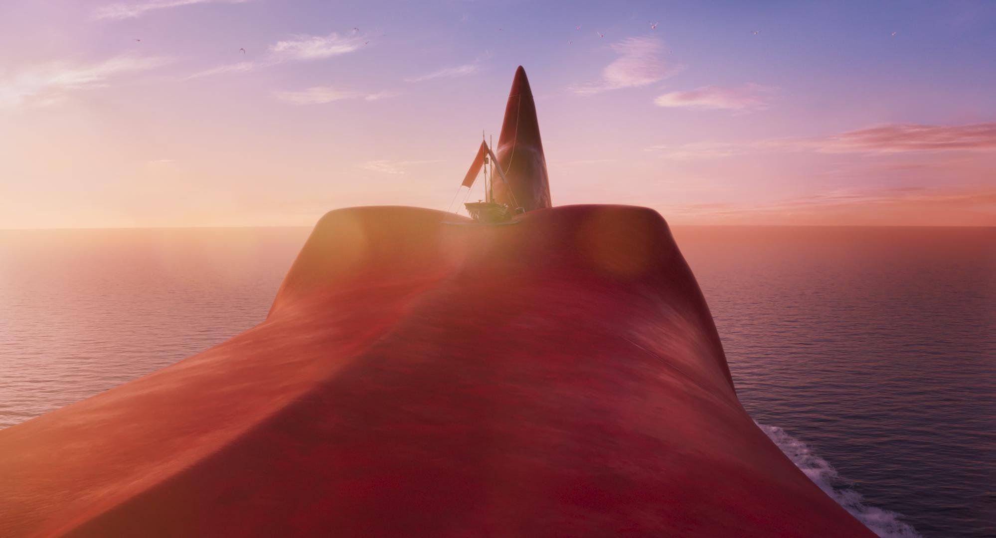
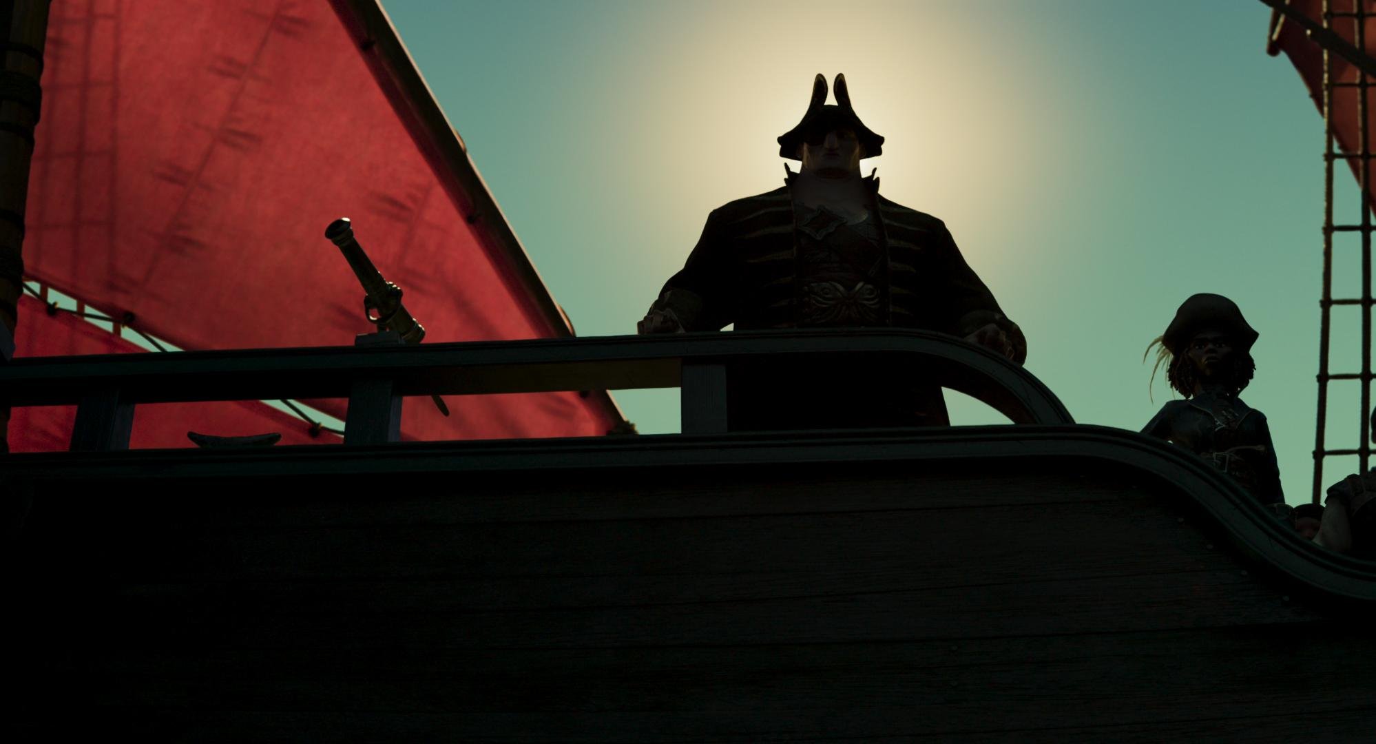
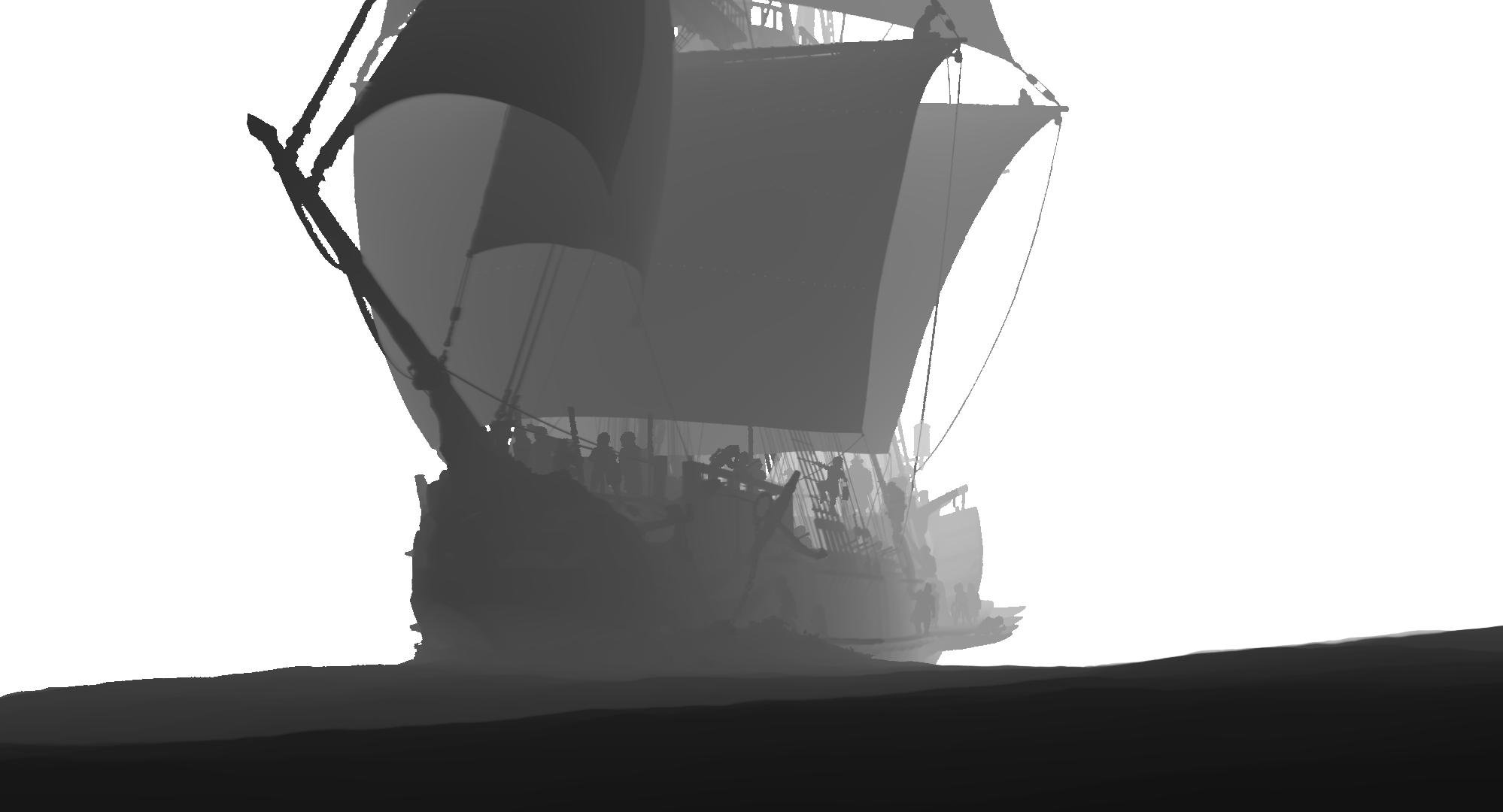
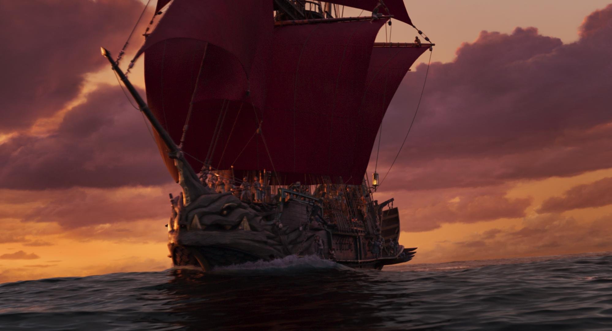
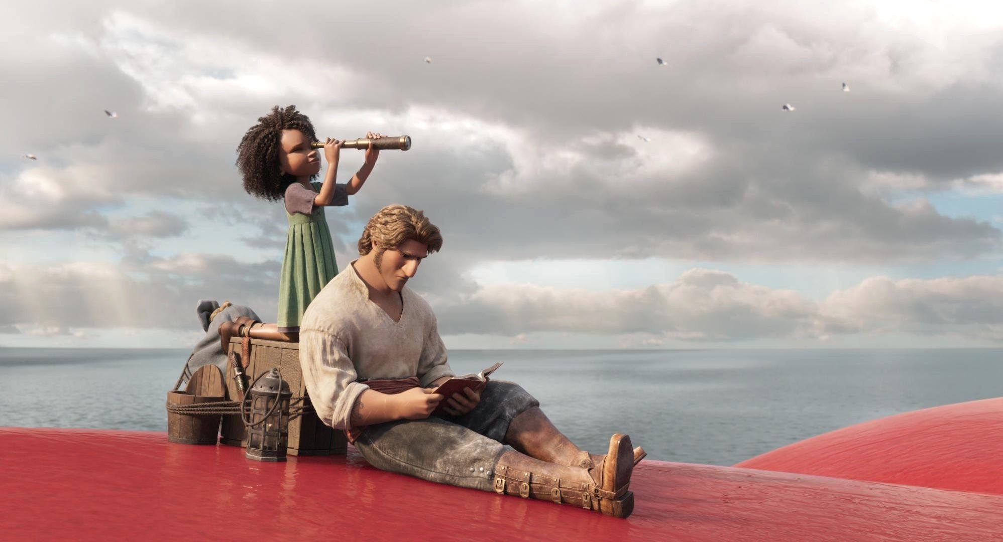
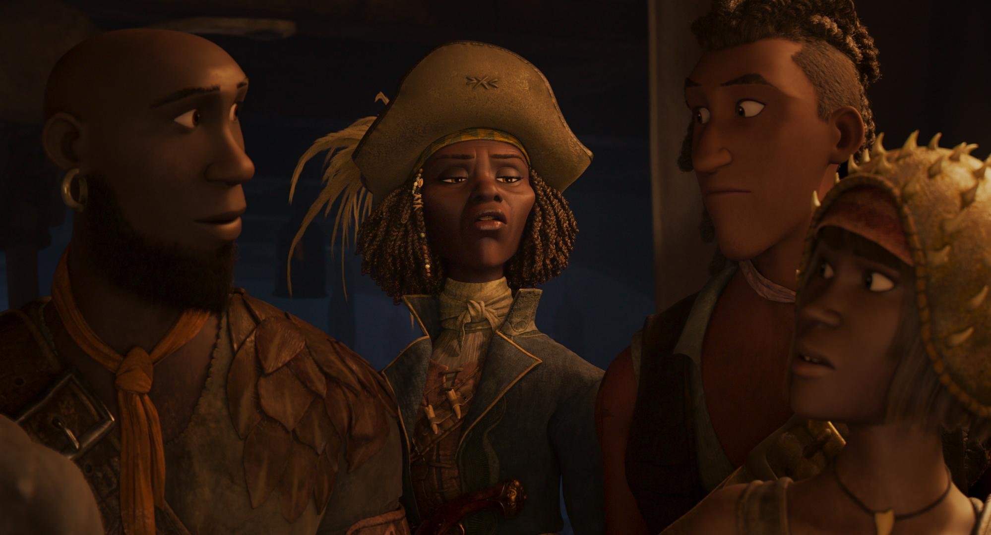
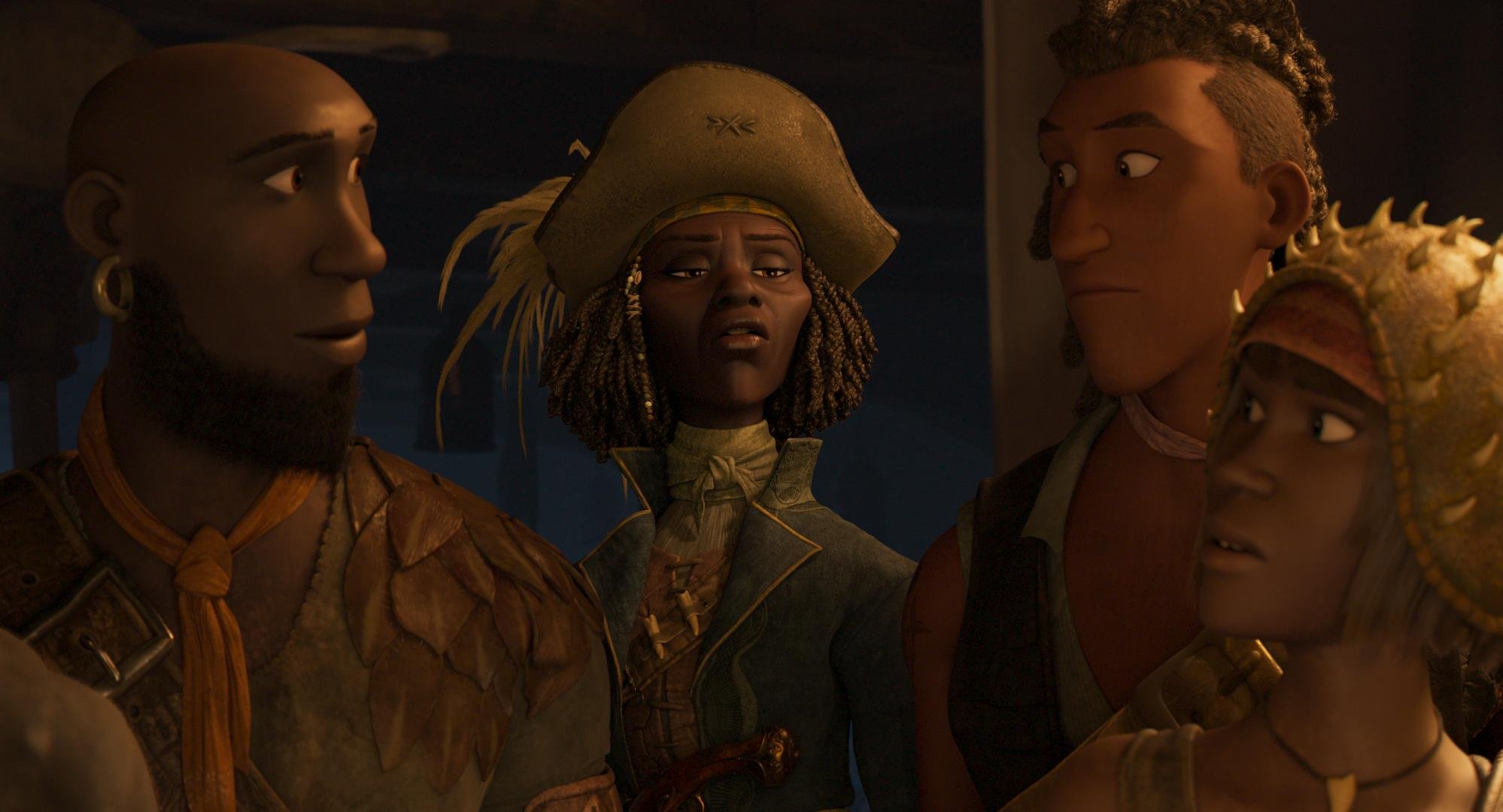
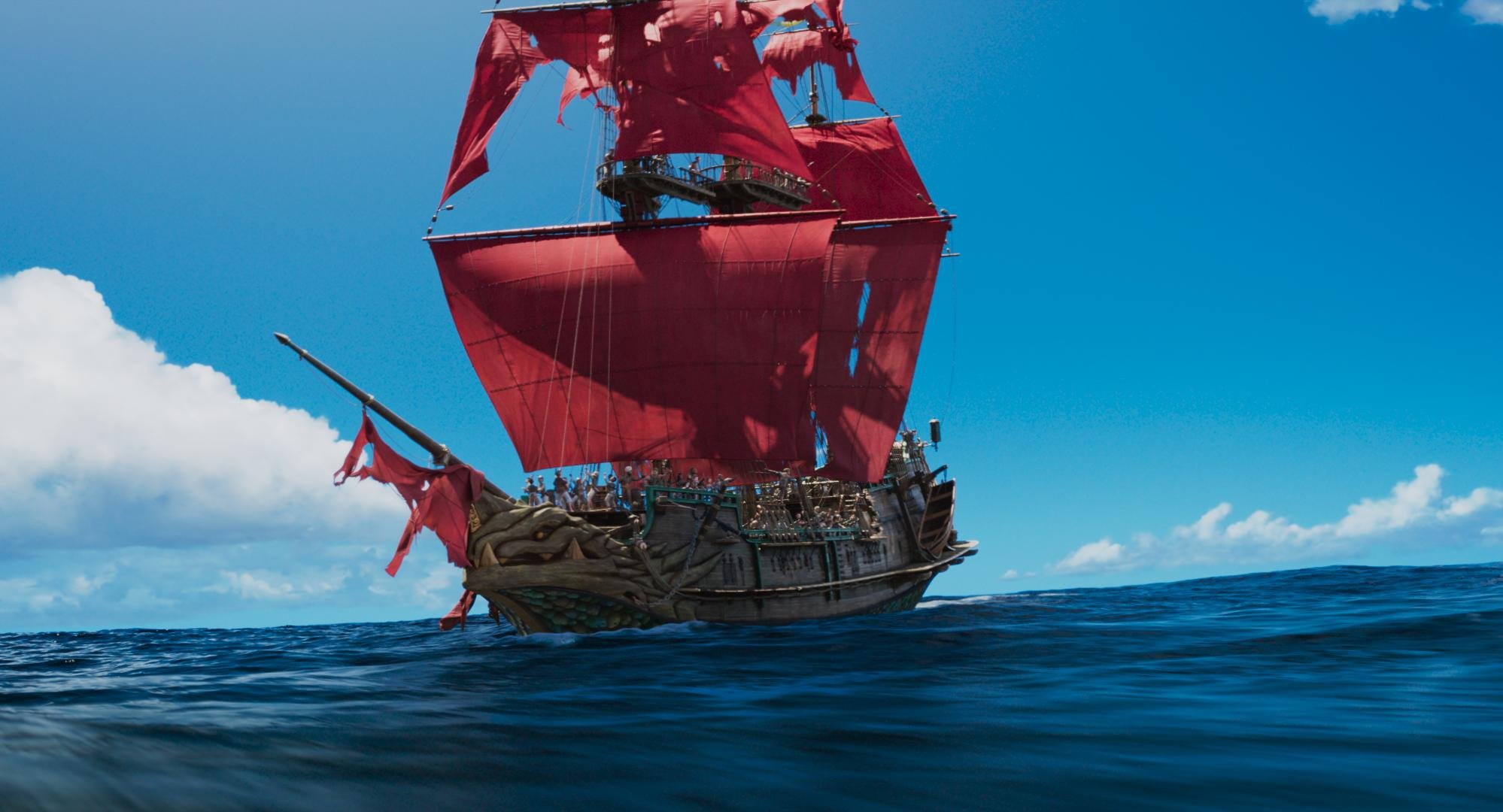
The Sea Beast - High Dynamic Range on the High Seas
Hey everyone, the Sea Beast is out today on Netflix and I am super thrilled to share some of the innovative aspects of the color finishing. I hope you all enjoy reading about the techniques used and the “why” behind some of the choices. It’s a gorgeous film and I’m very grateful to have had the opportunity to contribute my small part.

If it’s not on the page it’s not on the stage
It all starts with a script. In Sea Beast’s case, that script was co-penned by the story’s visionary Director Chris Williams. I’m a big fan of Chris’s past work, so getting the chance to collaborate with him on his latest was exciting, to say the least. He’s sort of animation royalty in my book.
The world was conceived from the minds of two fantastic artists. Matthias Lechner wore the mantle of art director while Woon Jung took up the production designer role. Sony ImageWorks was tasked with bringing the characters to life supervised by Stirling Duguid. Steven Schweickart kept us on time and honest, while Tim Archer supervised the post. Joyce Arrastia was the editor who put it all together. Netflix put together the dream team of animation heavyweights on this one and it shows on the screen.
The World
The look of the world in one word would be painterly. We used Filmlight’s Baselight to “paint” the frame with a lot of soft, atmospheric touches.


Much of the film takes place in humid locations with a lot of volumetric haze. This does two things for the picture. One, it softens what could be a sometimes overly contrasty CG aesthetic. Two, it really plays up the scale of the world by imparting a sense of depth.


We always made sure to play the background a little desaturated and low con. This was inherent in the design and execution of the files coming out of ImageWorks, but was further enhanced in DI with the use of mattes and depth channels.
Cyan blues were also very important, as you can imagine for a movie set out on the sea.


The sky and the weather were closely linked to the dramatic plot points of the story. We made sure that the sky felt like a reflection of the mood that was at play in the scene. One such example was when we darkened the storm clouds in the second act. This gave a threatening feeling as the characters trudged forward in the story.
Shapes used to create an ominous feeling in the clouds.
Enhancement of the Blood moon to create a foreboding presence.
Another important color consideration was the look of one of the main characters named Red. As her name implies, the character is a very saturated red hue. We made sure to play up the complementary nature of the relationship to the opposing cyan sky and ocean using secondary hue swings.

Special attention was made to ensure Red had the right hue for the environment. This meant slightly leaning Red’s skin color to align with the scene. Warmer in sunlight and more towards the cooler side of magenta at night.

A different type of script
The Sky was not the only color consideration when it came to plot. Matthias and Woon came up with a color script that we diligently adhered to. Here is a graphic of the most important hues vs. time.

You can see that as the film is building tension we leave the “pretty colors“ for a more earthen palate. One reference Matthias gave me was “Delicatessen” shot by the great Darius Khondji. I love that film and immediately knew what he was going for. We used the uneasy, green side of yellow to symbolize corruption.


As the character's adventure unfolds we see that certain arcs are “corrupted” by revenge, greed, or just plain ignorance. We linked the intensity of this descent to the intensity of our yellow look that we developed. I achieved this by mixing back the full look with differing levels of opacity to get peaks and valleys over time. I feel that the use of this device goes a long way in helping set the tone of certain moments. The idea is to be felt but barely perceived.
HDR modulation
Early in testing, I received a note from the team that the skies were too busy vs what they designed and were used to seeing. I started to explore what was causing this reaction because I liked the look that I had first presented very much. Once I dug in a bit more, I found that due to COVID restrictions most of the approvals were done in SDR. This was the first time the creatives were seeing what was hiding in their data.

I built an LMT to solve this concern. Up to this point, the show’s pipeline was vanilla ACES. The LMT mimicked what the sRGB output looked like but tone mapped to 1000nit PQ. I started with an exact match. Then I used a simple curve to “stretch” the picture so that the middle grey was mapping correctly. I then rolled off the top end, mapping the specular highs around 600nits. This gave us the feel of the SDR but still took advantage of the extra range.


Simplifying the sky by blending the LMT layer
This was a fantastic way to simplify the sky and get the picture closer to the original artwork. The LMT approach proved to be much more efficient and safer than a key would have been. We also found that in some cases the opposite was true. There are a handful of pivotal moments where maximizing the range was to our benefit. Certain shots hit harder from being more complicated in their HDR rendering. The images shown here in SDR don’t really showcase what is happening +100 nits, but hopefully, you get the idea.


We ended up riding the opacity of the LMT to taste. This gave us one more device that we could use to link the look with the narrative arc. Here is a graph of the “amount” of dynamic range over time.

You can see that the trend line shows we used more range as the film progressed. You might think that the curve would correlate to the action scenes, but I noticed while gathering the data for this graph that it was actually coupled to the scenes with the most emotional weight. This was a first for me but I plan on using this technique on other shows going forward. I have always said just cause you have the range doesn’t mean you need to use it. HDR is like salt, a little goes a long way, and too much ruins the dish. I now feel it’s better to approach the extra range like punctuation that enhances key moments. If everything has an exclamation point it sort of loses its meaning.


Mastering
We spent two weeks on the HDR grade. I’m a big proponent of HDR first. It is your highest quality master and the one that will live on past the others. Once we had the HDR P3D65 1000nit master perfect, we moved on to the Dolby SDR trim. This was pretty straightforward except for a couple of scenes. There is a scene early on with a very flared vibe. The Dolby tools were not allowing us to get to where Chris wanted to play it. I was unable to achieve the toe compression in the shadows that I wanted no matter how I trimmed the lift up and gamma down (I call this the gamma shuffle.) Changing the analysis and the L3 mid data didn’t get us there either. We needed to use the higher precision tools found in the color corrector.
We opened back up the HDR pass I made a curve tweak to the toe, keeping an eye on the SDR output simultaneously. I found something that worked for both and was by no means a sacrifice in the HDR world. Other than those scenes it was business as usual.


We also created a theatrical version for a DCP. We did that pass in a day and a half making slight contrast and saturation tweaks. I did this in the same timeline giving a “Theatrical” category to the stacks that I used specifically for the 2.6 48nit XYZ version. Then in the exports of the other versions, I set this category to “bypass.” There is a deeper dive into this type of workflow in my post on Space Jam a New Legacy under the “multiple deliveries, one timeline” heading.
Archival
We also created an ACES AP0 deliverable in addition to the standard display referred masters. This GAM (Graded Archival Master) had all of the grades plus the LMT baked into a linear gamma EXR with ACES primaries. Standard ACES transforms applied to the GAM will get you back to the display targets where we were in DI. We also created a NAM (Non-Graded Assembly Master) that was only the conform without the grades. Both of these masters can be sourced for remastering in the future. Since I’m a card-carrying member of the organization, People for the Ethical Treatment of Pixels, I can safely say, no pixels were harmed in the making of this motion picture.
Thanks
A big thank you to Leo Ferrini, Paul Lavoie, Chris Coleman, Patrick Brennan, and the entire Warner PPCS staff. This was a super fun swashbuckling project with an amazing team. I’m looking forward to this rich world’s following chapter and to “sea” what’s next for Red, Blue… and green 😉 Thanks for reading, and as usual, reach out with any questions or post in the comments below.
Now go watch The Sea Beast on Netflix today!
Happy Grading,
JD

FlyOver-Canada
WINDBORNE: CALL OF THE CANADIAN ROCKIES
Hey everyone,
Anybody that knows me can say that I have always been enthralled with immersive experiences. Early on, I dove into stereoscopic 3D and have worked in many immersive formats such as OmniMax, LED volumes, VR, and rides. I have even dabbled with my own motion platforms at home. I simply love being transported to new places through media and technology. I was very excited when the team over at FlyOver tapped me to help with their latest experience.
Windborne: CALL OF THE CANADIAN ROCKIES premiered this week at FlyOver Canada and is easily one of my favorite immersive projects that I have been a part of. Go check it out next time you are in Vancouver through September 25th.
Bit Depth and Precision - Why It Matters
My Camera only has a 12-bit sensor, a 12-bit master is fine right?
I recently had a client that had pre-graded material that was coming to me for a final pass and mastering/deliverables. They asked me if 12bit dpx would be ok. This client was not local and the smaller file size would save time and money in data transfer fees.
I thought about this one for a second and replied irrevocably with a no. My answer would have been different if these were camera originals since the show was shot with a 12bit sensor. Here is why 16bit matters in a 12-bit capture and display world.
Uncertainty in Measurement
Uncertainty in Measurement is defined by wikipedia as “the range of possible values within which the true value of the measurement lies.”
When I was a young chap, I had an instructor who explained to me how Subway was ripping me off. Every time I ate there they were cheating me out of sandwich and getting away with it. The loophole was simple. The metric Subway uses is not very precise (or in our world translates to having a low bit depth.) Subway sells a “footlong” sub. Now that is 1’, not 1.0’, not 1.1’ or 0.9’. The end of Subway’s precision ends at 6 inches. It’s either a foot or a half of a foot. The problem here is in actuality the Subs are around 9-10 inches. How do they get away with cheating me out of 2 inches?
The cheat is effective by not using any zeros. Subway simply rounds to the nearest foot since that is all their mathematic language accounts for. Using Subways “precision” a “footlong” sub could be anywhere from 0.6 feet to 1.4 feet. To no one’s surprise, I have never had the luck to receive the latter, but have received many less than subs.
Ok, I’m hungry, but what does this have to do with an Arri Alexa?
Most current cameras work with less than 16bits of precision. This doesn’t mean that we should. Let’s take two parrell paths. Same operations, but one executed with higher precision.
Higher Precision Pipe
Starting Captured code value = 9.0
Graded down a stop (linear data) 9.0/2 = 4.5
Mastered to a file that can accommodate the precision = 4.5
Remastered in the future graded up a stop 4.5*2 = 9.0
Lower Precision Pipe
Starting Captured code value = 9
Graded down a stop with lower precision (linear data) round(9/2) = 5
Mastered to a lower precision file = 5
Remastered in the future graded up a stop 5*2 = 10
Now that is a super watered-down example but hopefully, you get the point. We land in a world where 2+2 doesn’t equal 4.
Do we visually need the extra data? Is it worth it?
Absolutely not. Our current display systems have a 12bit precision at best. A 16bit file vs a 12bit file will look identical on the screen. The big difference is the 16bit file has more information about the path that was used to get there. Baselight and Resolve, both work at 32bit float internally. We should strive to retain as much information about what happened in the grade as possible. Additionally, GPU’s think in 8’s or 16’s. Even if a 12bit word is smaller it is padded to 16bit before processing. There is zero performance gain except for slightly less disk IO and usage. Visually two icebergs may look the same, but they can be very different under the surface.
Let’s protect our pixels by ensuring they have the best chance to weather the bends folds and manipulations that future generations will impact on them. 16bit is the new black ;)
The Sea Beast Teaser | Netflix
Here is a first look at the latest project from Chris Williams and Netflix that I graded. An awesome project with an animation A-team. Let me know what y’all think.

Kimi - Virtually a Virtual Production
Hey everyone! Steven Soderbergh’s latest “Kimi” is out today on HBO Max. This was a fantastic project to have been a small part of. Here is a quick look at how the color was finished.
Getting the Band Back Together
Firstly, It was great to reunite with Steven and the team. Kimi marks the sixth picture helmed by Soderbergh that I have been credited on. There is a shorthand that has been developed over the years with his core post team consisting of Corey Bayes, Larry Blake, and Peter Mavromates. The speed of this kind of communication and the trust built over the many projects makes for an extremely efficient finish. When the maestro is at the helm, it is not movie-making by committee. Truly just a singular voice of one of our generation’s greatest auteurs.
Another exciting aspect of this project was that it utilized virtual production technology. Bruce Jones supervised the visual effects on the show. I have worked with Bruce going all the way back to Michael Jackson’s “This is it” concert. The Stereoscopic LED portion of that show was directed by Bruce and I did the 3D finishing. Again, there was the benefit from a comfort factor built over many years. The first task was to ensure the plates matched the 3D asset that would be playing back from Unreal. The second task was to tweak the white balance of the plates to ensure they answered back the way Steven was expecting once captured by the RED camera off the LED screen. The color pipe for the screen ended up being REDWG Linear to REDWG log3G10. It was all a bit of voodoo to me after it went into the engine. Unreal is an area I would like to devote more time to in the future. A few years ago I made a VR app in Unity. In hindsight, I should have been tinkering with Unreal. Thankfully the masters at Weta Digital ensured that the footage was tone mapped correctly to the LED display provided by Monolith.

Kimi LED wall background
The Look
Sometimes it’s not the buttons you press but the ones you don’t. When you have a cinematographer as masterful as Peter Andrews the only thing to do is mind the picture. A younger me had to learn this lesson the hard way. Often I felt my worth as a colorist was defined by how much I did to the picture. Over the years I have come to realize that to be truly in service of great cinematography, you just need taste, a tempered hand, and a language for giving cinematographers consistent results. This is one of the reasons why I default to film terminology so often. Most folks know what a stop or one point looks like.
I used the RED ippv2 color science with Filmlight’s basegrade for a majority of the film. There are a few shapes here and there but that’s pretty much it. Soderbergh lights and shoots what he wants.


Mastering
Most of the heavy lifting was done in HDR P3 D65 PQ 1000nits. Second up was the theatrical version which was a tone-mapped derivative off of the PQ master. Once we were at a good place on the projector, we screened in the Steven J. Ross Theater marrying the sound for the complete experience. After those two versions were locked I used the theatrical p3 D65 2.6 gamma output as a reference for the Dolby SDR trim pass. I set up the Baselight in dual cursor output with a p3 to 709 LUT in-line on the reference output. Then I trimmed to get as close as the Dolby tools would allow on the other cursor. There was one last screening to approve the 709 derived off of the XML.
Watch it on HBO Max
Kimi is a fantastic story that taps into the zeitgeist of the world we are living in now. I’m very excited for it to finally be released. Go check it out on HBO Max and let me know what you think.
Happy Grading,
JD
EDL Extension Cleaner
I needed to remove the extensions from the filenames in an edl today, so I wrote this right quick. I’m sure some of you out there will need it too or at the very least a template to do something more complicated. It’s written for Python 2.6 and up.
import os
import sys
import re
import string

###v3 changed to work only on lines that start with 00
import re

def process_text(input_filename, output_filename):
    """Removes extra characters from filenames in the input file and writes the processed text to the output file."""
    with open(input_filename, 'r') as input_file:  # Open input file separately
        with open(output_filename, 'w') as output_file:  # Open output file separately
            for line in input_file:
                if line.startswith("00"):
                    filename = line.split()[1]
                    #print(filename)
                    short_filename = filename.split('.')[0]
                    print(short_filename)
                    line = line.replace(filename, short_filename)
                output_file.write(line)

if __name__ == "__main__":
    input_filename = sys.argv[1]  # grabs file from cmd line
    output_filename = input_filename.split('.')[0] + "_cleaned.edl"  # Use string concatenation for Python 2.6
    process_text(input_filename, output_filename)
    print("File processed successfully! Output saved to: %s" % output_filename)  # Use %-formatting for Python 2.6
Happy Grading,
JD
Kimi Trailer
I’m excited to share the latest film from Steven Soderbergh which we finished color on last year. Let me know what y’all think.